SIMEK (GREECE): From Tagging to minimalist METASHAPES
Hello Christos Tzaferos aka SIMEK. You are based in Greece, in Athens, born in 1985. Can you tell us something about your childhood?
I was born and raised in Chalkida, a small coastal town near Athens. As a child, I spent most of my time outdoors, riding my bike, playing sports, swimming in the sea, listening to a lot of music, working in the summer in my grandfather restaurant and occasionally painting. I’ve always loved being active and creative. I’ll admit that I didn’t enjoy school or waking up early, and that hasn’t changed much!
But those first sixteen years were full of freedom and exploration, and they shaped who I am today.
Did you draw as a child, and if, what did you draw?
I didn’t draw much as a young child, but I started getting into it around the age of 12. Back then, I mostly doodled and loved copying logos from brands like FILA, Champion, and Adidas. It was more about exploring shapes and styles than creating original art at that point, but it definitely sparked my interest in design and aesthetics.
Are there any artist in your family?
I’m the first in my family to explore anything artistic. There’s no artistic background at all. I discovered and developed it on my own, and over time, it became a significant part of how I express myself and approach the world.
How and when did you discover style writing/graffiti?
I discovered graffiti writing back in 1998. At that time, there was no graffiti scene in the city where we lived. One day, an older kid showed us a newly released book about graffiti in Greece. My friend and I were instantly hooked. We borrowed the book for a few days and studied every page. That’s really where it all started. It opened up a whole new world for us.
Which book was it?
The book called: Το Graffiti στην Ελλάδα (Graffiti in Greece).
When did you start writing graffiti? In 1999?
Yes, I started writing graffiti in 1999. My friend (Tensa) and I had just gotten into it and were excited to try it ourselves. We grabbed the first spray cans we could find and went to an abandoned salt work building in our area. That’s where we created our first piece together. It said ‘FIRE FOX.’ In hindsight, it wasn’t that good, but at the time, it felt like a huge moment.
With what names? Since when do you call yourself SIMEK and has it a meaning?
My first tag was SEK. Over time, I started looking for a tag that didn’t already exist, that didn’t carry any specific meaning, and that had nice flow between the letters. That’s how I came up with Simek, and I’ve been using it ever since.


Were you active in any crews? Which ones?
Yes, I’ve been active in several crews. My first crew was HKIDS with Tensa. After a few years, we create GIVEUP with Donforty. Then, I became a member of the USE Crew with Lune, Tek, Urid, Elz, Tensa, Skerz, and Donforty. Since 2011, I’ve been involved with Blaqk, a crew that I started with Greg Papagrigoriou.
Any particular style or writers influenced you in the beginning?
Early on, I was heavily influenced by Greek graffiti crews like FSB, HEROES, and HIT. Their style, presence, and attitude shaped my view of graffiti during those early years. They were the local pioneers.
Which styles did you prefer: Block letters, Wild style or 3D style? Seems like you tried all three, even mixing the styles?
Over the years, I’ve experimented with different styles, including wild style and 3D. I’ve even combined elements of them. However, I’ve always felt most connected to block letters and throw-ups. There’s something about their boldness and simplicity that really appeals to me.
How important was tagging for you? And what about throw ups?
Tagging played a big role in the beginning—it was all about getting your name out there with style. I was never a great tagger, but I’ve always loved throw-ups. To me, that’s the true spirit of graffiti.
Where did you like to paint most outdoor?
As a graffiti writer, I liked painting pretty much anywhere outdoors. I was especially drawn to central, high-visibility spots in the city—that’s where the impact is strongest. But when I wanted to experiment or try new things, I preferred more relaxed areas, like walls near train lines or in abandoned places.
Did you especially travel to paint elsewhere? Were you also going to graffiti jams?
I was really into graffiti jams—they were a big source of inspiration and motivation for me. I also travelled specifically to paint, mostly within Greece. It was a great way to meet other writers, share ideas, and experience different vibes in each city.
I read you studied graphic design after school. Where and how long?
After finishing school, I enrolled in AKTO’s three-year graphic design program. The program provided me with a solid foundation in design and visual communication that later influenced my artistic work.
Did you work as graphic designer?
Yes, I work as a freelance graphic designer. I don’t actively promote myself—most of my projects come through word of mouth, with each job leading to the next. I really enjoy graphic design and want to keep doing it, but in a very limited and selective way.
Did these studies influence your graffiti practice on walls?
Yes, my design studies definitely influenced the graffiti I was doing at the time. But more importantly, graphic design has become the main influence on the work I create today as an artist. It has shaped the way I think about composition and form. When I started studying graphic design, my view of design changed significantly. I learned fundamental principles and rules that I later adopted for my art work. Concepts like the grid system, the golden ratio, the use of space—both negative and positive—and contrast are now key factors in how I develop my pieces.
Are there any modern or contemporary artists/movements that inspires you?
Yes, I’m inspired by a variety of modern and contemporary artists and movements. I’m especially drawn to graphic design pioneers and artists who explore bold forms and colours. Movements like Bauhaus, Suprematism, Constructivism, and De Stijl have influenced how I think about simplicity, balance, and structure. My visual language is deeply rooted in the study of the urban environment and architecture, and these movements continue to inspire the way I approach my work.
Did any artist influence your abstract work? Like minimalist artists?
Several artists have influenced my abstract work. Artists like M.C. Escher, Frank Stella, Sol LeWitt, Mark Rothko, and Richard Serra have each had an impact on the way I approach space, form, and repetition. Their ability to create powerful visual experiences through minimal means continues to inspire my practice. There are many more, but these stand out as important references in my development.
What interests you in Minimalism?
What interests me about Minimalism is its ability to convey powerful ideas using the fewest possible elements. I’m drawn to the clarity, balance, and discipline behind minimalist works. It also creates space for viewers to engage and interpret the work in their own way, which I find very powerful.
Architecture and the urban seems to inspire you, can you tell us what in particular?
Architecture and the urban environment are a constant source of inspiration for me. I’m particularly drawn to architectural elements of buildings, structural details, patterns, and motifs as well as industrial design in general. I’m fascinated by the geometry that exists all around us, in cities, often unnoticed. The repetition, rhythm, and contrast found in urban spaces play a big role in how I develop form and composition in my work.
In 2007, you started painting some geometric elements in your letter pieces, mixing shapes with fat black outlines with shapes without. Can you explain this phase, and what challenges you had here?
That shift began in 2007, around the time I started studying graphic design at university. The things I was learning composition, structure, negative space had a big impact on how I saw graffiti. I started experimenting by combining geometric elements with traditional letterforms, mixing filled shapes and outlines. It was a big step for me, both stylistically and conceptually. It felt like a new way of working on the wall, more intentional and design-driven, but still rooted in graffiti.


From 2011 on you started painting abstract shapes, like stripes, bars and circles, mixing with calligraphy, reducing the colours to black and white. Hard edge geometric shapes combined with handwritten letters. This calligraphic work came from tagging I suppose, but where did this inspiration come from? The Greek alphabet? Arabic calligraphy?
This is work by Blaqk team (Simek and Greg Papapagrigoriou). The calligraphy part of this work is not from me, is from Greg Papapagrigoriou, my work is the geometric part patterns, lines, abstract shapes.
From 2014 on, you started to reduce the shapes to abstract patterns in black, white, and grey, playing with positive and negative spaces, how did you evolve towards this?
The design journey began around 2011. At that time, I felt a strong need for change—something that would challenge me and renew me creatively. My first reaction was to take the lettering work I was already doing and push it toward abstraction. This initial change opened the door to a new way of seeing and creating forms. Over time, I delved deeper into design studies, gradually improving my approach. This process led me to focus more on the interaction of positive and negative space between black and white.
In 2015, you painted your reduced shapes in a particular dark blue in Marocco. Can you tell us how you came up with this blue colour?
The blue colour was inspired by Essaouira, the place where I was painting. In that town, blue and white are everywhere: on houses, doors, and boats. The atmosphere there influenced me, so the colour blue naturally became part of my work.
A year later you started to reduce your forms to black flat bars applied in parallel, using positive and negative spaces. Do you remember how you evolved towards this visual language?
Definitely through experimentation and lots of sketchbook drawings. I call this series Parallel Lines. The main idea is two parallel lines that “run” through each space or material, creating geometric compositions and shapes.
I use a set of design rules that explore the boundaries between what can be read and what cannot, pushing the work toward abstraction and minimalism. These compositions are inspired by typography, calligraphy, and architecture. They give the viewer illusions—of geometric forms, abstract letters, or even images that each person might interpret differently.
You started playing with 3D-effects again in 2019 in adding volumes to your black flat shapes, creating optical illusions like surfaces with steps, bents or building compositions with rectangular volumes. It seems you wanted to trigger more our view and break the flat surface. How long was that phase?
These compositions are essentially a continuation of the Parallel Lines series, which I’m still working on today. In 2019, I began exploring how the same visual language could suggest depth, space, and architectural volume—creating optical illusions that play with perspective. So rather than being a separate phase, it was more of a natural evolution within the same ongoing series.


Since 2024 you paint single shapes, they are bigger and real masses, the contour of those single round and angular shapes seem to be more important. Can you tell us the meaning behind these shapes?
For almost five years now, I’ve been exploring the design and meaning of the circle and the curves it creates. Parallel Universe marked the beginning of a new direction—pushing beyond the line-based studies of my earlier work, which focused on strict geometric compositions and two parallel lines. This shift allowed me to explore curves and rethink my design approach from the ground up.
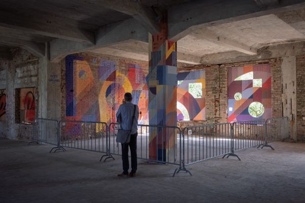
My latest series, titled METASHAPES, continues this exploration. These abstract, minimalist forms are inspired by the cyclical nature of life and universal symbols—shapes that suggest eternity, wholeness, and perfection. From the orbit of planets to the passage of time and the sun’s energy, each form reflects the powerful cycles that shape our existence. I want my work to leave space for interpretation—inviting viewers to question, reflect, and find their own meaning in these forms.
Do letters still play an important role ? Is your name SIMEK still the structure, the base for an evolving work?
Letters will always be important to me—they were the starting point of my visual language. But in the work I do today, they are no longer the main inspiration behind the design. The focus has shifted more towards form, structure, and composition beyond typography. While SIMEK was once a core element, the project has evolved into something broader and more abstract.
Are you still calling your works outdoor „pieces“?
Yes—or sometimes I call them new kids :).
What do you like the most in abstraction?
It opens space for the viewer to see something personal—everyone brings their own meaning to the work.
How will you describe your actual style with your own words?
Abstract—minimal, geometric, and open to interpretation.
You seem to like lost places, what kind of places do you prefer (old ones or modern ones) and how do you discover those?
I don’t have a specific preference. Each place offers something different—a new experience, a different feeling. I usually take the car and search around certain areas. In recent years, I’ve also discovered many interesting places through a good friend of mine who loves exploring these kinds of spots.
With which technique did you paint in the beginnings, and what are you using on walls nowadays?
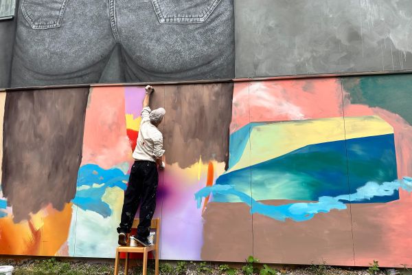
Like most graffiti artists, I started out mainly using spray paint. For the past 14 years, I’ve been working with acrylic paint, roller brushes, tape measure and paper tape, sometimes still use spray paint, depending on the surface.
What special techniques did you develop?
I haven’t developed any unique technique, but I’ve refined essential skills crucial for my work. This includes precise measurement and drafting to create accurate geometric shapes on large-scale surfaces, ensuring clean, sharp edges without errors. I also focus heavily on surface preparation and adapting my painting methods to different textures and materials, whether rough concrete or smooth walls, to achieve consistent and durable results.
Are you constructing your own tools?
I haven’t had to make my own tools yet.
How are the steps for your painting process on walls and how long does it take?
It depends on the location, the size of the wall, and how complex the design is. I usually work fairly quickly when painting on the wall itself. Most of the time is spent beforehand, developing and refining the preliminary design. I can typically finish a fairly large wall in about 3 to 5 hours.


Are you doing a sketch before?
Sometimes yes, sometimes no. Often, I create the composition directly on the wall or in front of the wall.
How important is sketching for your work?
The sketch is very important because of the nature of the work I do. It helps me have a clear idea of the final result beforehand—including the dimensions and how the piece will be positioned on the wall.
How important is freestyle in your work?
When I’m in a freestyle mood, it means I’m having an experimental day. Experimentation is very important to me because it’s through trying new things that fresh ideas are born.
How do you work to find new forms/shapes ?
I usually start by sketching—either on paper or on the computer. There’s always a basic inspiration or idea behind it, and from there, I begin to develop and explore the form.
You mainly paint in black in white since quite a while. Why?
First of all, I love black and white. For me, the contrast between them is very strong. Black and white help me focus on form and composition without the distraction of colour. It’s about contrast, balance, and clarity. This simplicity allows each shape to speak for itself.
What kind of challenges do black & white (mono or bichromatic) have for you compared with coloured ones?
They’re two different approaches, so for me, there’s no real challenge—just a different way of thinking and creating.
Do you often collaborate with others artists? What does this impact?
Yes, quite often! I usually collaborate with people who are friends, whose work I admire, or when there’s a good vibe from the first moment we meet. Every collaboration brings a different final result compared to what I would create on my own—and that’s what makes it so interesting. I’m also always curious to see how other artists work. A collaboration always has something to offer and something to teach you.
You have a collaborative project called Blaqk with visual artist Greg Papagrigoriou since 2011.
Can you tell us how it started, what exactly you do together, and what is the difference with your own practice?
We first met in 2009 through our mutual friend Don40. At the time, Greg had just started experimenting with calligraphy, and I was looking to explore something new in my own work. After two years of creative exchange, we decided in 2011 to go to the centrre of Athens and paint a wall together. We liked the result, and we immediately felt that there was a strong connection—something powerful could come from this collaboration. That’s how Blaqk was born.
Since then, we’ve been working together continuously. For several years, most of our projects were created under the name Blaqk, and in many ways, our personal practices evolved through that collaboration. We bring together two different visual languages: my focus on geometric forms and Greg’s expressive calligraphic style. The result is something unique—work that neither of us would have made alone.


How important is your studio work in your practice?
Every part of my work is important that’s why I’m doing it. Working in the studio is different from working on a wall—it requires a different approach and adaptation of ideas. It’s also a more solitary process, which allows for deeper focus and experimentation.
Are you working more outdoor or indoor?
It really depends on the time of the year. I work both indoor and outdoor throughout the year.
What are the differences between the works outdoor and indoor besides the scale?
In an outdoor space, there is freedom in terms of scale and movement, but also a responsibility to consider how the work functions in a public or abandoned space.
The work, like myself, is called upon to respond to weather conditions and participate in the architectural dialogue of the environment.
Indoors, the approach is usually more detailed, personal, internal, and focused on a specific context.
Which techniques do you use in the studio?
In the studio, I primarily work with acrylic paints on different types of paper and canvas. I also create wooden sculptures. Recently, I have been more consciously exploring texture in my work, experimenting with materials such as sand mixed with acrylic paint. This combination enables me to add depth and tactile qualities to my work.


How would you describe your own artistic evolution?
I would describe my artistic development as an endless journey of exploration and self-discovery. With each piece, I experiment with new techniques, emotions, and perspectives. Painting is a means for me to connect with myself.
It is a form of meditation that allows me to evolve and discover something new. The process itself—with its challenges, surprises, and good and bad moments—gives me a deep sense of satisfaction that transcends the final result.
Thank you Simek!!!


Leave a Reply