

The corset of the picture are and remain the letters
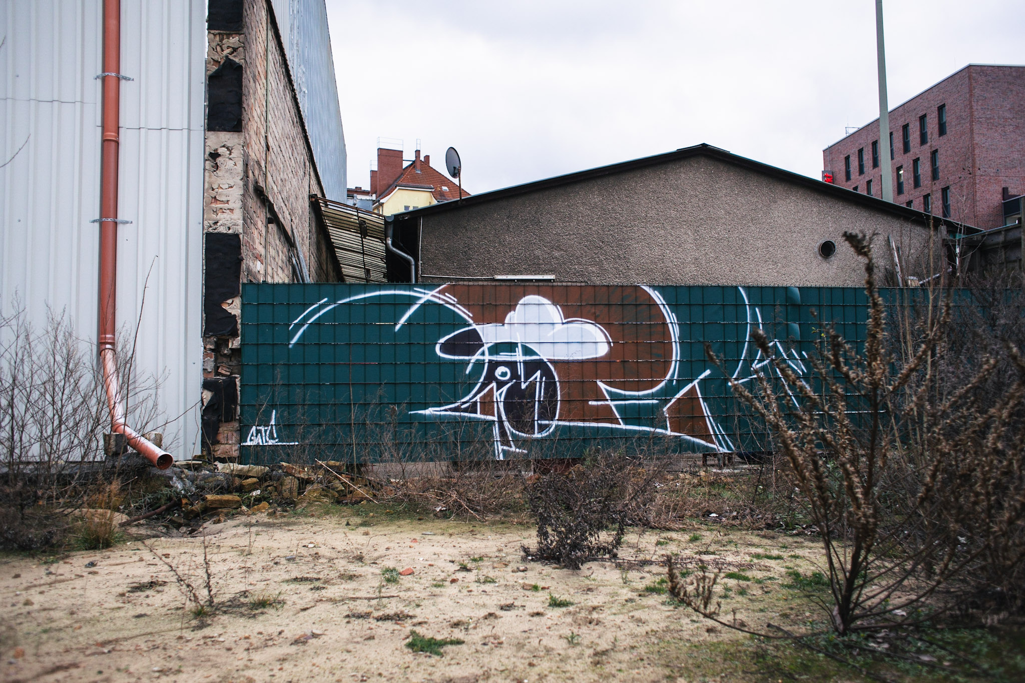
The Graffiti Writer GATE is one of the Berlin style writers, who has been developing new styles and formal languages with different names and in different creative phases since the 90s. GATE is always looking for formal renewal. His various stylistic phases usually last four to five years, with transitional phases to find a new visual language.
For some years now, one can observe in his styles and wall paintings the abstraction and dissolution of the lines of the letters, but for him this is and remains the 1st step, the basis for a composition, the corset of a painting.
GATE always starts on a wall with a previously created sketch and then improvises, out of feeling, to free himself from fixed ideas in the painting process. By drawing the basic lines with a spray can or with white chalk – which allows delicate, filigree and only indicated lines – he roughly defines the shapes and size of the composition. After applying the basic structure, the artist then breaks with the initial design, usually during the painting process, and the work begins a new life of its own with the paint, in the moment and directly on the wall in an architectural setting. GATE likes to work with self-imposed restrictions in order to challenge himself with few elements and to concentrate on the essential. Whether with simple geometric shapes and a reduced color palette, with few resources he tries to create a balanced composition but still with tensions – the essence of a good piece. The breaking of something that is already there (here the preferred framework of letters) and thus to improvise playfully on the wall, such as continuing the course of lines and abstracting torn forms spontaneously, is the creative process that GATE ultimately stimulates and drives on most.
Gate, Athen, 2015 ©Gate 
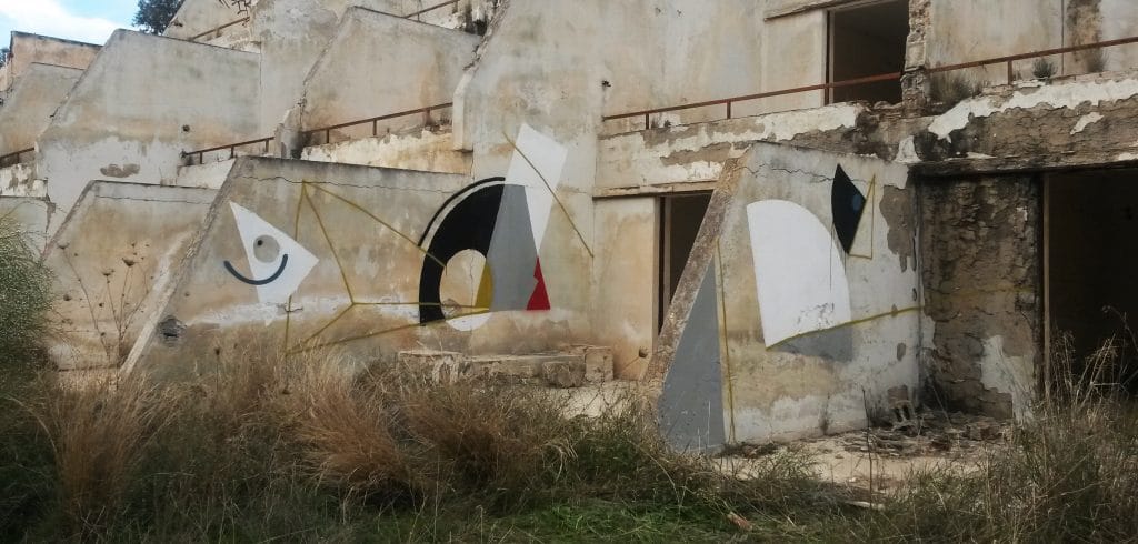
Gate, Athen, 2013 ©Gate

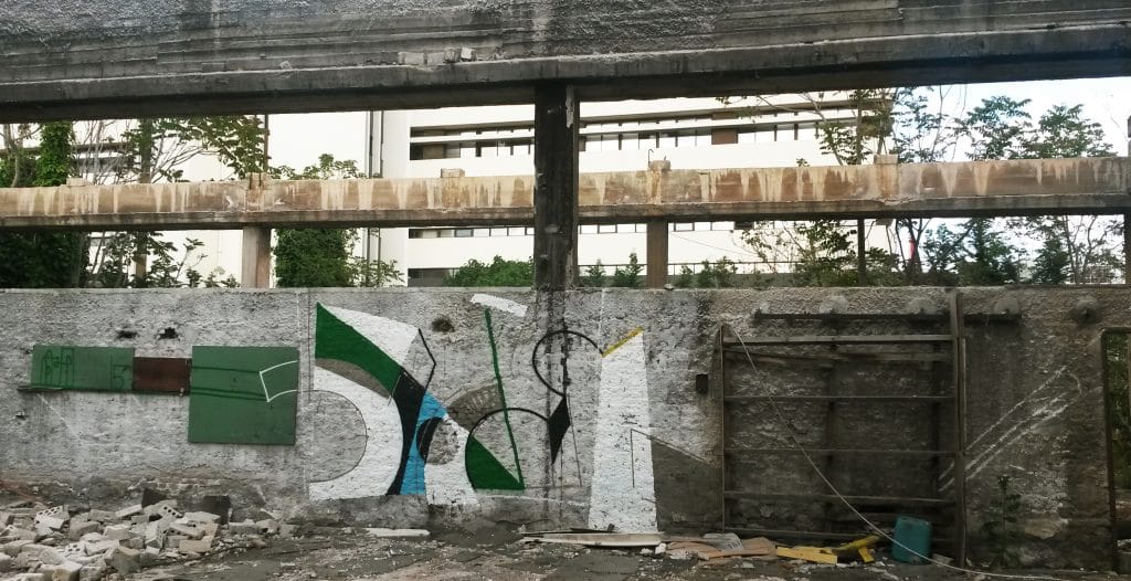
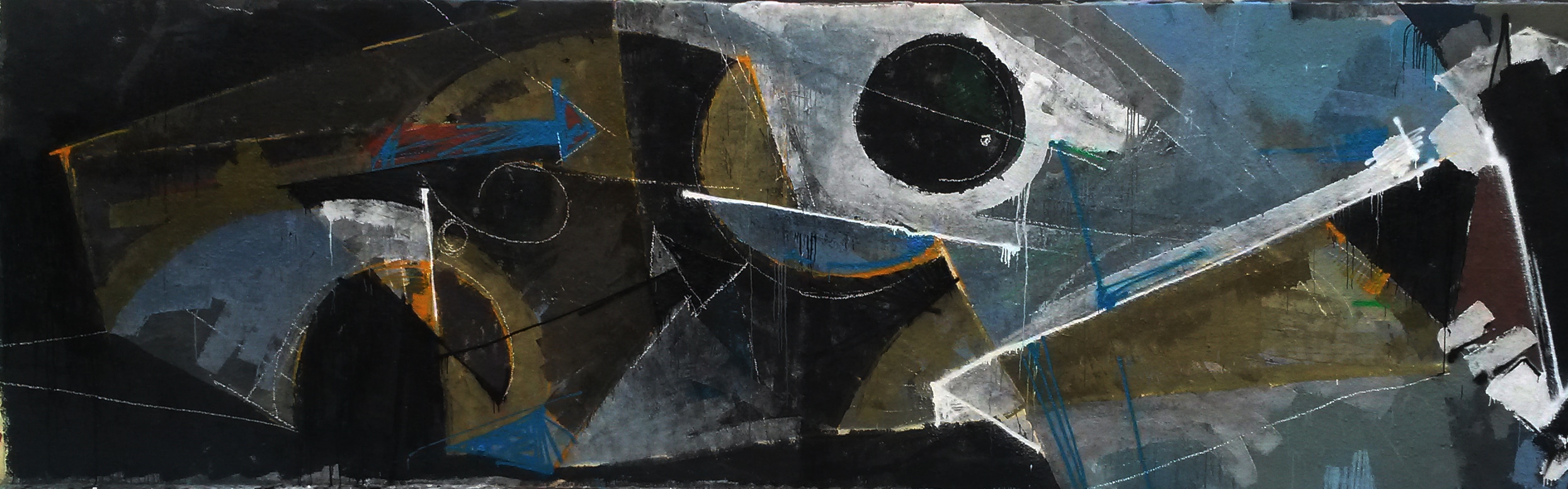
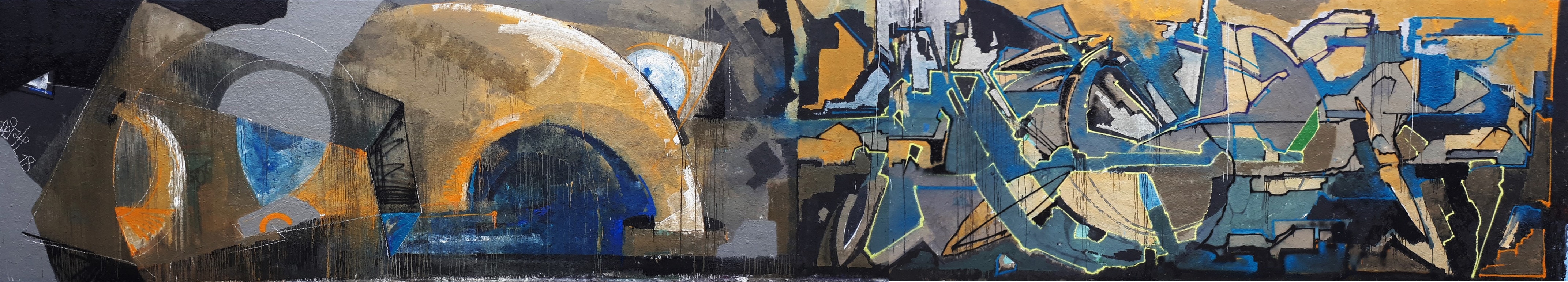
In his remarkable painterly wall works, simple forms usually dominate, often round, as the initial letter, the letter G, does preset. The artist combines open semicircles, weighted lines and smaller circles with angular forms such as distorted triangles, points and arrows. His combinations shape balanced contrasts of forms, which are nevertheless under tension. The filled circle, the dot, which is usually set in the letter E or in a triangular shape or pointed edge, evokes in some works a stylized bird’s head, which is a hint at a former character he developed that appeared earlier in earlier pieces in the letter E.
Gate, Athen, 2015 ©Gate 
Gate, 2014 ©Emmett Edelstein

Picturesque compositions
GATE’s compositions of the last 15 years, with simple naive geometric colored forms and the special choice of colouring, partly remind of modern painting of the 20th century: e.g. Kandinsky in more abstract works with open forms, which dissolve into color surfaces with single drawn floating lines. Or also to works by Paul Klee or Miró, who create simple, clear geometric forms, lines and contrasting shapes, in which the colors of the composition harmonize and/or create contrasts and tension.
GATE appreciates abstract painting. He tries to influence his pieces in this direction, but is only enthusiastic about abstraction to a certain extent, because in a way he lacks motifs in pure abstraction. And even if abstract paintings often seem more emotional to him than figurative works, those emotions also evaporate very quickly in his eyes.
In GATE’s painting it is not about creating a perfect balance in the composition, but on the contrary to build up a tension in the picture. And according to him, it should also hurt. The overall impression, the tension and dynamics in his pieces/pictures, also result from discret areas in the picture itself, from gaps in which colors and forms “contract”. Generating energy is one of the great challenges of each piece or painted image.

Gate, Athen, 2017 ©Gate 
Gate, 2018 ©Gate
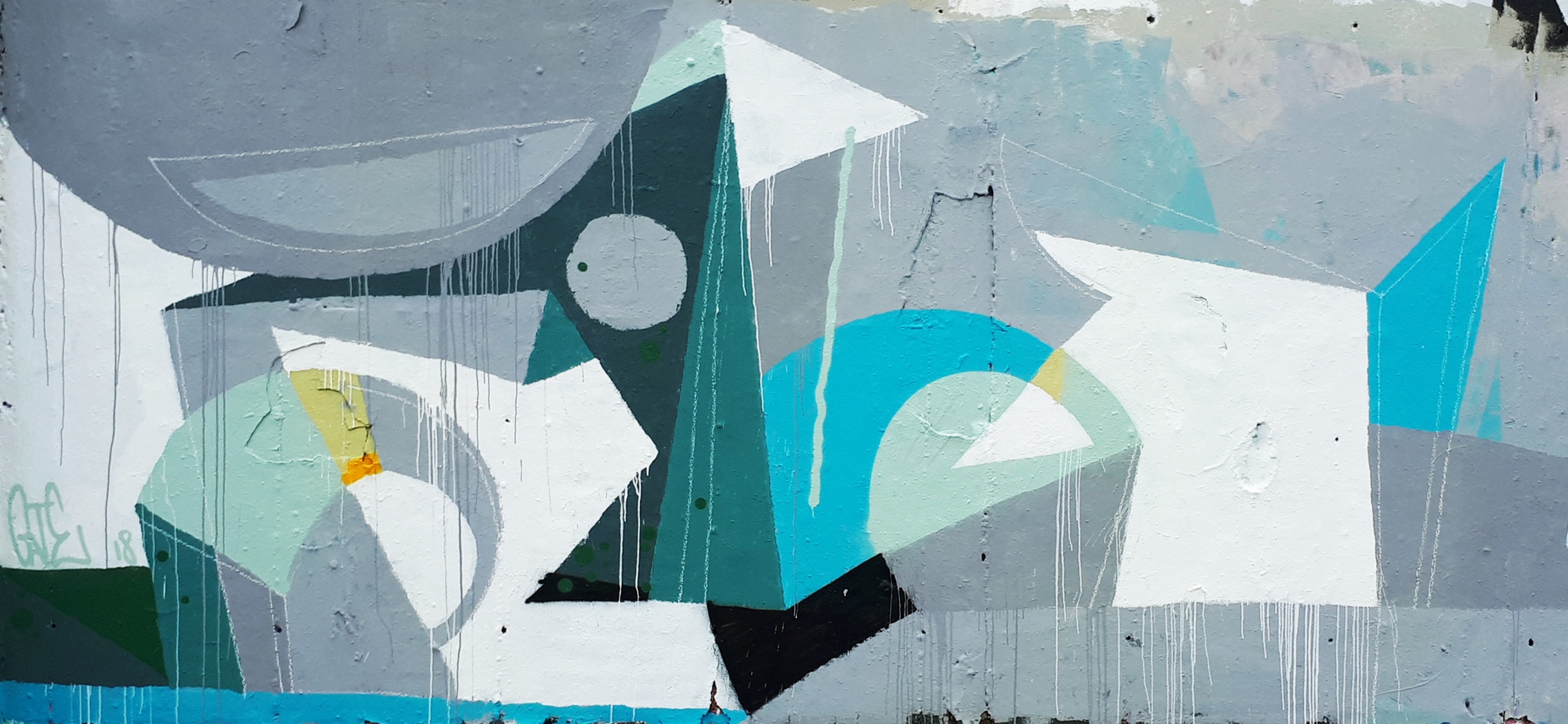

Gate, 2018 ©Gate 
Gate, Athen, 2016 ©Gate
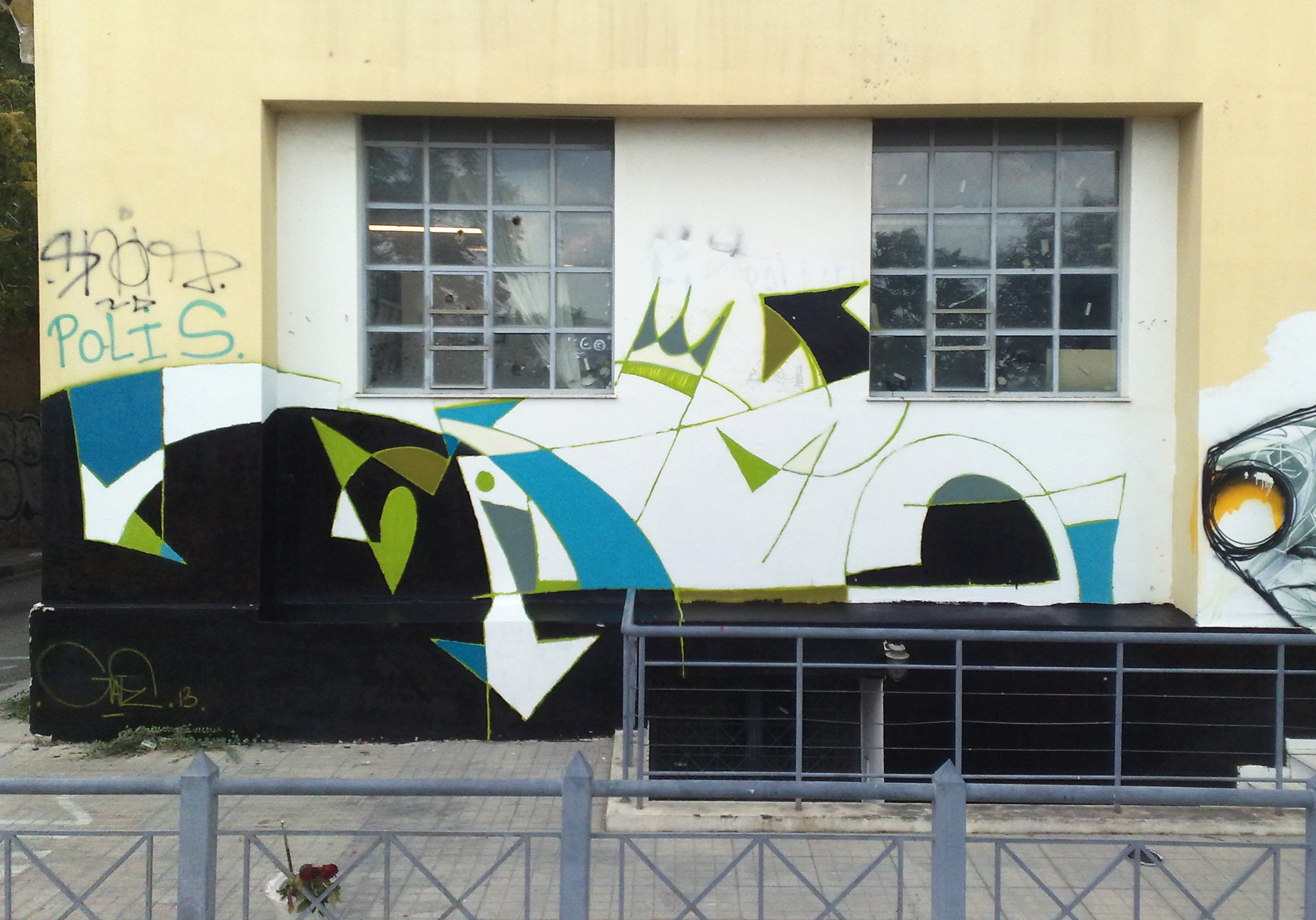
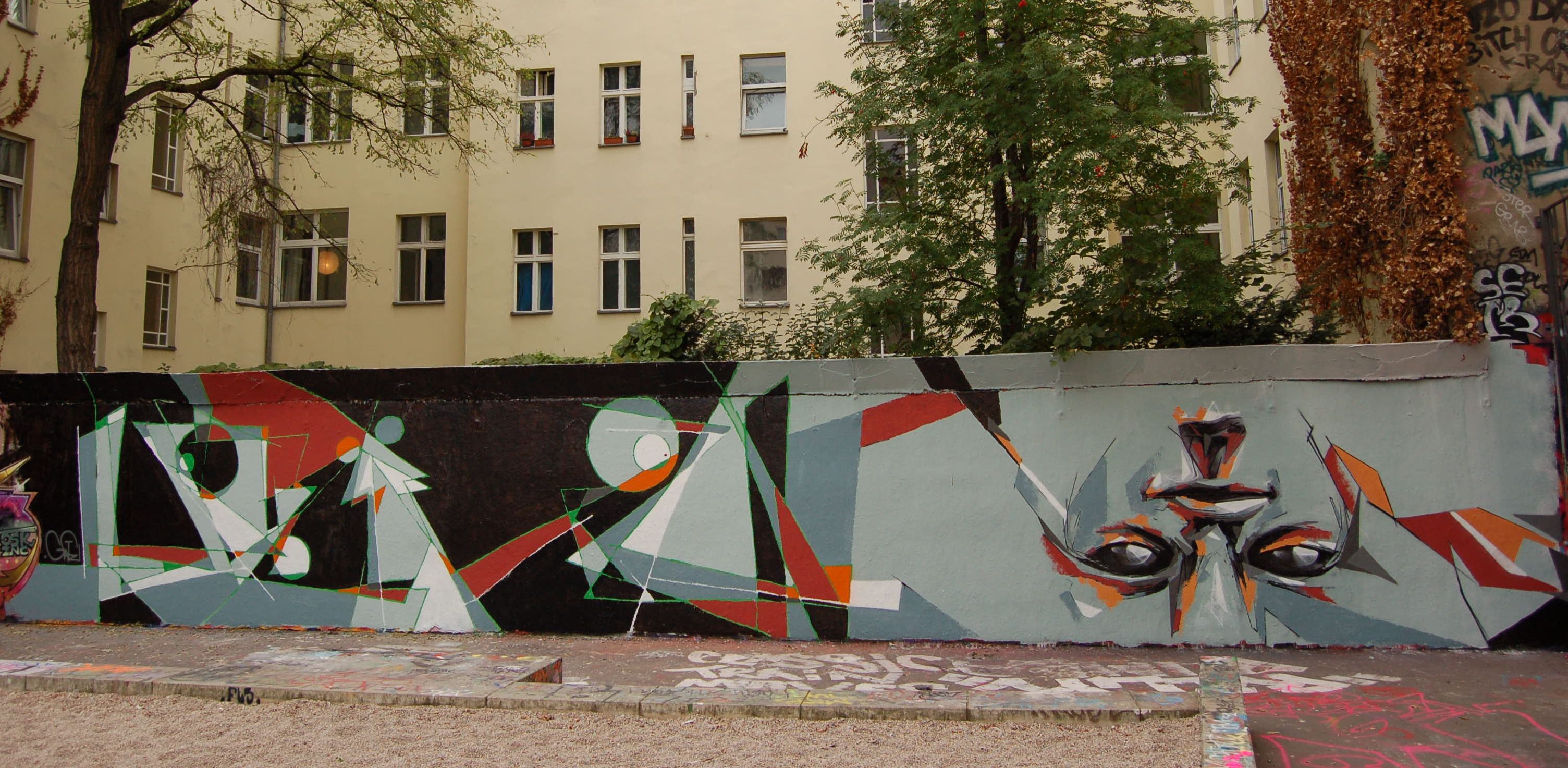
Resolution of clearly defined forms
Since 2015 GATE has taken important new stylistic steps with the writer SENOR in Athens. Thanks to the lively intellectual and conceptual exchange with him, he discovered new approaches. Since then, GATE has also been using more often a paint roller for large murals and commonly paints the letters without any outlines. Actually it is more about the painterly approach, no longer about the style and background, but about creating a single surface/plane. This consists of different color areas, so that background and fill-in merge into one composition on one layer. The letter forms are no longer closed, but rather hinted and open, color areas are no longer defined by lines, but by the pure application of paint with some transitions or overlaps of the different color areas in the picture.

Gate, Athen, 2018 ©Gate
Lately he has been painting the name BERD more often, because it contains more round letter forms: the B, the R and the D, which allow him to use several circle forms in different variations and open up new formal possibilities. Fine lines suggest shapes, some lines have arrows, shapes and areas are not completely filled with color, the unpainted areas of the background are part of the composition. These recently created wall works appear like a hint of a minimalist piece, sketchy, incomplete, a play with visible forms and the fields in between, the background, the wall as raw material, the field that becomes visible as a shape on the same plane.

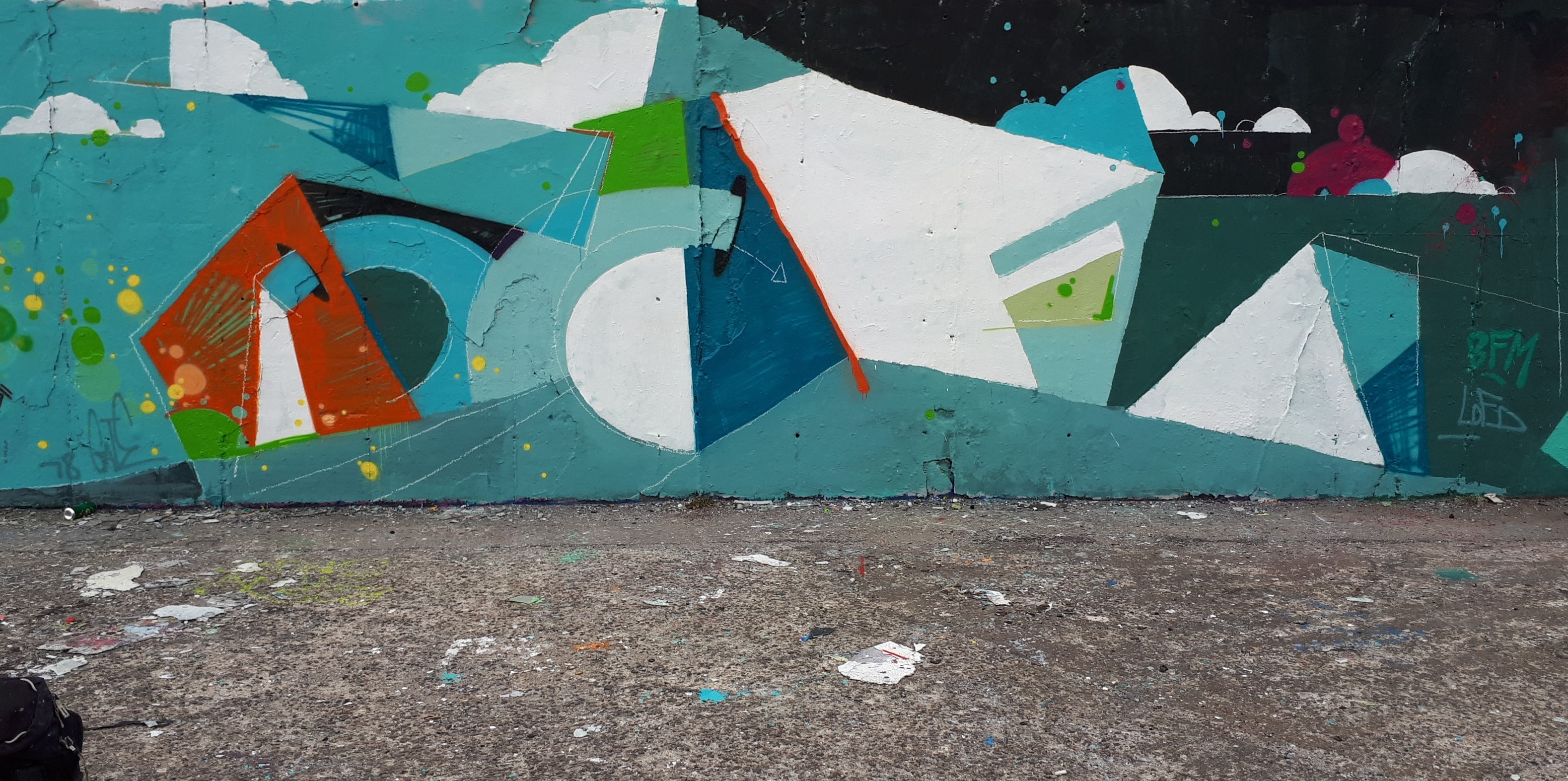
Berd, Mauerpark Berlin, 2020 ©Gate 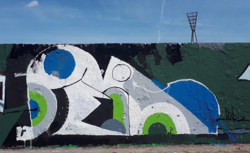
Berd, Mauerpark Berlin, 2020 ©Gate

A widespread tendency in style writing is the dissolution of the letter forms, the detachment from the typographic work, from the given form into a freer painterly process. It is one of the characteristics of post graffiti painting, in which style writing has also been transformed into non-figurative painting by certain graffiti writers. The letters are only minimally hinted at by coarse or stylized forms, alienated or disappearing completely to become unreadable forms. The motif, the name, is almost or completely abandoned. GATE follows a similar approach, is experimental and painterly, and remains true to its chosen letters – even if very stylized – so far.
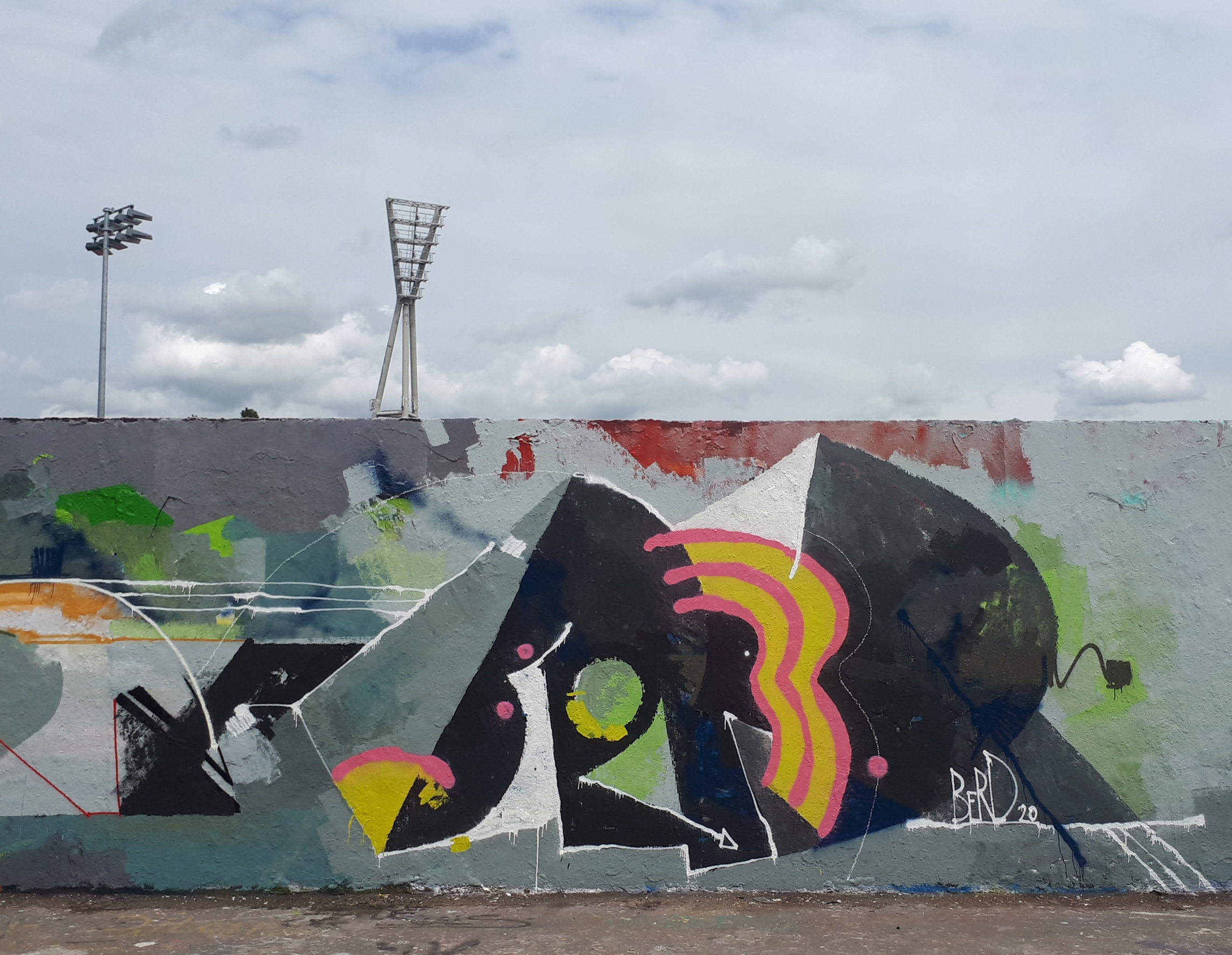
Berd, Berlin, 2020 ©Gate 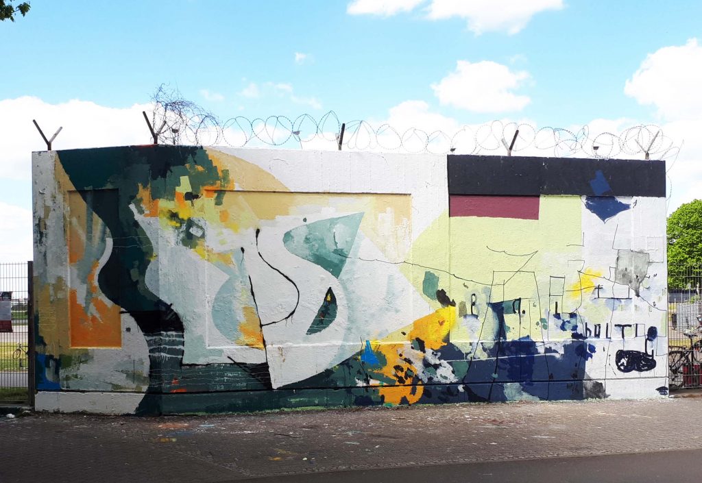
Berd, Sascha, Berlin, 2020 ©Gate
Colors like in the twilight
GATE’s color palette plays a major role in his compositions, in addition to line management. He uses mainly and for a long time emulsion paint, which he applies with a paint roller. These are not clear colors, but rather softened tones. The intentionally limited colors are blue, red, green, yellow black and white. GATE mixes his colors himself to obtain muted, often greyish tones, which, as he says, are colors that appear muted and matte as at dusk. Paint residues are reused, and he usually uses the spray can at the end to apply the last color points with specific shades. These are mostly clear and bright colors. Its grey muted colors create a calm, pleasant atmosphere, the brighter, more garish tones or white stand out brilliantly. Rich color accents, black and white contrasts versus softened colors, angular shapes as a contrast to the soft rounded forms create a field of tension that challenges the eye of the beholder and yet gently entertains him.
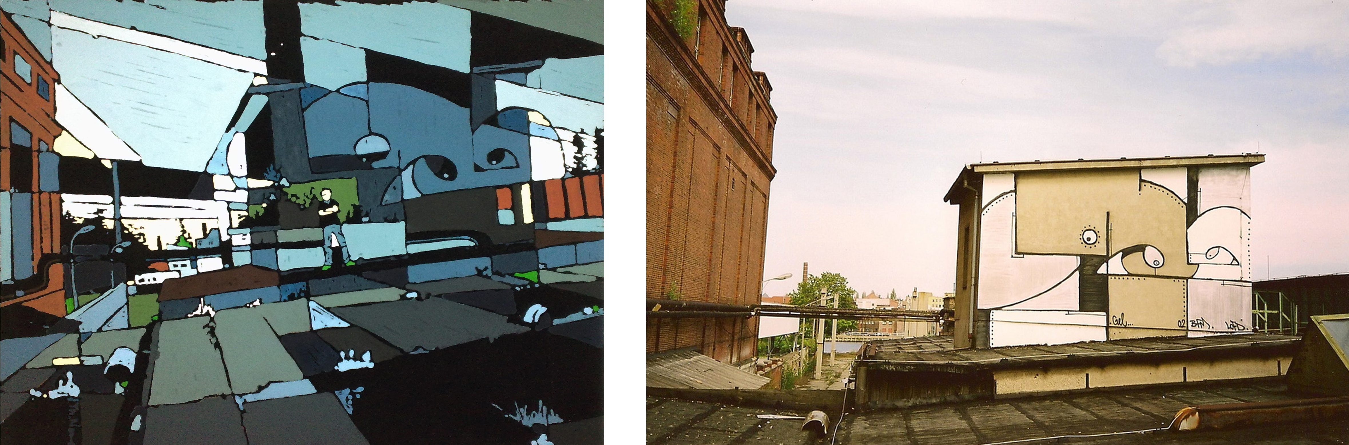
Studio works „Cityscapes“
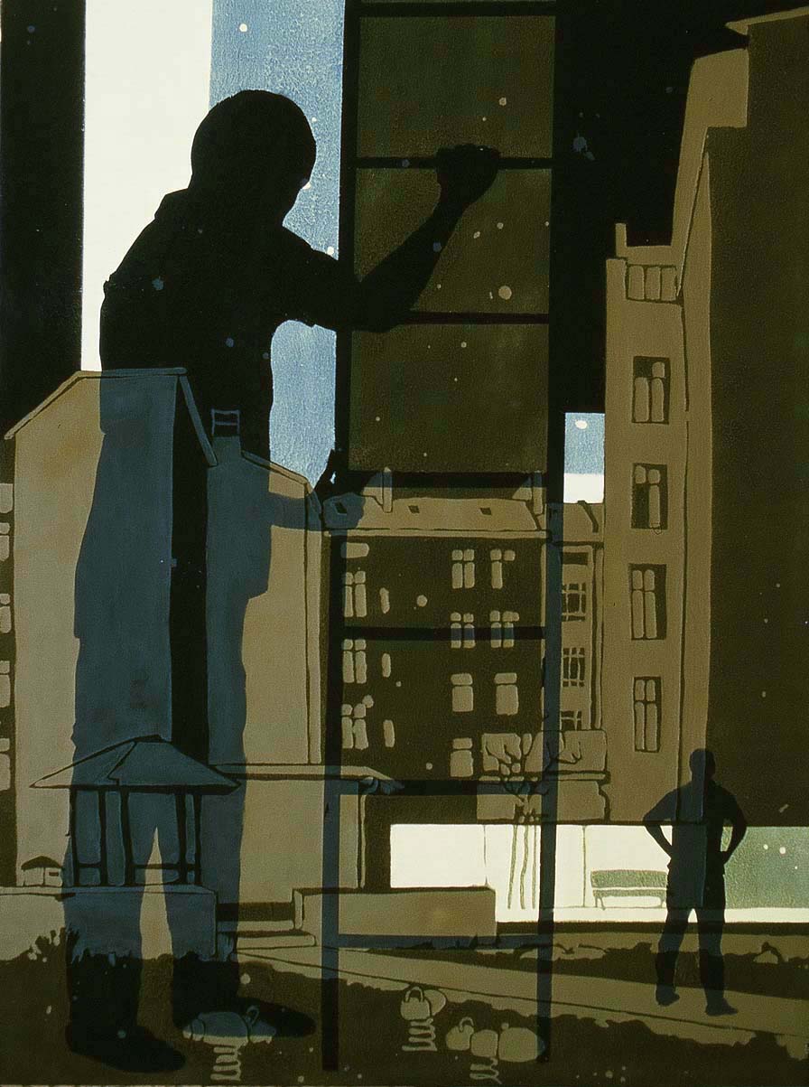
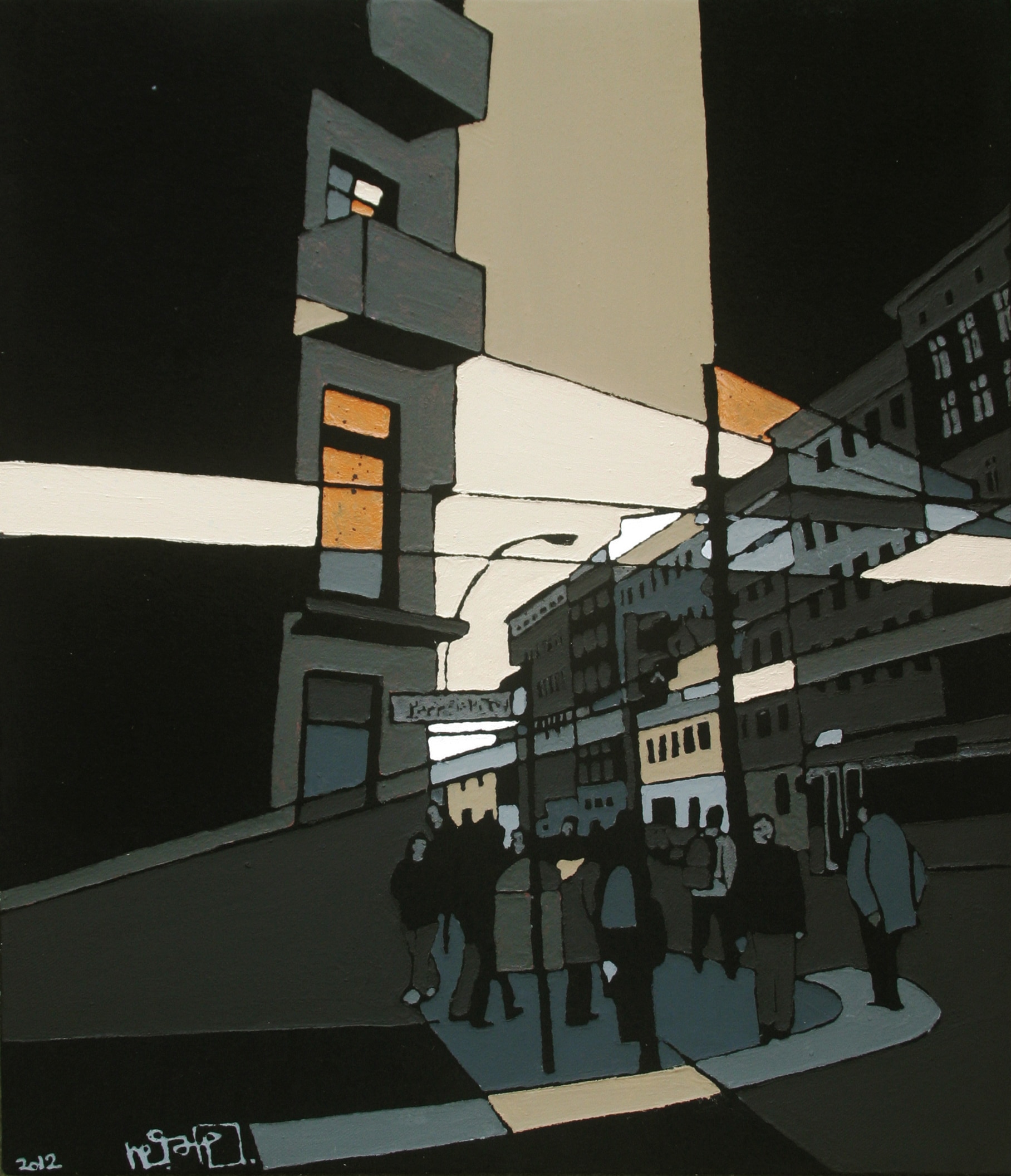
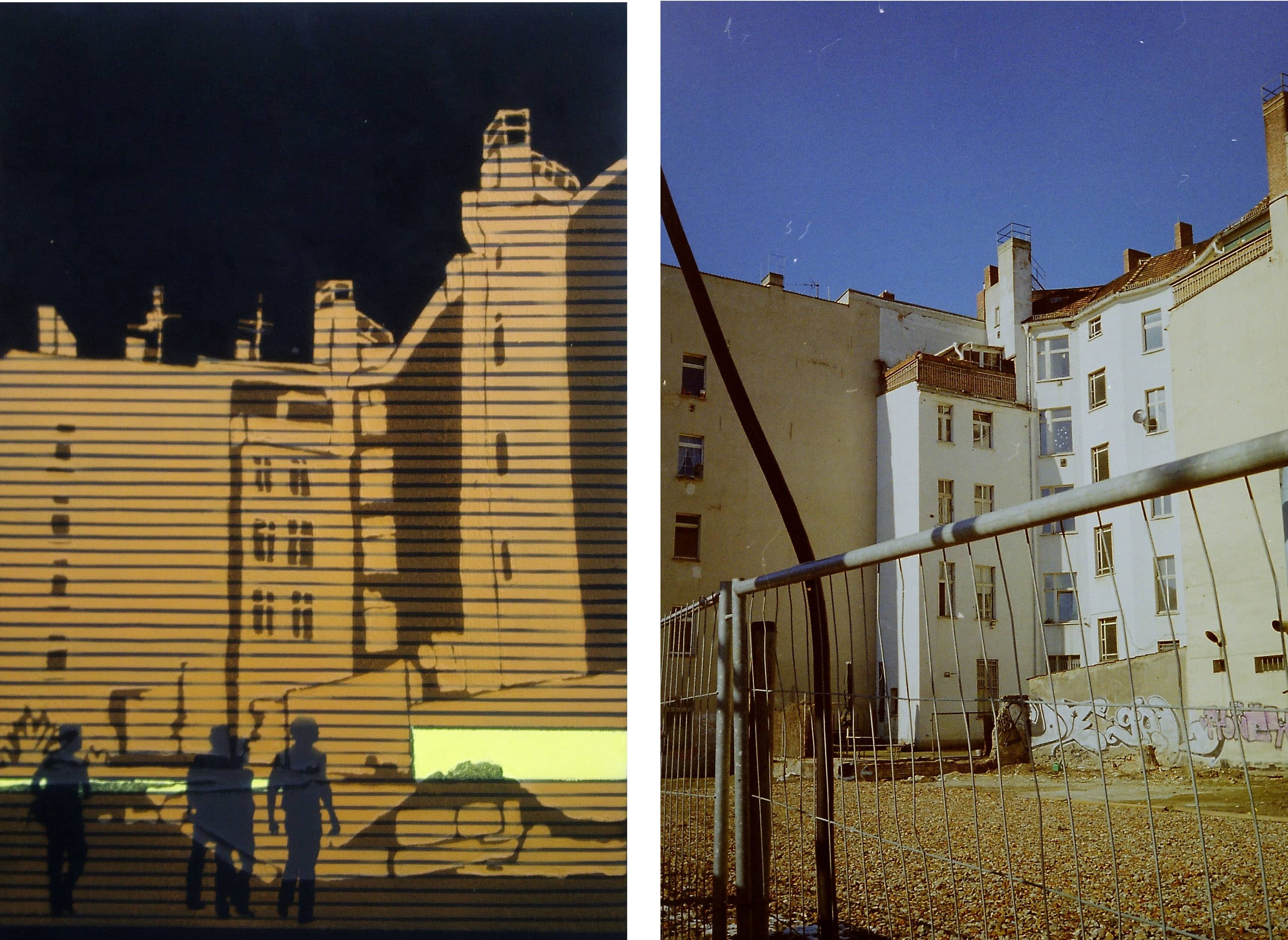
GATE’s interest in architecture and urban constructions is hardly evident in his pieces, but they are the source of inspiration for his studio works on canvas, paper or molleton fabric. This series was created between 2005 and 2012 and is called “Cityscapes”. The focus here is on constructing with lines and surfaces in order to depict certain places in Berlin, where he once painted pieces or rooftops on the walls, as he did in the early 2000s with his first pseudonym GEL. Usually in four or five color tones, with black areas of the processed black molleton fabric, he plays here with lines, surfaces and strong contrasts. One recognizes street corners or roof views, which he reduces to two dimensions as constructed surfaces and yet sets them in perspective.
The reference to the place always plays an important role here, because these are places on architectures that he had appropriated and also photographed as a writer at the time. Many were created in Prenzlauer Berg. GATE’s cityscapes are not deserted, but mostly one or two human shapes are in the picture, in the front or the back, and often the artist represents himself on those canvas in a stylized way.

GATE, Schöneweide, Molton Stoff, Acryl Farbe und Sprühdose, 90 x 70 cm, 2008-2012 und Fotografie Rooftop by GEL ©Gate 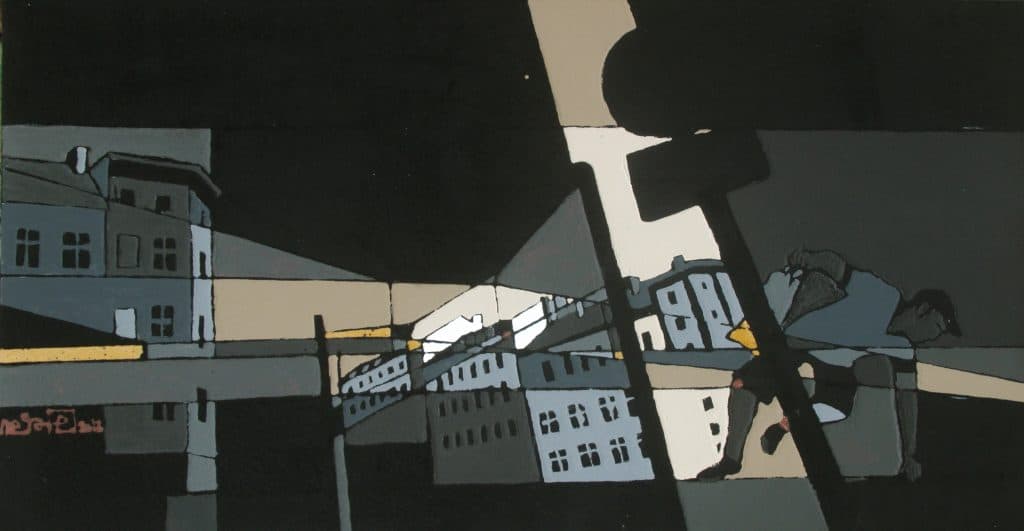
GATE, Stadtstudie 1, Molton Stoff, Acryl Farbe und Sprühdose, 120 x 65 cm, zwischen 2008 und 2012 ©Gate


GATE, Stadtstudie 2,Molton Stoff, Acryl Farbe und Sprühdose, 80 x 130 cm, 2008-2012 ©Gate 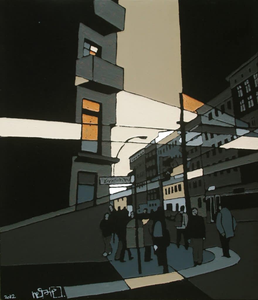
GATE, Danziger Straße, Molton Stoff, Acryl Farbe und Sprühdose, 2008-2012 ©Gate 
GATE, Hackescher Markt, Molton, Acryl, Sprühdose, 55 x 80 cm, 2005 ©Gate
Initial ignition and collaborations
Whether as GEL, GATE, or BERD, what stands out about these names are the round initial letters and the E, which is present in all three names. Born 1974 in East Berlin, GATE’s interest in style writing began when he saw the film “Beat Street” and after the opening of the wall, in the winter of 1989, he drove to West Berlin and saw painted trains on the line U1. This was the initial spark of a passion that has lasted until today. Later he regularly bought the graffiti magazine On the Run and began to frequent the hip hop scene in Berlin-Hellersdorf in the “Lubminer Club”. This place was at that time one of the few in the district in East Berlin without Neo-Nazis. Punks, skaters, and Hip Hop-ers met there. From this mixed scene a group developed, which was more interested in Hip Hop, and from which the crew LofD emerged, GATE and also ETIK joined the crew. Later GATE was engaged for years on the Isle of Youth in Berlin -Treptow for the “Swat Posse”, from 1993 to 1999, where he co-organized and supervised countless concerts.
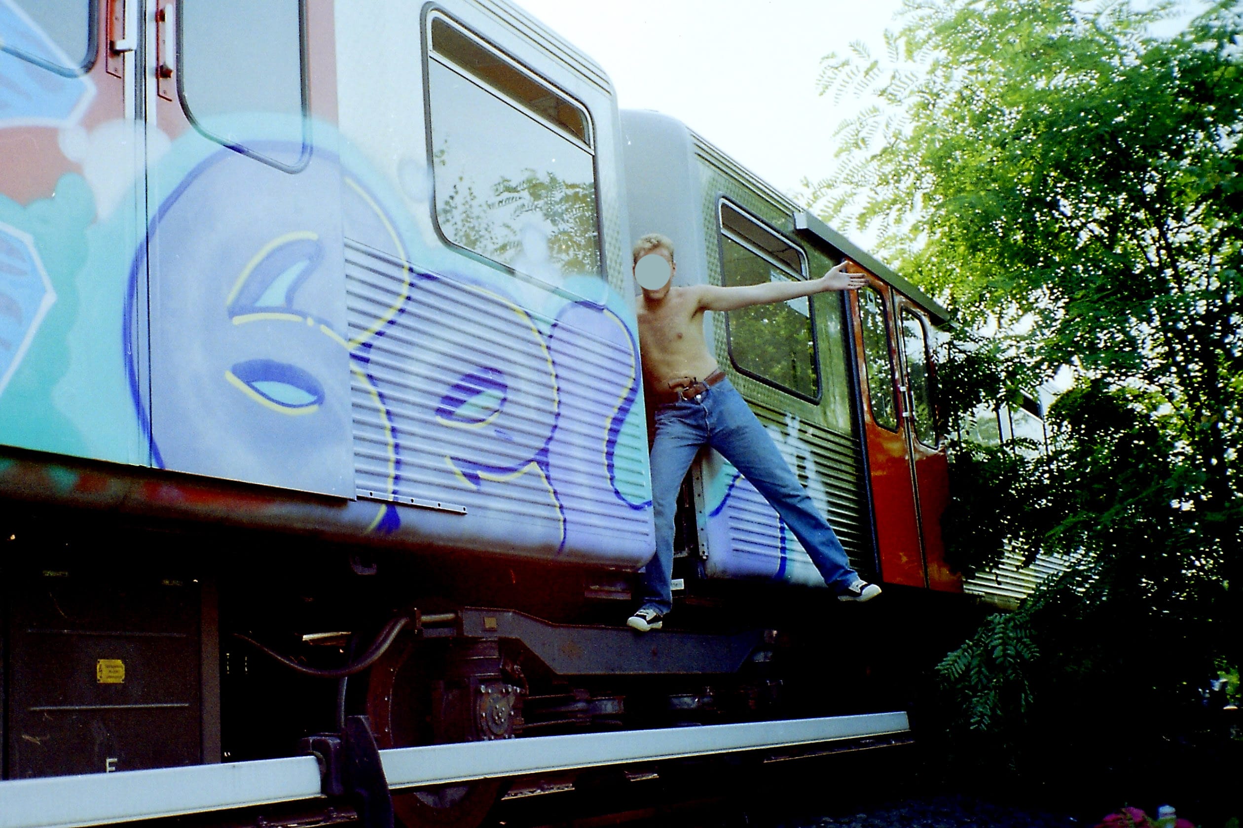
The first name GEL was created in 1992/93, when he painted an “end to end” train with his writer friend ETIK in Hamburg and quickly had to think up a short name. With the crew Lords of Doom (LofD) they painted some pieces like Rooftops until 1995/96. Later he came up with another name, whose length and sound he found catchy: GATE. With the next crew BFM (Back for More) he realized many new works.

Gel, Hamburg, 1993 ©Gate 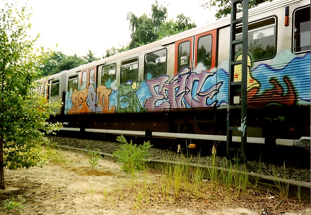
Sero, Etic, Hamburg, 1993 ©Gate 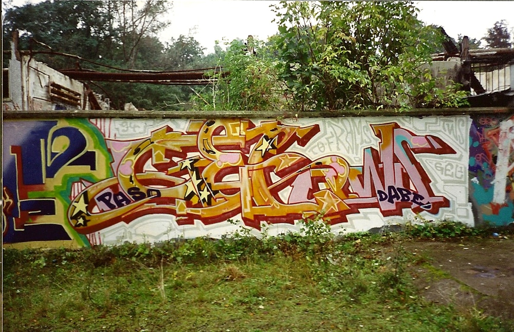
Gel, 1994 ©Gate 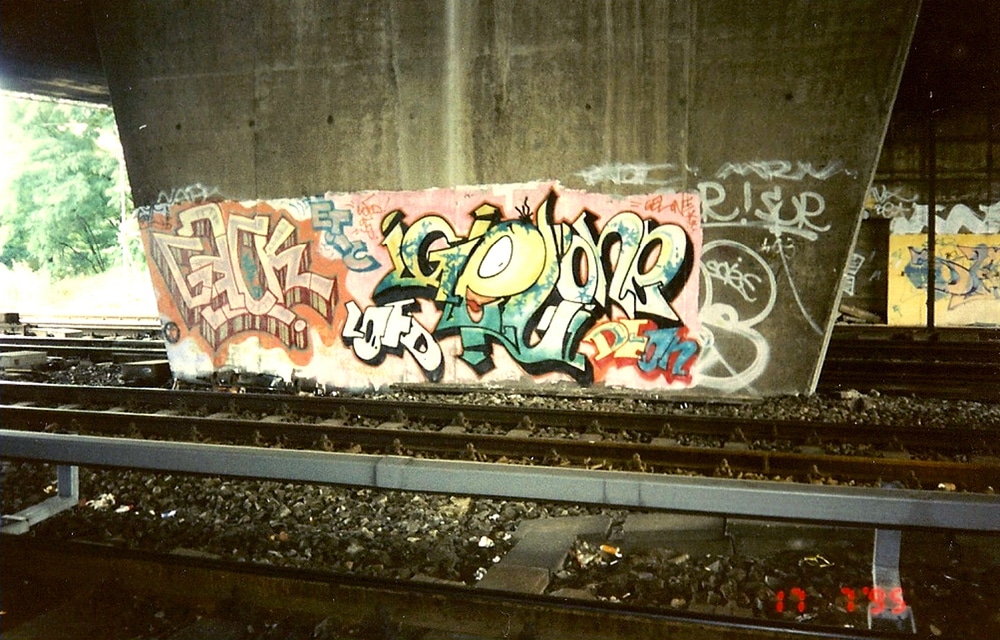
Hok, Gel, 1995 ©Gate 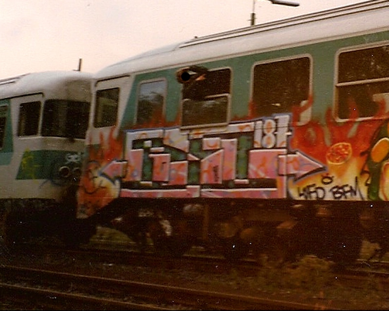
Gel, 1997 ©Gate 
Gel, 1998 ©Gate 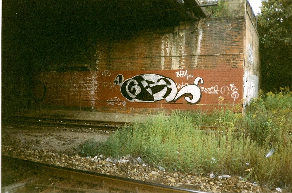
Gel, 1998 ©Gate 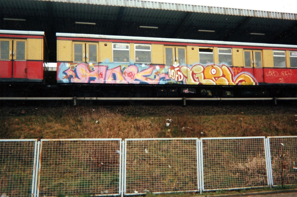
Hok, Gel, 1998 ©Gate 
Gel, 1998 ©Gate
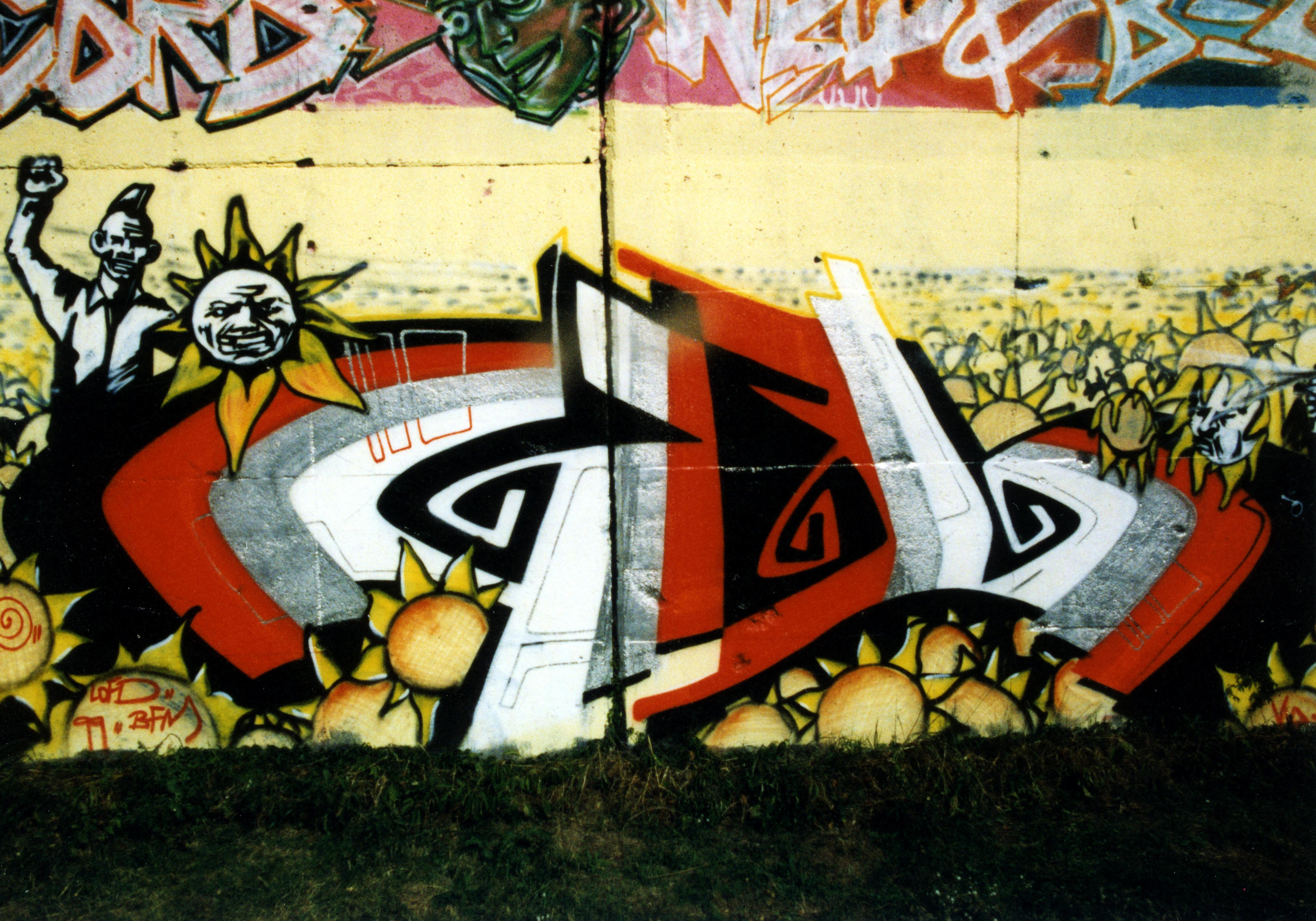
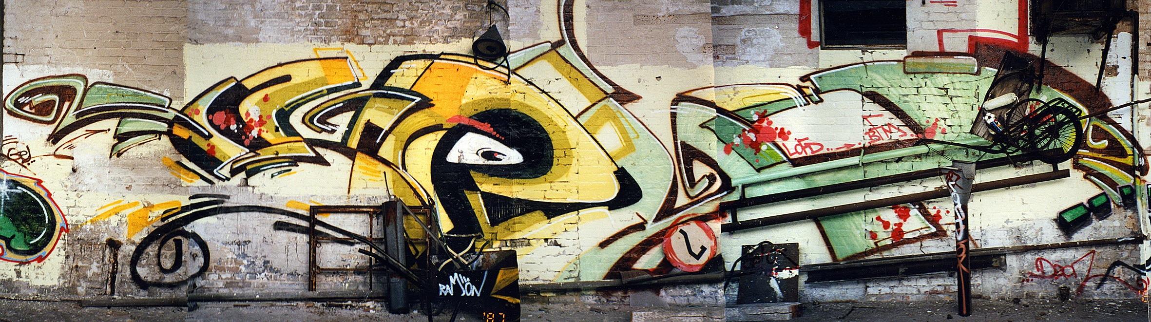
It was mainly through the artist IDEE that GATE got new impulses, and they developed new styles as a team. They painted a lot together with roller and paint from circa 1996/97 until 2004. With IDEE he made a very big artistic development, because they developed not only new styles together but also concept works to think graffiti differently. For them the city was considered an open gallery, or as „open studios” and they left many interesting works in public space with new techniques and materials like also works on paper. The concept walls with IDEE, which they often produced at construction sites, mostly dealt with new types of lettering, which were completely different from classic style writing. In the early 2000s in Berlin, the two artists stood out stylistically from common style writing. With innovative styles and placements, they were part of an avant-garde writer scene at that time in the city.
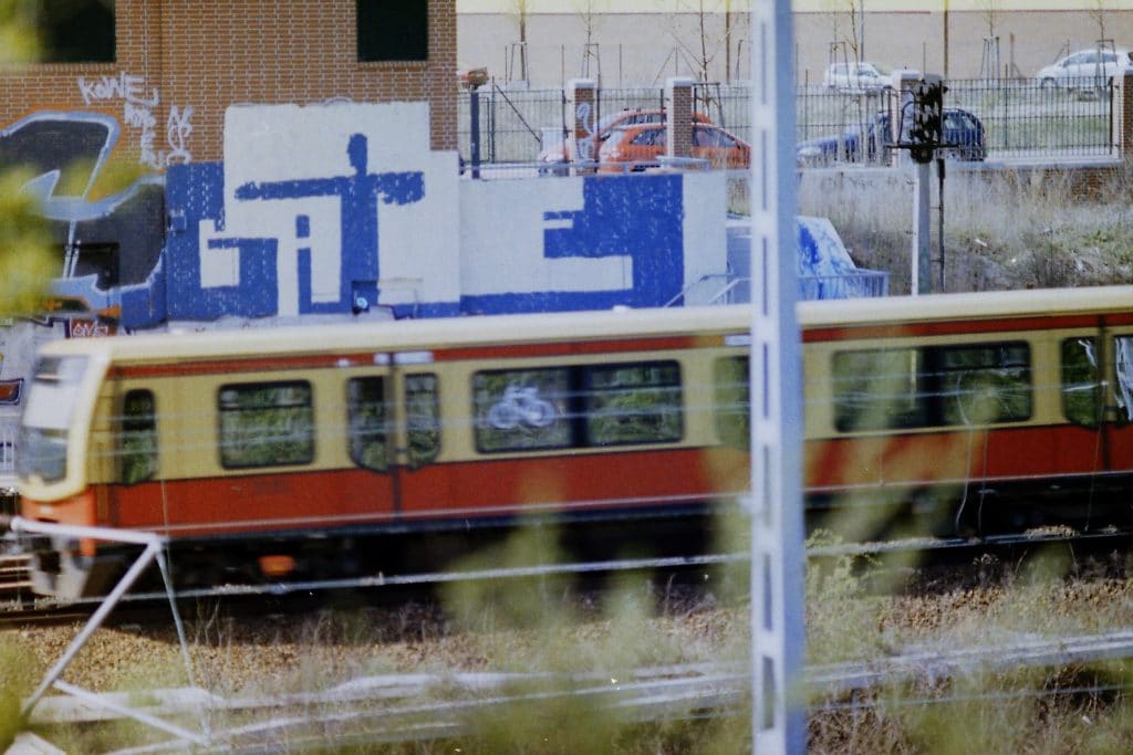
Gate, 2006 ©Gate 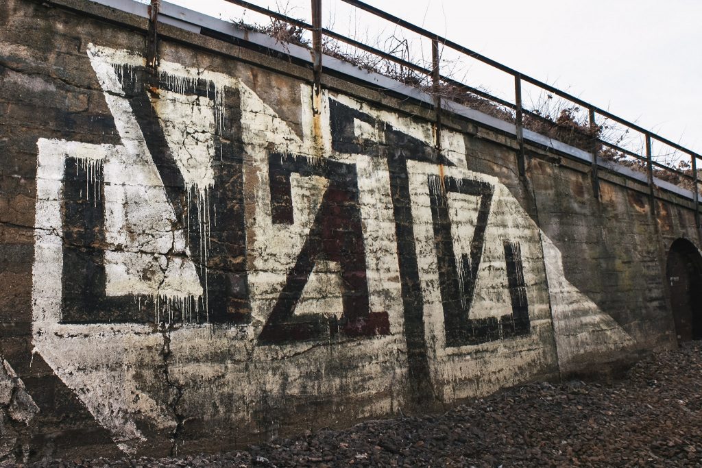
Gate, 2010 ©Emmett Edelstein 
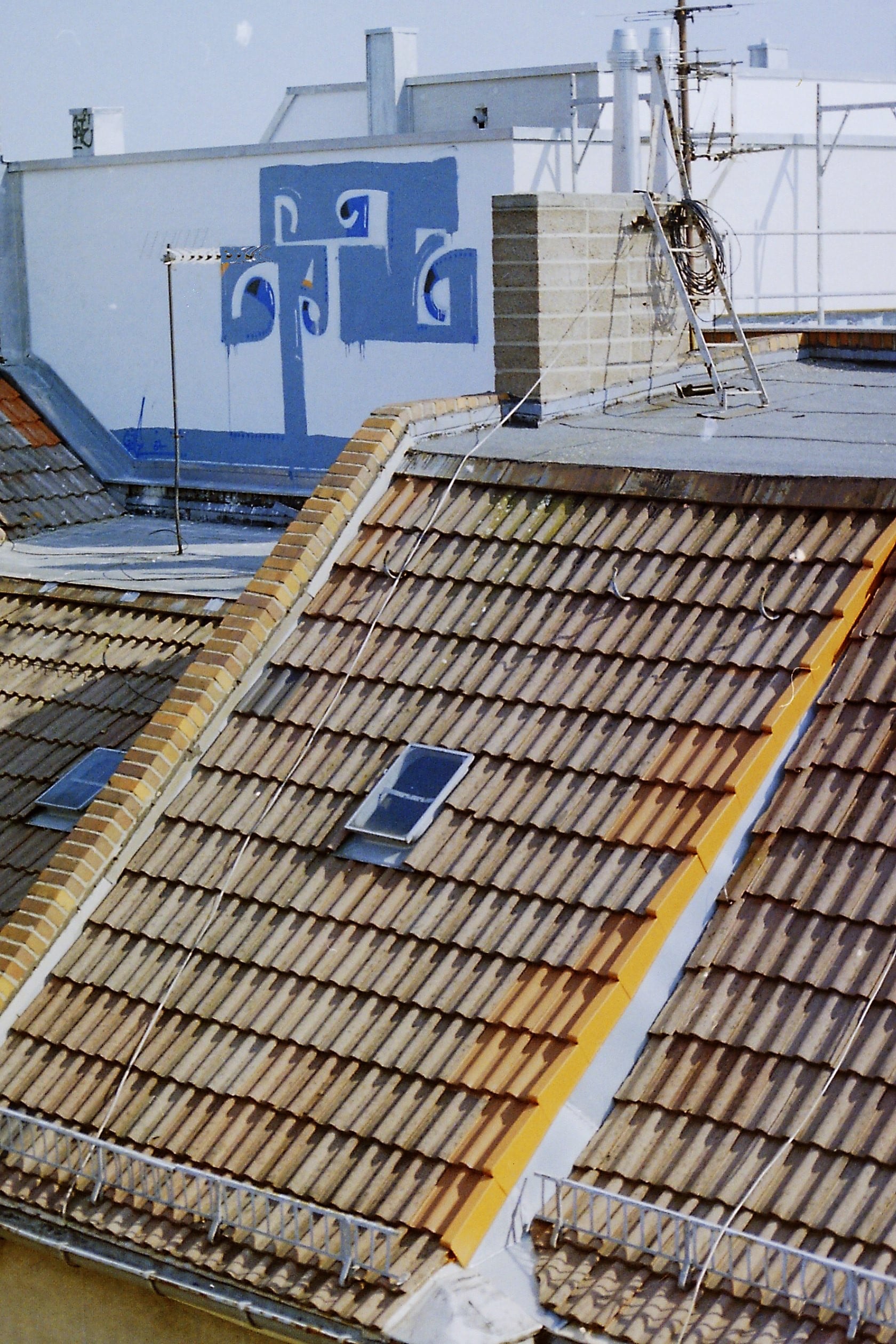
Gate, Roof, 2005 ©Gate 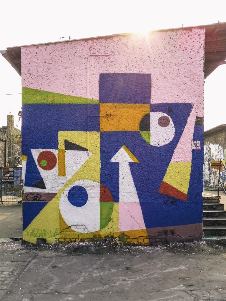
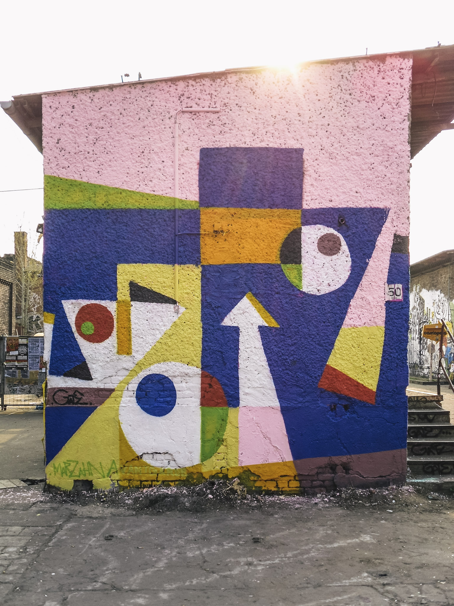
Gate, 2009 ©Emmett Edelstein 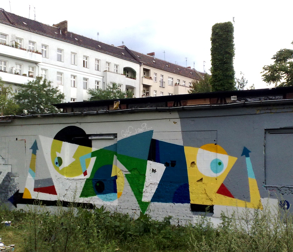
Gate, 2009 ©Gate 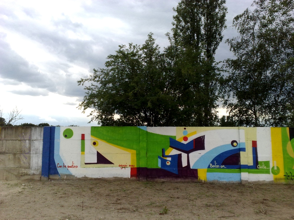
Gate, 2009 ©Gate


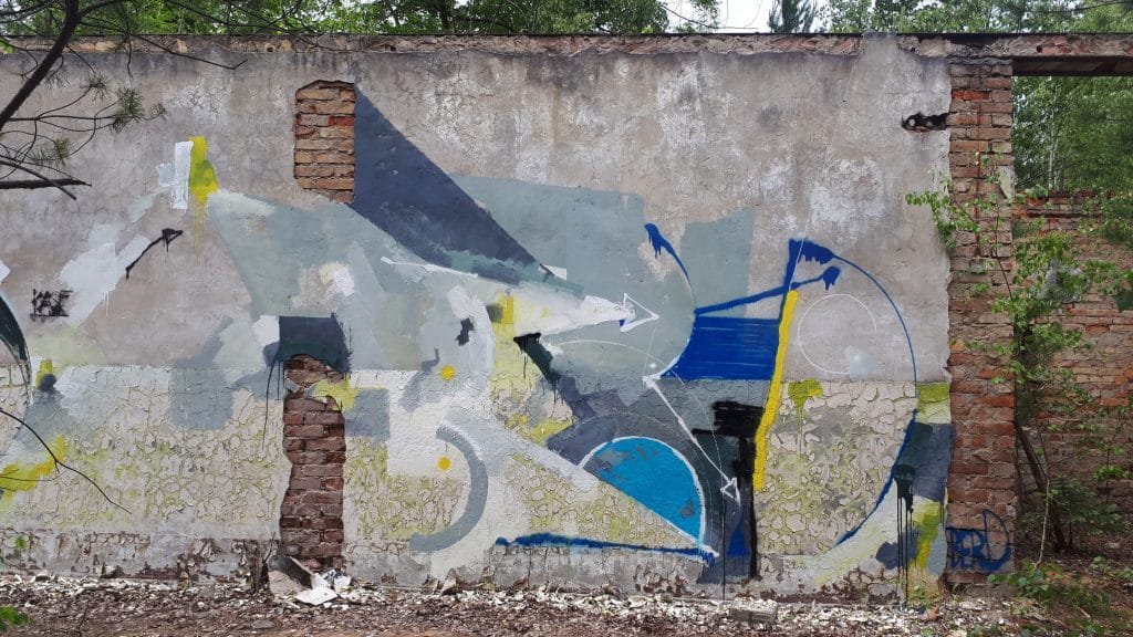
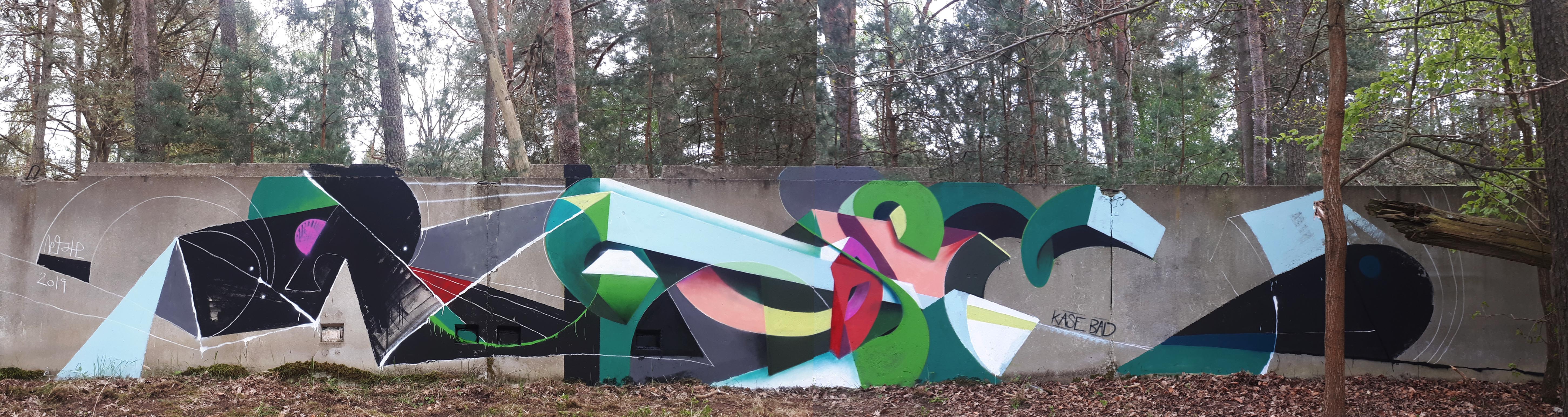
GATE remains one of those writers who want to rethink style writing differently and who continues to think and practice on a painterly level. In 25 years he painted with various writers and artists in several cities, since 2015 regularly in Athens with SENOR cresting concept walls and in Berlin often with KASE, as in Lost Places in the surrounding areas of the city. Over many years of writing, GATE has repeatedly experimented artistically and developed new visual languages around letters. Today he is still searching for new formal languages with a painterly handwriting, in order to express himself anew on walls time and again.

Berd, Kase, Berlin, 2019 ©Gate 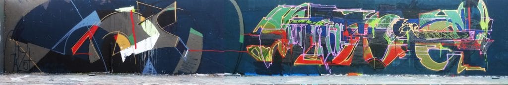
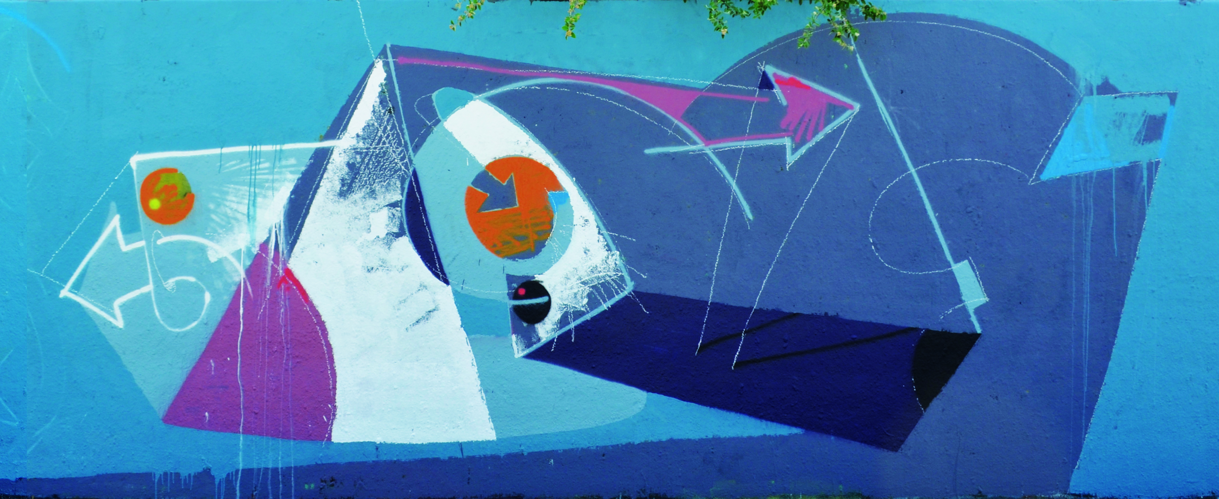
Gate, Senor, Athen, 2015 ©Gate 
Gate, Ino, 2006 ©Gate

Gate: instagram.com/187geight8
Fotos: Gate & Emmett Edelstein


Leave a Reply