

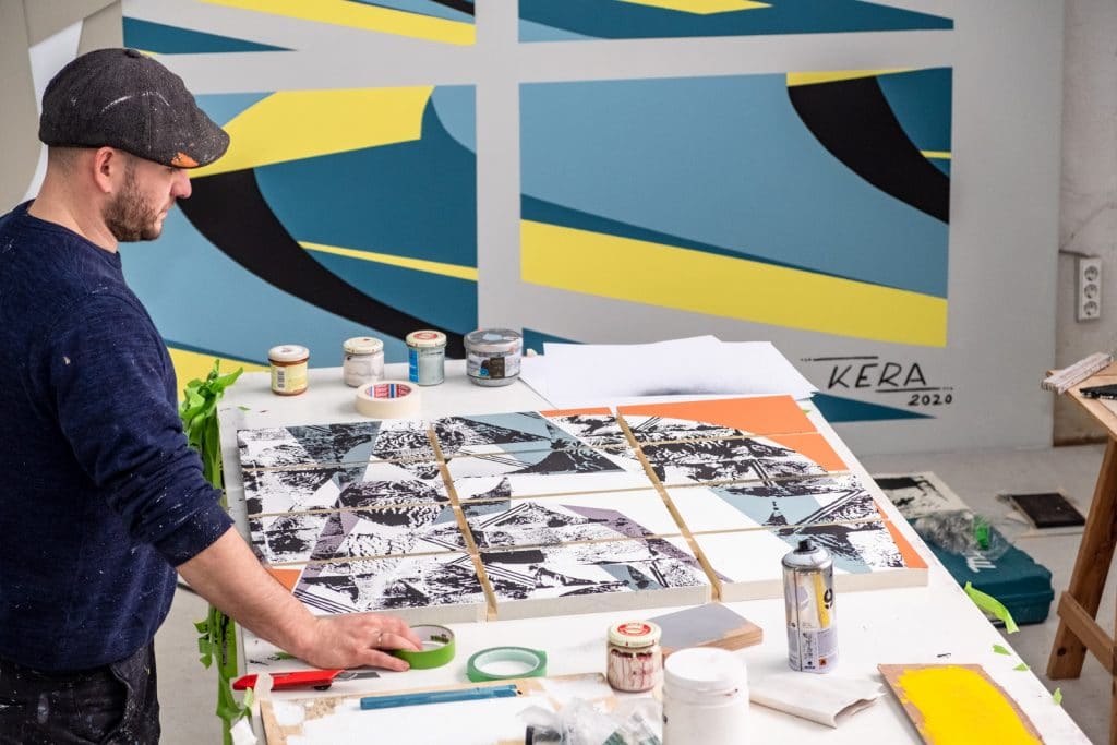
Studio Visit – Kera, Feb 2020

The basis: style writing and printing techniques
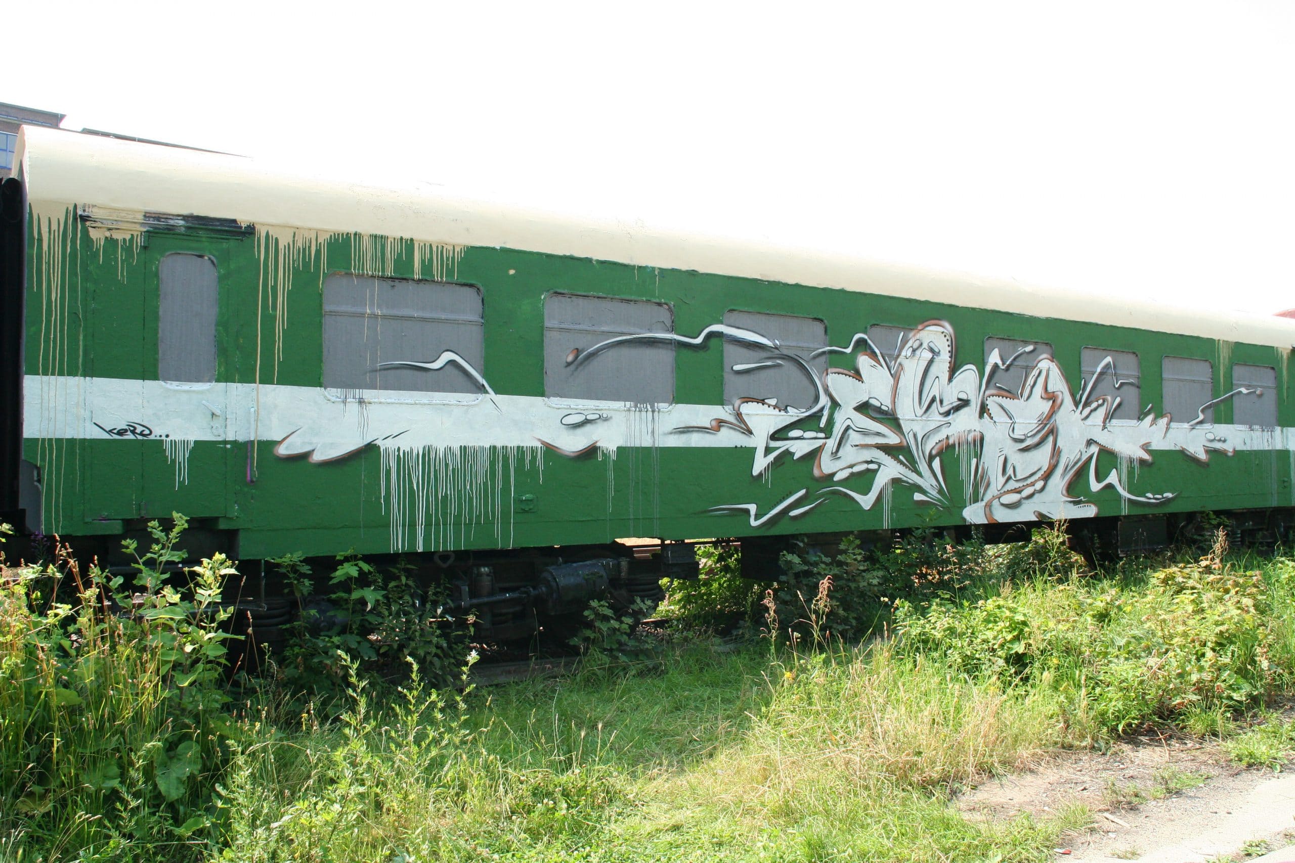
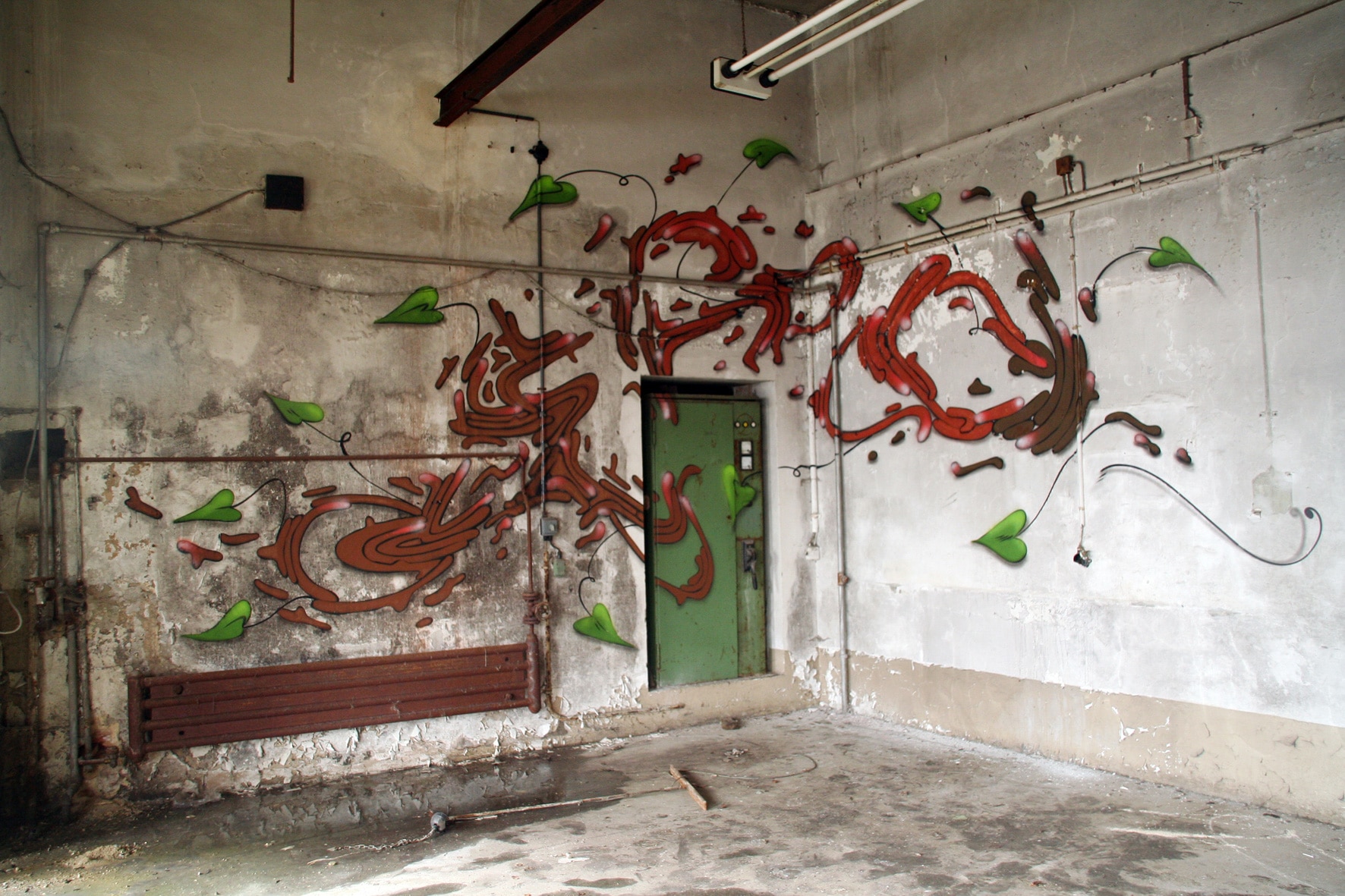
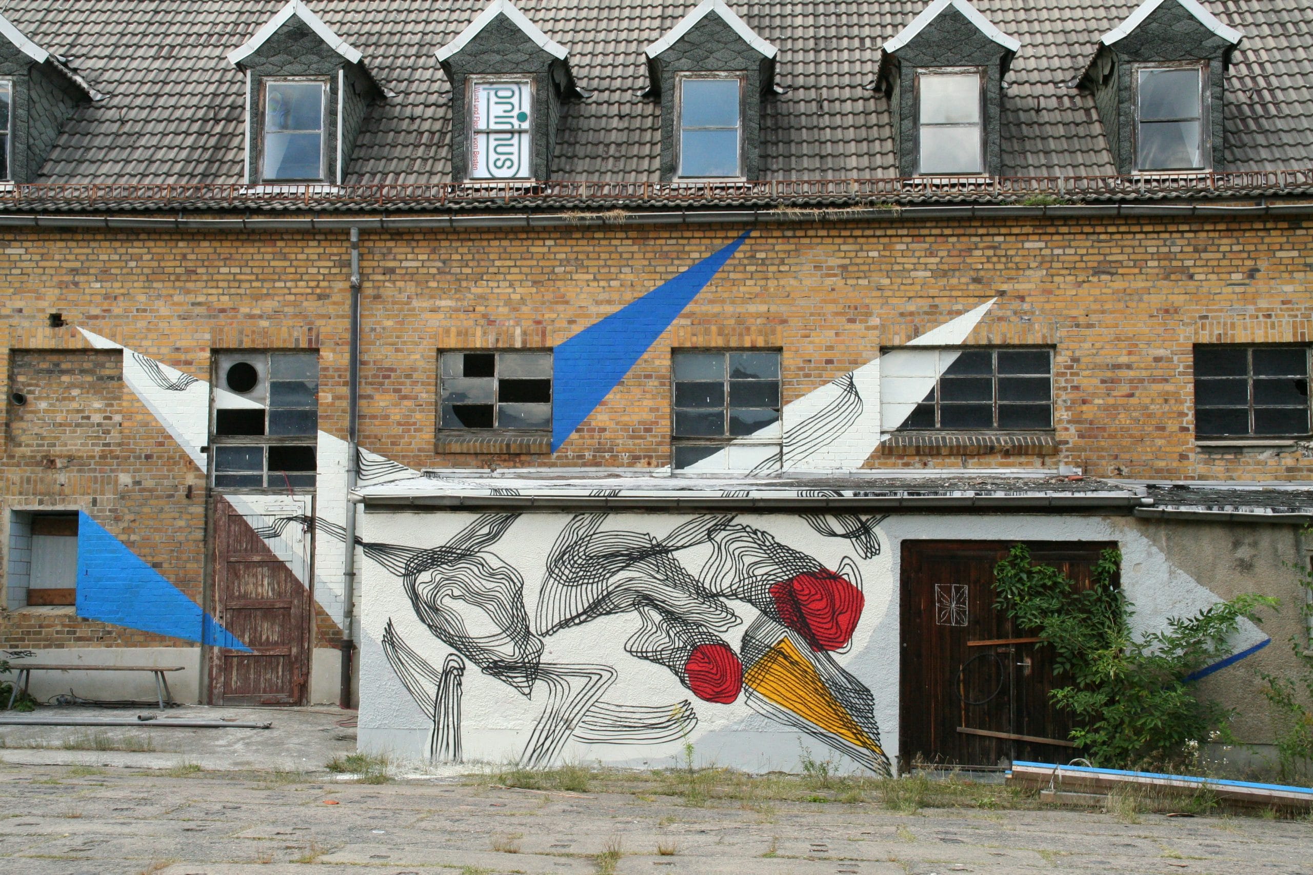
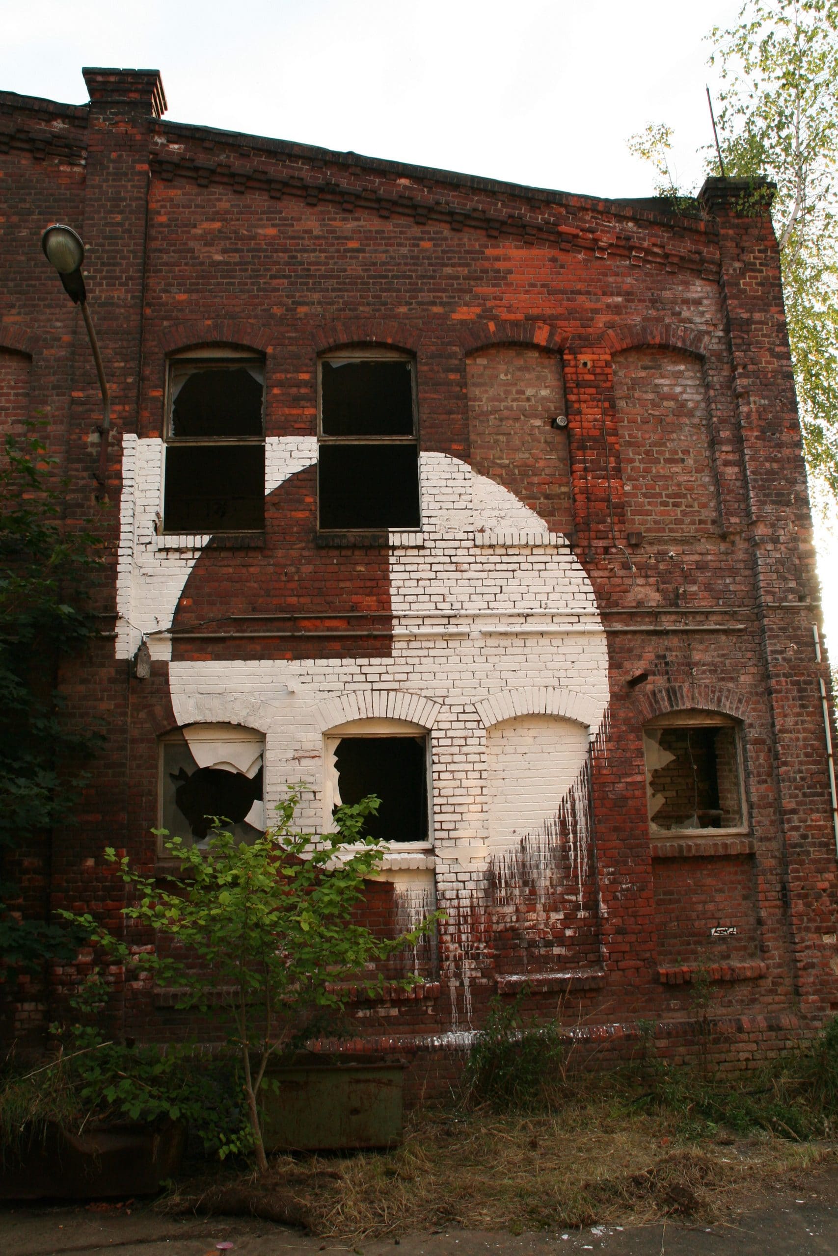
The Berlin artist KERA aka Christian Hinz (born 1985 in Berlin) has now been working with painting and printing techniques for over 20 years. At the age of 14 it was graffiti writing that made him paint and thus finally helped him to become a visual artist. For more than 15 years he sprayed styles with his name KERA, but at some point, bored by the letters, he started looking for new forms, sometimes more figurative or abstract, to make other pictures more picturesque. With his crew he painted countless concept walls all over Germany and other countries. In doing so, they jointly emphasized narration and agreed on a specific theme beforehand. At the age of 18, KERA got to know the screen printing studio of Frank Senf in Lichtenrade, where he learned many printing techniques – developed his love for the screen printing process – and was able to experiment conceptual and technical aspects. In this screen printing studio, the manager Frank Senf had already supported many oldschool writers since the 80s and encouraged them to go creative ways. KERA then decided to do a training in graphic design at the Lette Verein Berlin and was later able to incorporate the knowledge he had learned into his art. From 2007 to 2009 and from 2010 to 2012 KERA moved into different studios at Tacheles and worked on photography on silkscreen, created metal sculptures and continued painting on walls and other surfaces with international artists such as INTI or Axel Void. Tired of style writing, KERA picked up on lines and geometric shapes in his first abstract small to medium format murals at various festivals. Because of their structure as long horizontal forms, they were still reminiscent of graffiti pieces.
Cottbus 2007 – Pic ©Kera 
Jena 2007 – Pic ©Kera 
Ibug Festival 2011 – Pic ©Kera 
Ibug Festival 2012 – Pic ©Kera 
Ibug Festival 2013 – Pic ©Kera 
Ibug Festival 2012 – Pic ©Kera 
All You Can Paint Festival 2014 – Pic ©Kera

Plan, combine and in the end improvise
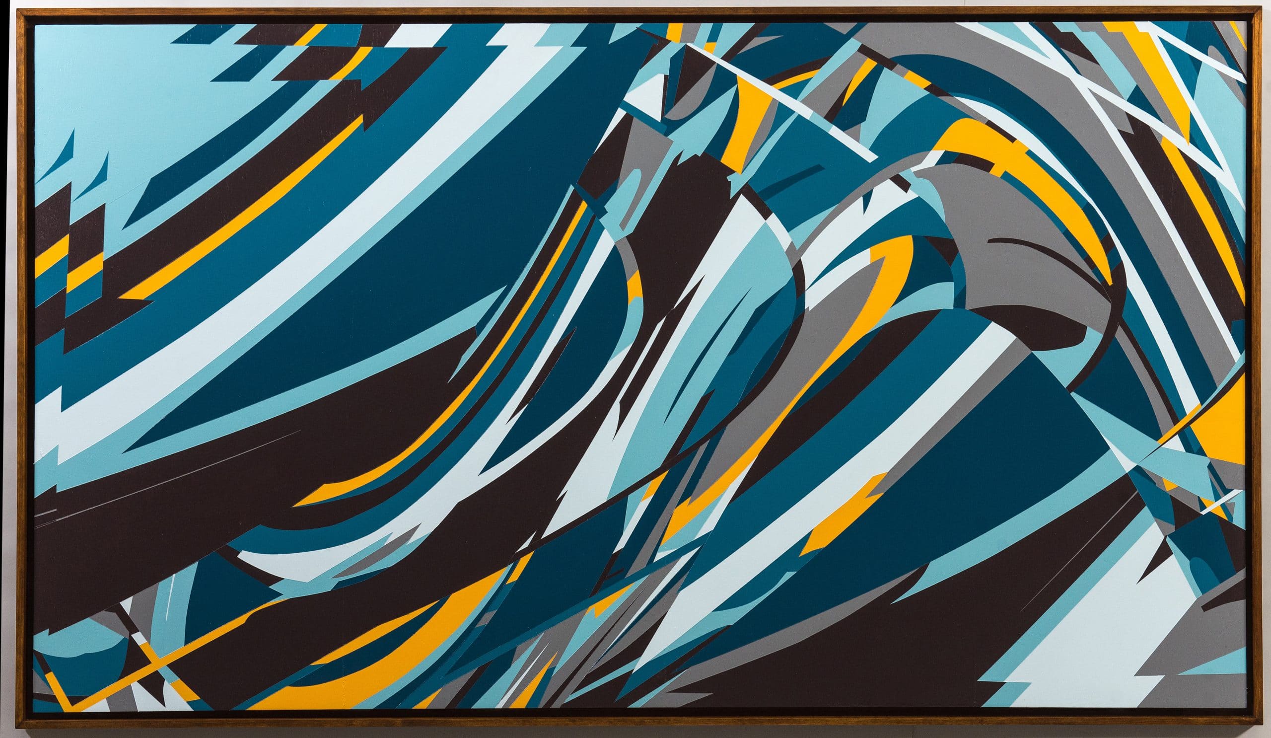
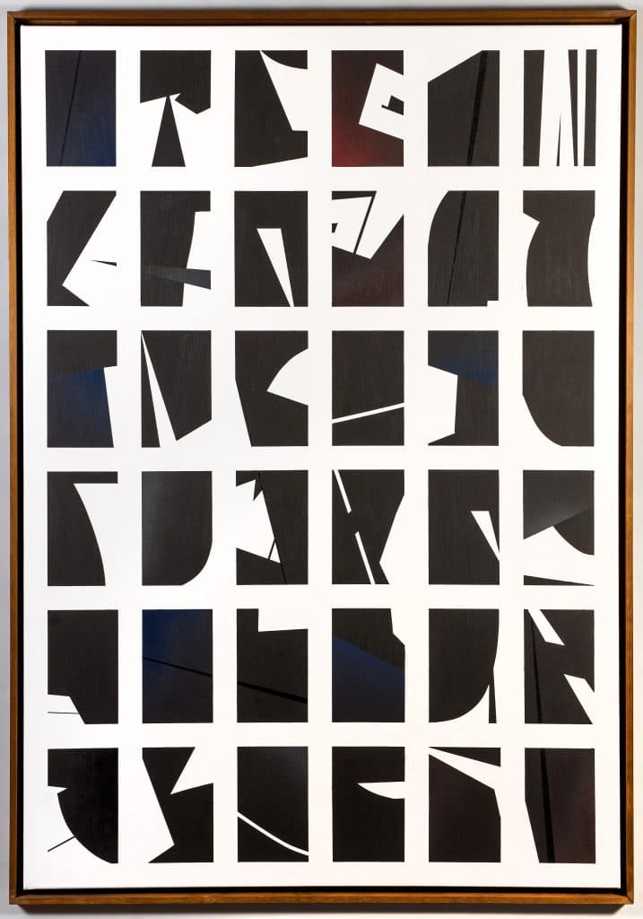
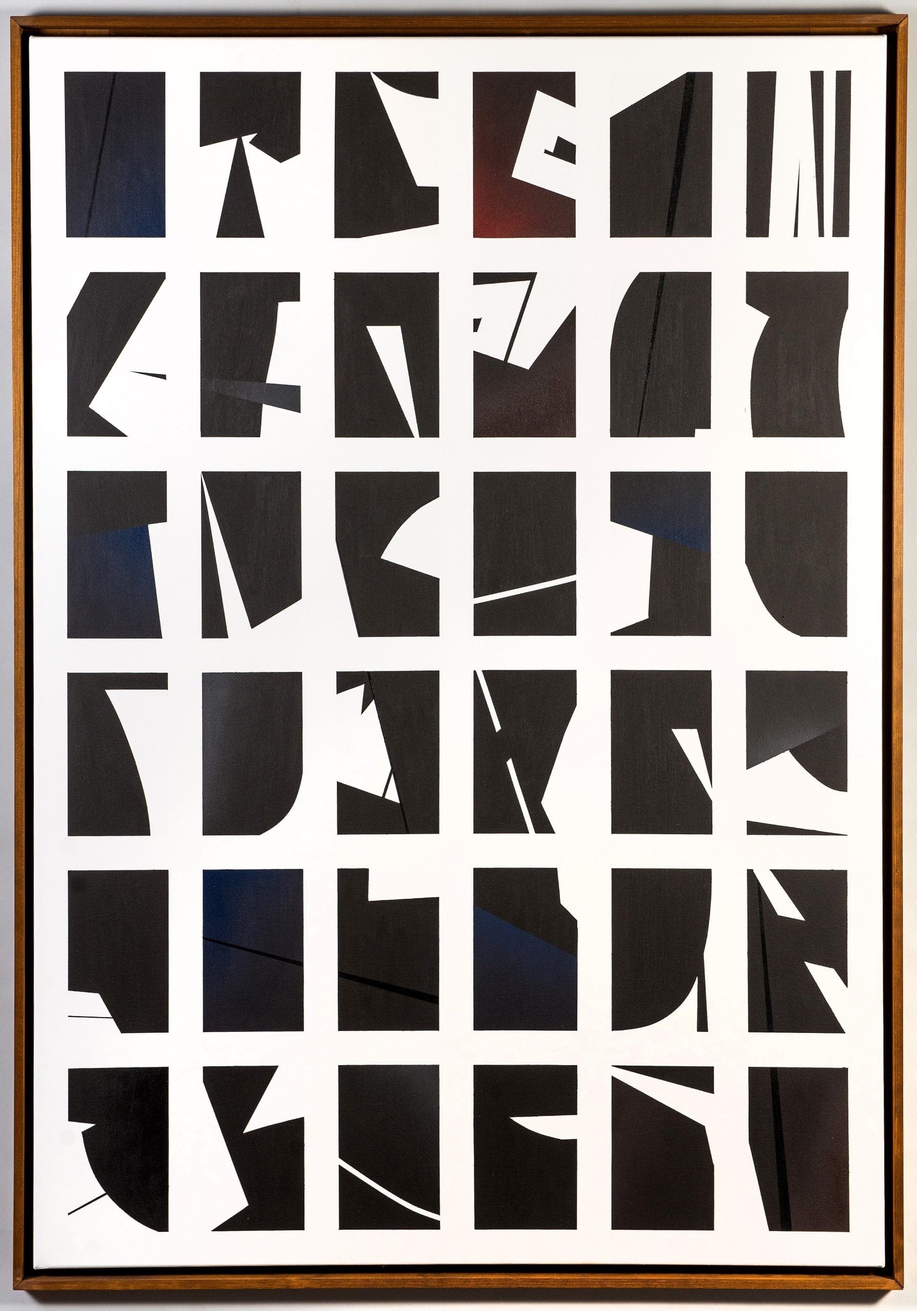
The preparation and collage of lines, structures and colour fields on the computer, in order to transfer them onto canvas, paper and large surfaces on walls, has been part of KERA’s working method for years. He thus uses various tools to achieve an abstract graphic result, which is very well structured and pre-planned, but still leaves room for small spontaneous changes and variations in the craft itself. His abstract graphic style could be defined as a mixture of Hard Edge Painting, Constructivism and Op Art. The connection and the transfer from digital to analogue technology is particularly appealing to KERA. The designs of his pictures are almost always created on the computer. There he sets clear grids, which sometimes overlap or are fragmented, thus generating surfaces that are repeated, partly distorted or deformed, creating structures and patterns that seem to be arranged almost mathematically. The choice of colours and colour combinations are also planned on the computer, but here KERA allows the freedom to change tones when mixing the colours.

52. Kera Leinwand – Pic ©Kera
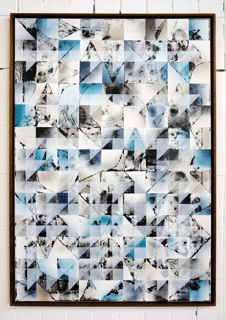
In his monotypes, which are created by means of manual printing and are therefore also unique, he repeats the form in a certain predetermined grid. When stamping, the resulting structure is often arbitrary and varies according to the impression, the quantity of ink, the pressure applied and the nature of the substrate. This results in unplanned patterns, which the artist, however, in turn, already includes as texture and thus playfully uses for his pictorial language.
43. Kera Leinwand – Pic ©Kera 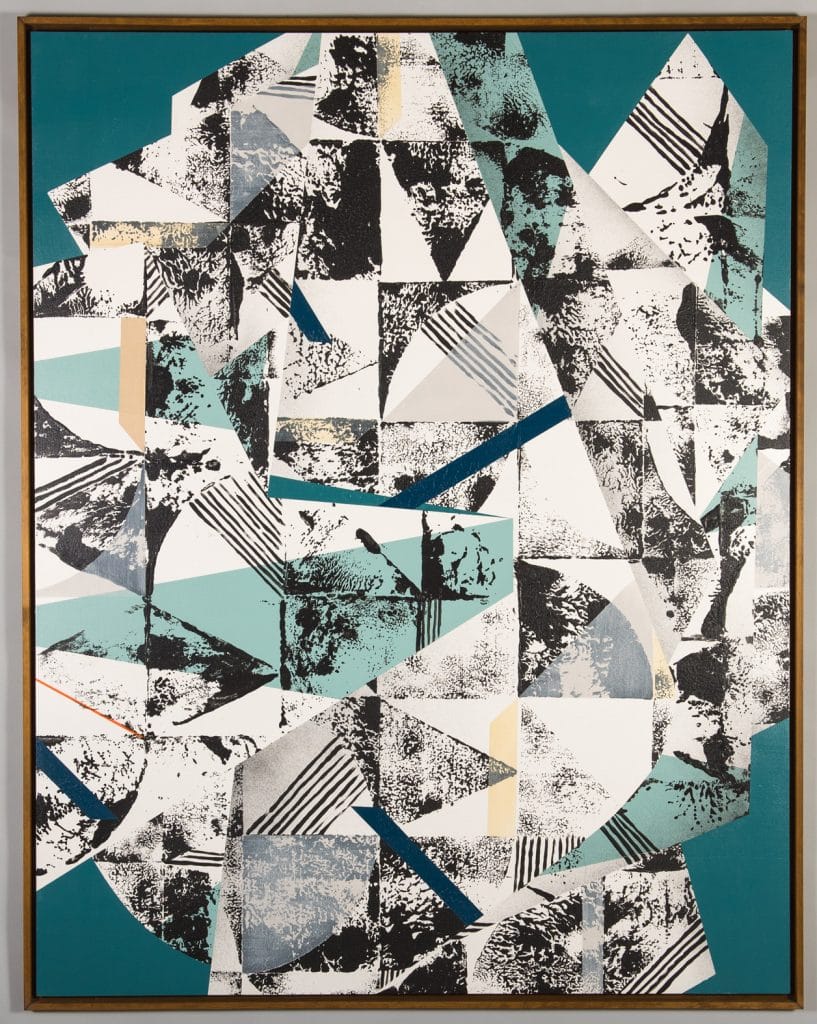
53. Kera Leinwand – Pic ©Kera
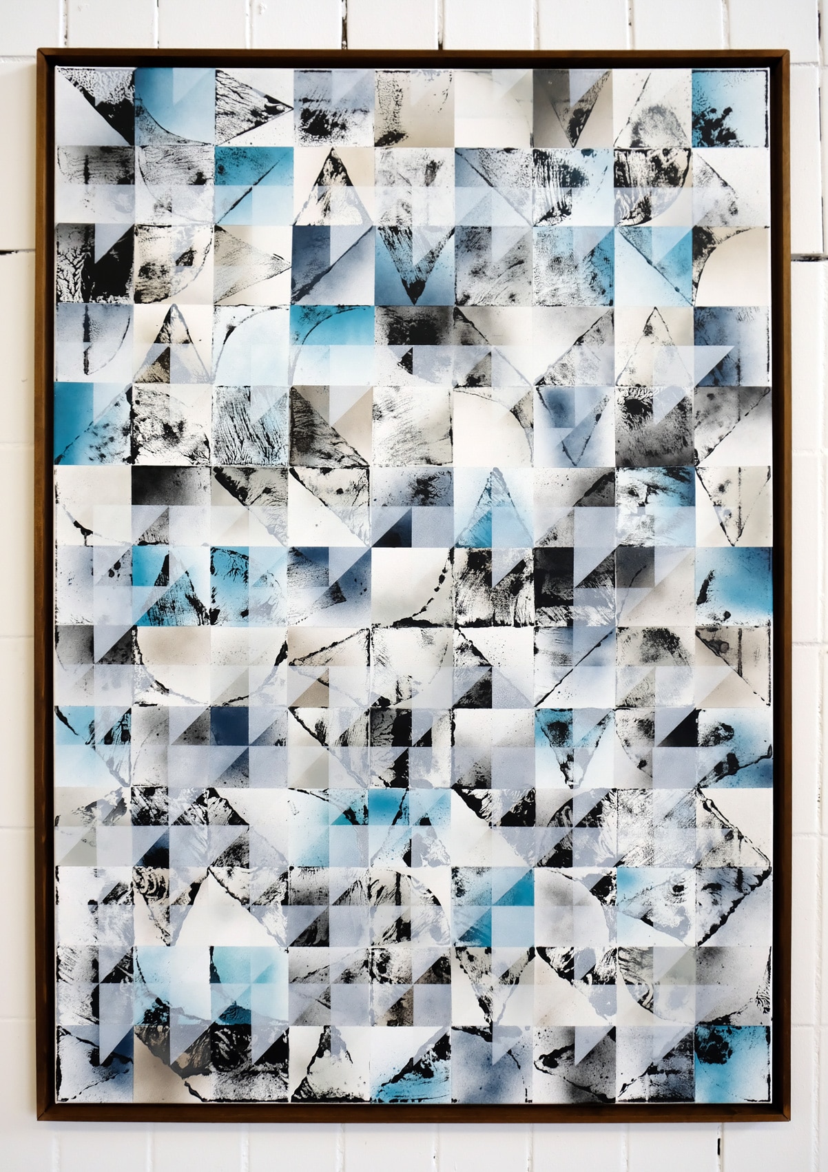

KERA’s aim is to incorporate dynamics and movement in repetitive fixed structures and to create balanced compositions. According to the artist, however, no repetitions are the same, always new variations and new images with different effects are created. His abstract graphic style as well as his colour palettes have become one of his distinguishing features. In the beginning he painted his Graffiti pieces very colourful, but through his graphic education, experiences and further development he later reduced his palette. Blue is one of his recurring colours, whether muted, subtle, loud or quiet, sometimes lighter, sometimes grey, he especially likes to use the blue outside on the wall, adapting to the dye of the sky. KERA also likes to use the combination blue-grey-yellow again and again, mostly even unconsciously.
KERA’s aim is to incorporate dynamics and movement in repetitive fixed structures and to create balanced compositions. According to the artist, however, no repetitions are the same, always new variations and new images with different effects are created. His abstract graphic style as well as his colour palettes have become one of his distinguishing features. In the beginning he painted his Graffiti pieces very colourful, but through his graphic education, experiences and further development he later reduced his palette. Blue is one of his recurring colours, whether muted, subtle, loud or quiet, sometimes lighter, sometimes grey, he especially likes to use the blue outside on the wall, adapting to the dye of the sky. KERA also likes to use the combination blue-grey-yellow again and again, mostly even unconsciously.
42. Kera Leinwand – Pic ©Kera 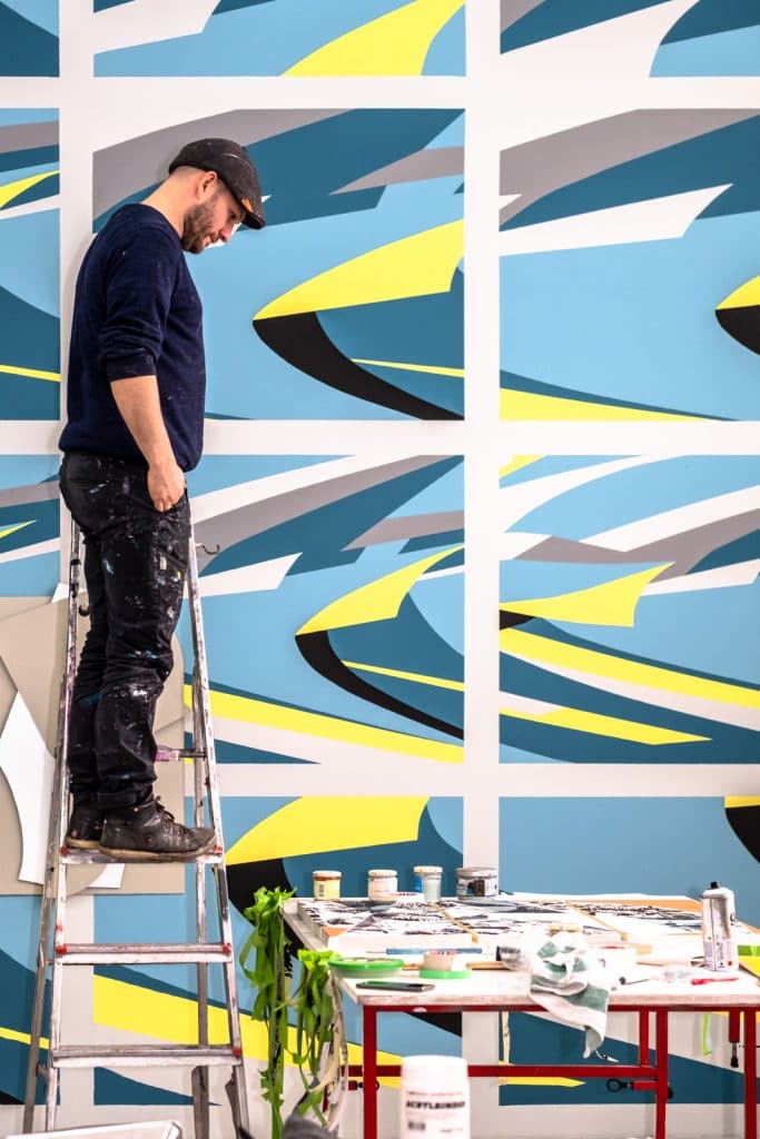
Studio Visit – Kera, Feb 2020 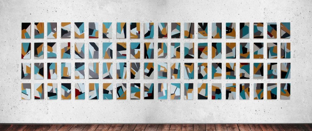
29. Kera – Pic ©Kera
Enjoying to create outdoors
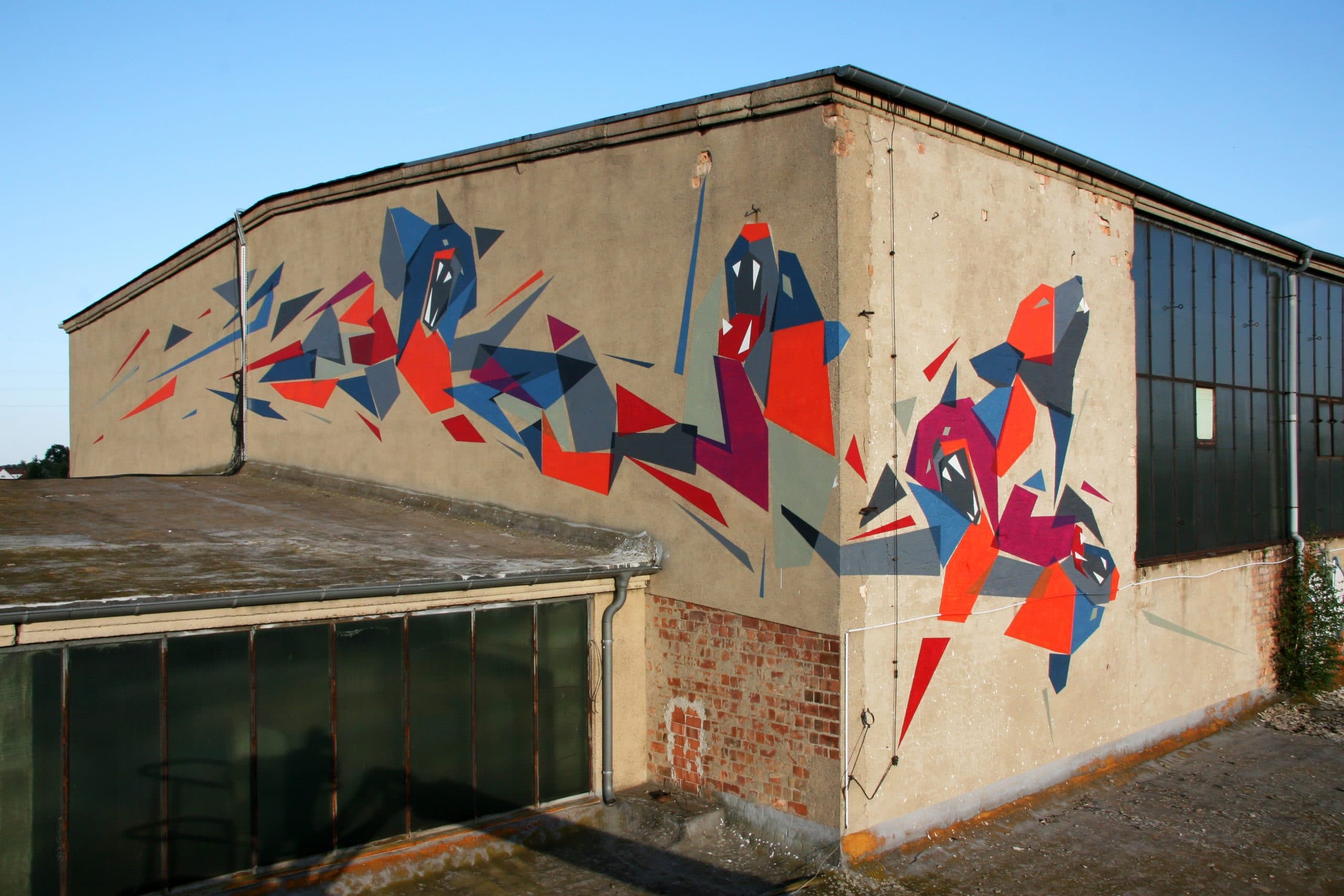
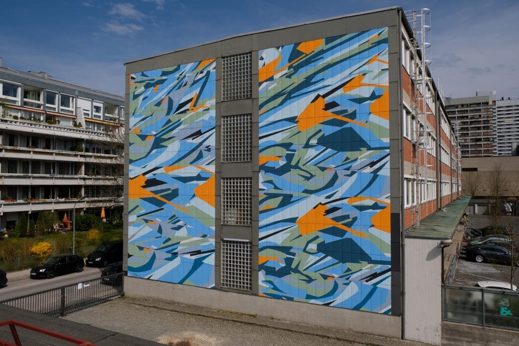
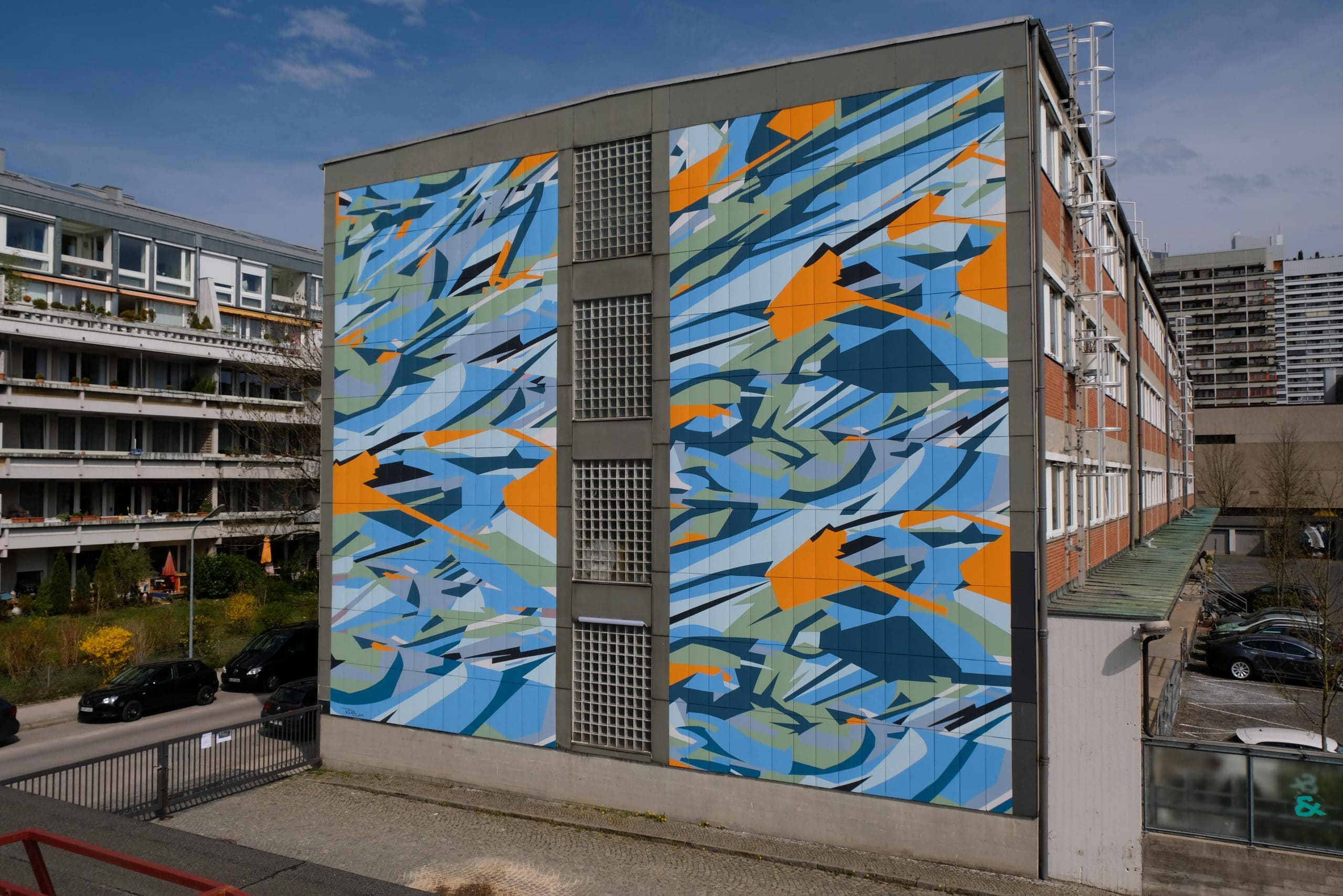
On the one hand KERA especially enjoys the planning process, a certain security and structure for his works, on the other hand he enjoys to paint outside on the wall with the unexpected, which is often the case with mural painting. KERA’s main concern here is to create a lasting image in the cityscape that is eye-catching but not disturbing and gives the viewer a good feeling. Since 2012 KERA has painted more than 100 walls worldwide, 30 of which are large murals. Four murals are in Berlin. On average he realizes 12-14 murals per year and that is considerable. Whether at festivals, through private initiatives or as commissioned work, his great passion is to paint on large-format walls outdoors. Before painting a mural, he always pays attention to what is in the surroundings of the wall/facade, which colour worlds surround the architecture, in order to be able to determine his colour palette accordingly. He usually chooses colours and tones that harmonise with the surroundings and are not too intrusive. In addition, he wants to pay tribute to the architecture with its visible elements such as windows, balconies, frames, stucco etc. and make them part of his compositions rather than simply painting over them. This is already taken into account in the draft. The grid of the design is transferred to the wall in the adapted proportions by hand, or the artist orients himself on lines that the wall already has through architectural elements.
The creative process, the finding of practical solutions for possible spontaneously occurring problems and spontaneous adjustments on site, are a lot of fun for KERA. He is a tireless painter with incredible speed and craftsmanship and has retained the DIY mentality from graffiti. And not only that, but also the cohesion, helpfulness and networking with the artists from the scene remains. And even though KERA today prefers to act alone, he still seeks and needs the exchange with other artists and therefore shares a studio with long-time artist friends in Berlin since years.
Mural Z-Common-Ground 2019 – Pic ©Kera 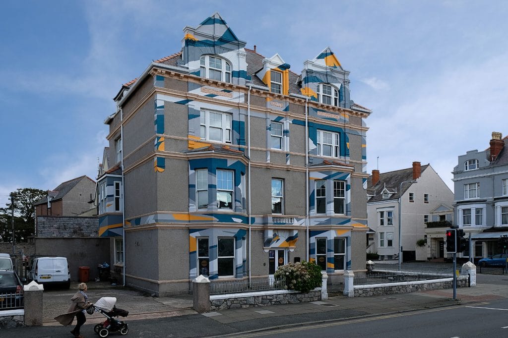
Mural Llandudno 2019 – Pic ©Kera 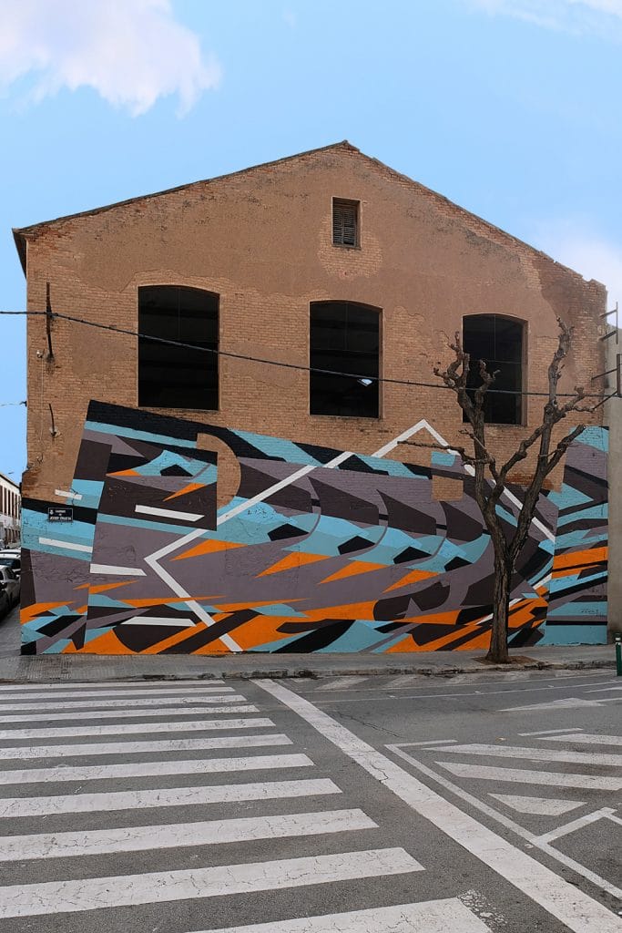
Mural Barcelona 2020 – Pic ©Kera


Leave a Reply