

Beginnings in a rural context
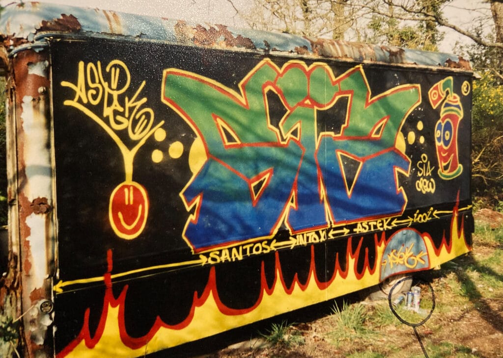
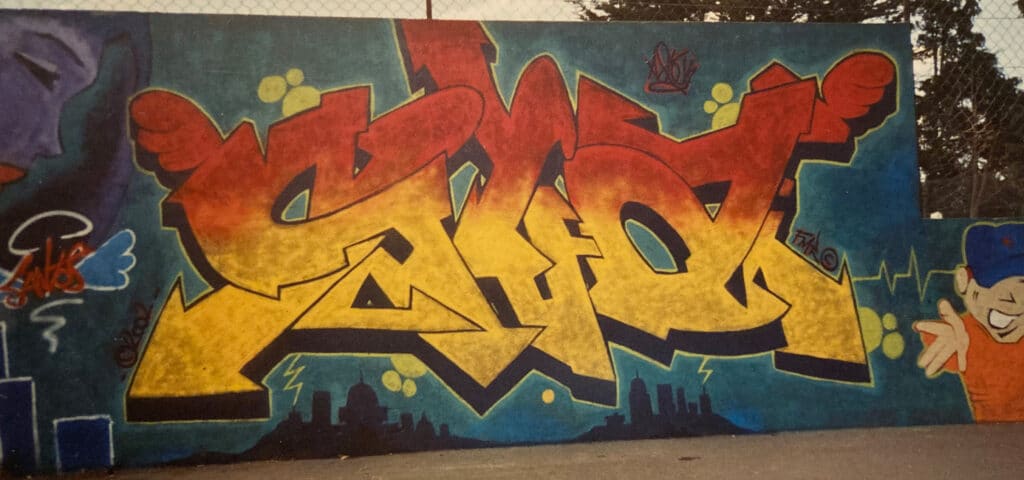
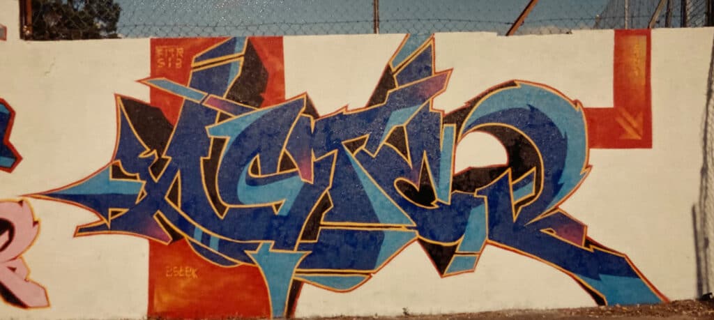
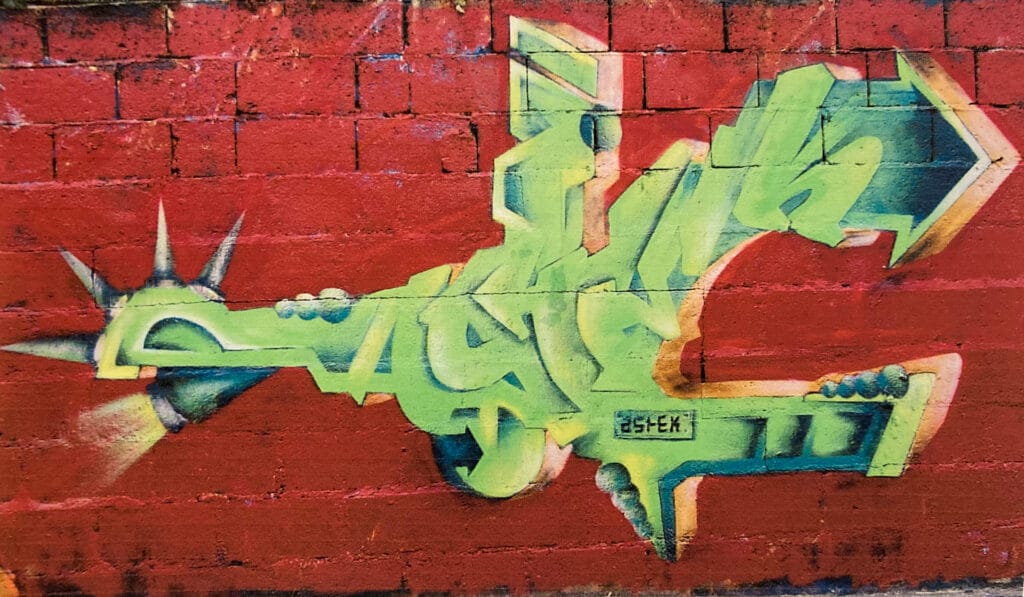
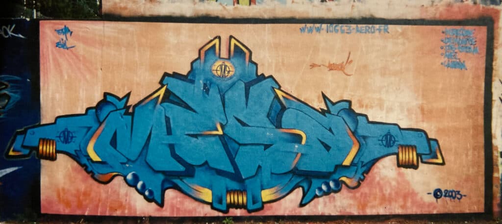
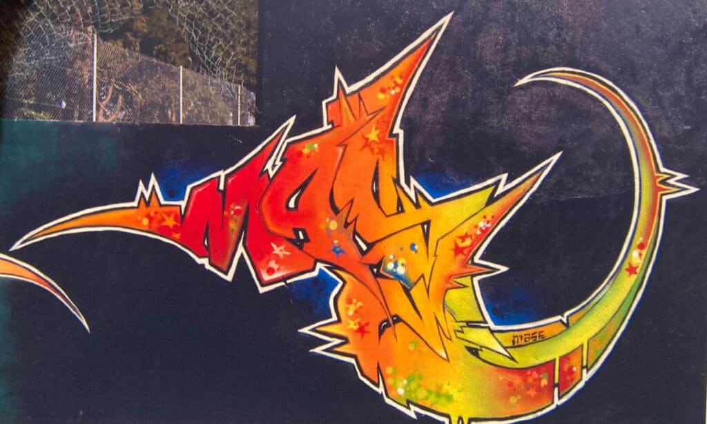
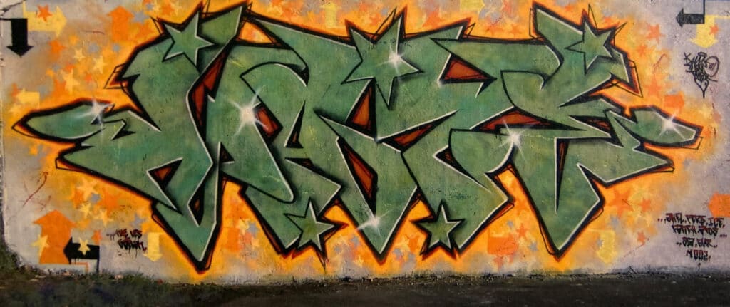
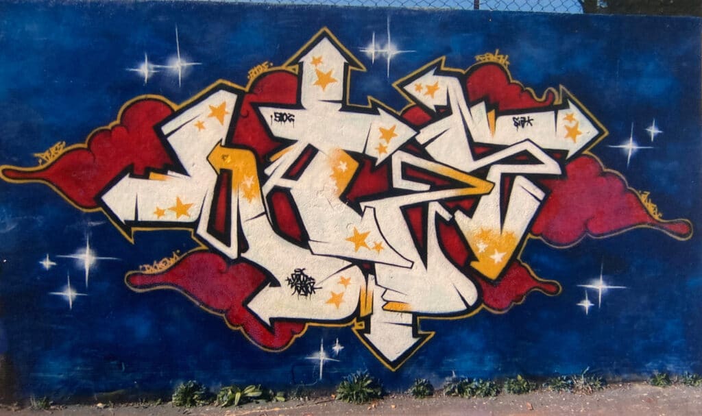
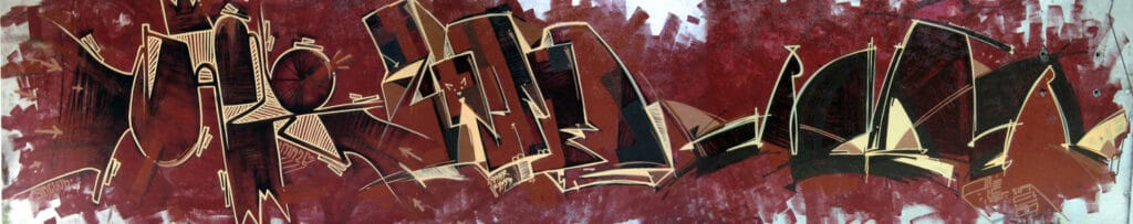
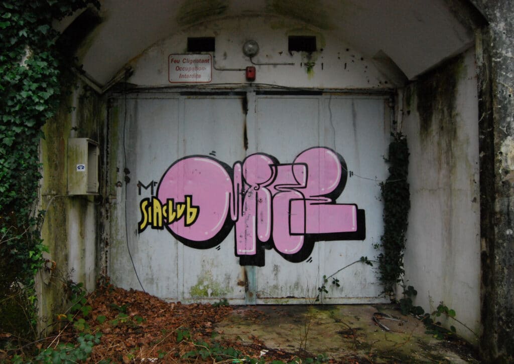
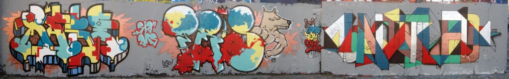
Arnaud Enroc was born in 1983 in France, in Brittany, in Quimperlé. After a time spend in Lyon and Rennes, he lives actually in Nantes. At the end of the 90s, he discovered graffiti writing in the city of Lorient and Brest and was fascinated. Again and again he drove to those cities to examine new pieces. Through images of graffiti in the press, in some skate magazines and in the “Radical” magazine in France, his interest grew until he started drawing himself, buying spray cans and trying his hand on wooden boards in his parents’ garden. A friend of his was also enthusiastic about it and became active himself. Together they painted scrapped vehicles in the countryside at first. At that time, his first moniker was ASTEK and there was hardly any graffiti in the rural area, even in abandoned factories the two boys were the first to leave graffiti pieces. Only in the city of Brest was a graffiti store for accessories those days and when Enroc got his driver’s license at 18, he was mobile and could explore more places with graffiti and therefore meet other writers. Initially, his stylistic influences were in classic graffiti: wild style, semi wild style and 3D style. In Brest the crew C29 painted mainly in wild style, in Lorient the crews MOKER and BAN and especially DINO left striking pieces in a 3D style that impressed Enroc, as well as throw ups by MOSEN. Few times later, he discovered pieces by ARS crew, who painted in a less classic style, which later on, would inspire Enroc as well. As of 2002 Enroc painted MASE/MAZE and became a member of his first crew SIA, founded by him, L’OUTSIDER and AHEL. At that time the pseudonyms of the three members were SANTOS (later AHEL), INTOX (later L’OUTSIDER) and ASTEK (later MAZE). This crew then became YOLERAP with other members such as PomZ, SNOBE, TAKOS, DGLS, PACK, AHEL, ICER and BONER. From 2001 to 2006, Arnaud Enroc was at home in classic graffiti writing until he got bored with it. However, his great passion for typography remained, and he attempted new visual languages for painting his name in the following years.
Breaking with the old codes
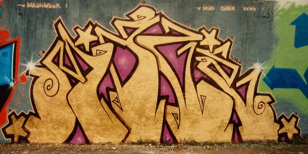
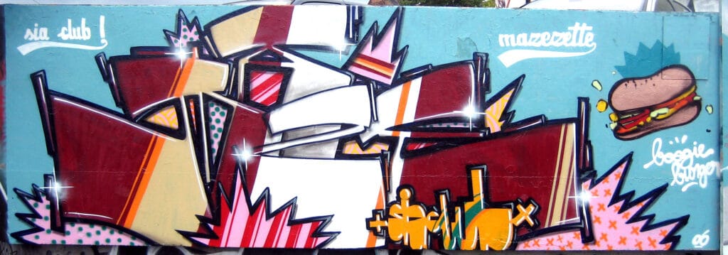
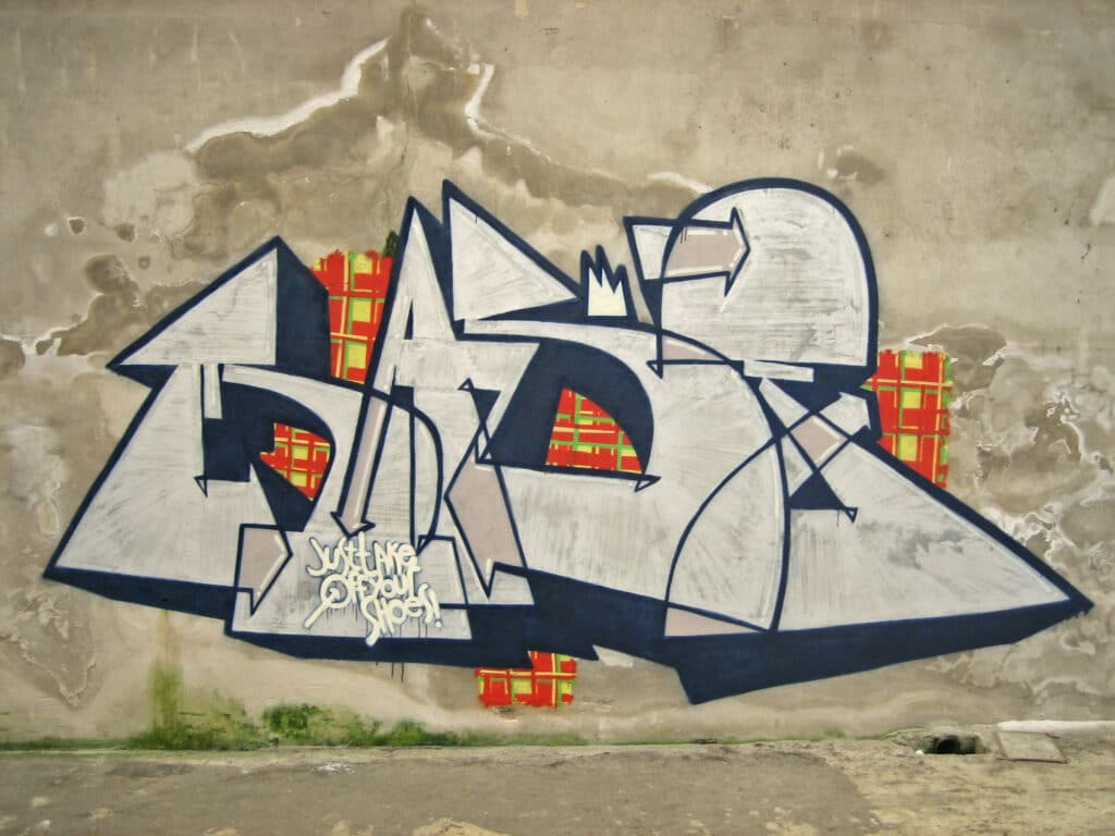
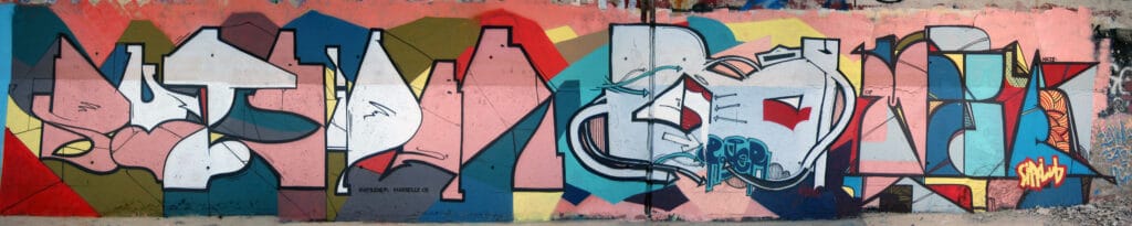
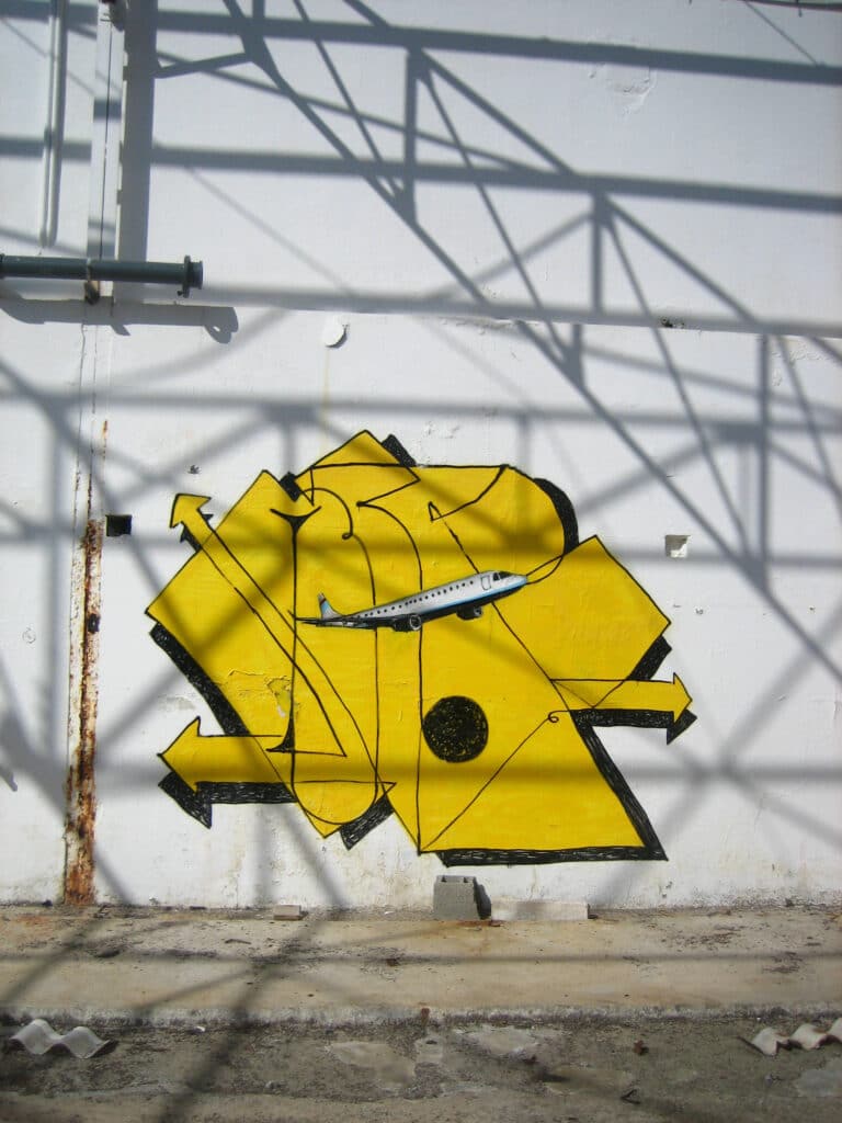
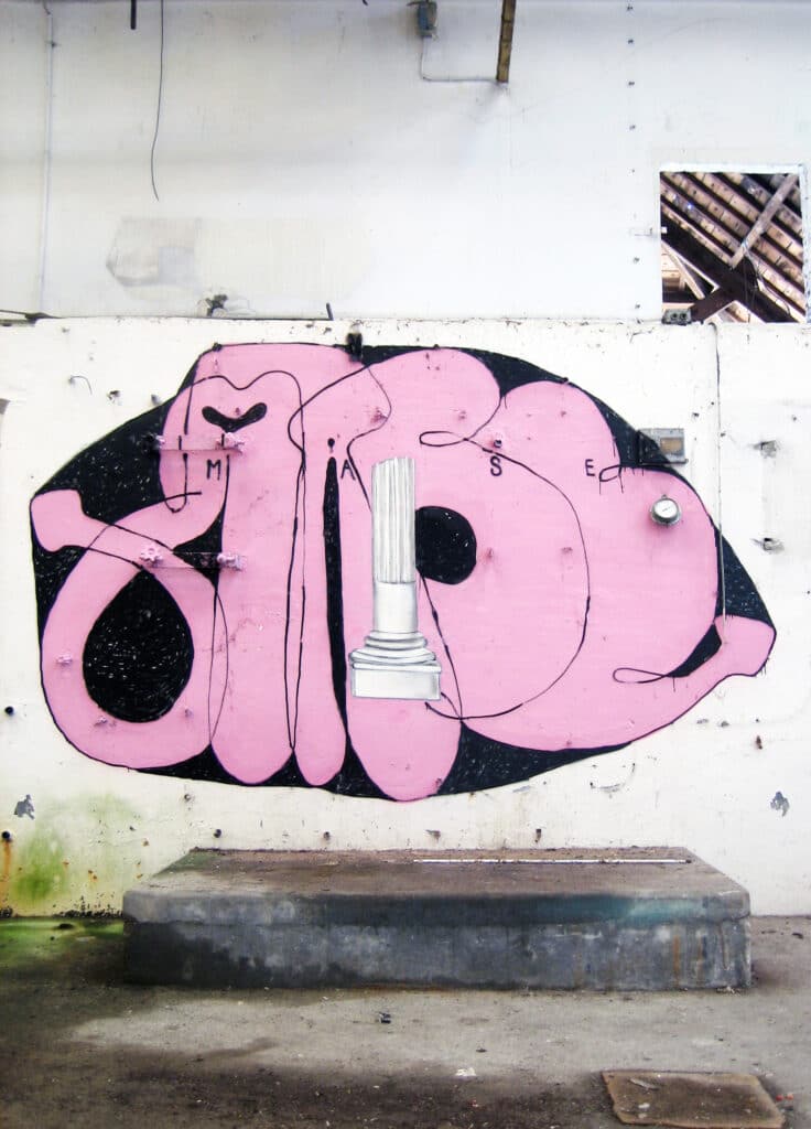
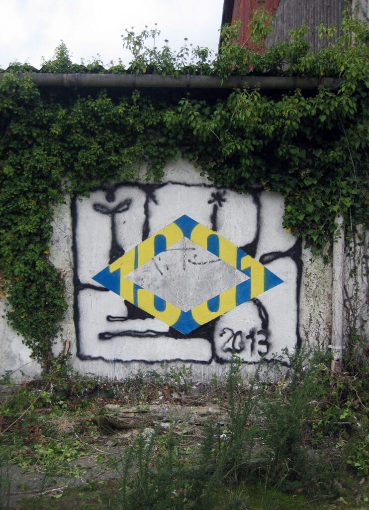
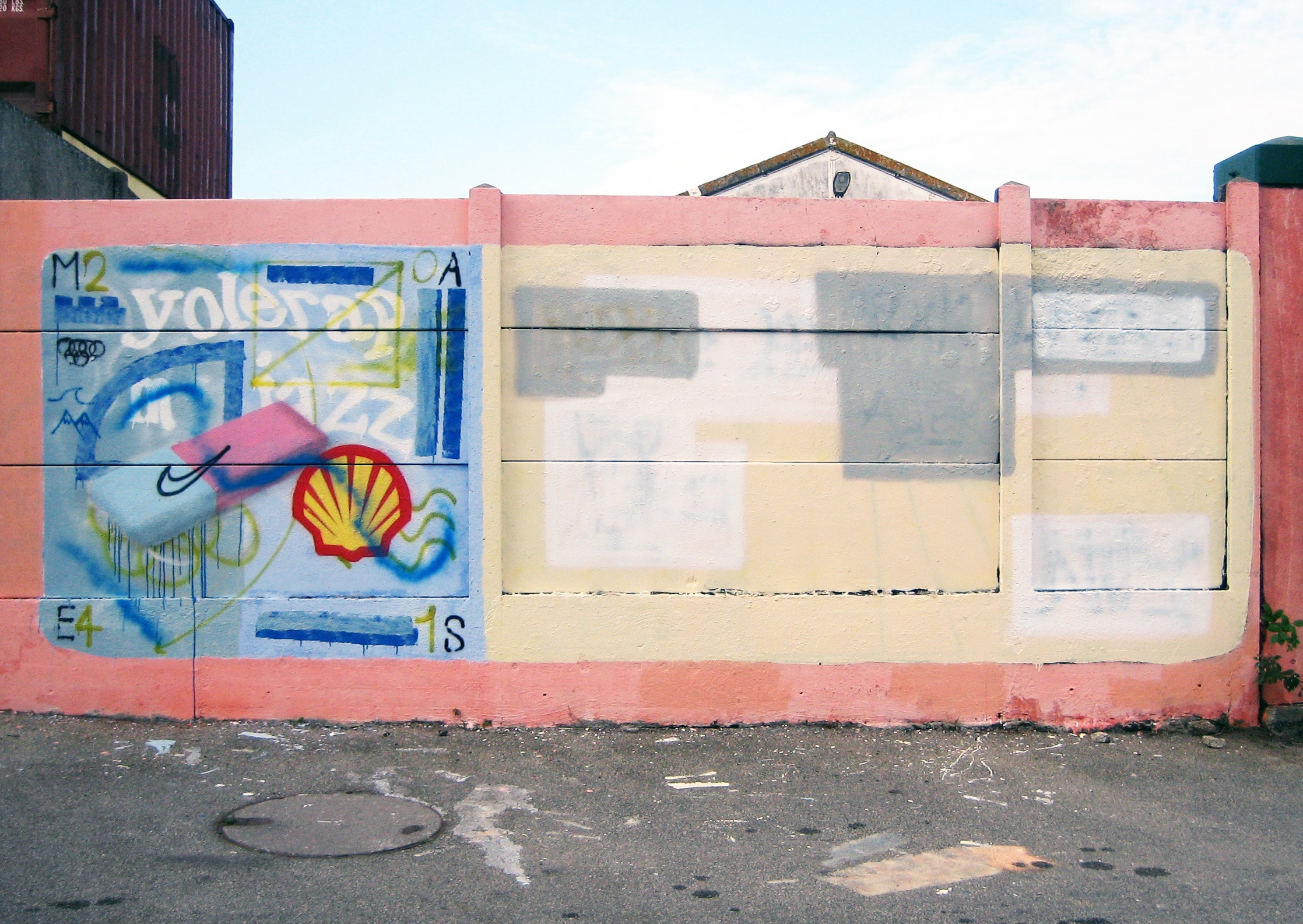
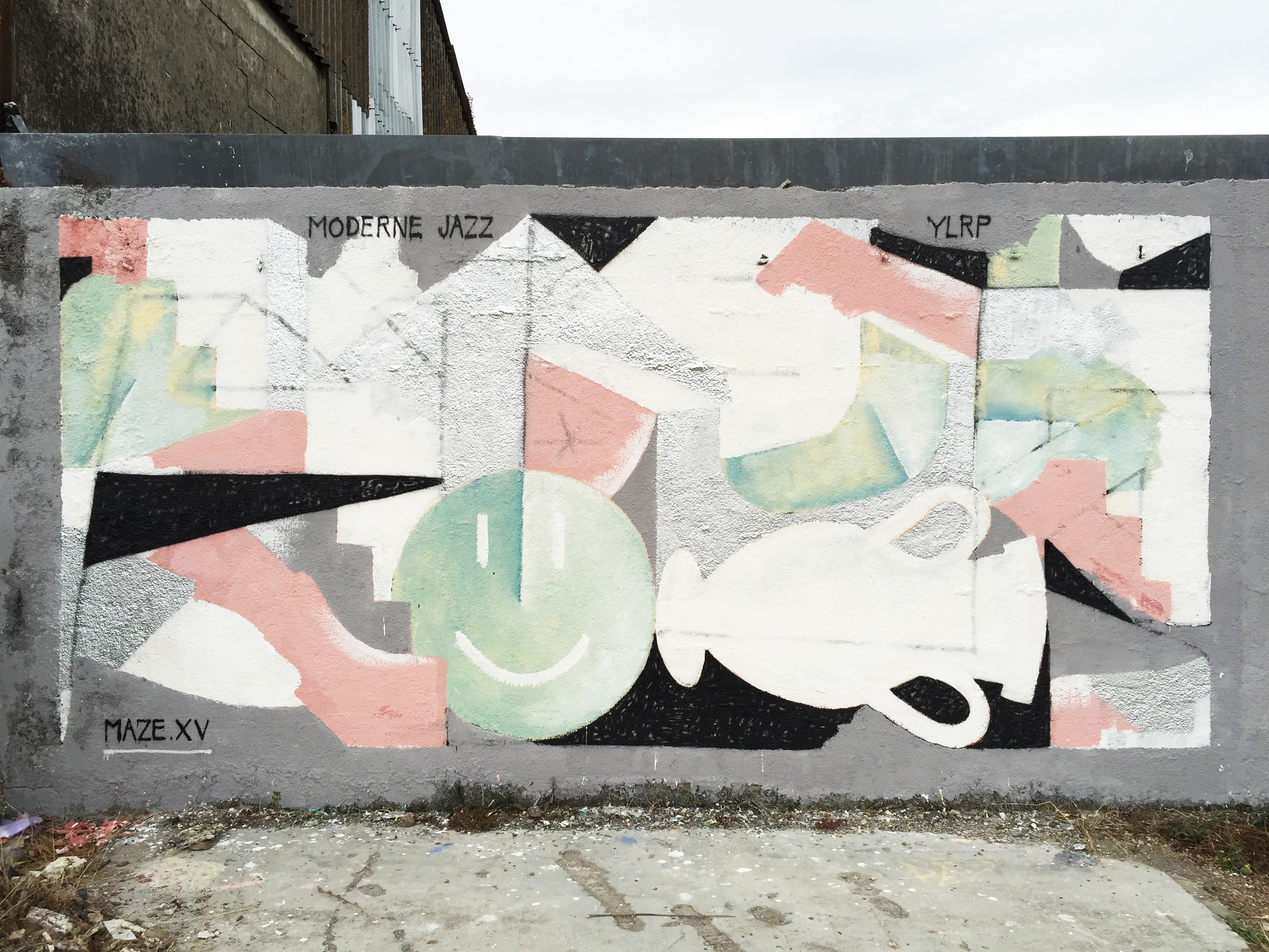
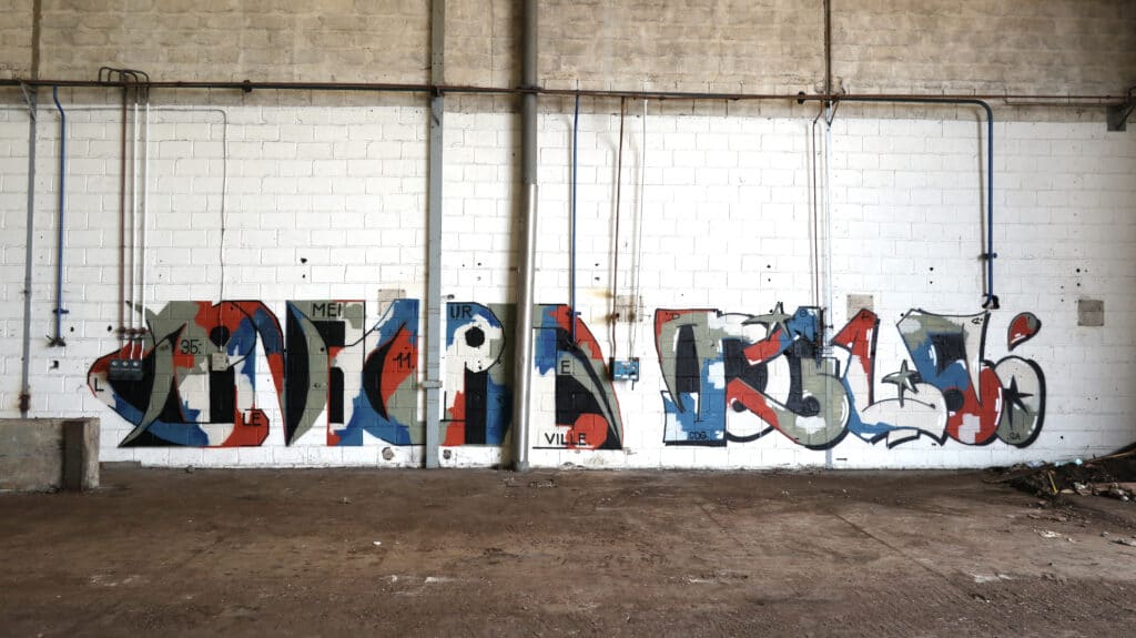
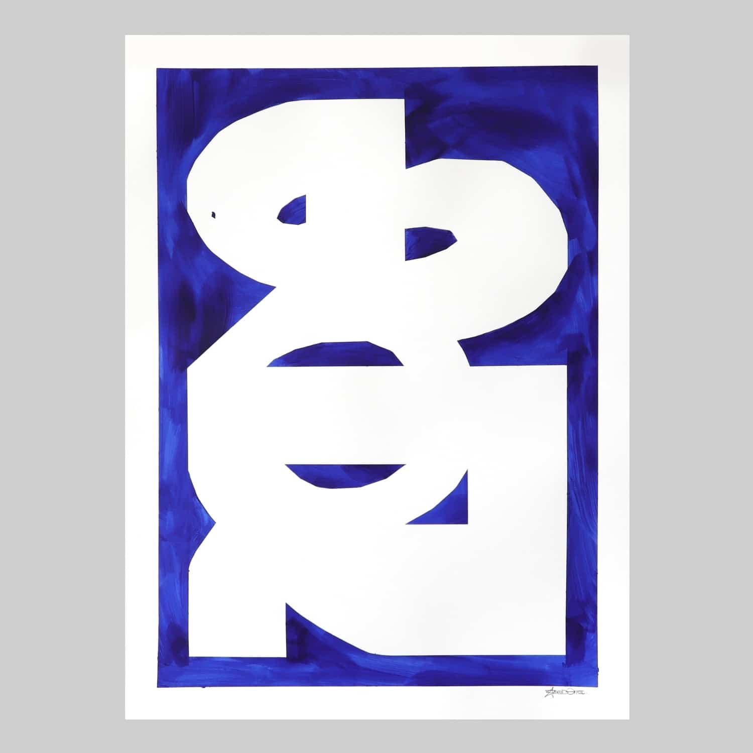
In the early 2000s, there were already a number of writers around the world who were rethinking graffiti and developing new kinds of styles. On the Internet, Enroc followed these developments and networked at the time through websites like aero.fr, fat cap, fotolog and streetfiles. From 2007, Enroc changed his style and intentionally painted failed “innocent” letters, as he calls them, with sometimes poorly drawn lines, and added figurative motifs over his lettering with a kind of sticker effect. These realistically painted motifs, such as plants, airplanes, classical architectural elements, or antique sculptures, appear strangely, bizarrely displaced on his pieces because they had nothing to do with the graffiti context. In this phase, Enroc deliberately did not want to create reproductions of well-known classical graffiti codes, but rather to break codes, experiment, create an anti-style, with simple typographies, representational motifs taken out of context, and thus create atypical pieces, images, hybrids of graffiti and painting. The outlines of the pieces were no longer only horizontally laid out like a lettering, but partly oval or misshapen, or they were surrounded by a painted frame. Single simple small drawn letters of his pseudonym were placed here and there in the large letters.
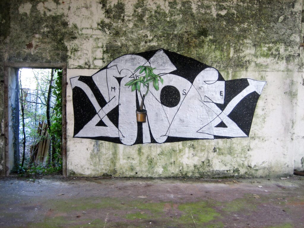
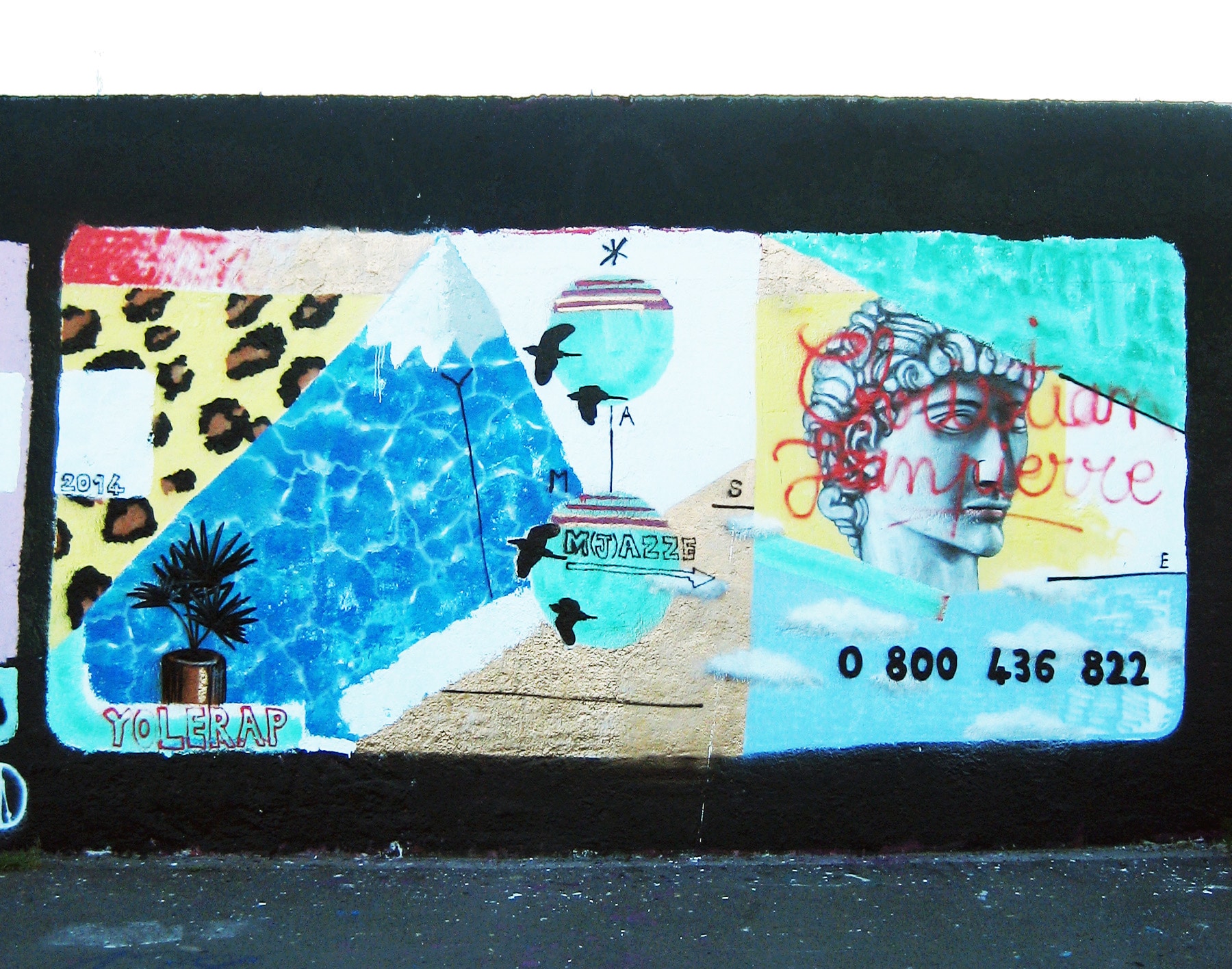
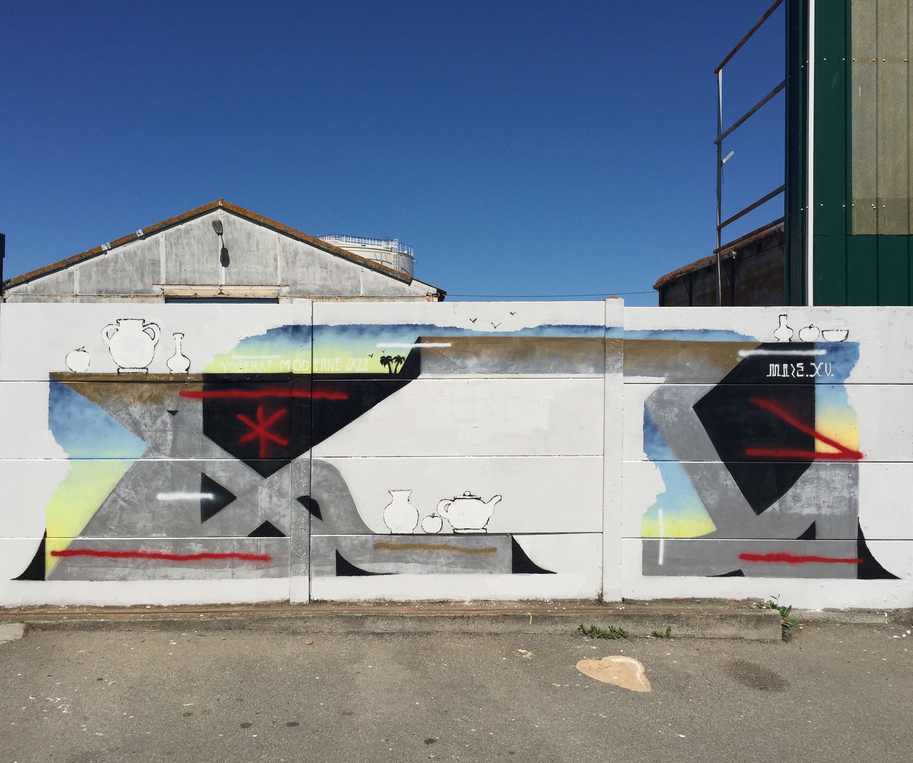
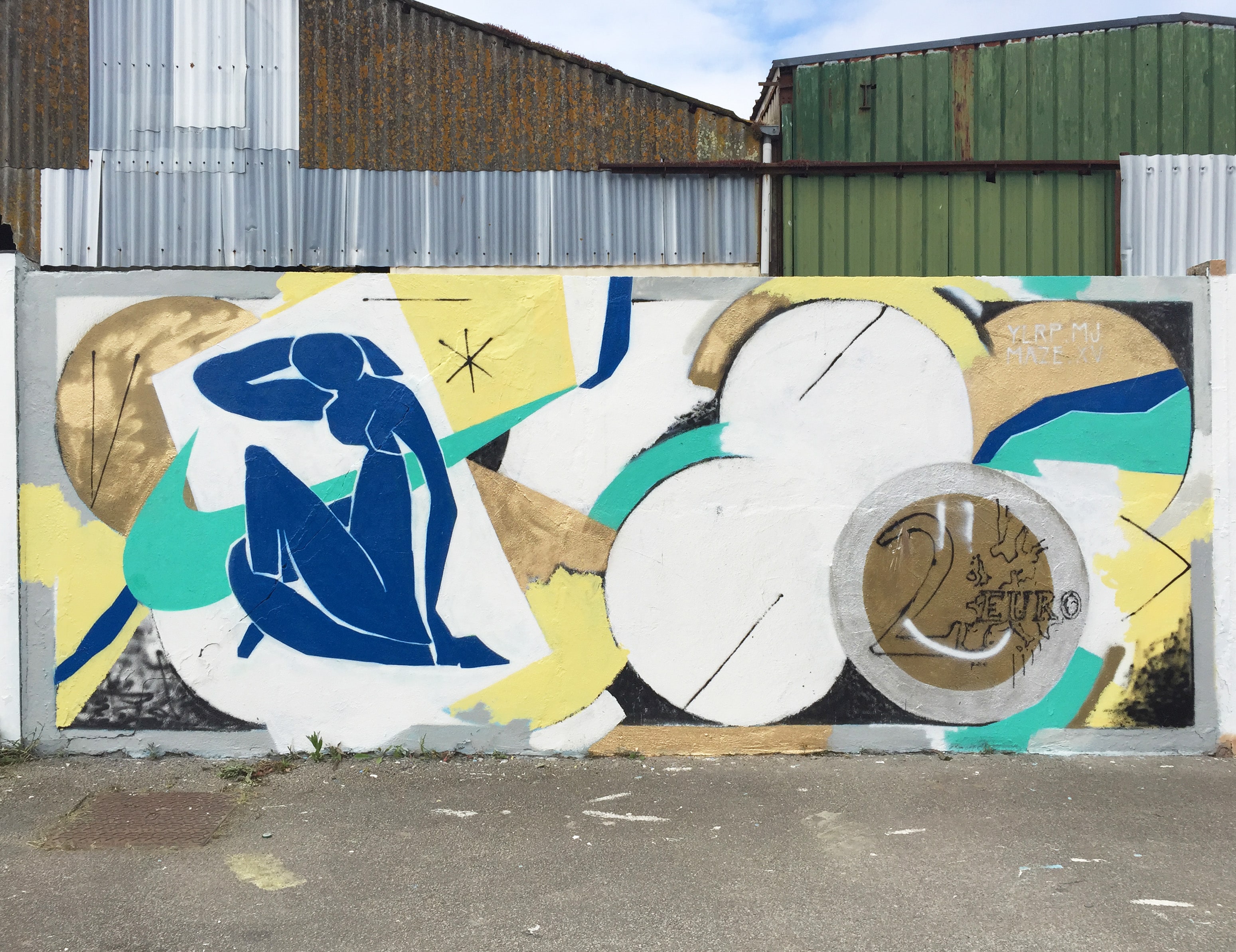
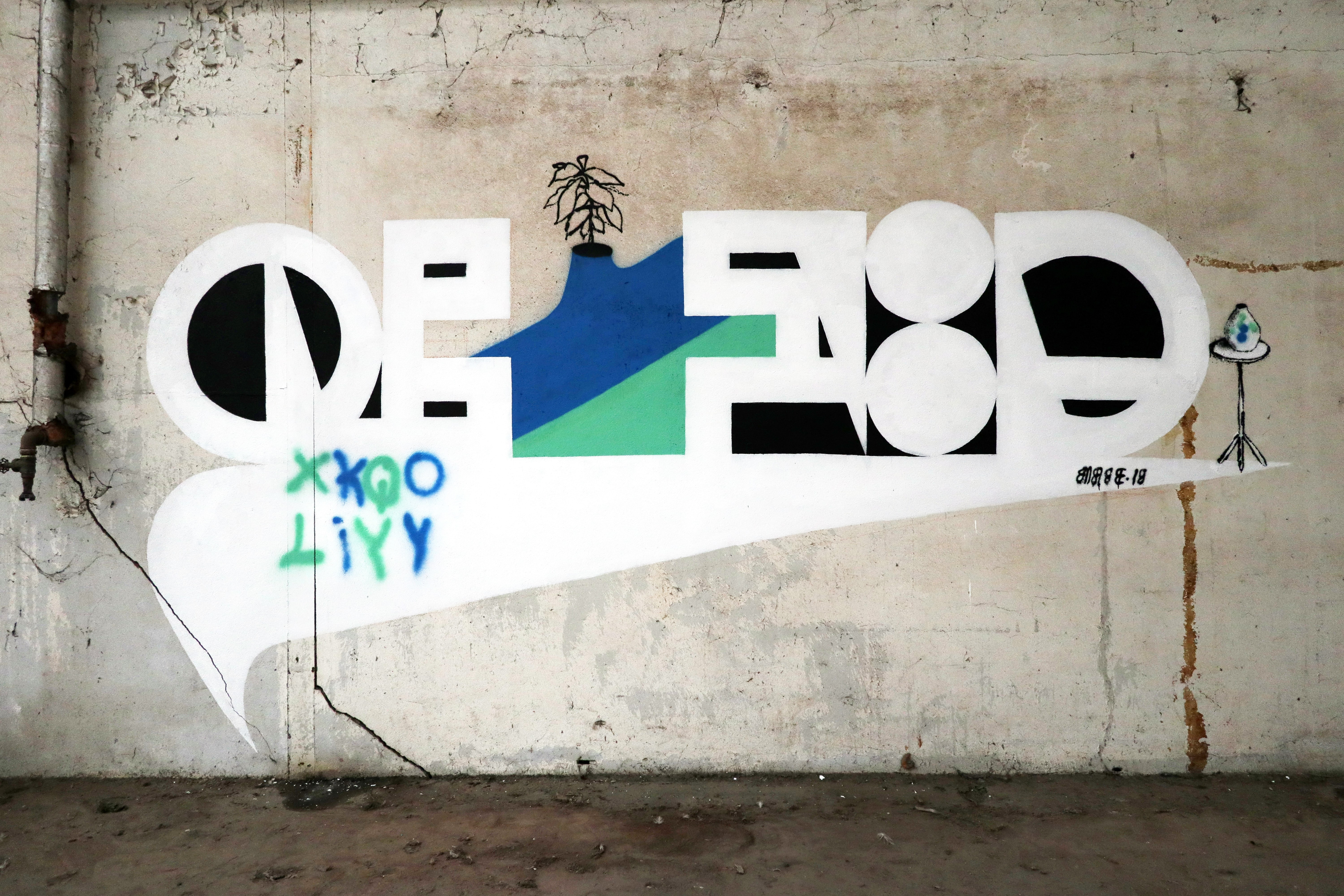
After 2013 Enroc painted even more experimental. The legibility of the letters interested him less and less, his pieces were increasingly only about shapes and motifs. For this, he also liked to fall back on kitsch, was inspired by random images from the photo platform tumblr, used ornaments and simple figurative representations, such as the motif of the vase, which appears again and again in his work to this day. He also added quotes in the form of motifs from classical antiquity, such as columns, or classical modernism, such as the world-famous silhouette by Matisse ” Nu bleu“. The French artist Matisse continues to be a source of inspiration for the French writer with his planar coloring and tense lines, playful pictorial structure, lightness of his pictorial themes and, in his late work, his concentration on the essential. Just as the play with emptiness and fullness is an important theme in the silhouettes, the paper cutting, it is also a theme in Enroc’s work. Modern painting inspires Enroc for his visual language till now, even if, according to him, he has not dealt with it in depth. But his work continues to revolve around the letter, which he constructs and deconstructs in his pieces, abstracting it, stylizing it into geometric forms or even making it disappear, all in favor of an experimental picturesquely aesthetic.
Playing with alphabets, typographies, quotes and GIF animations
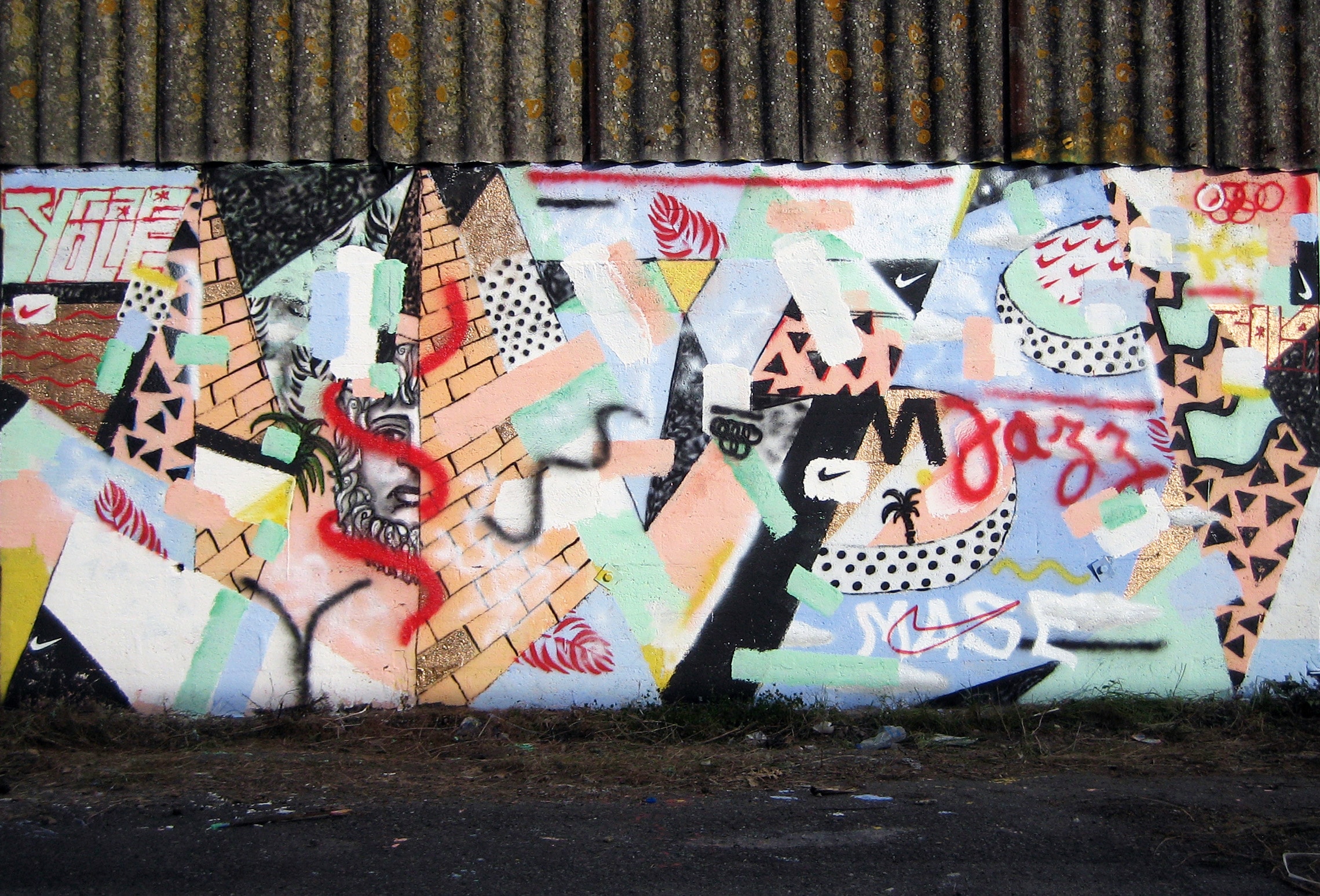
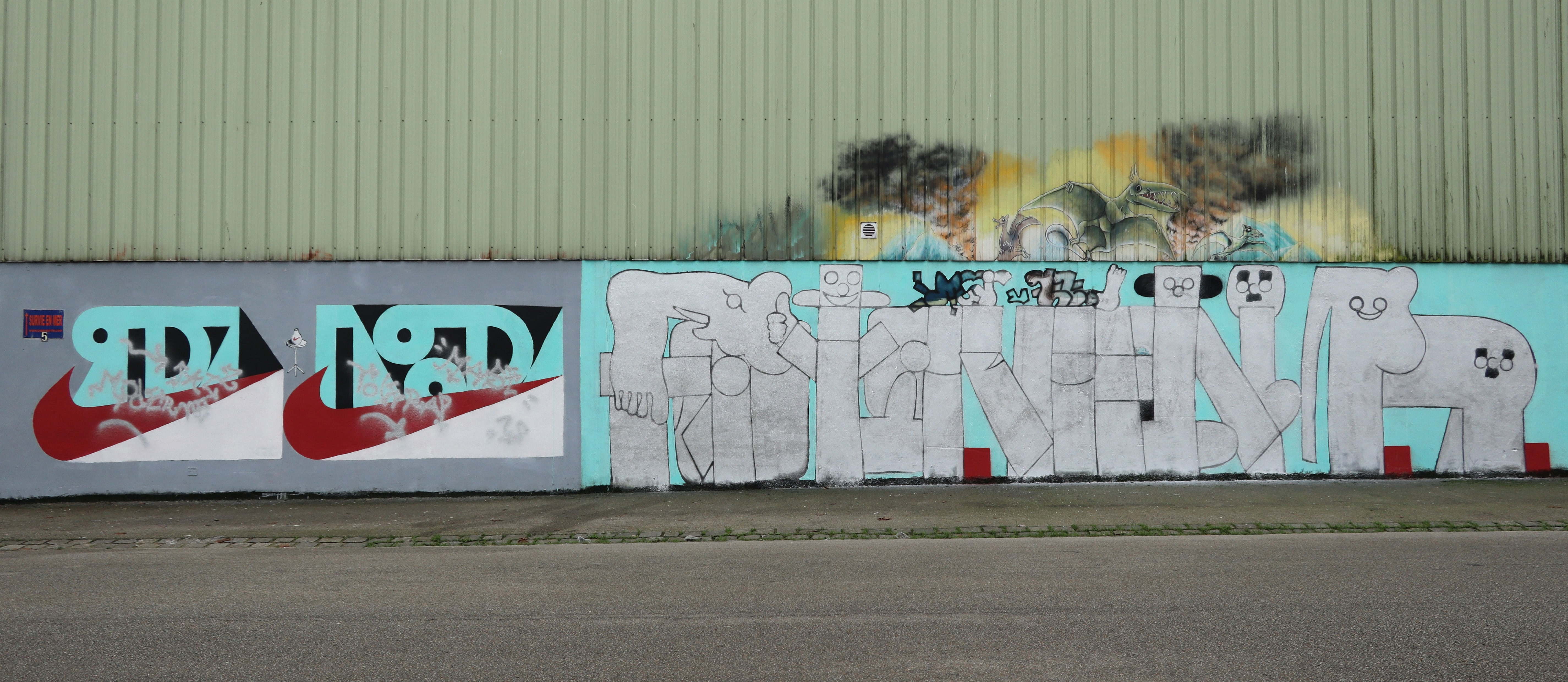
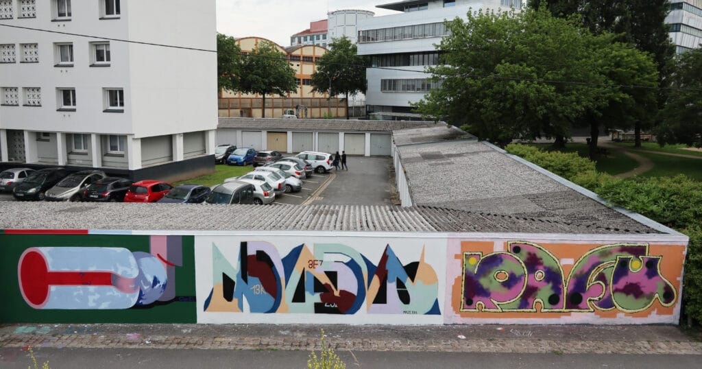
In the following years, Enroc continues to experiment and realizes many works, some partially appearing like a montage, with elements from naive painting or pop art. The composition of surfaces with patterns, abstract color gradients, figurative representation of objects like the vase, which stands for letters, or the integration of logos from our contemporary everyday life, like from Nike or Shell, form picturesque images with simply held forms and recognizable quotations from our Western culture and partly without clear, legible letters.
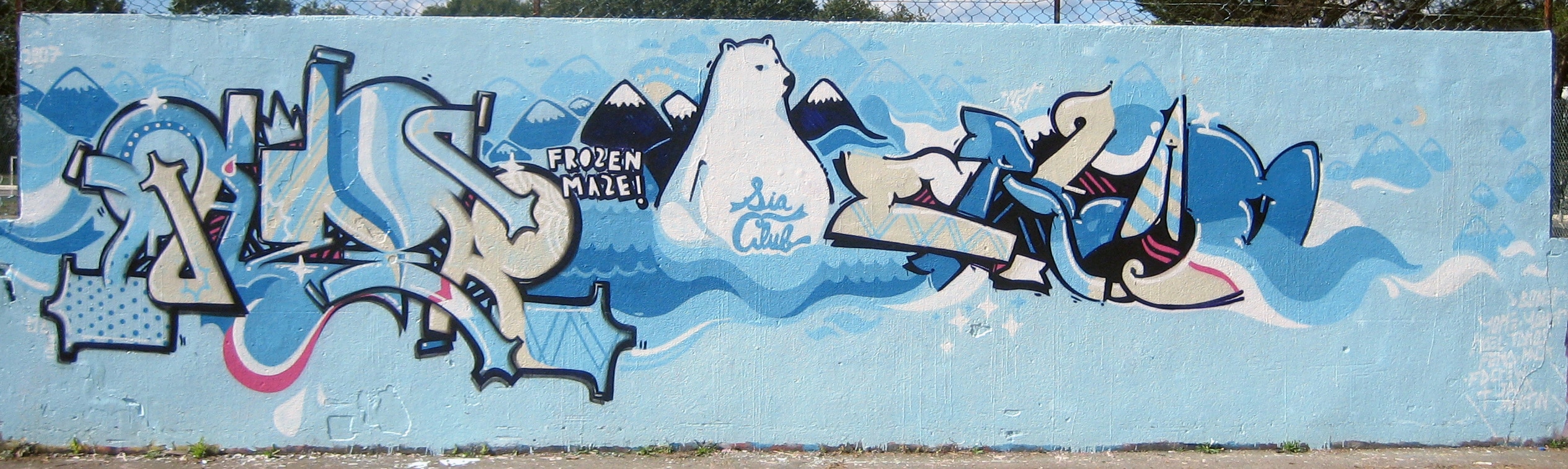
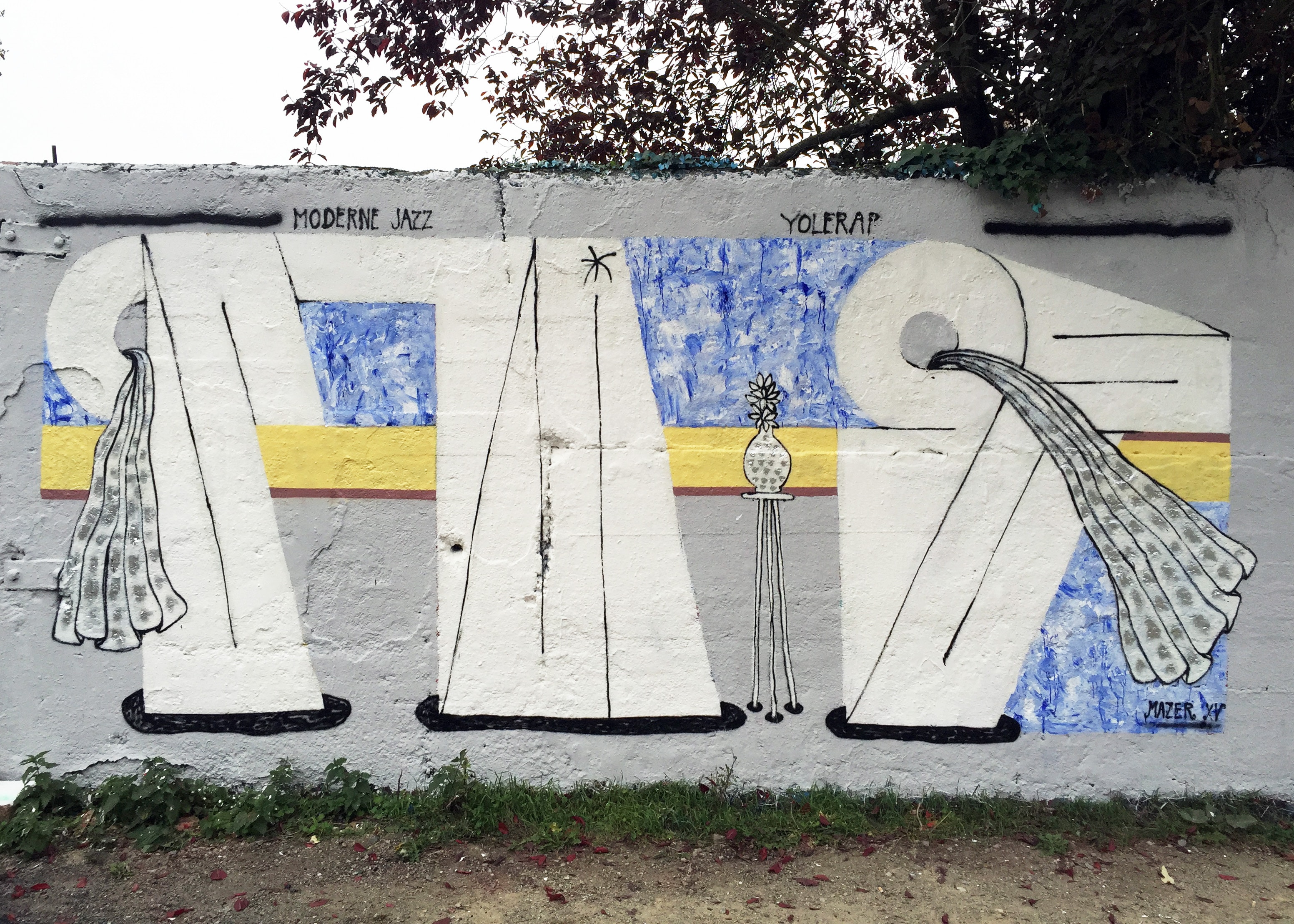
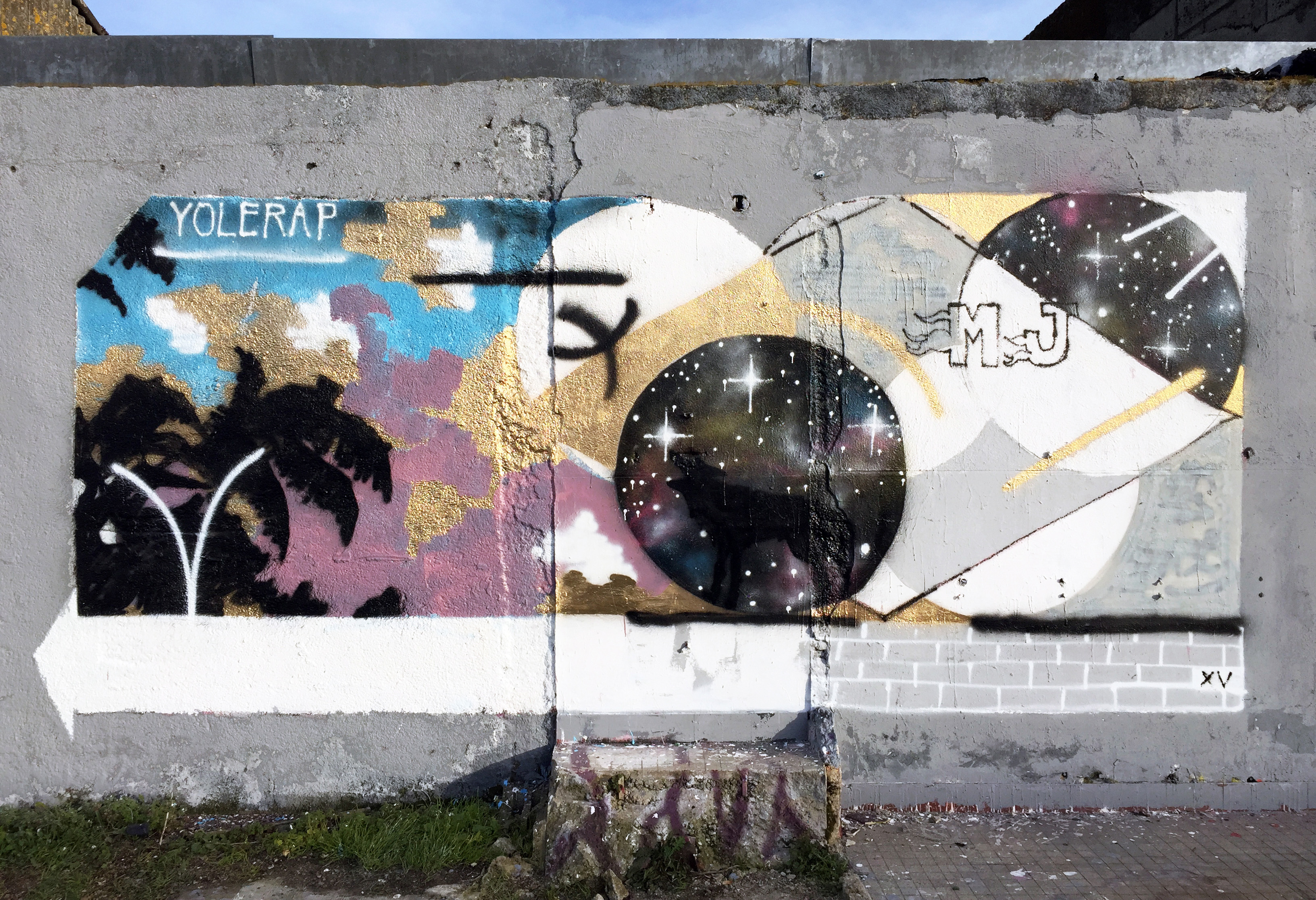
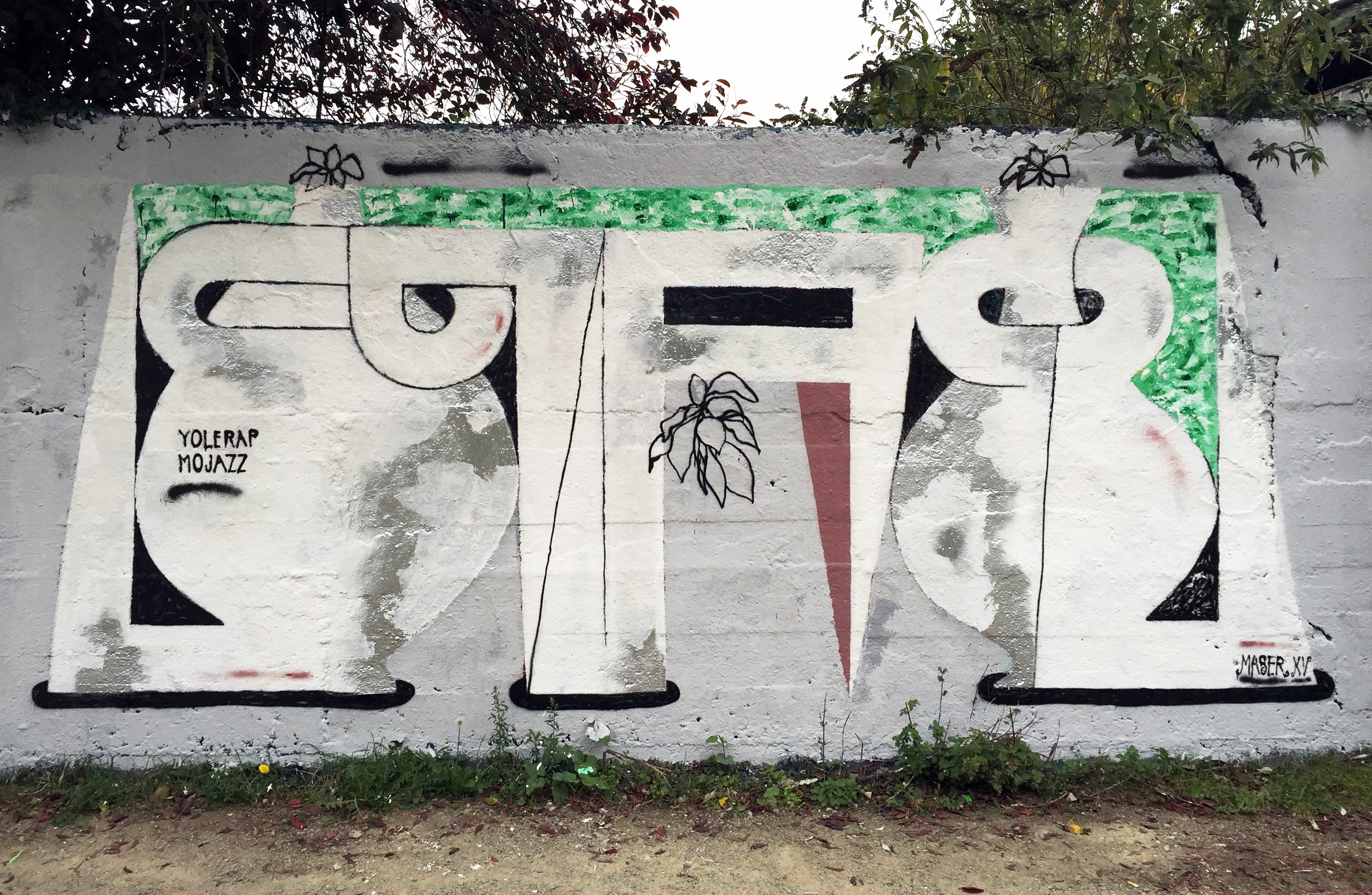
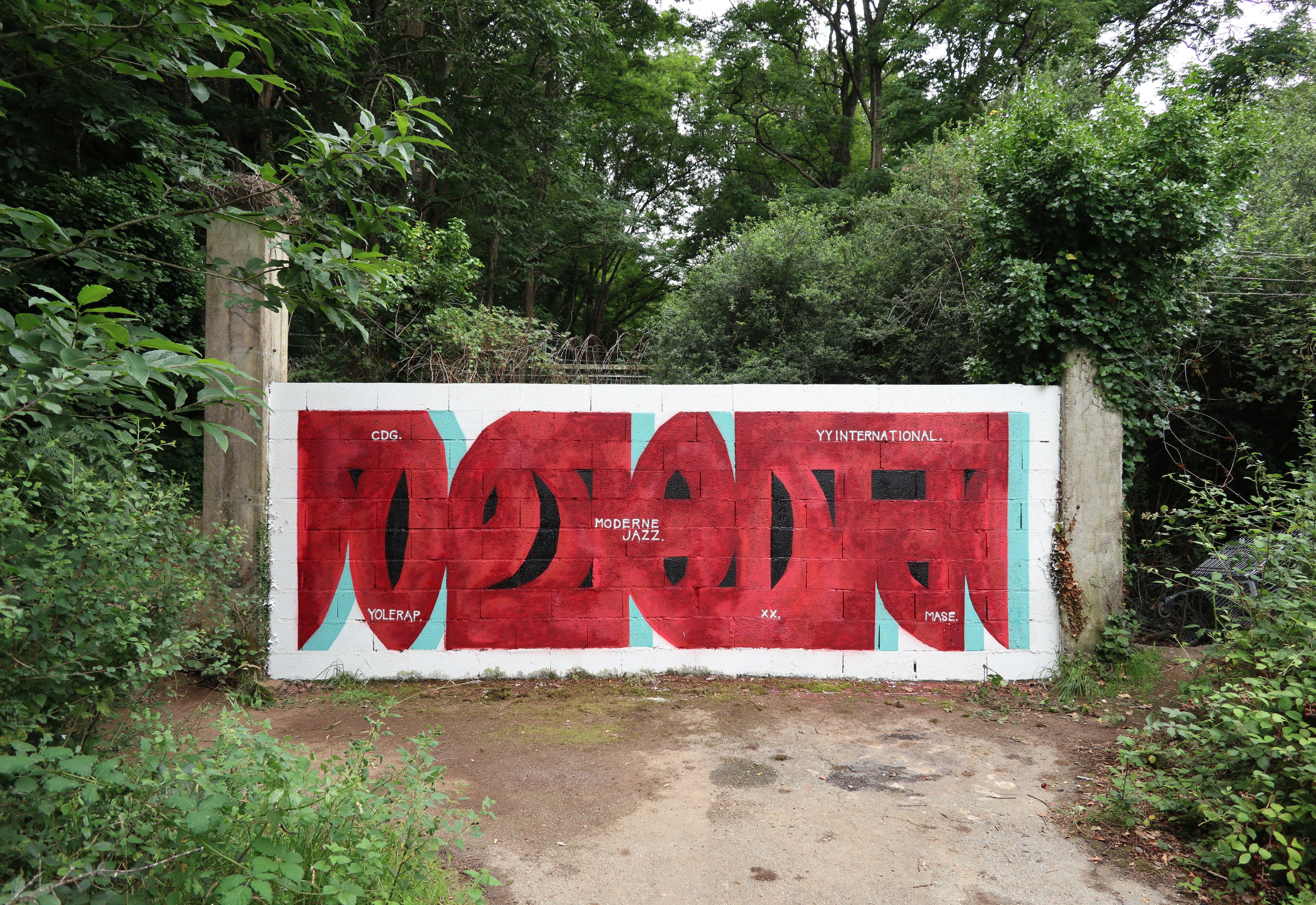
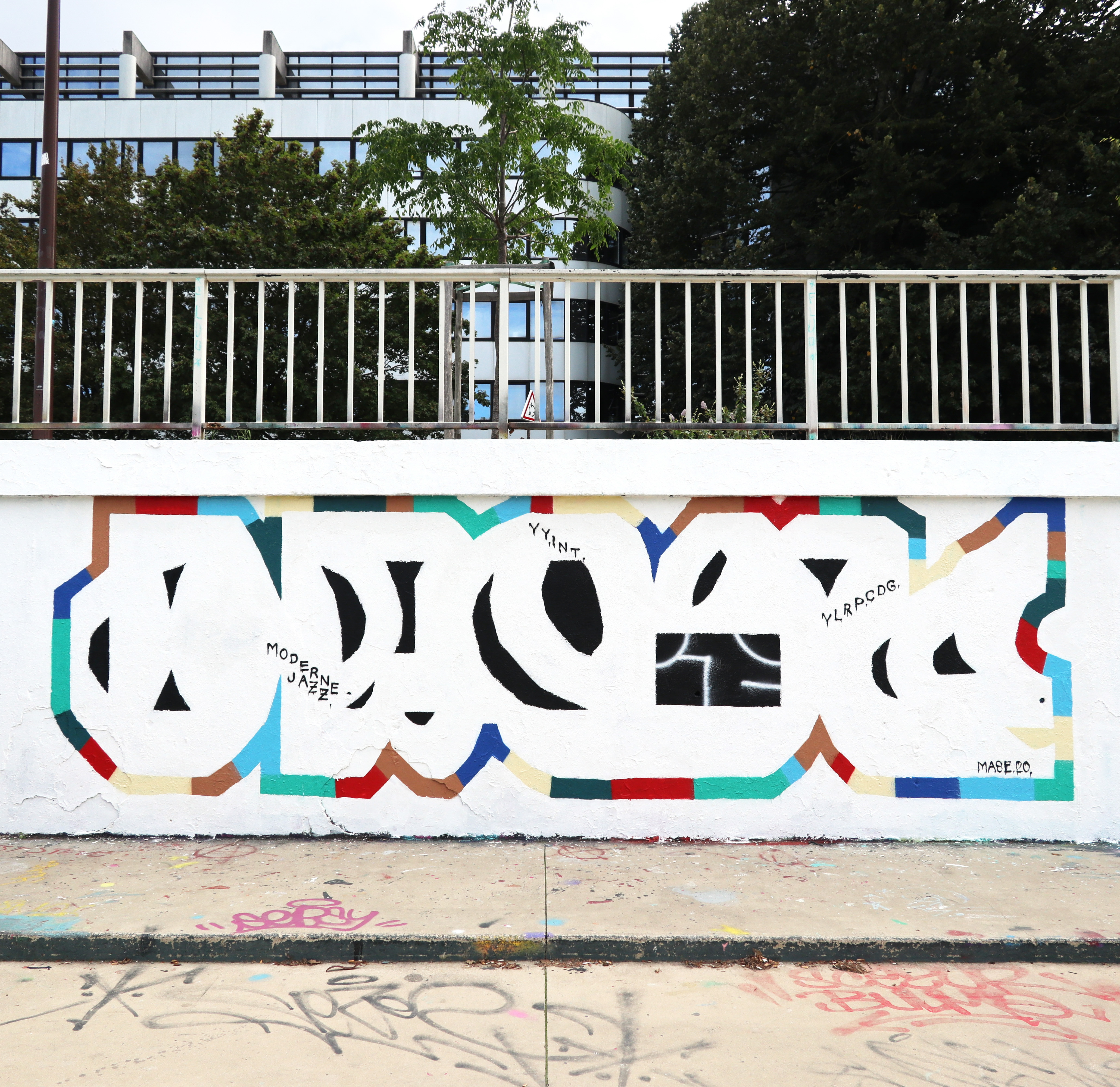
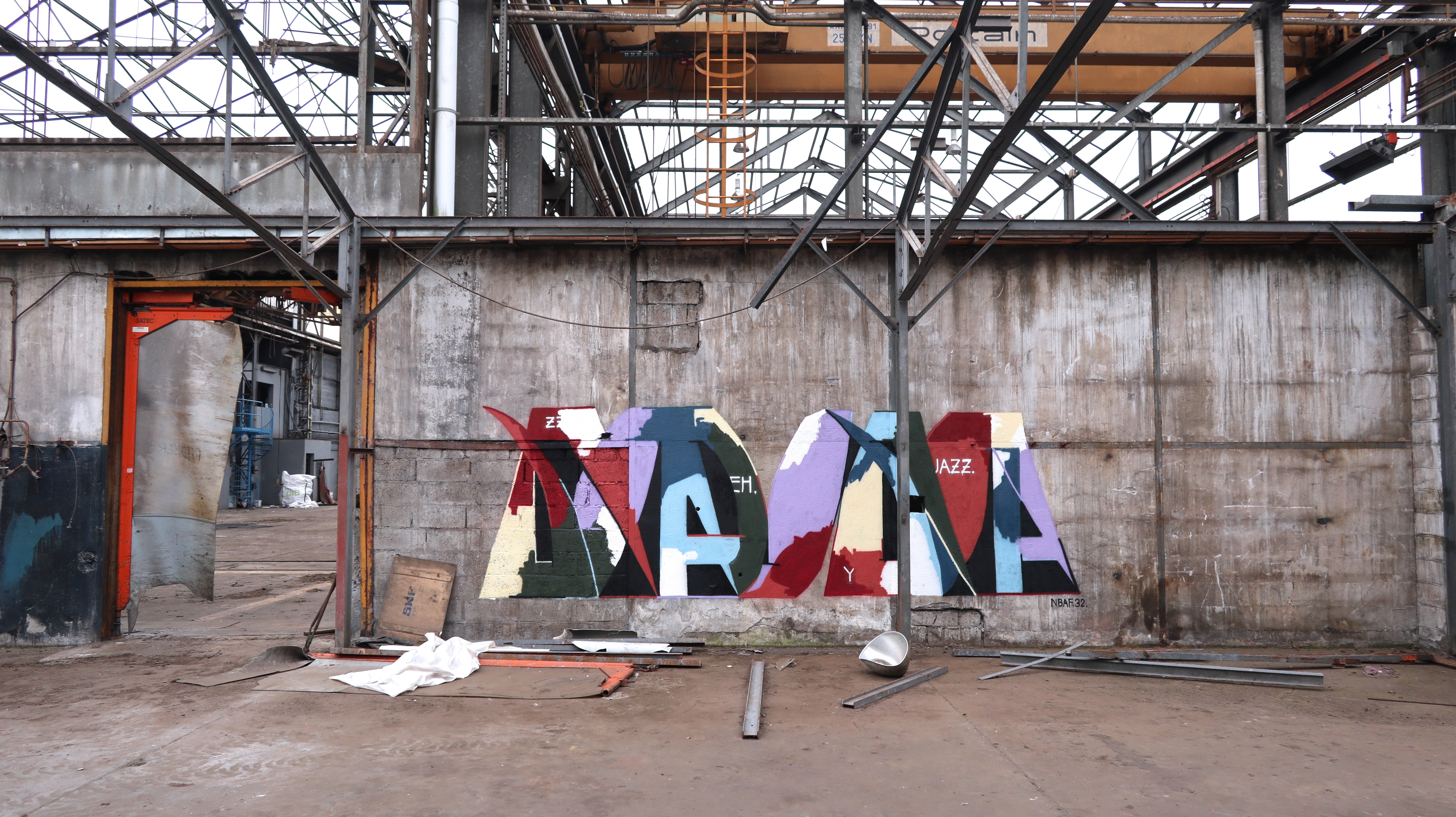
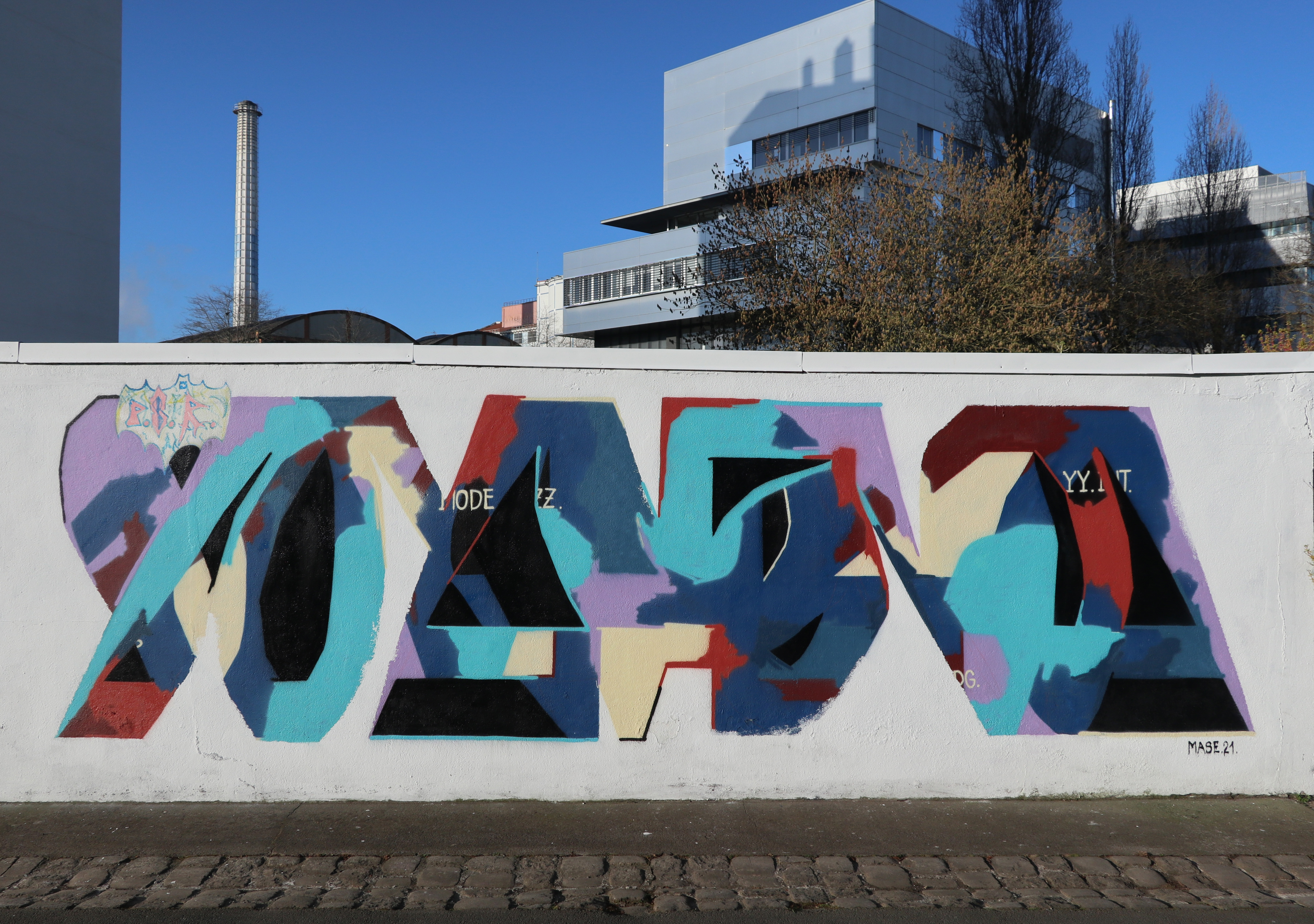
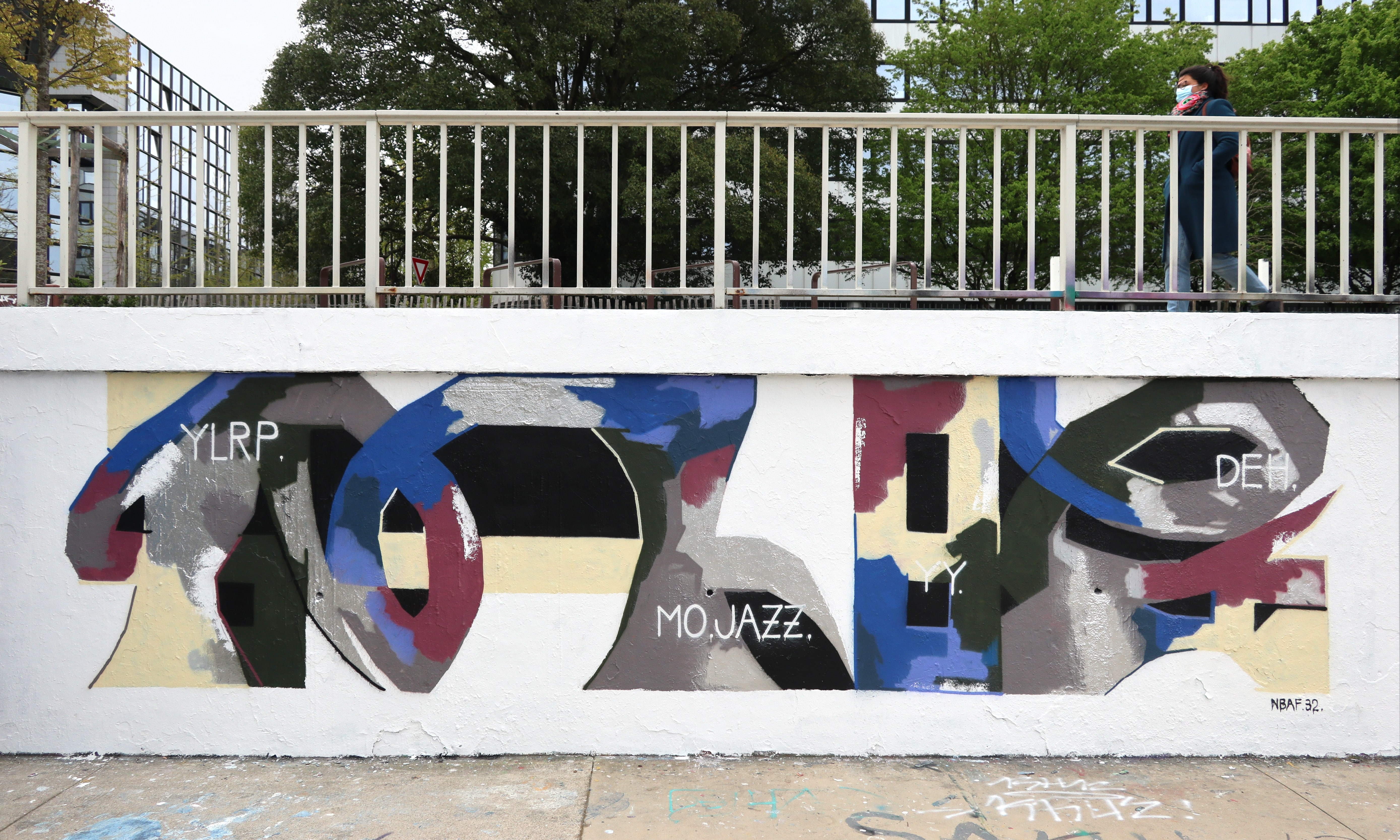
At this time, in 2015, he becomes part of the friends collective Moderne Jazz, which now has many members, and all break with the classic graffiti codes and engage in novel forms and partly abstract graffiti (GSULF, MATI, TORPEN, FRIDA, AKBAR, NOTEEN, DJOB,DUCON, OBISK, RIOT, QUENTIN CHAMBRY, JORIS GOULENOK, HAMS, OPAR, CHRIST, SOIR, L’OUTSIDER. YMMOT, YOR81, COR21, ISHEM, ELIOT, MAZE). In 2016, Enroc also becomes part of Crew YY with many other members of Moderne Jazz, and integrates a bit later the crew CDG. The mutual influence of the crew members with their diverse styles is noticeable in some, and yet each writer has developed their own unique style. According to Enroc, the works of ISHEM, GSULF and YOR81 in particular have certainly left their mark on his own creative work, which sometimes unconsciously appears in other forms in his visual language.
In 2017 Enroc developed the reduced form of a car with rectangles and circles (for the wheels.), which he used in some of his pieces. The wheels gave Enroc the idea to animate them with a software on the photo of the piece. He wanted to make them rotate and thus created his first GIF animation. Later, he achieved more animations with balls rolling along his pieces as if on a track. This new playful digital medium resulted in the creation of specially designed works on the wall: in which all the abstracted letter forms were linked together and constructed so that the ball could roll perfectly along the shapes up and down as if on a “roller coaster” in the painting.
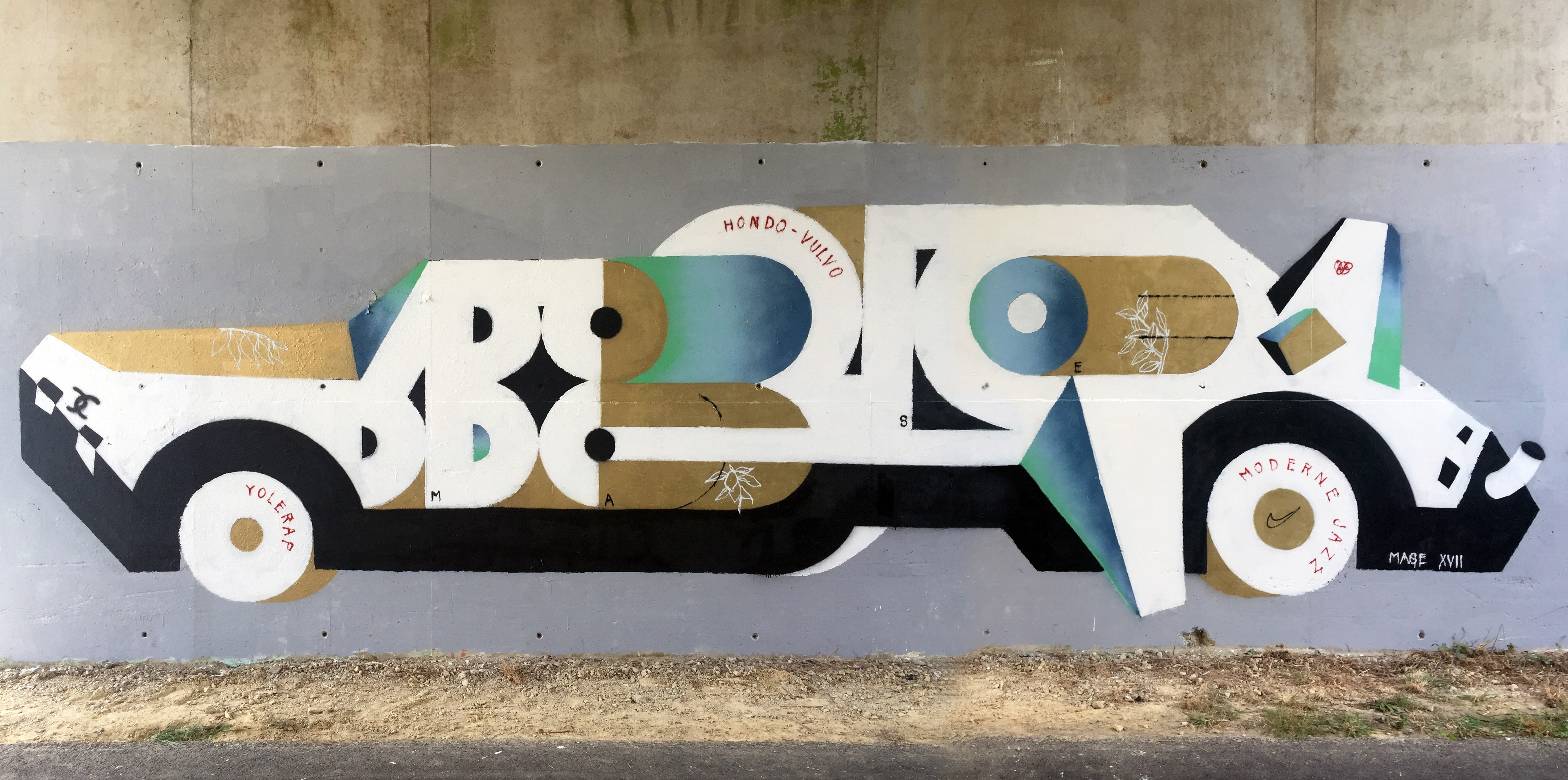
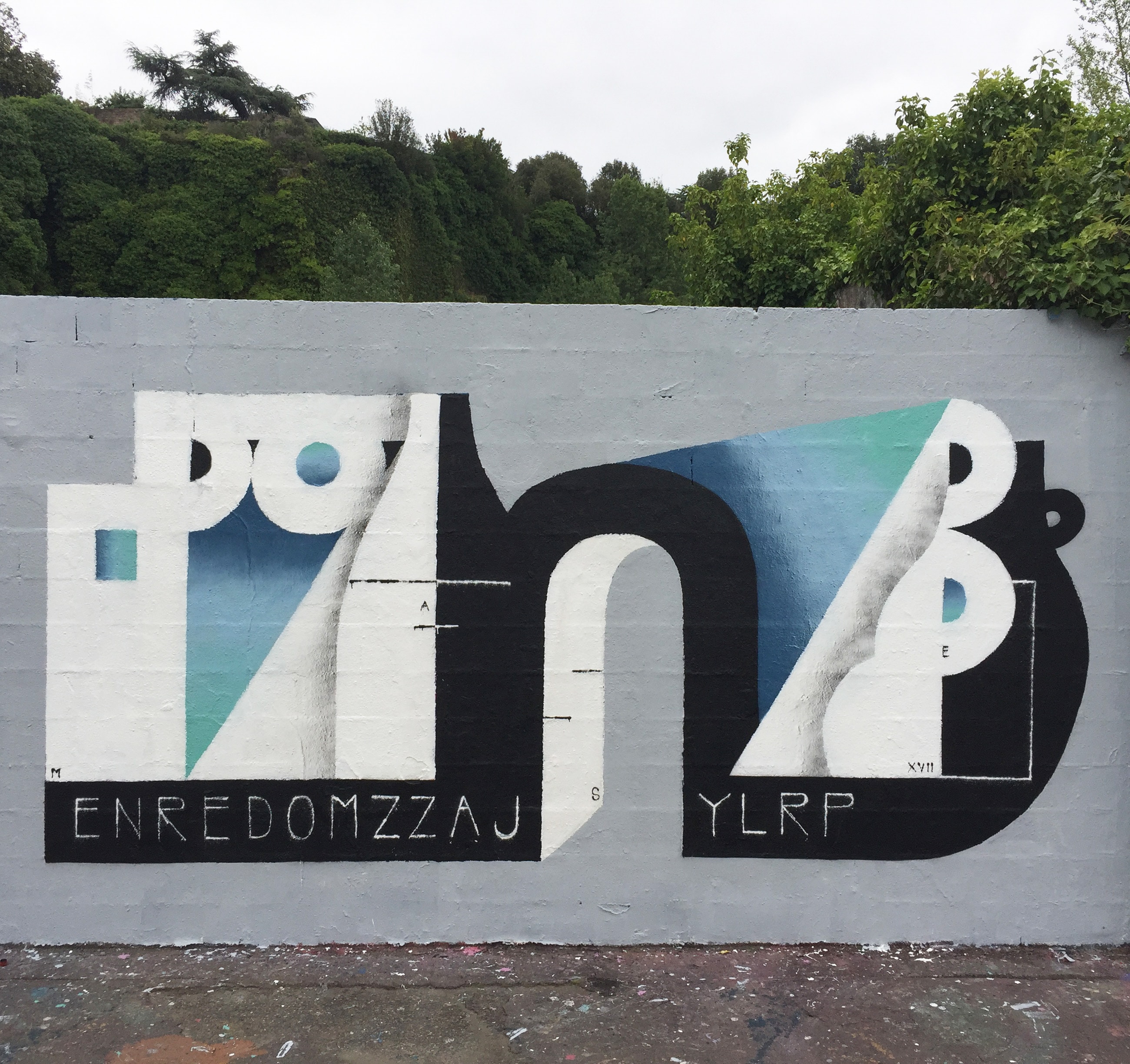
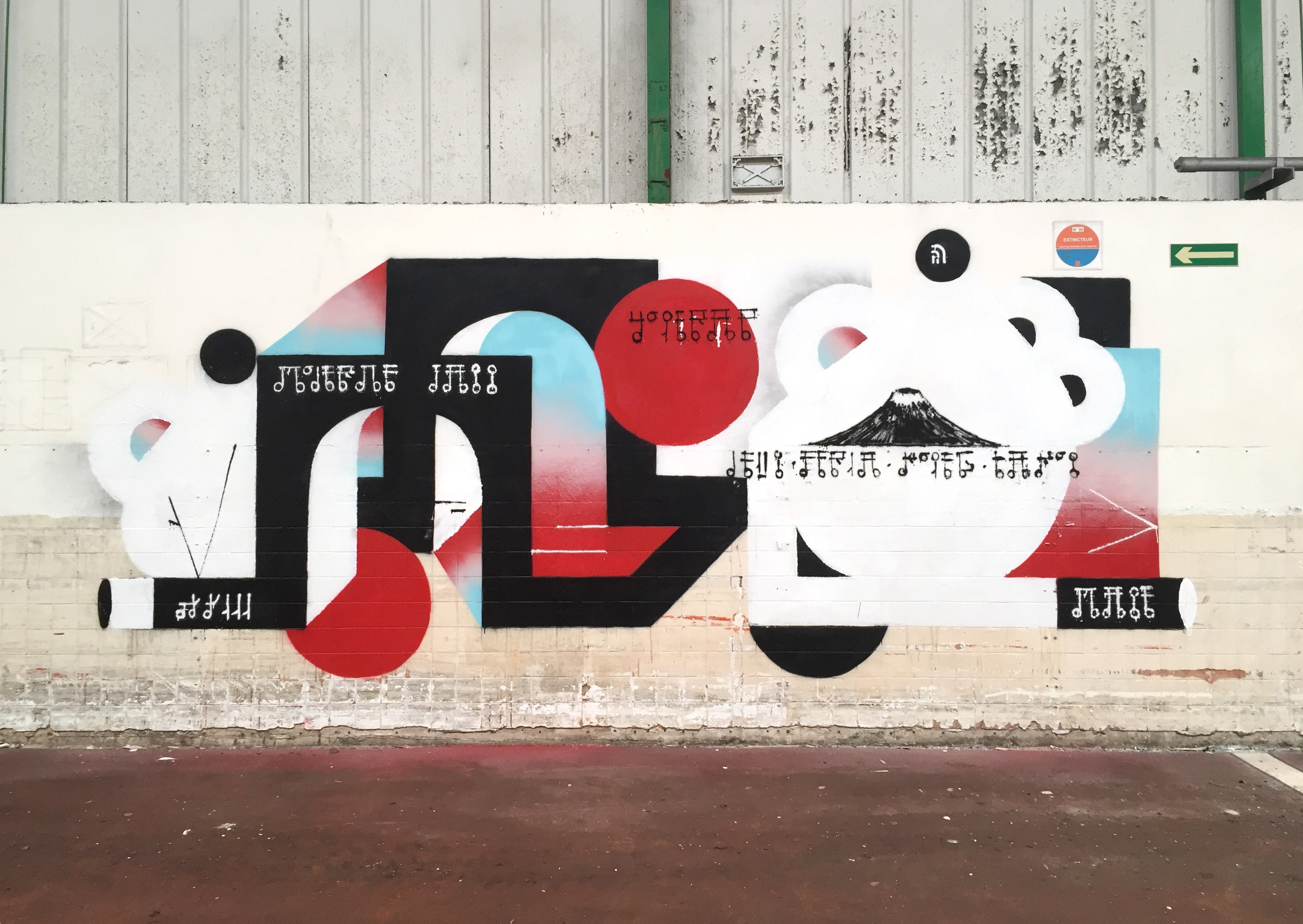

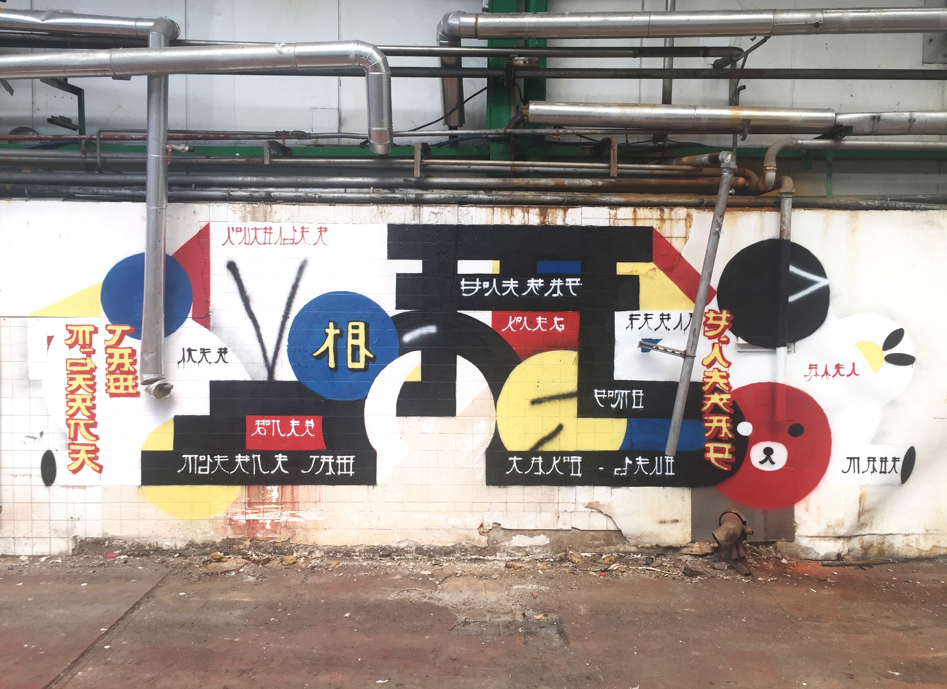
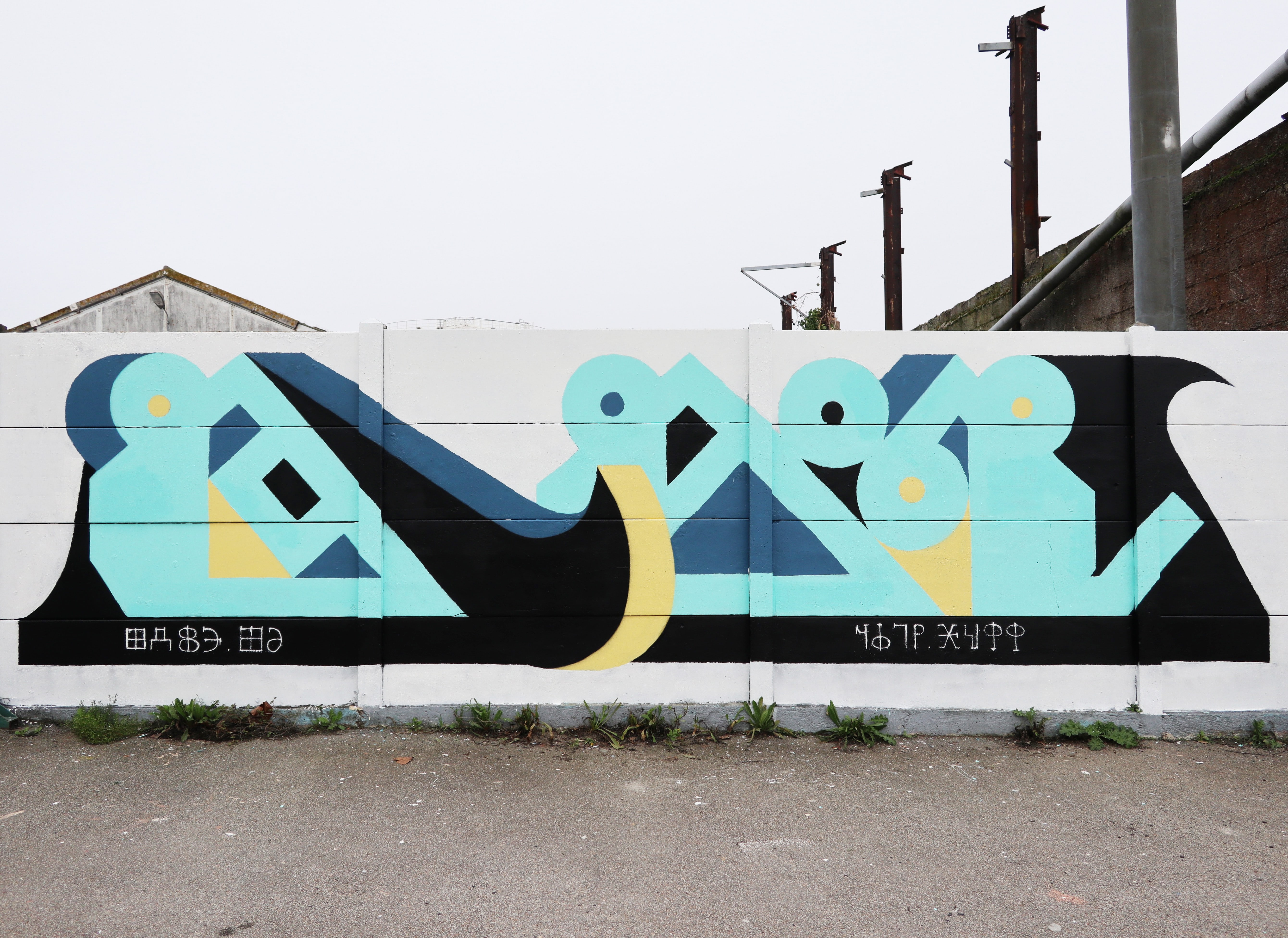
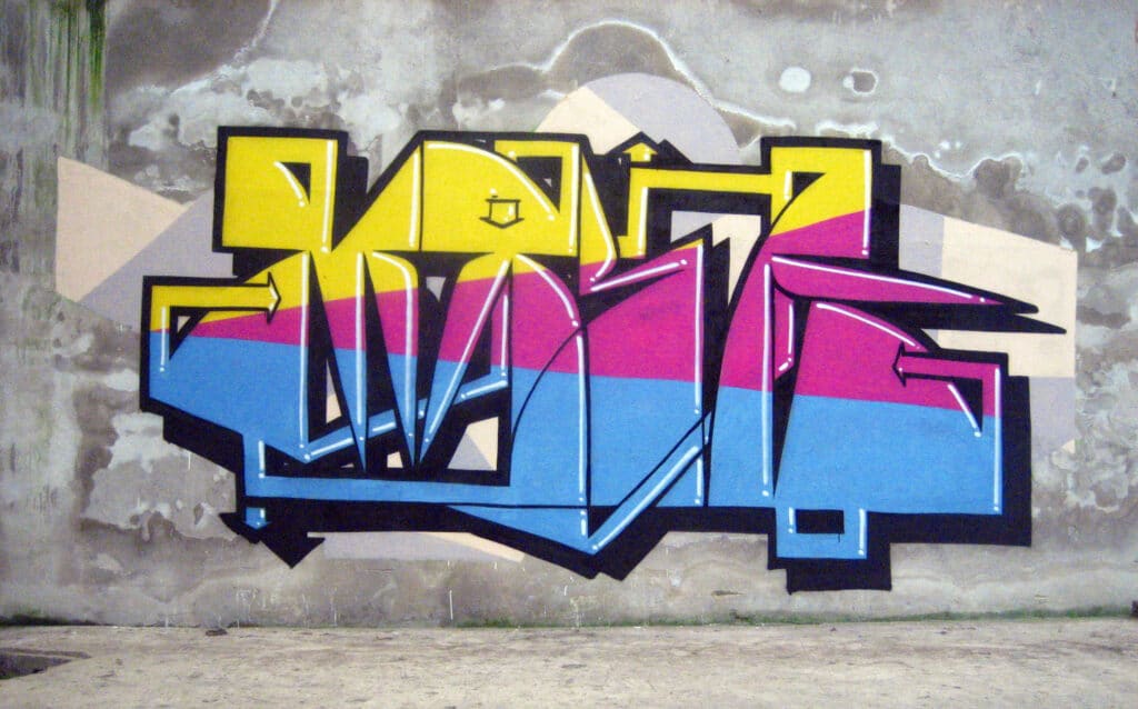
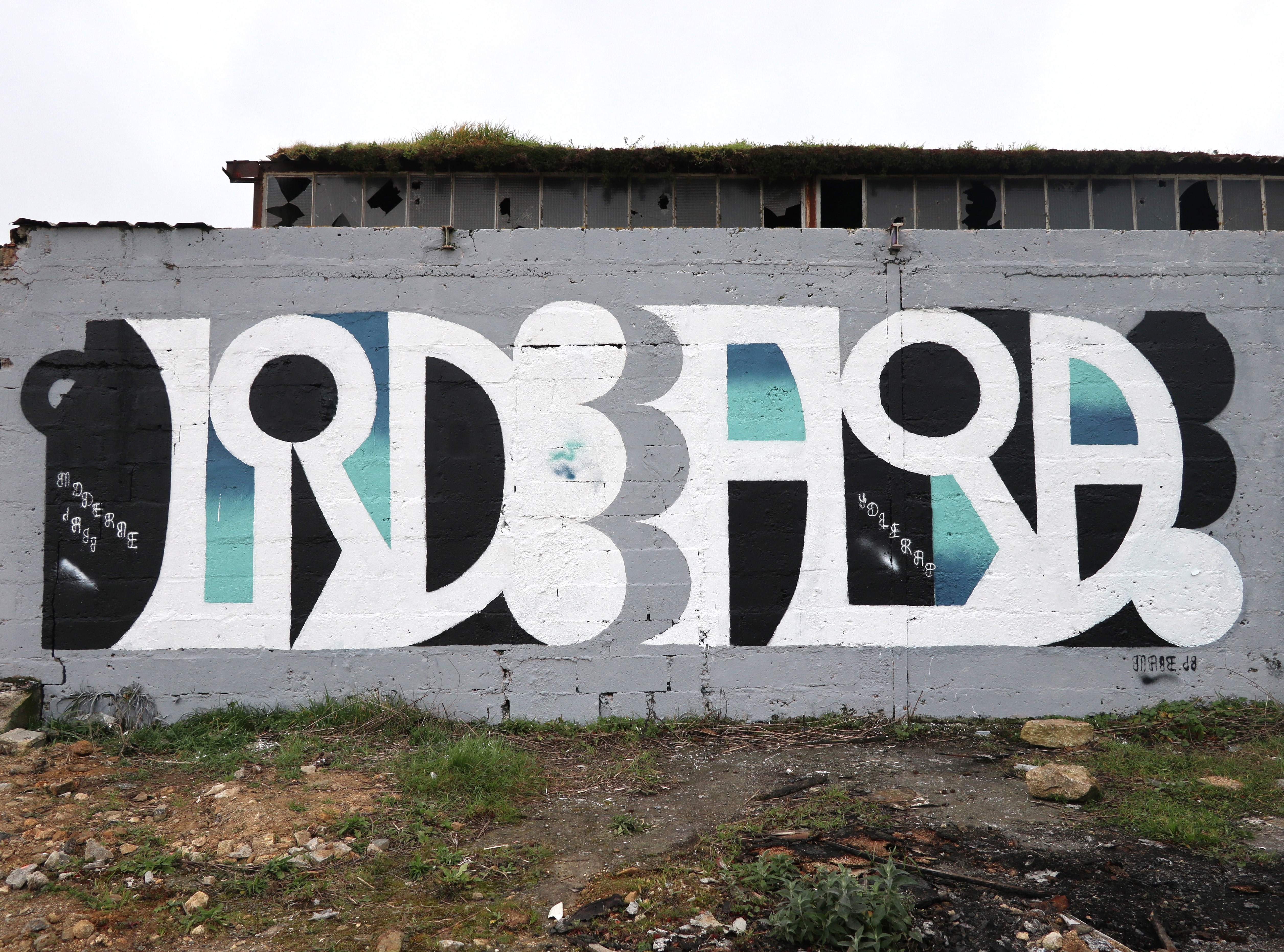
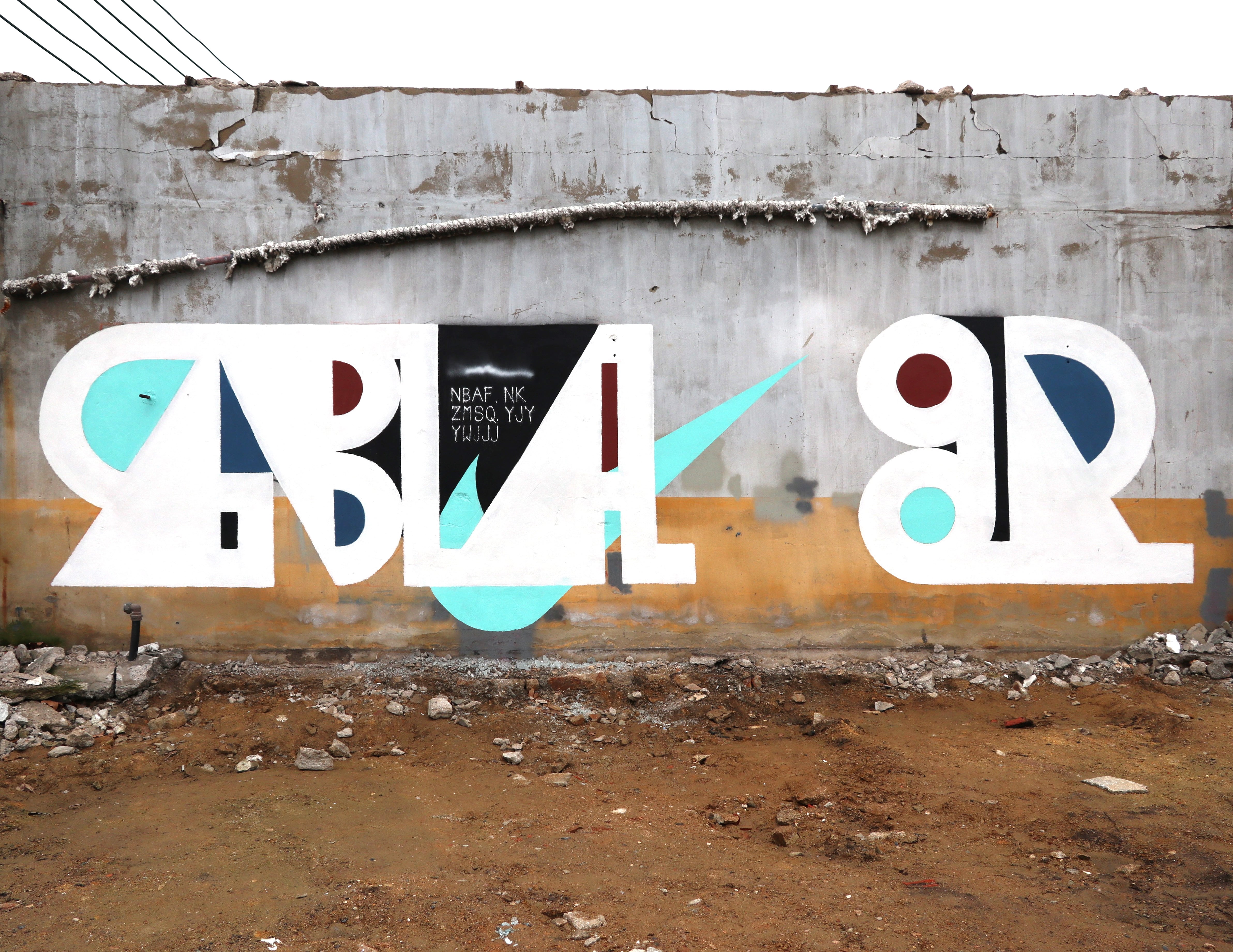
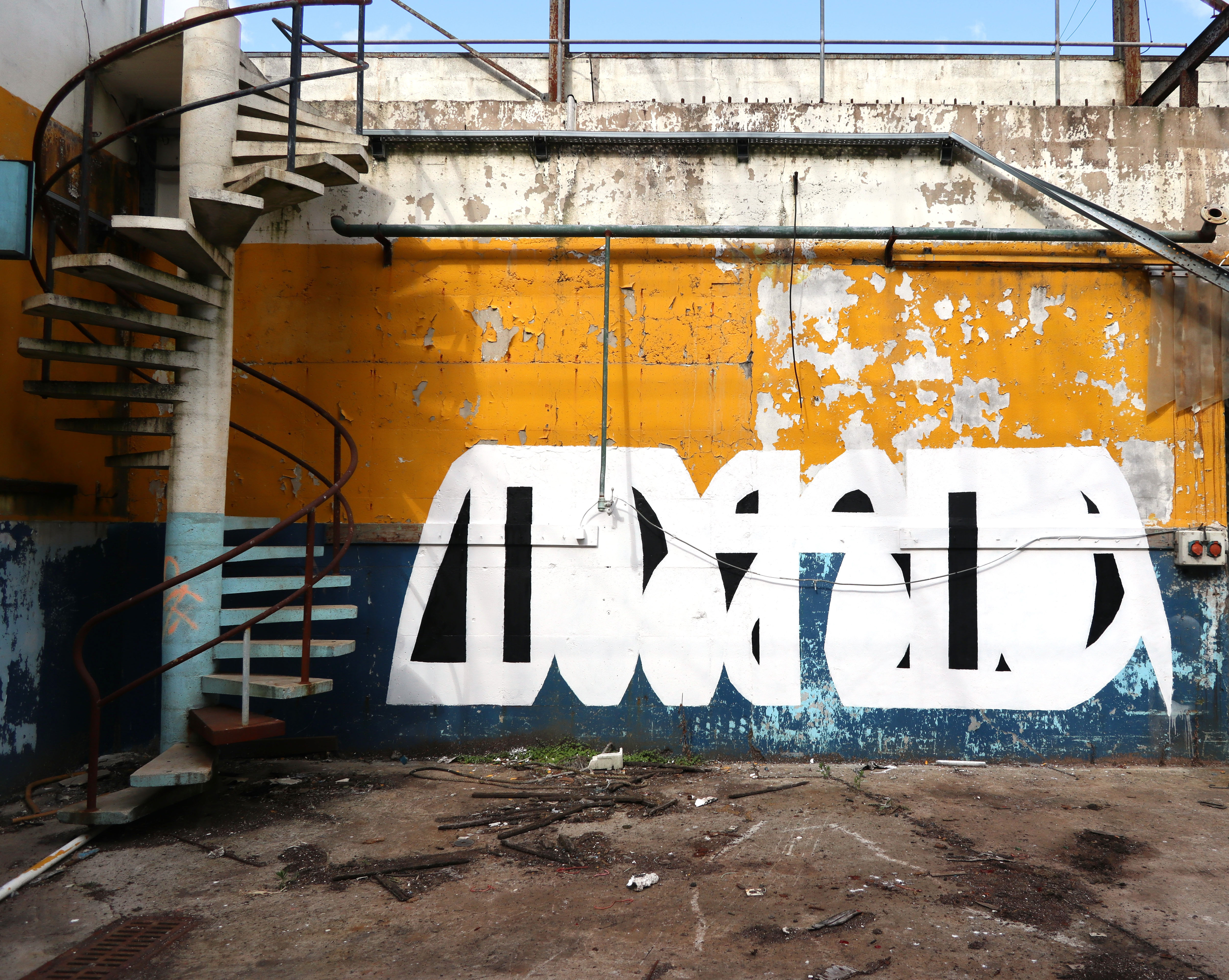
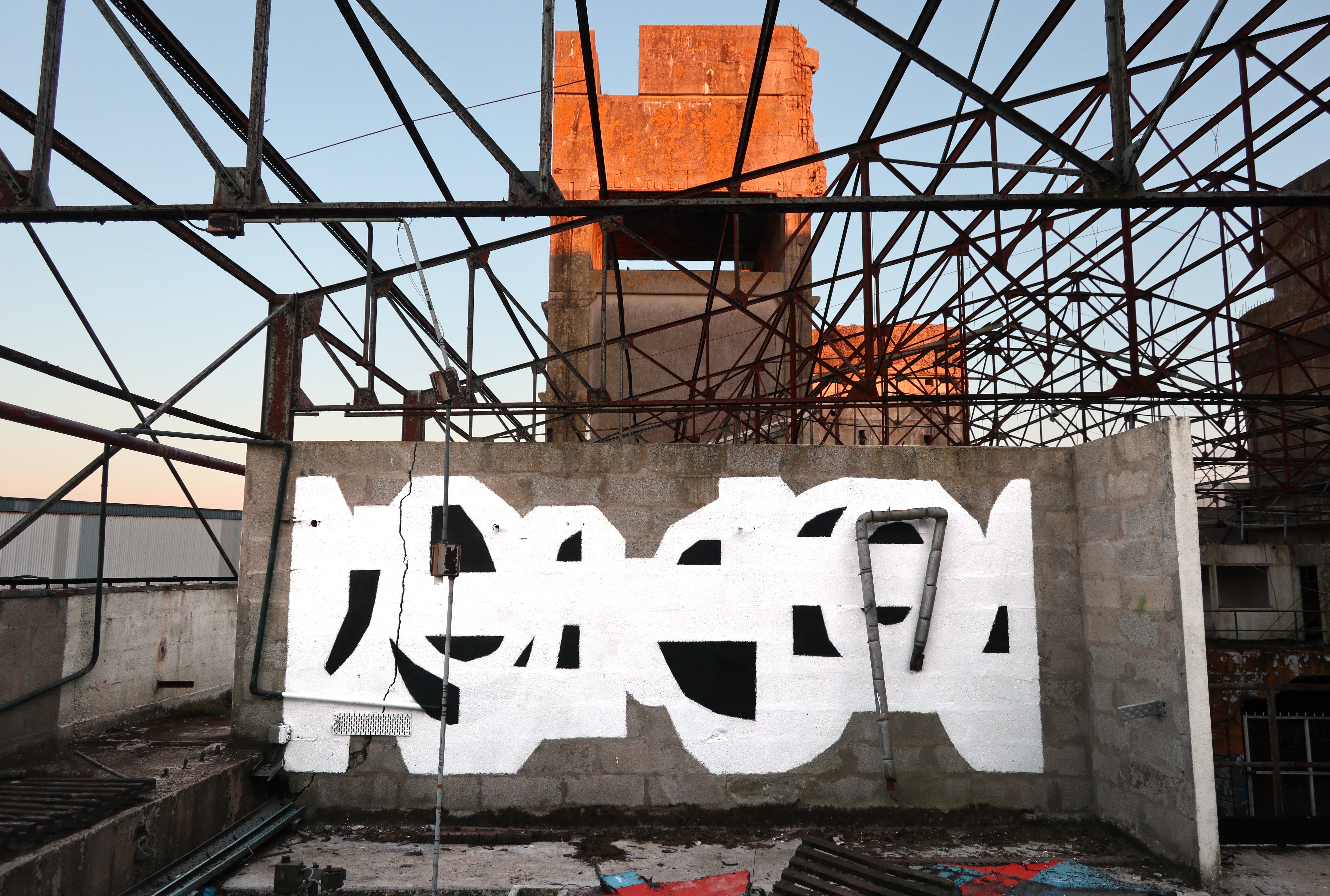
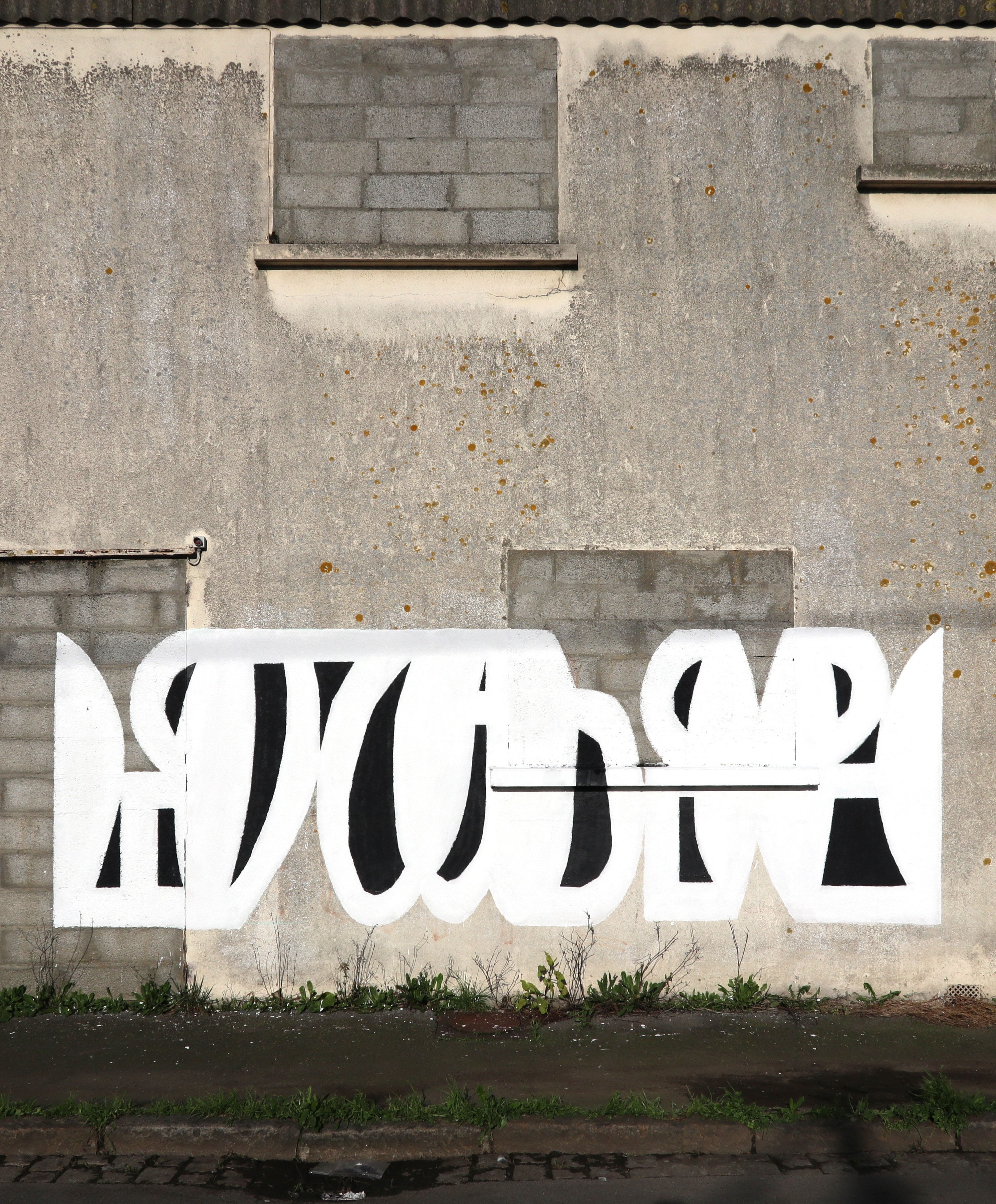
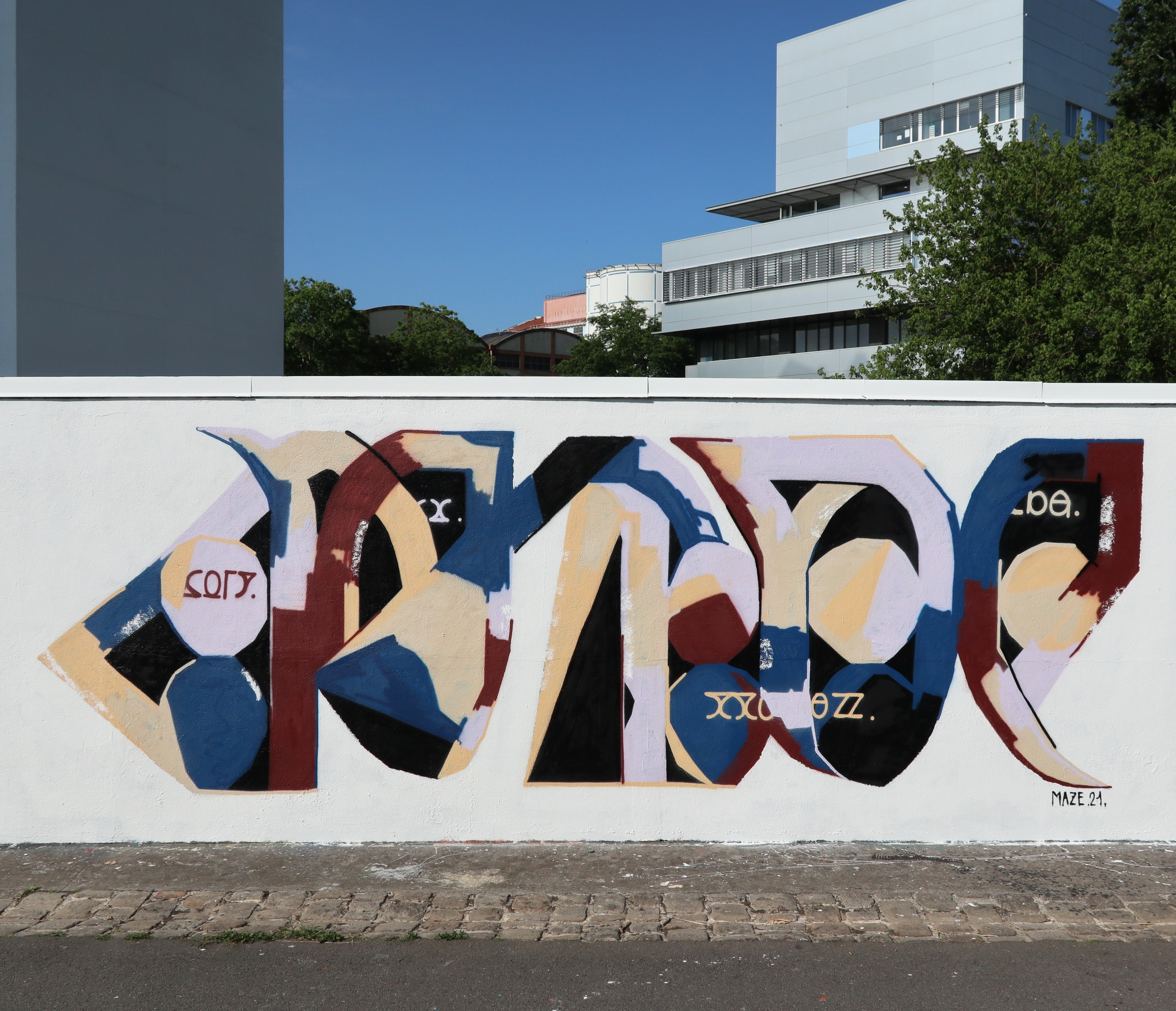
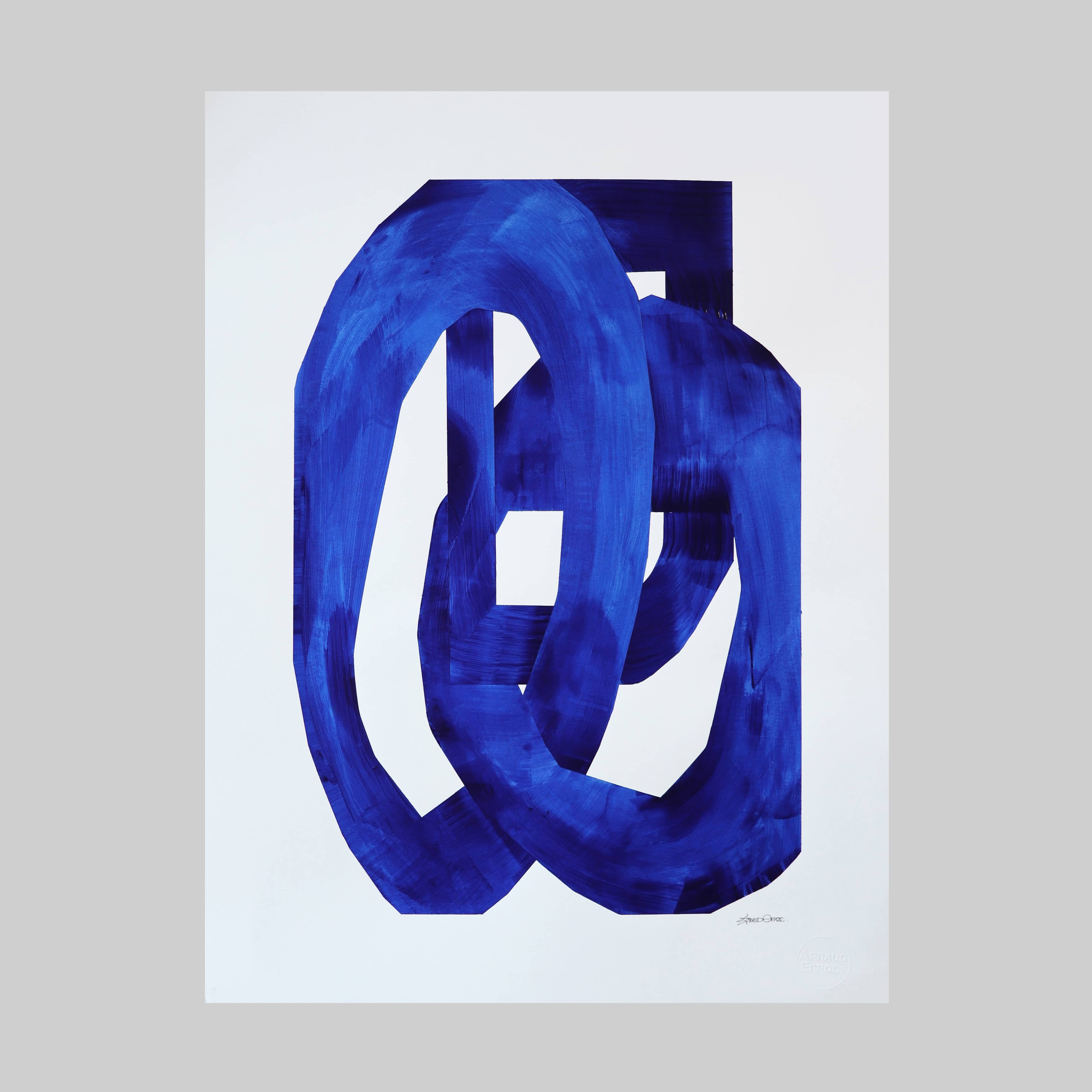
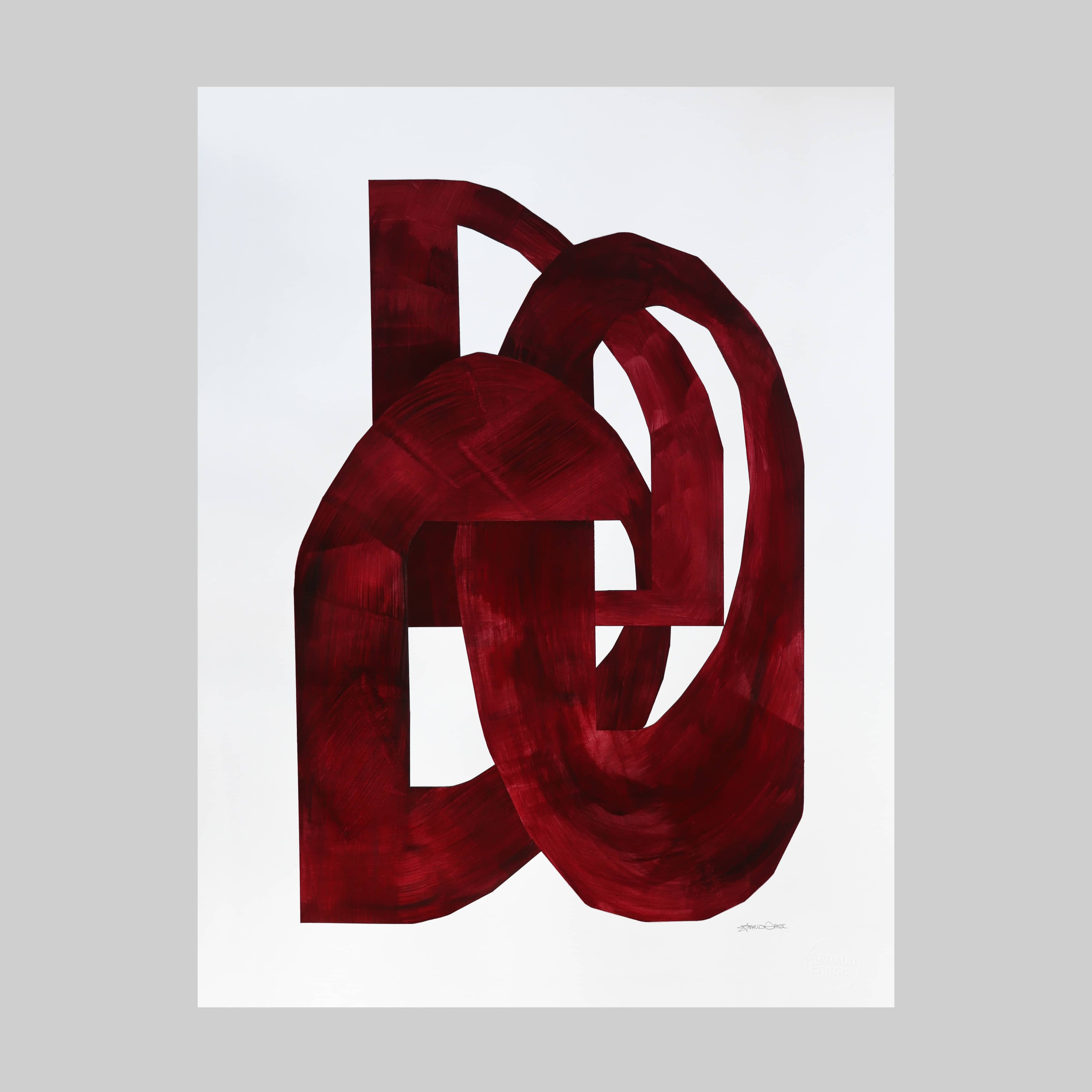
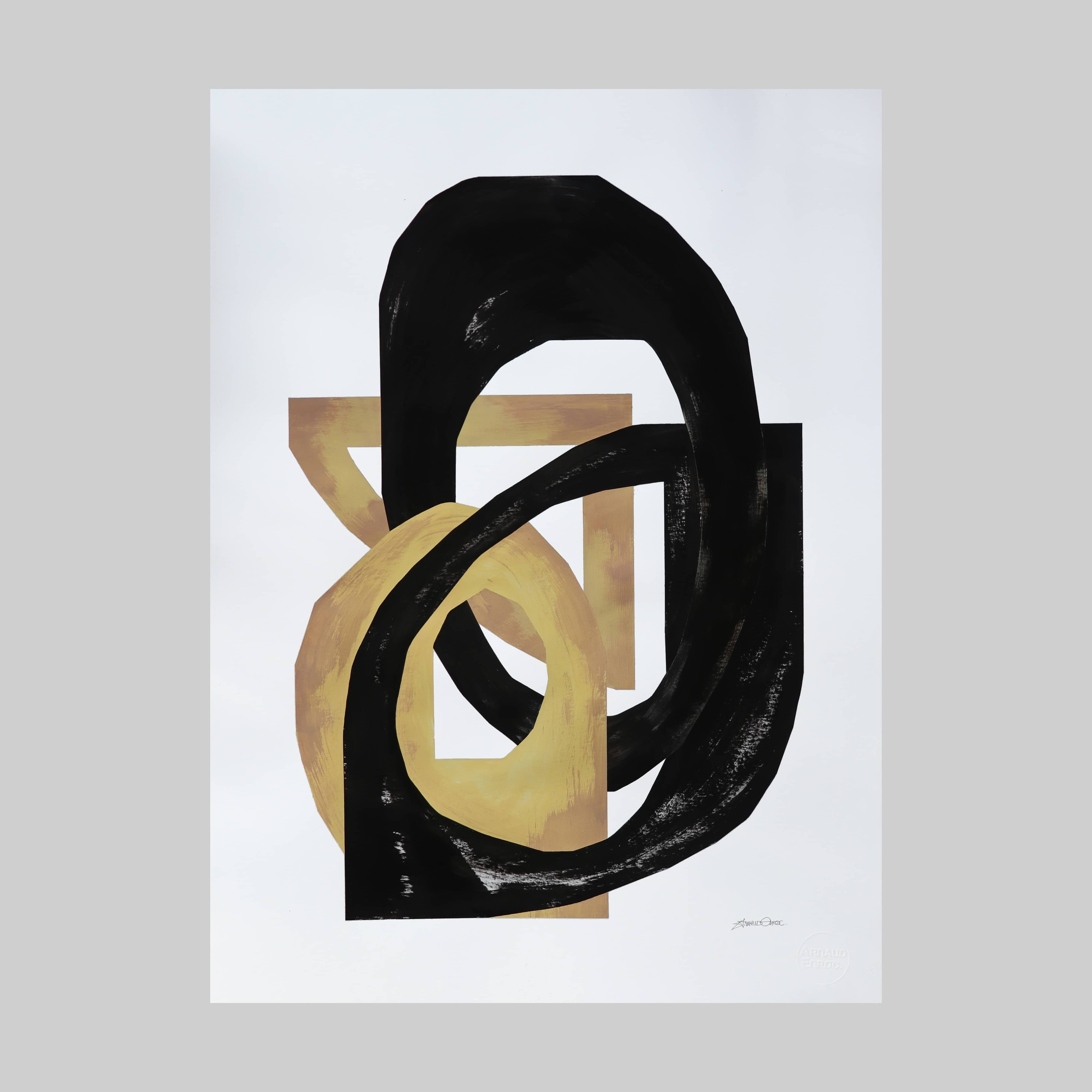
At this time, Enroc increasingly constructs his letters with geometric angular and round voluminous forms that are chained together, drawn from a single stroke as in cursive writing and barely decipherable. The play with emptiness and fullness, outer form and inner forms of the letters blur the logic and legibility of the typeface images. He also integrates into his compositions small simple printed letters, like inscriptions, like scratched graffiti, and letters from other alphabets such as the Cyrillic alphabet or Korean characters. Inscriptions and new letter forms that seem partly antique, cryptic, bizarre and in this context futuristic as well. Enroc likes to play with trace blurring and visual misdirection by using other letters for his writer’s name, such as using the next letter in the Roman alphabet of his four letters of his name for example, thus creating a new name. Since 2014 Enroc likes to integrate the Nike logo in some of his pieces. As a distinctive feature for everyone, it is used here as a pure form, which with its sweep also reminds of the typical arrow or debauchery of a letter in classic graffiti.
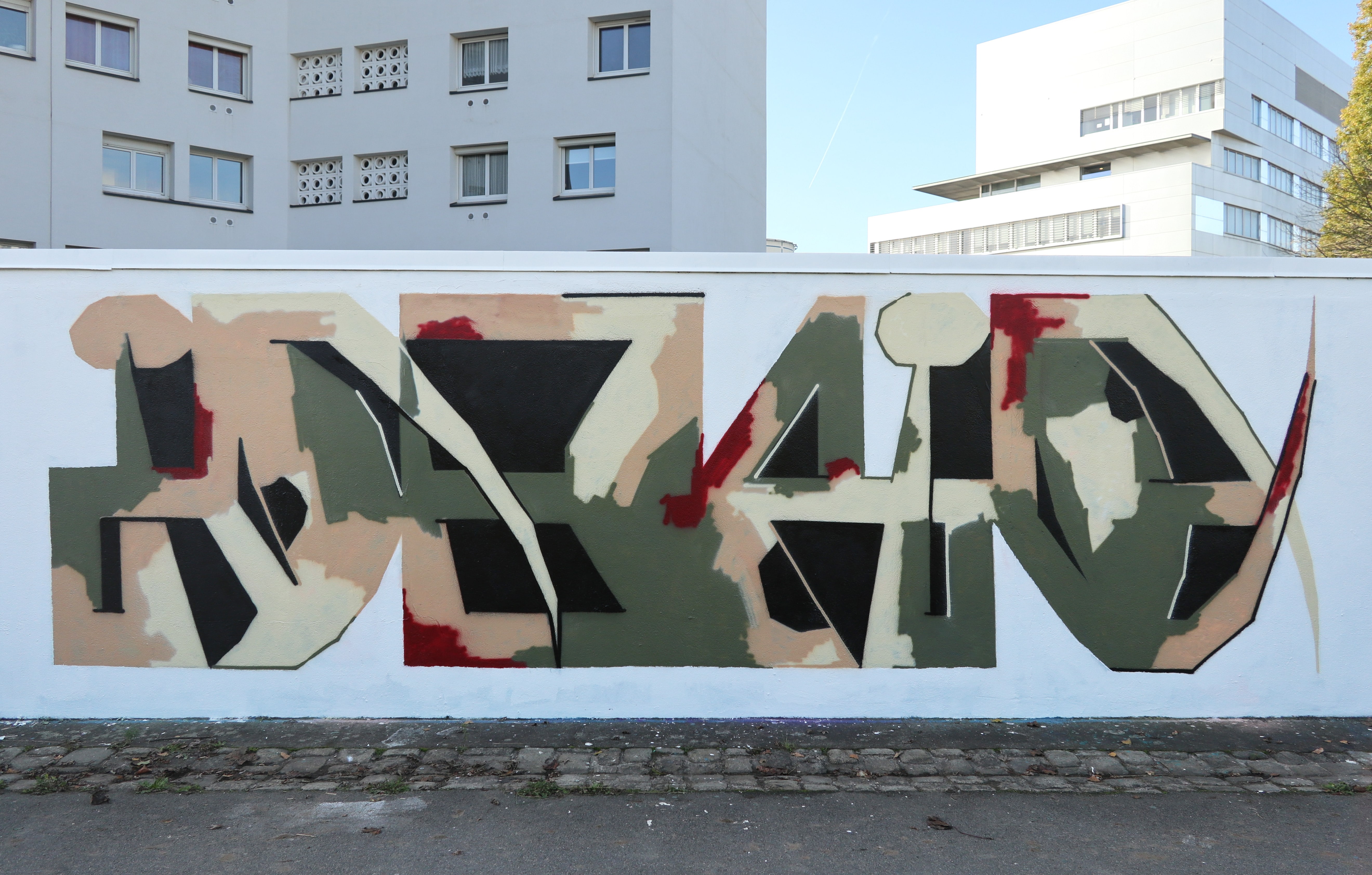
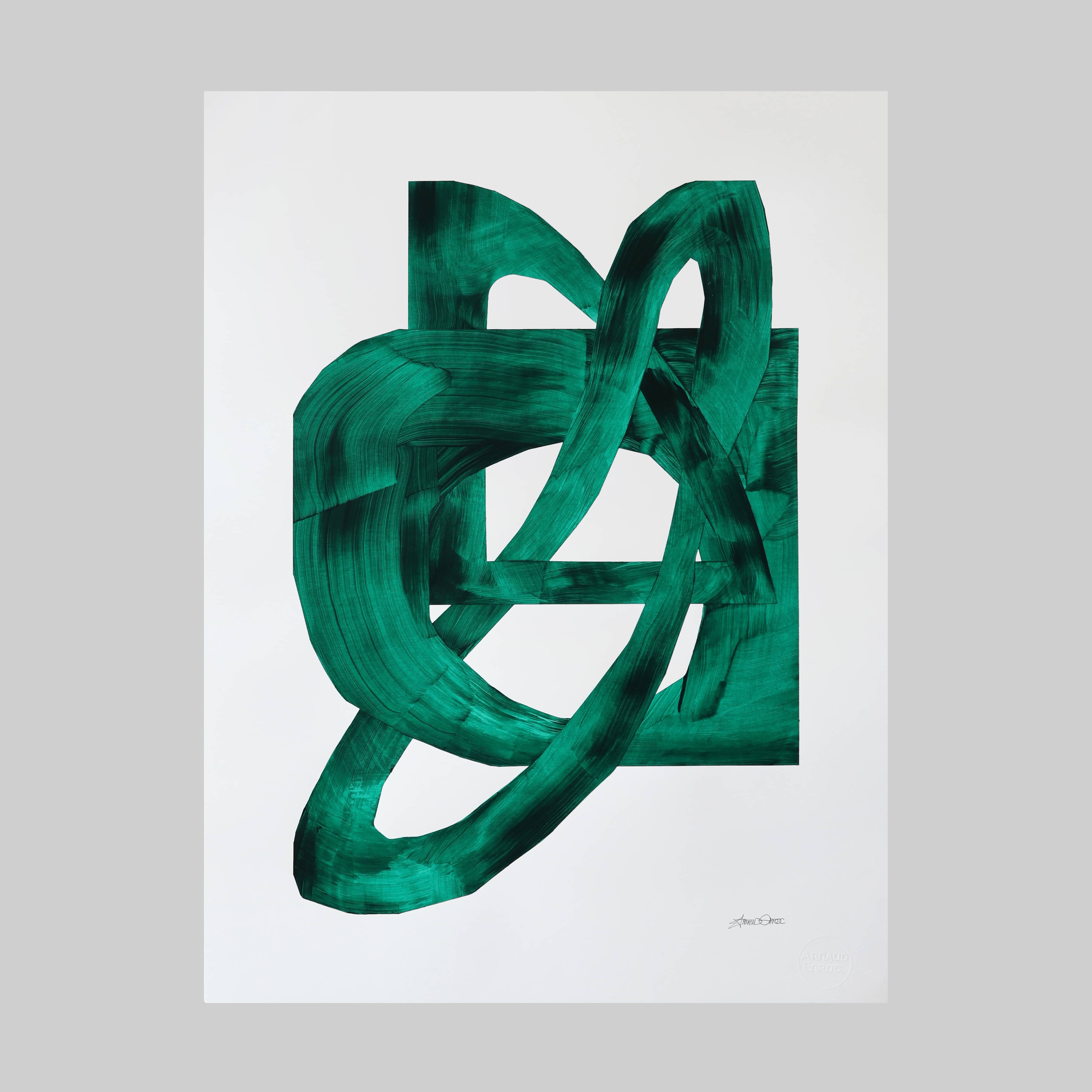
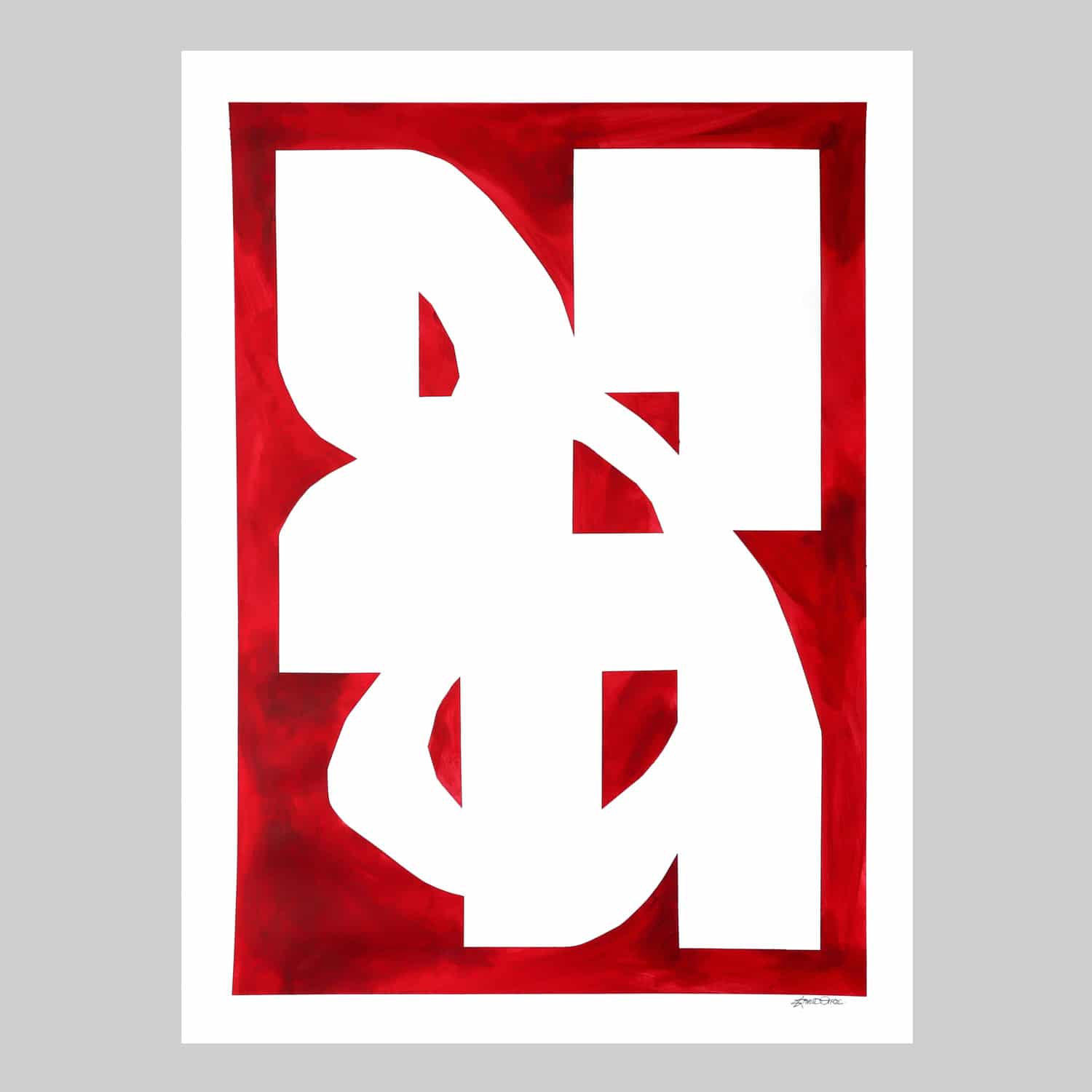
Since 2019, the forms of his letters in his pieces are more open, almost without outlines, only the inner surfaces are filled abstractly with different colors. He finds his way back to simple shapes in the style of throw ups, which he appreciates a lot with their quick, spontaneous gestures in execution. Enroc likes to work with accidents during the execution on the wall of a previously sketched piece. Because he always goes to the wall with a black and white sketch in his hand, draws a lot, on paper or even on a pad, for which he also allows his intuition and spontaneity. For his wall paintings, he has developed his own mixed media technique and works with wall paint, brushes, rollers, car paint and spray paint. He used to mix colors with a lot of white, so he often painted with pastel tones. He still appreciates Black-and-white works very much and today he is sometimes advised for the color choice from a Japanese book he owns, which suggests various color combinations of three to four colors.
Studio works: drawing and shaping
Since 2011, Enroc has been drawing regularly with acrylic paints on paper. For this, he uses thick brushes and plays with color transparencies that make the brush trace and painting gesture clearly visible. A broad line forms a straight, angular as well as round simple interconnected form, a floating form in space “written” with one line. Spontaneously, intuitively and dynamically realized, the works seem free and yet constructed, spontaneous in the finding of form, but noticeably executed with a skillful confident gesture.
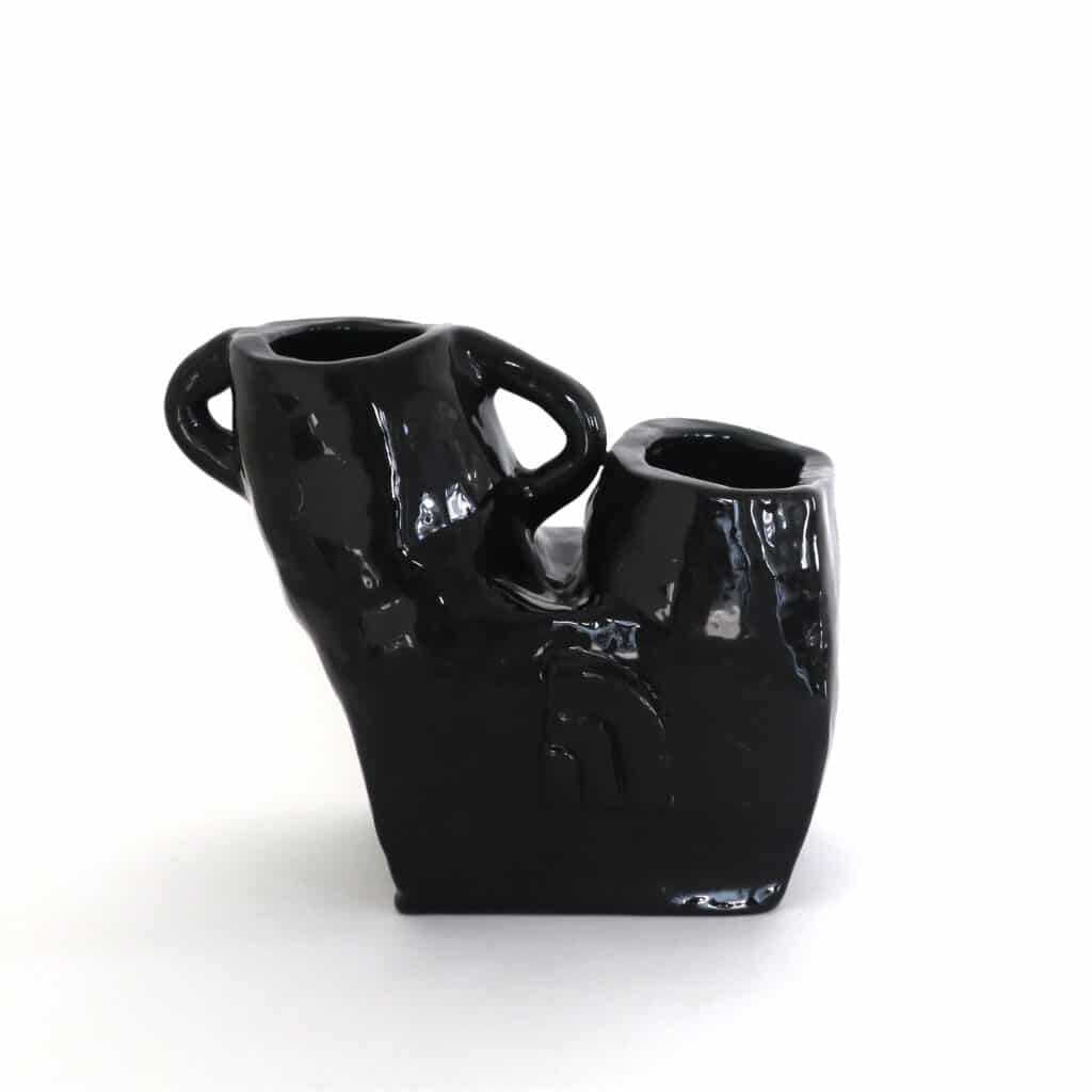
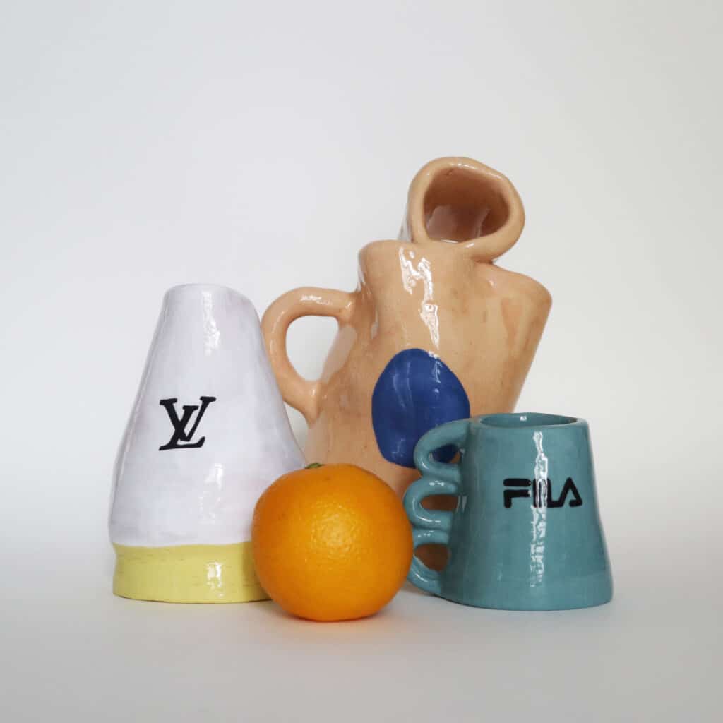
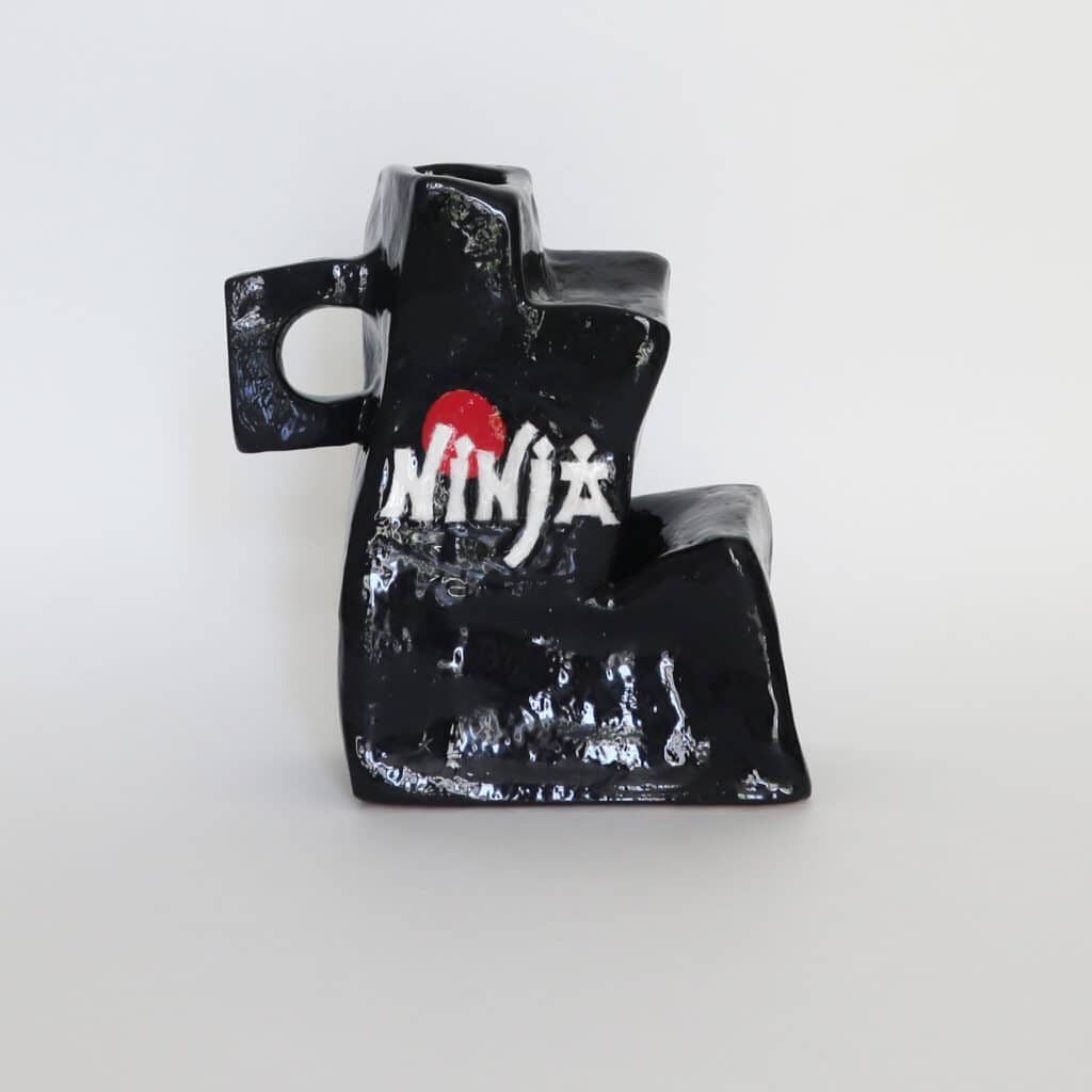
The French artist’s interest in the motif of the vase led him to work with clay and ceramic art. He wanted to create the object itself, shape it, fire it, paint it. He created small sculptures, objects that remain recognizable as a vase, through the handles, for example, and yet are deformed in their classical form, misshaped, intuitively imperfect and “childlike” depicted. Some with painted logos of Nike, YSL or Fila are dadaistically led into absurdity. Just as Enroc repeatedly breaks with classical modes of representation for his graffiti pieces, working more freely and playfully by giving space to intuition and following it, he also uses this very same attitude to create his studio works.


Leave a Reply