

A childhood surrounded by bilingualism and a creative grandfather
Remi ROUGH was born in 1971 in London Bridge, South East London and grew up in different areas of South London such as Clapham and Streatham. His mother was half French and half Italian and his father was Welsh, but spoke fluent Italian. Both of his parents came from working class families. As a child, Remi used to draw all the time. His mother used to tell him that when he was around 6 or 7 years old, he drew a combine harvester verbatim even though he had never seen one. Drawing was a way of locking himself in, entering his own little world. Within his family, his grandfather was the creative input. He drew and designed things and also had a kiln in the basement of their house, where he used to fire nice ceramics and pots. He was also very computer literate, would design websites and used a Radio Shack computer. He was doing CAD drawings when Remi was around 10 years old and bought him his first Apple Mac when he was about 16 years old. His grandmother’s brother, Antonio Pacitti, was a painter and a potter and he taught Remi how to stretch canvas.
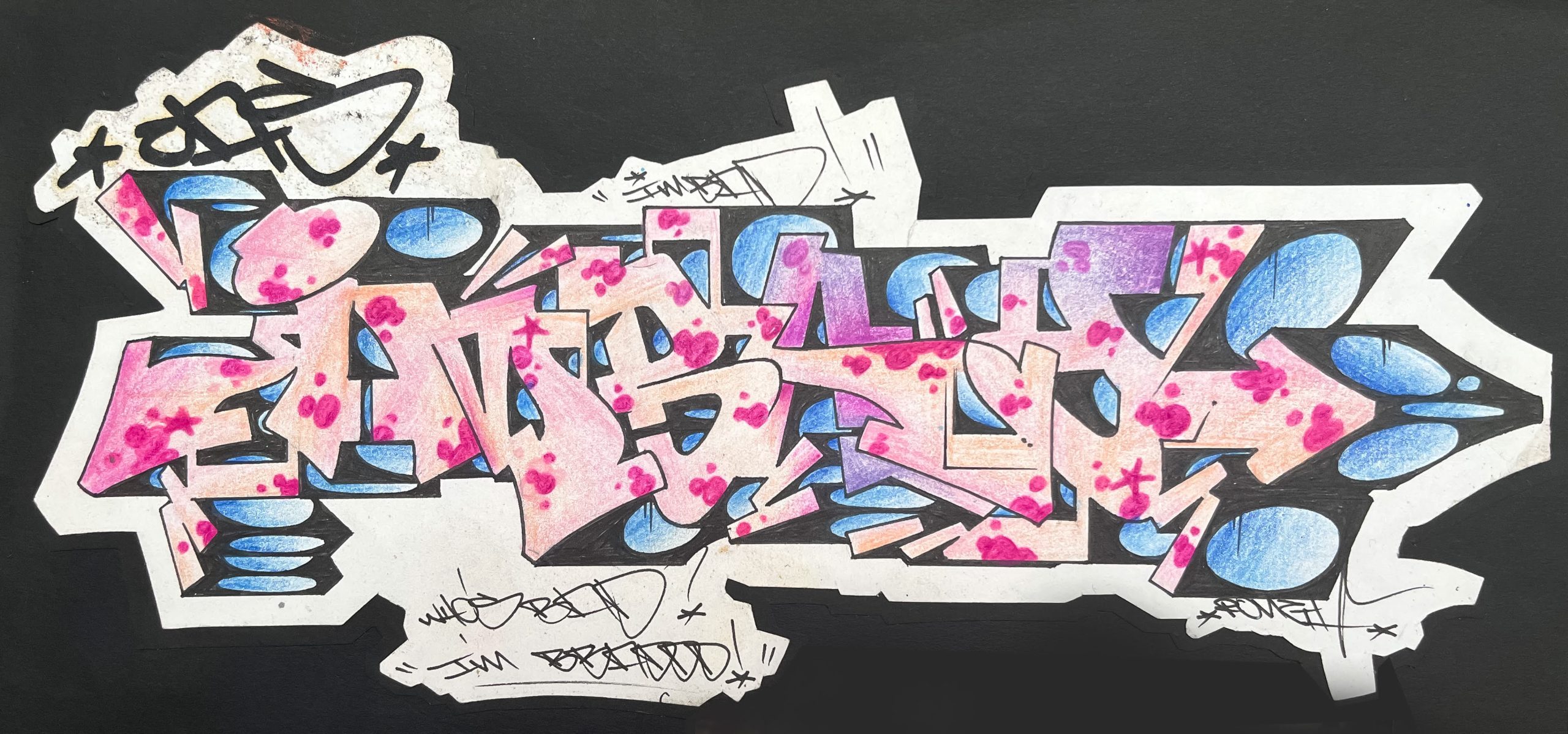
When Remi was 14 years old, he discovered style writing through a boy in his school. He showed him the book „Subway Art“ in early 1985 and let Remi take it home one night. Remi was already into hip hop, electro and breakdancing at that time. He was aware of graffiti and had tried out his first piece in November 1984. But this book of New York graffiti discovered in 1985 was the moment when Remi understood the concept of style writing.
Beginnings of style in London
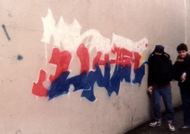
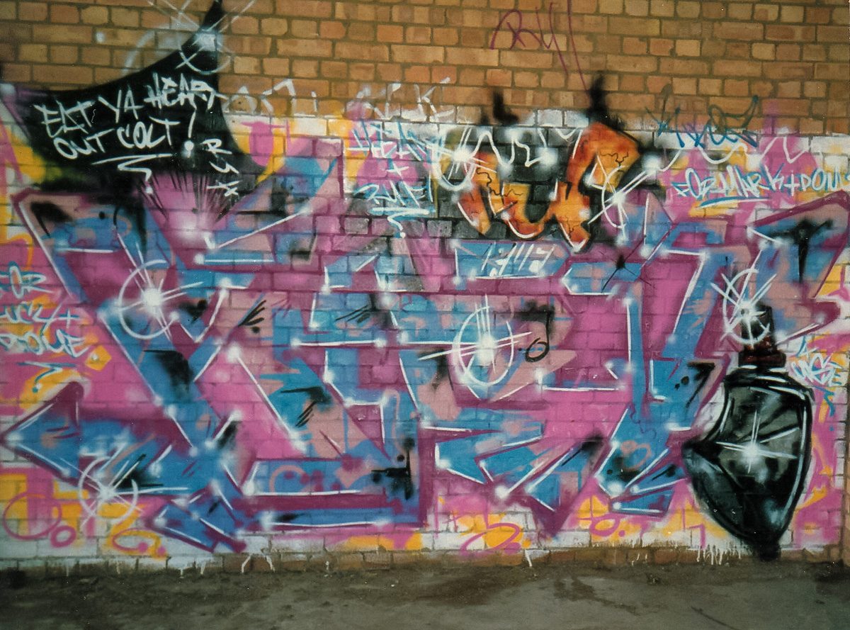
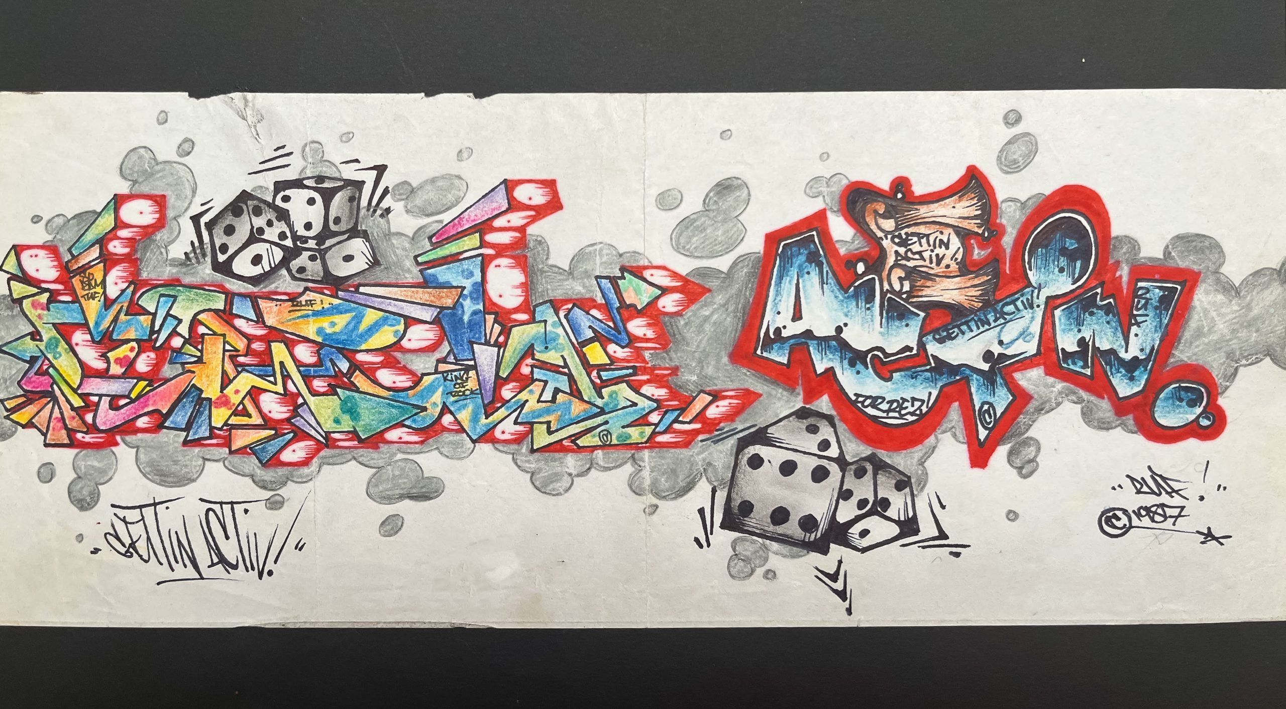
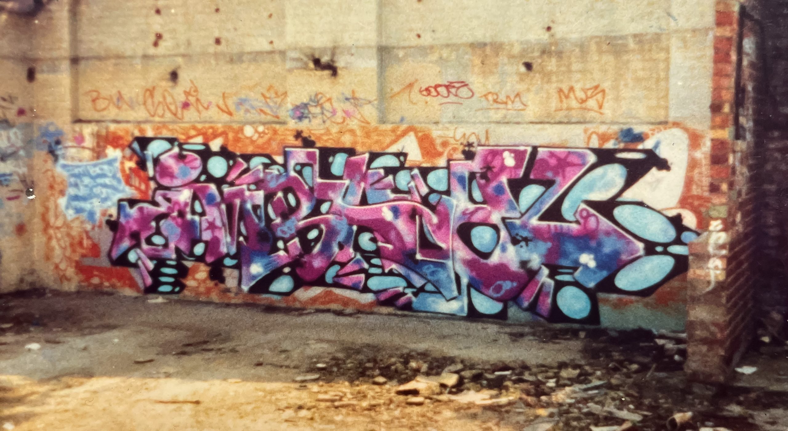
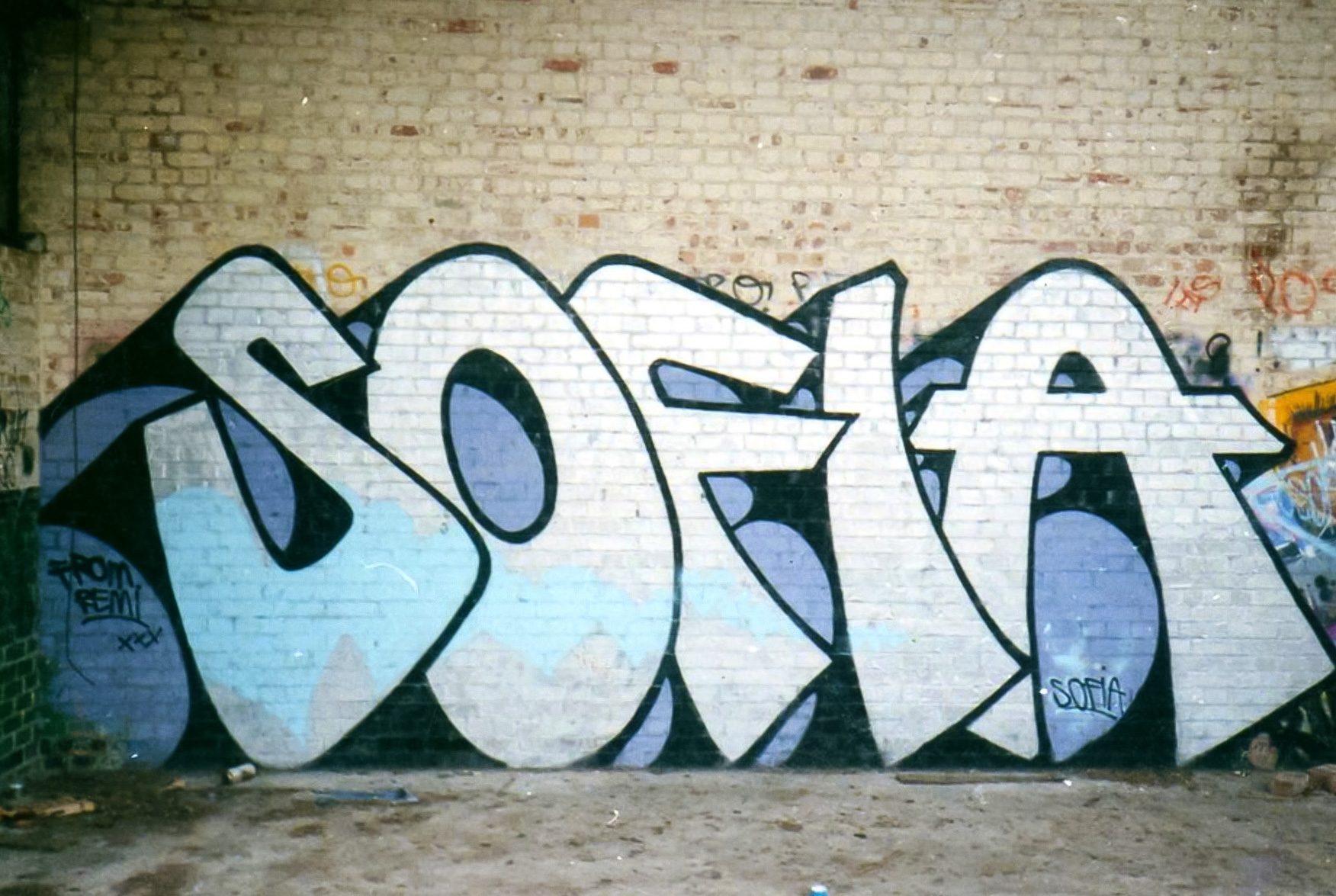
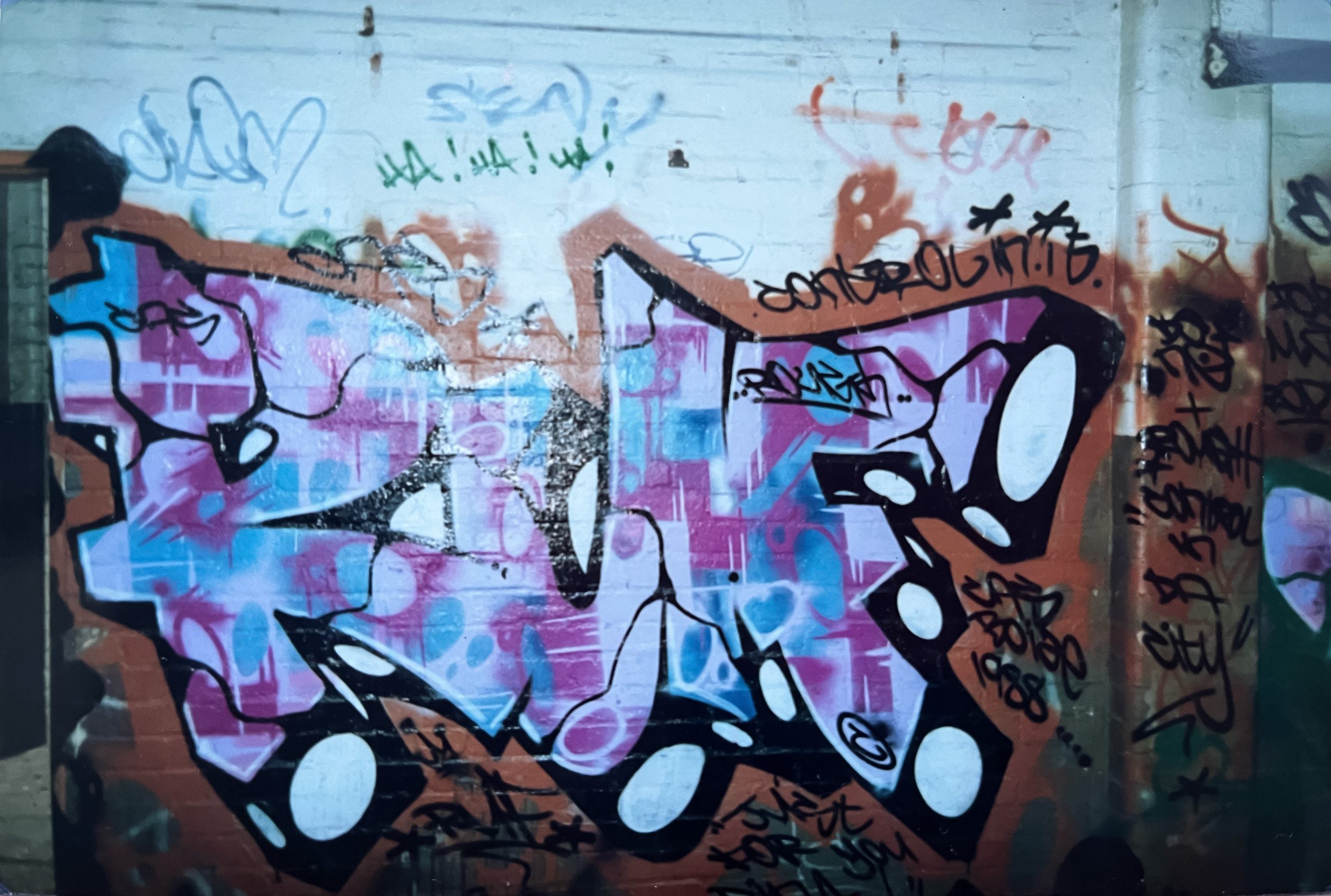
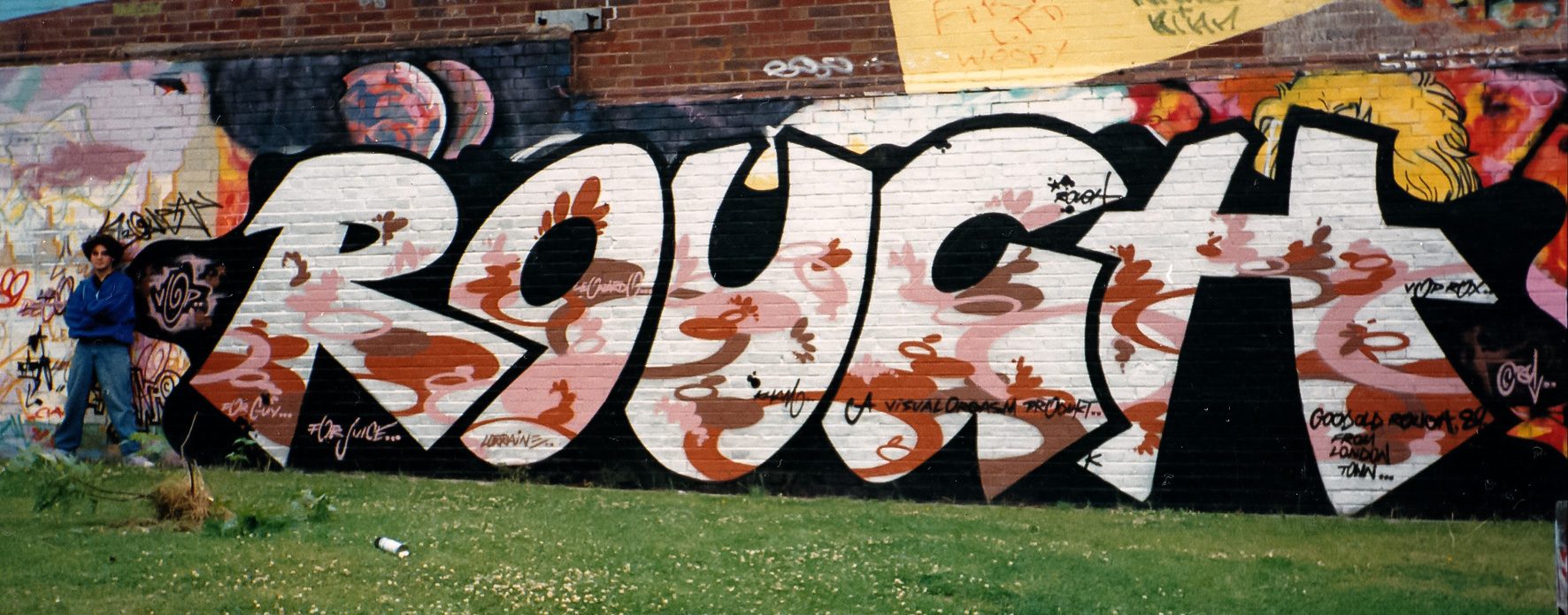
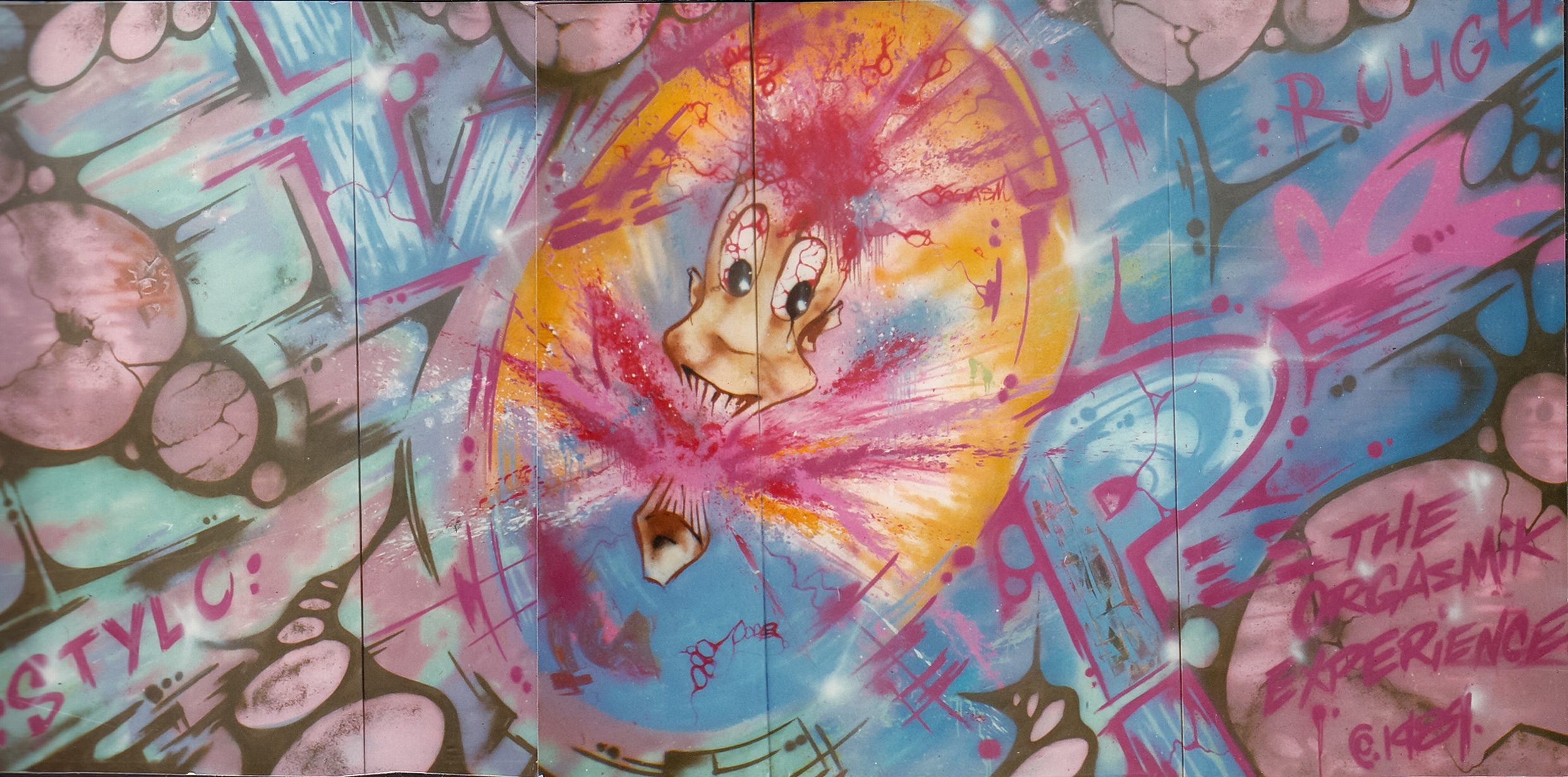
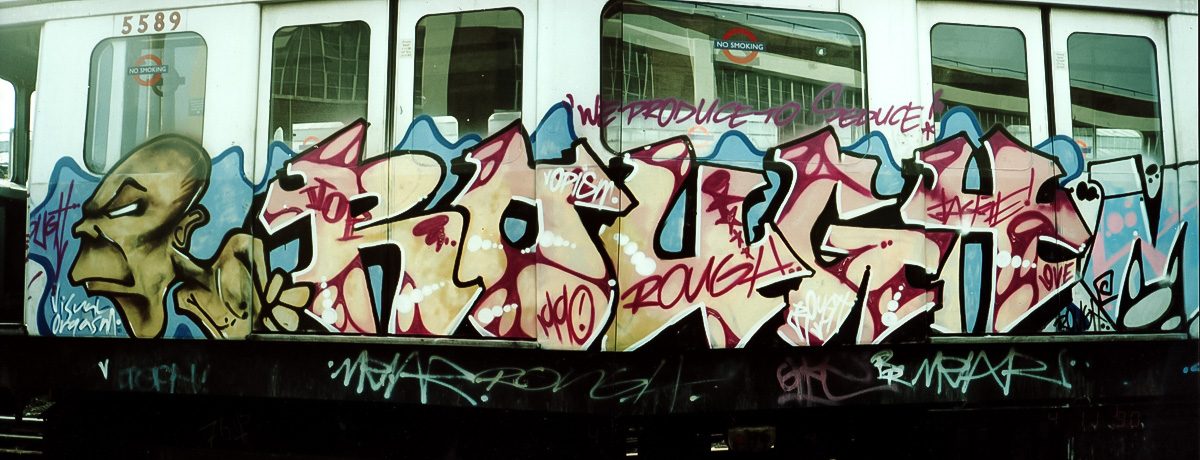
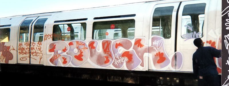
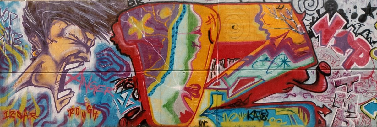
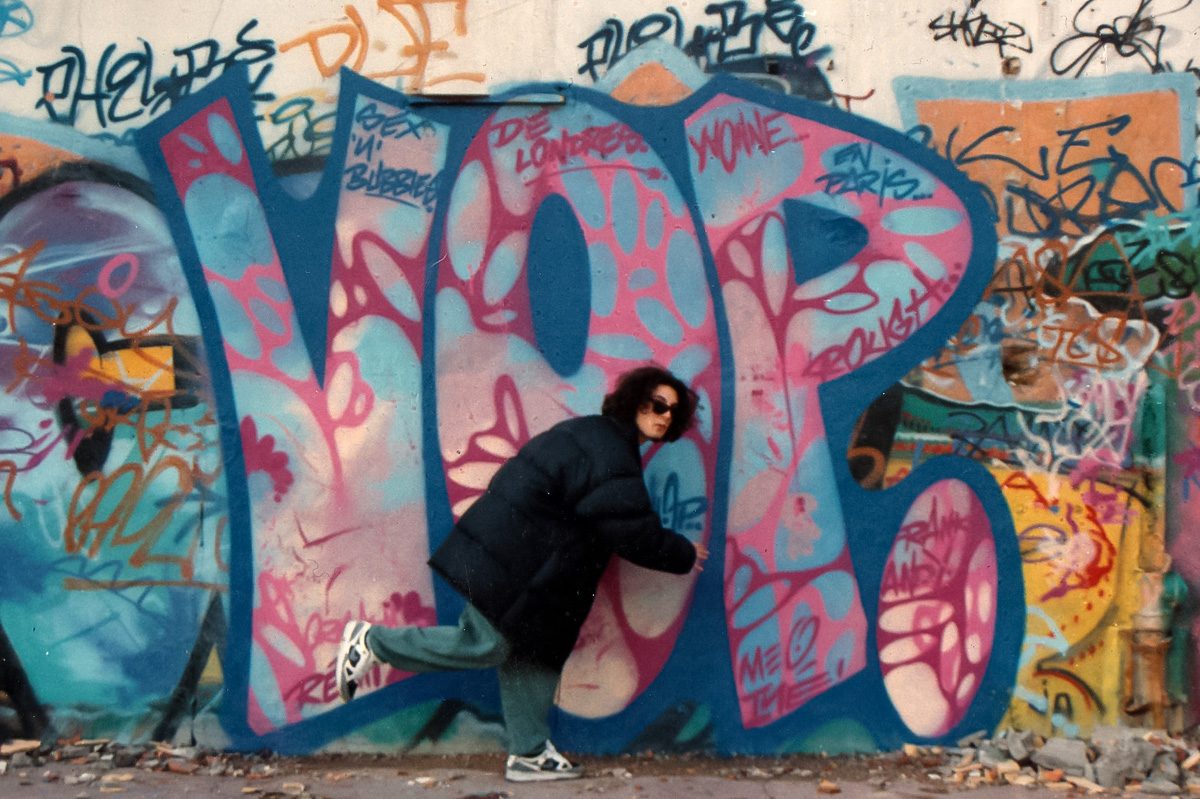
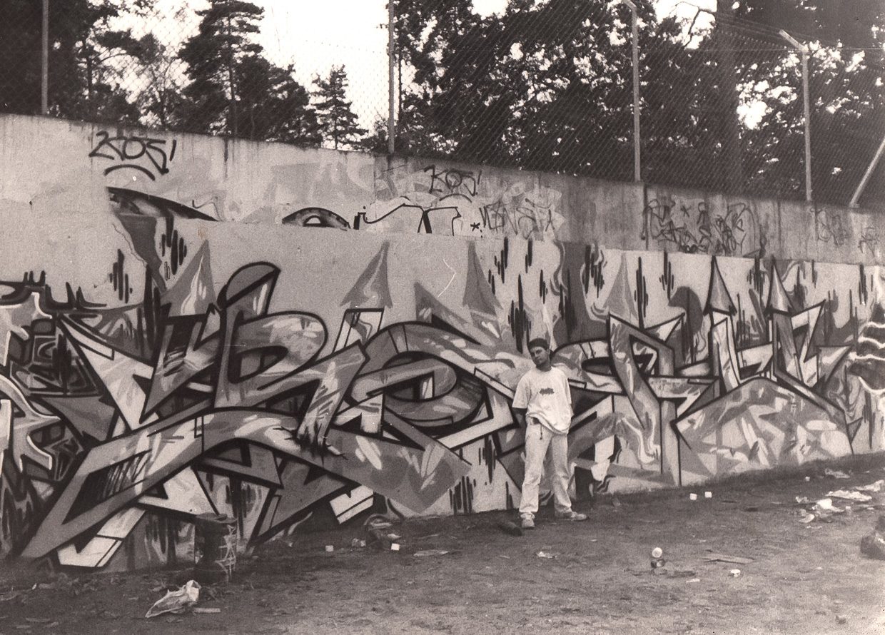
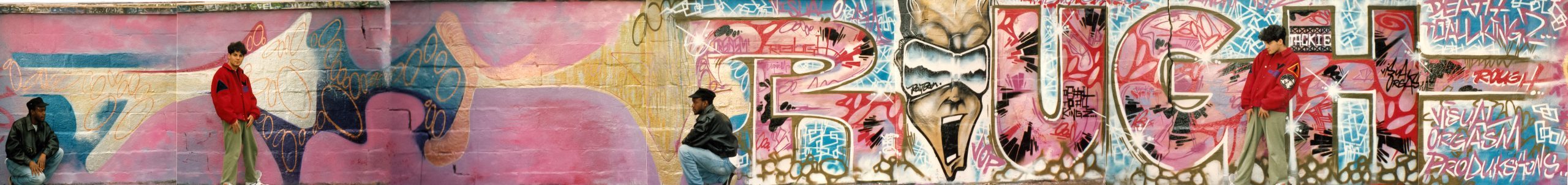
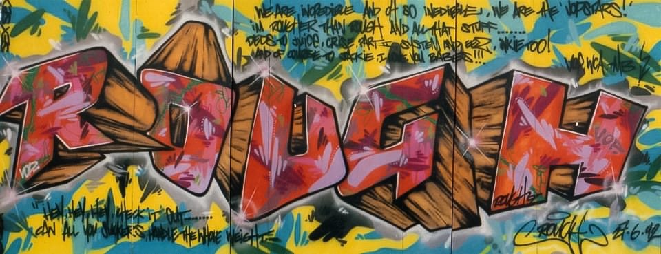
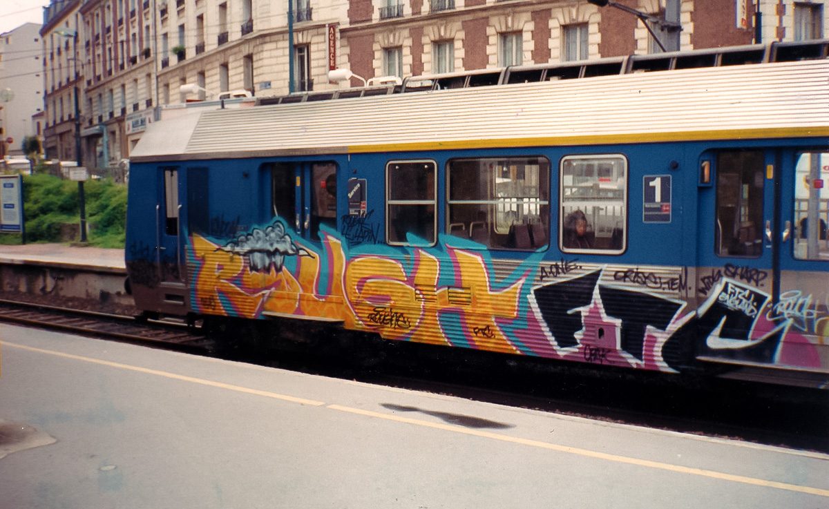
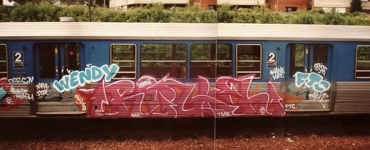
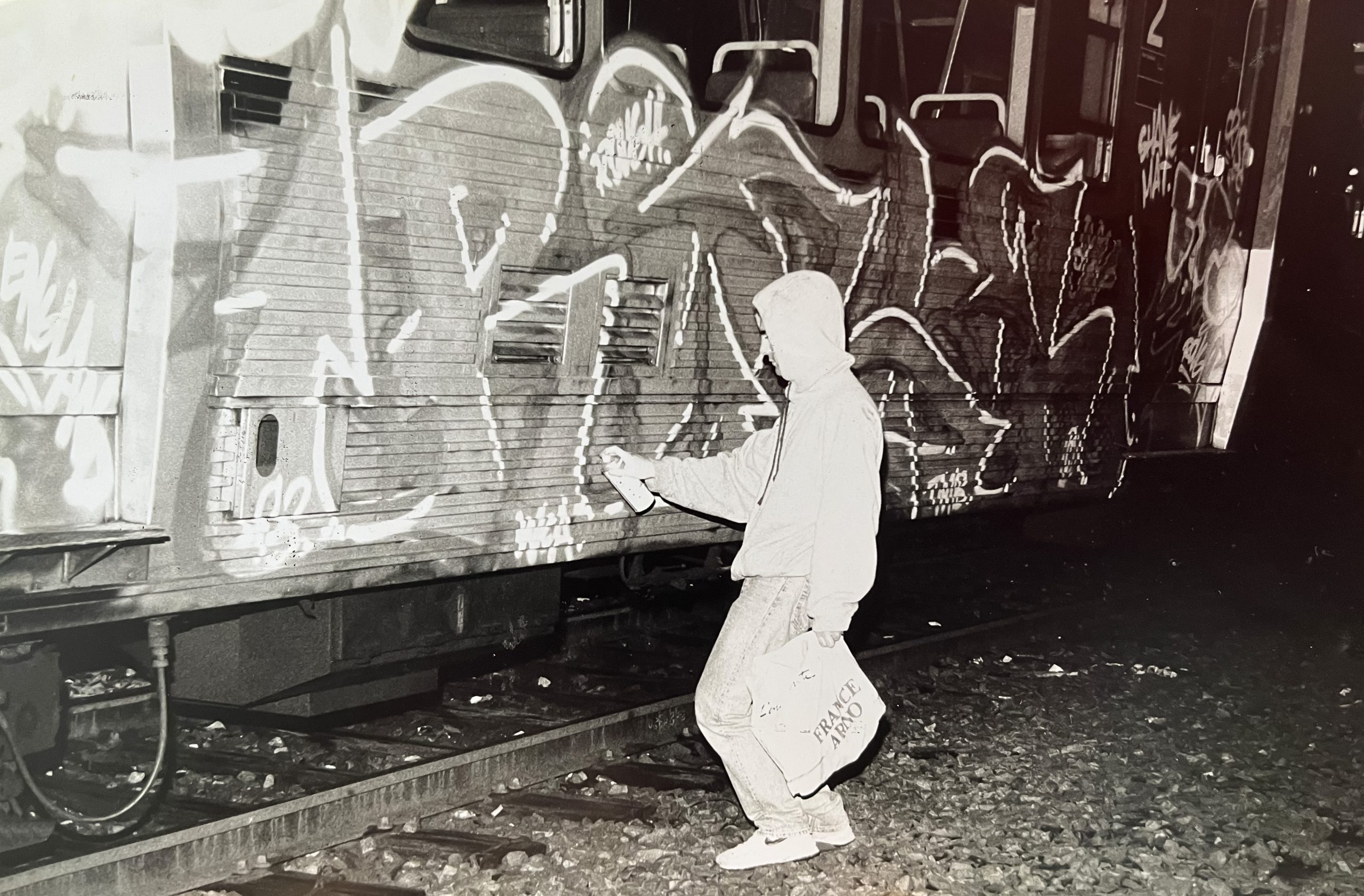
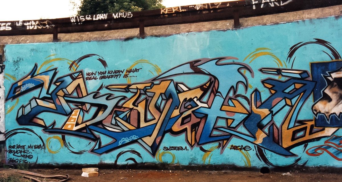
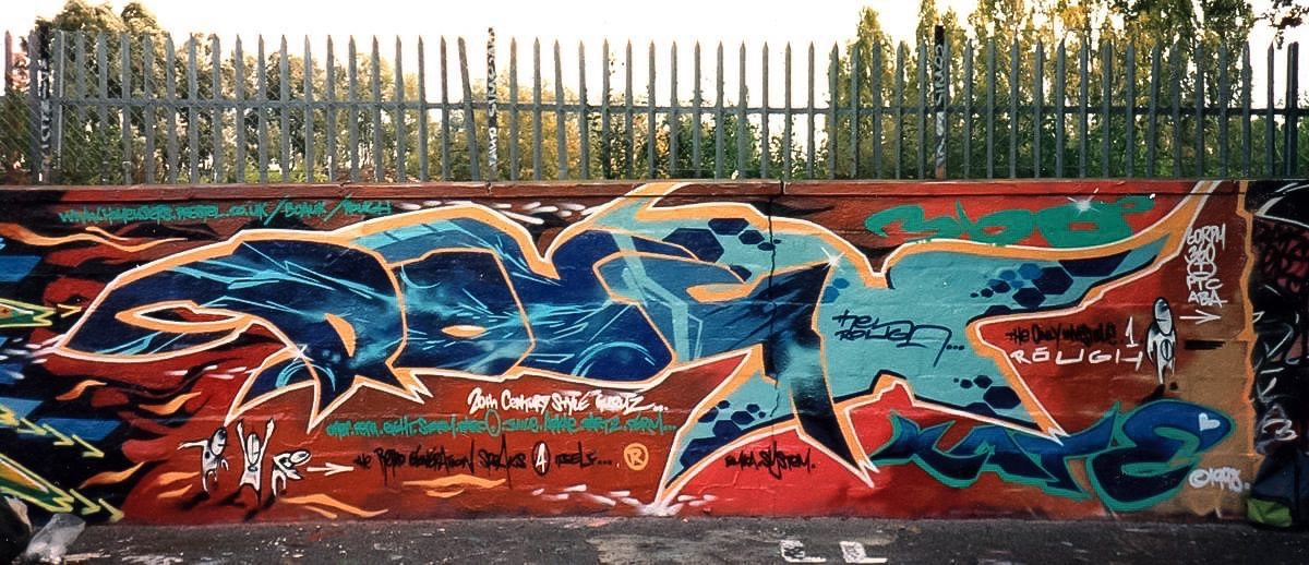
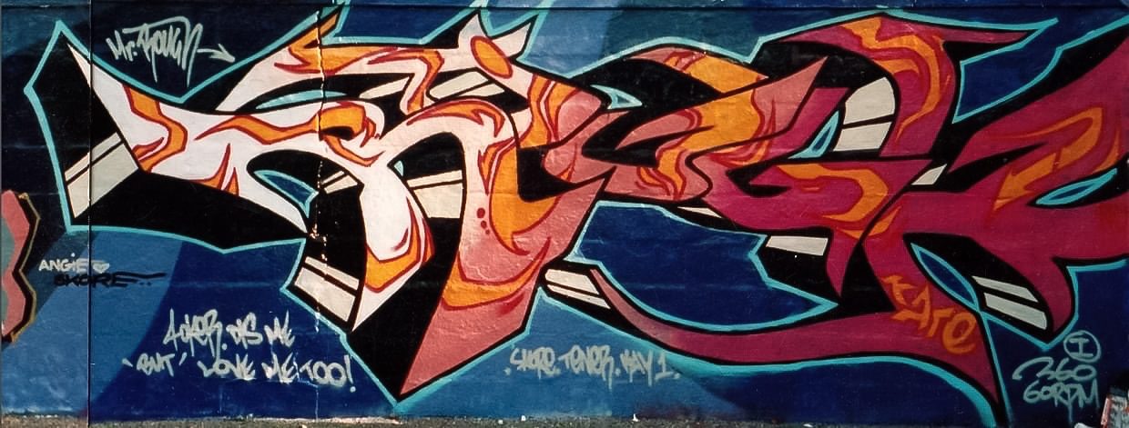
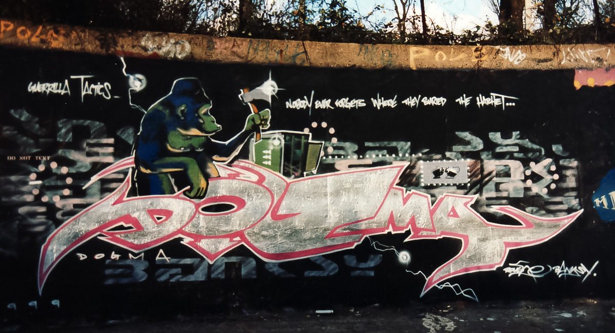
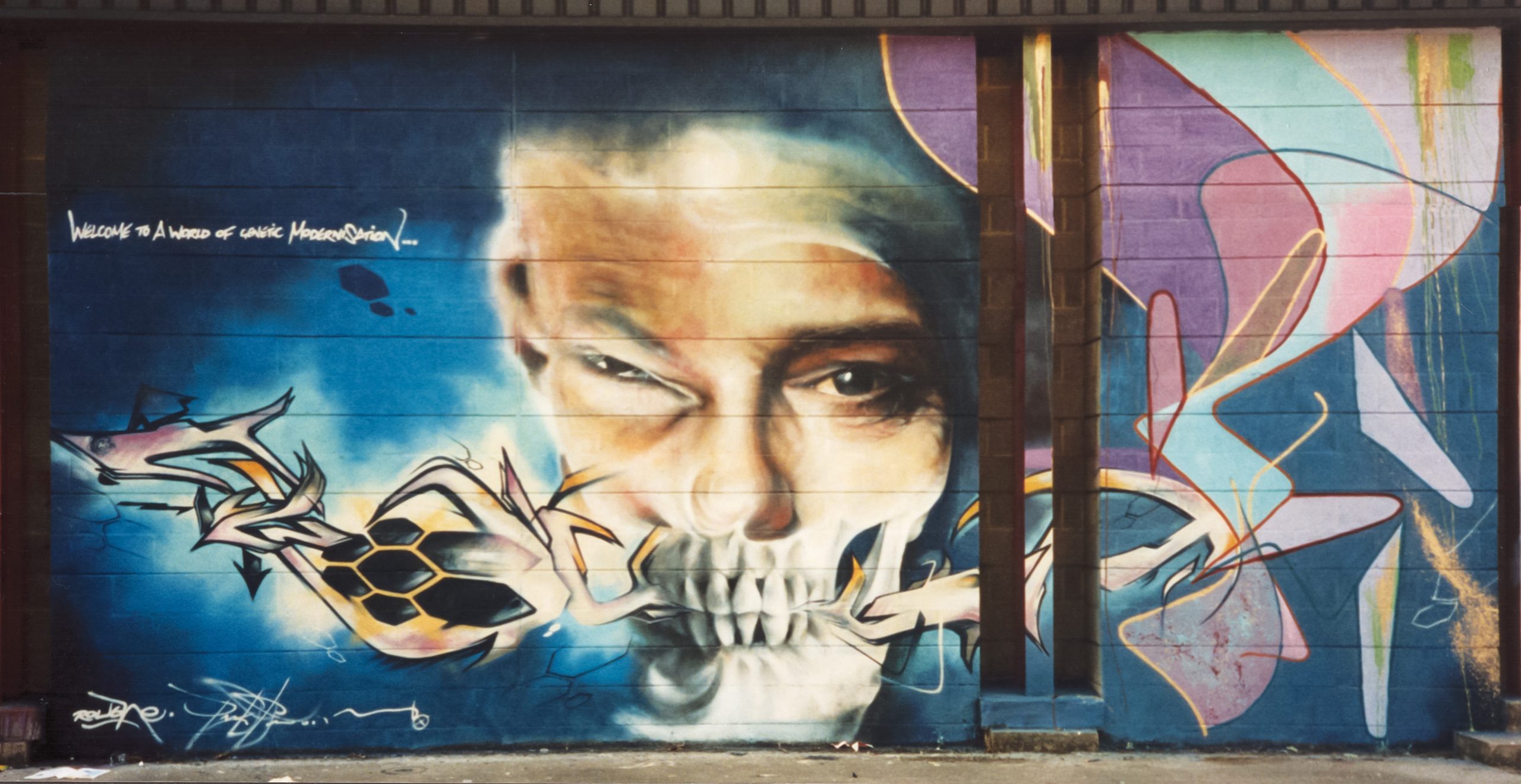
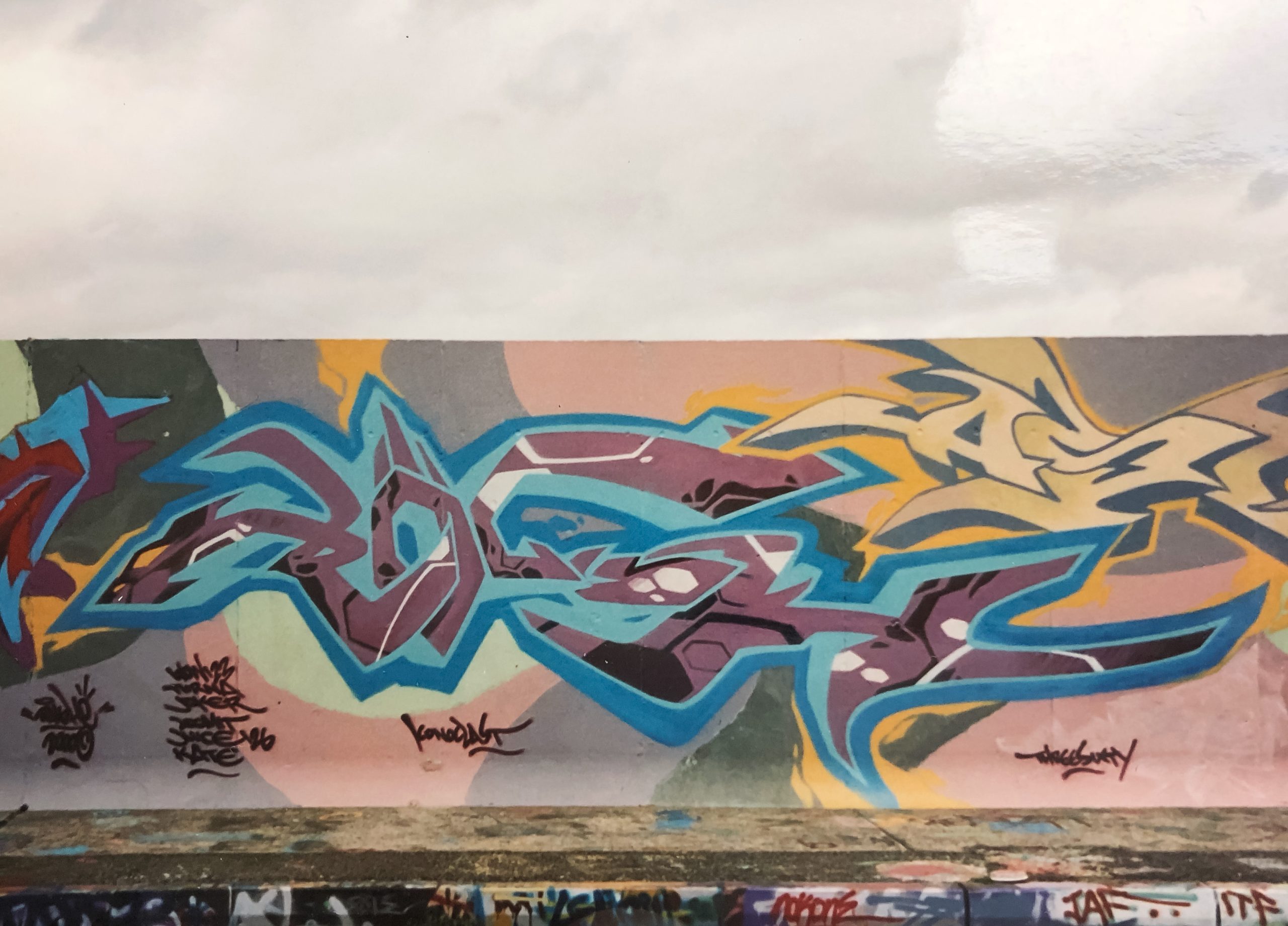
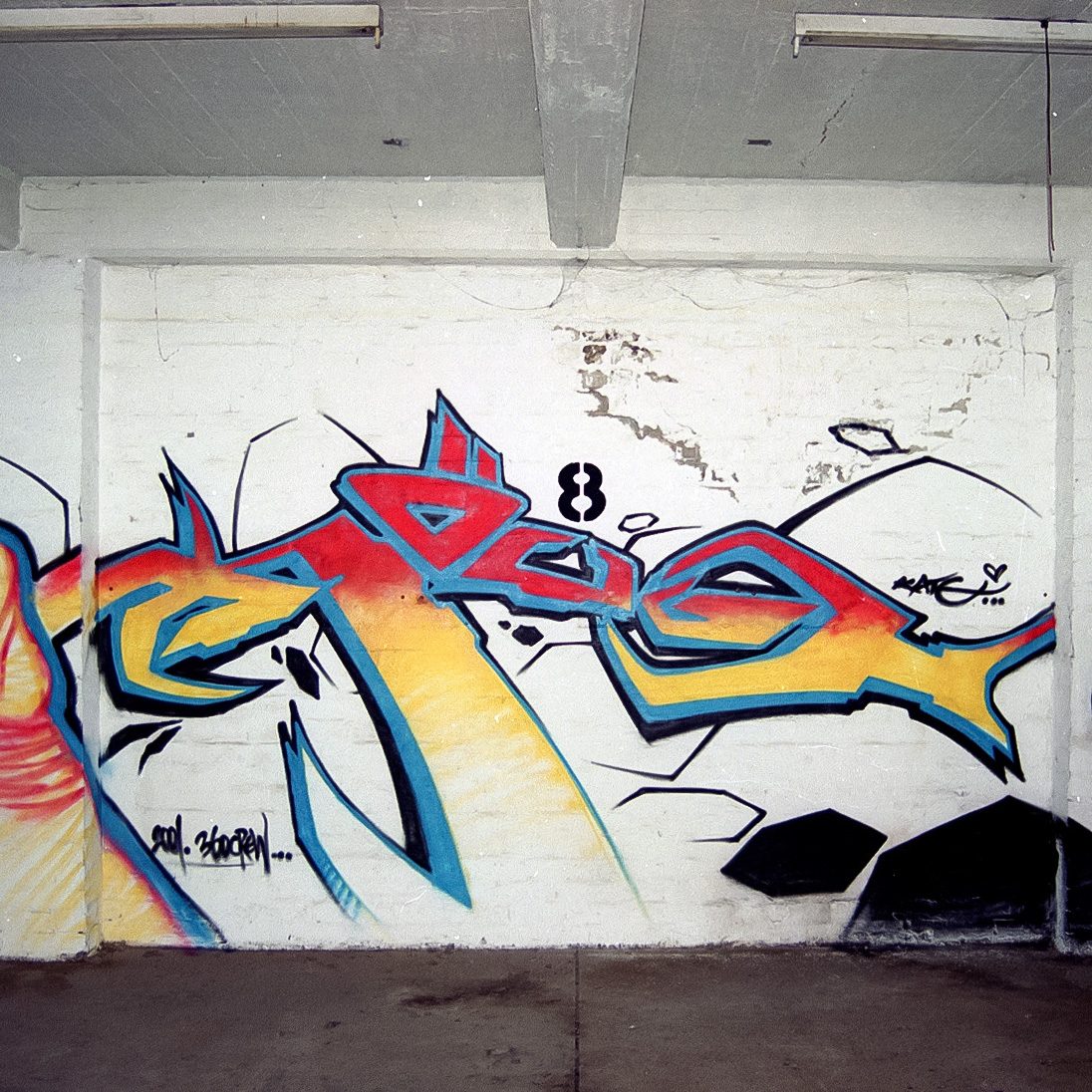
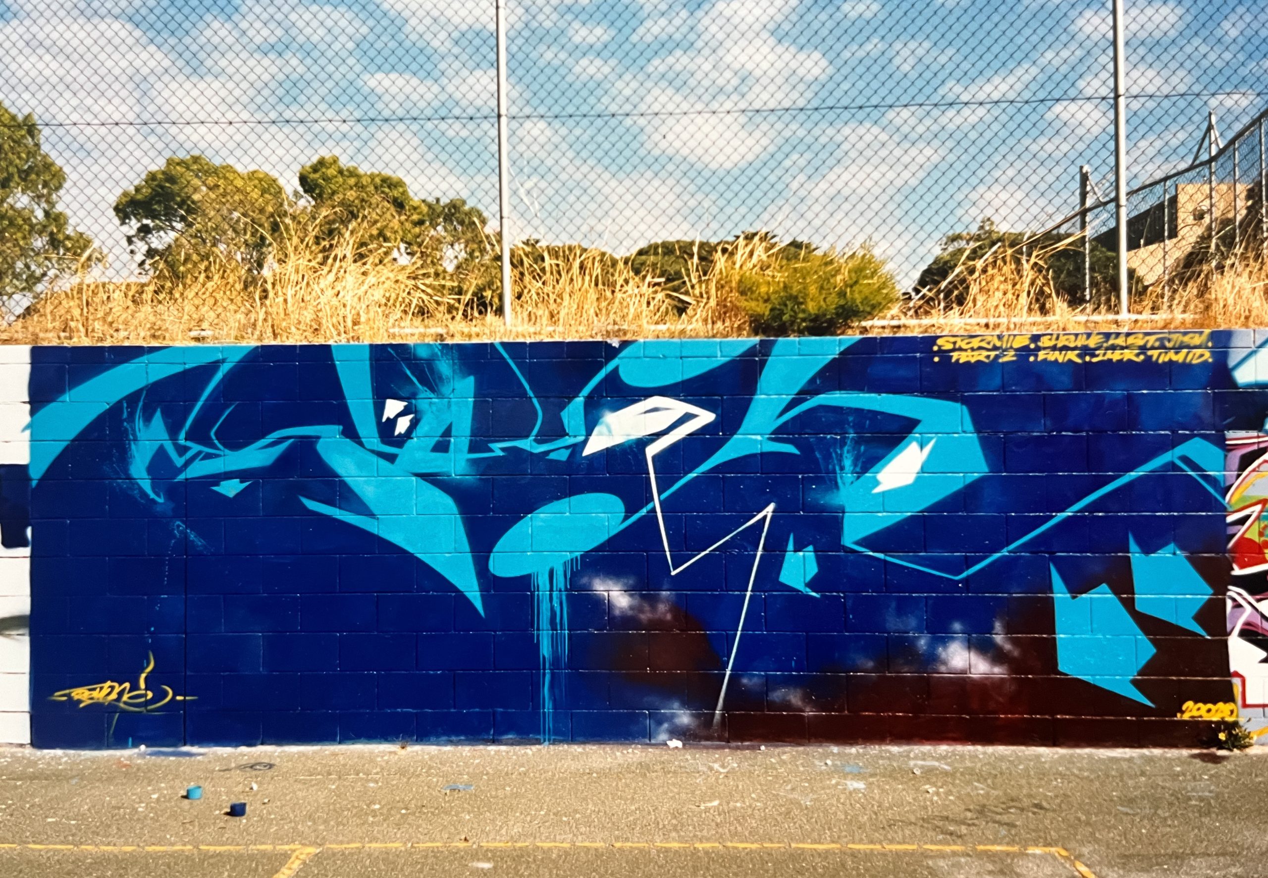
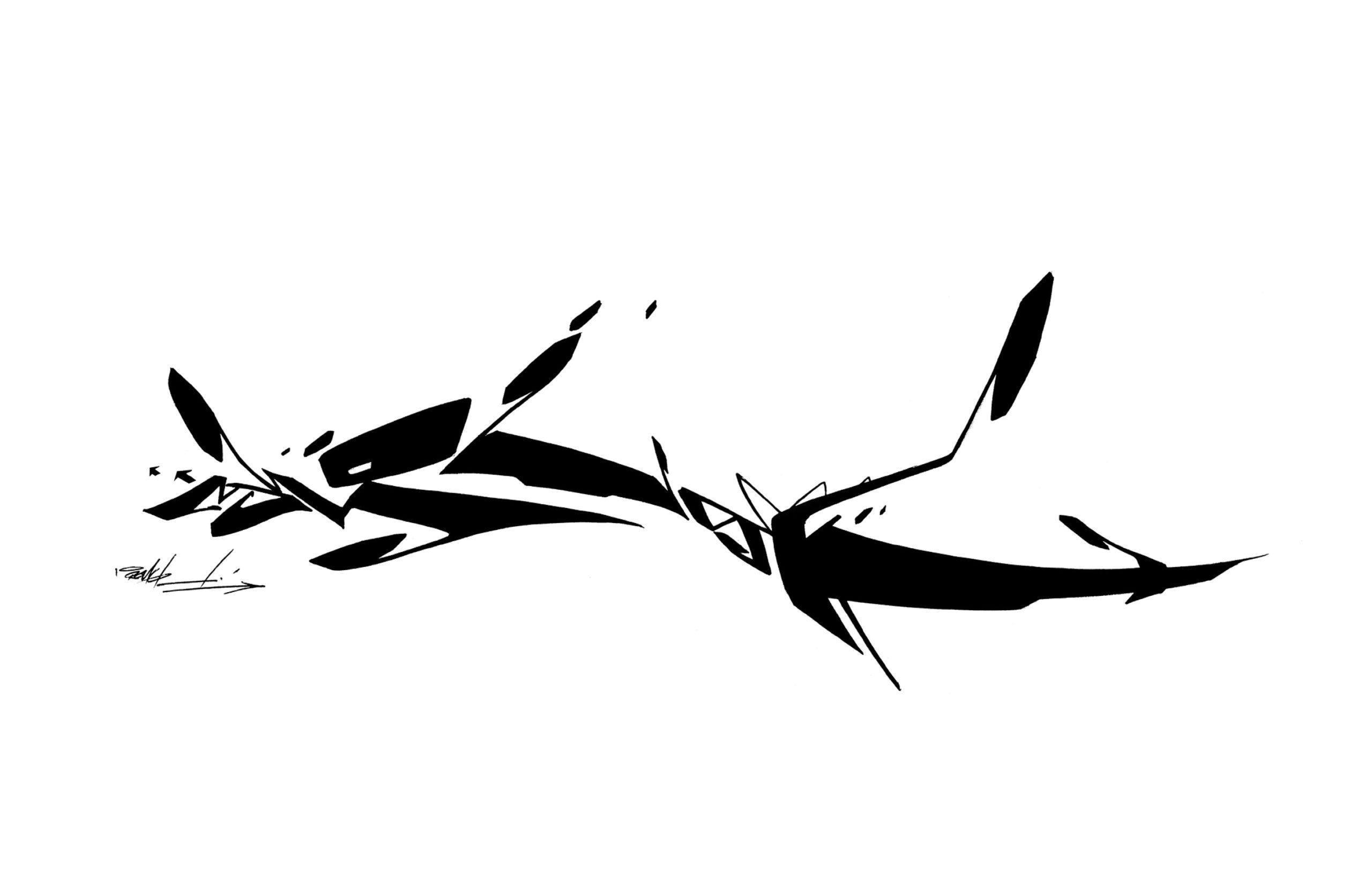
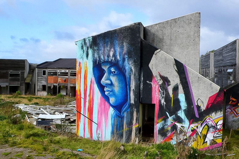
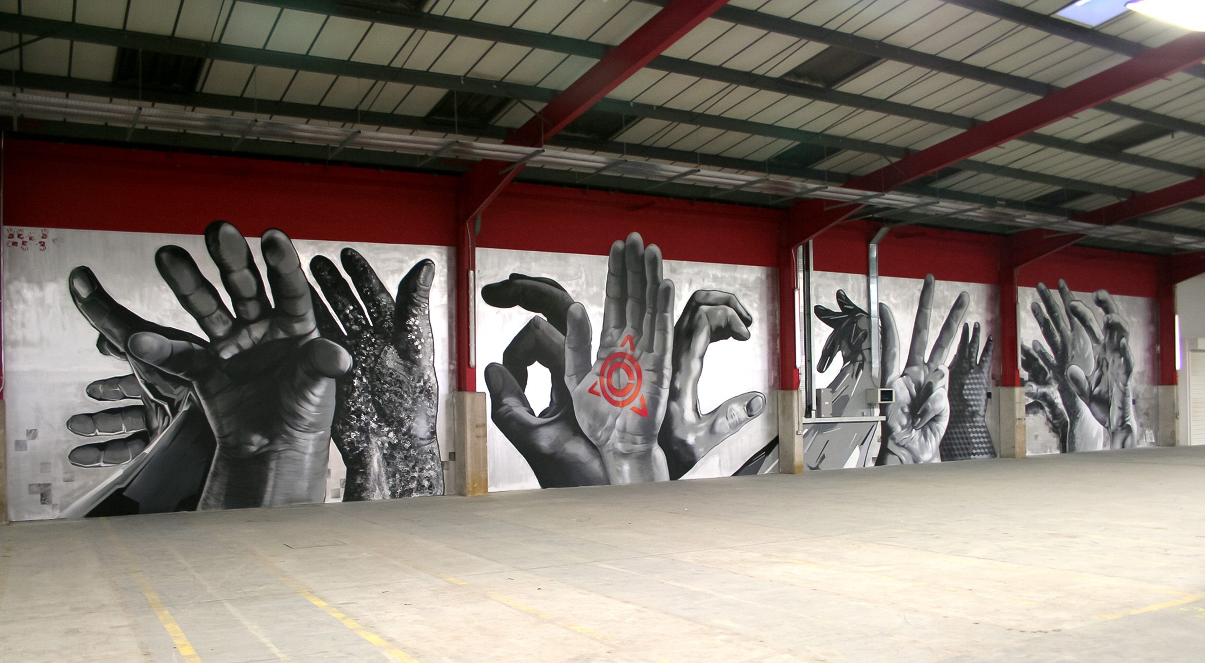
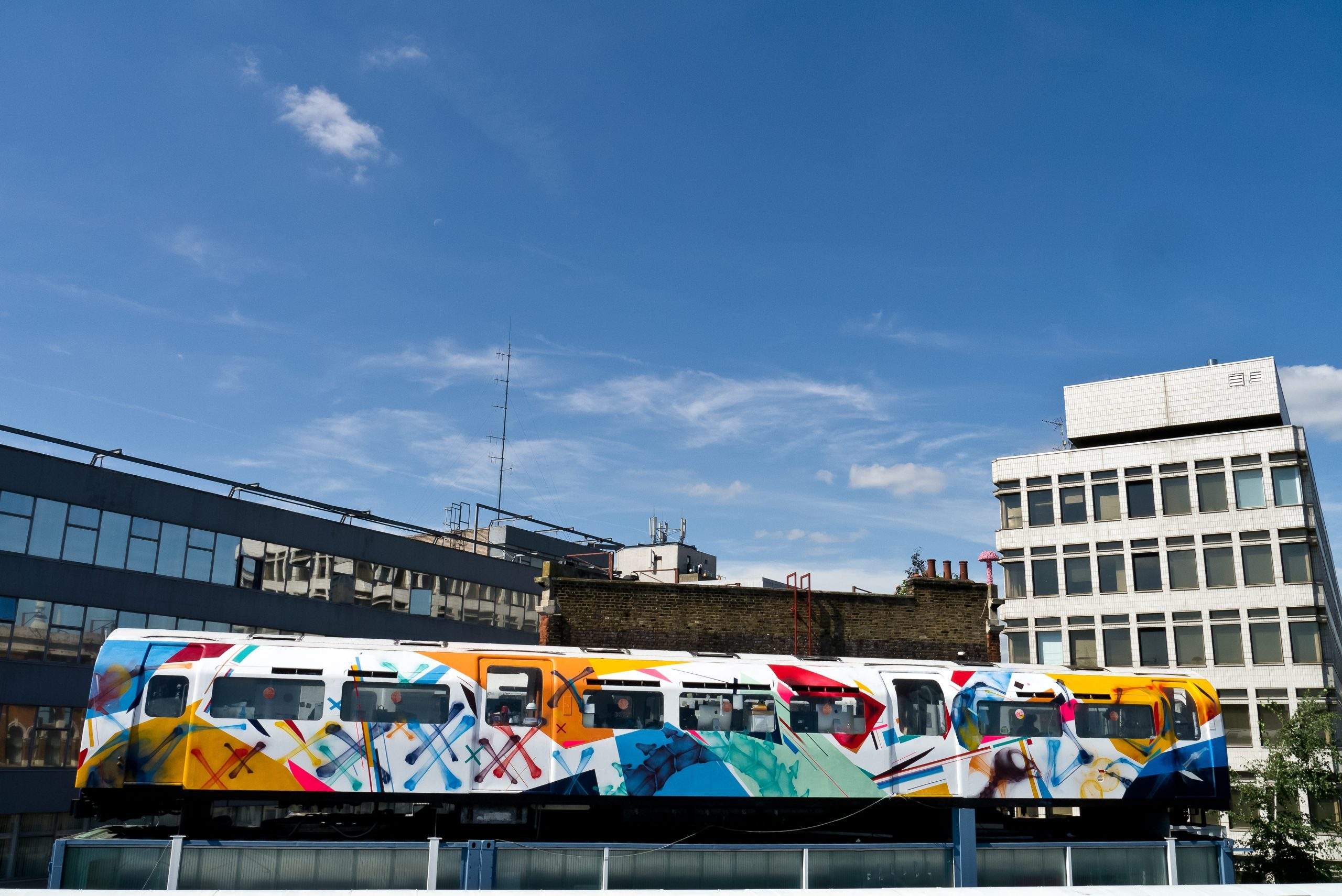
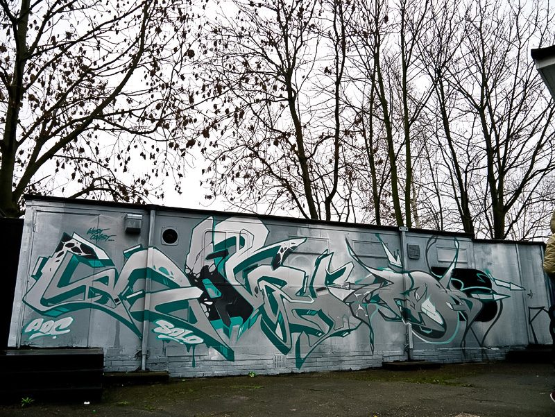
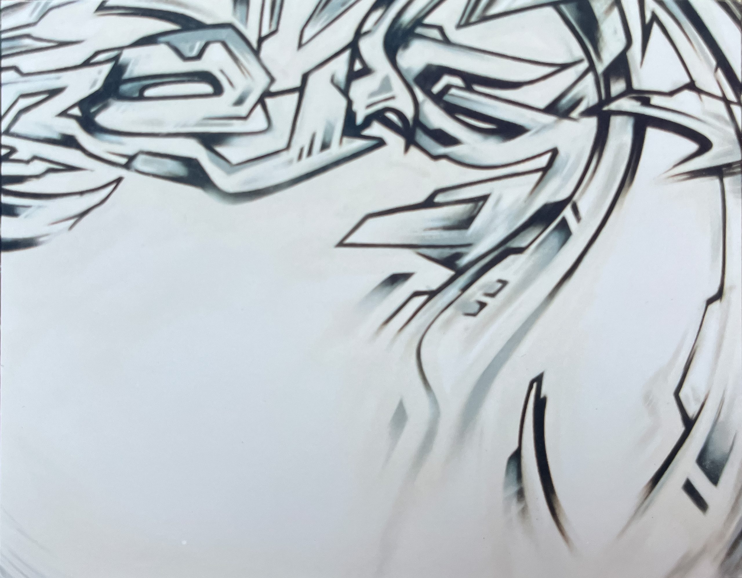
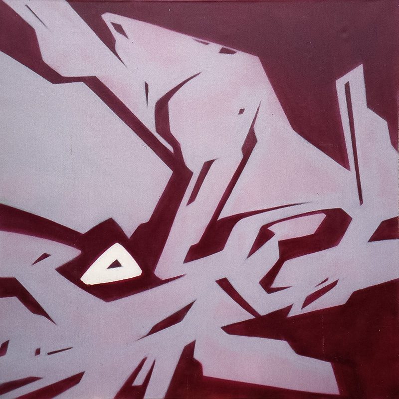
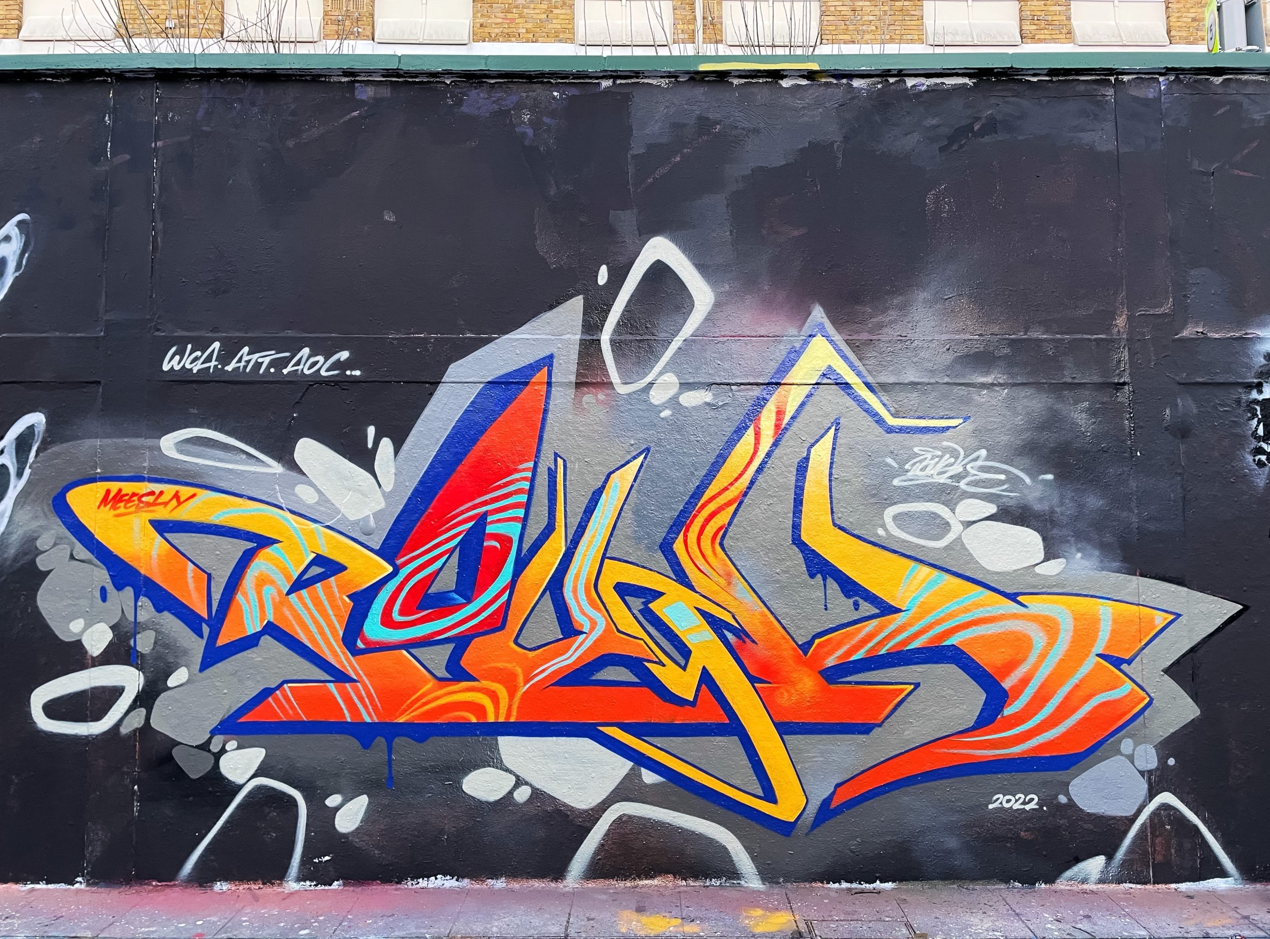
His first piece wasn’t really about letters but about shapes with a big arrow coming out of it, the artist tells today. In 1985 he started with the moniker ‘Theme’ and had numerous throw away names before coming up with ‘RUF’, which later became ‘ROUGH’. In the late 90’s it became ‘ROUGHE’ and finally he settled on ‘REMI ROUGH’, due to Stormie Mills and Charlie Dark, both calling him that all the time. In the beginning, the two crews and their members who really had an influence on ROUGH were the London Giants and Tuf Artz. He also loved Non Stop Crew from West London even though their style was completely different. Besides lettering, ROUGH painted characters as well. He thought that in order to get respect and to be considered a good writer one had to be able to cover all bases. The first crew he was part of was Smart Art SA in 1986 until 1987. After that he was in a South London Crew called Controlin’ Arts CAS till 1988, founded by the brothers SEEK and SPRAZE. From 1988 to 1992, ROUGH was part of VOP, Visual Orgasm Productions which was one of the famous London Crews of that time because of the off-key productions they used to create. ROUGH was also part of the Iconoclast Movement from 1989 until the mid-90’s. It was more of a movement than a crew and consisted of some of the best left field painters in the scene at that time, like JUICE126 who created a concept loosely based on RammellZee’s Iconoclast Panzerism manifesto. It was a beautiful time according to ROUGH, and many amazing walls were painted back then. Artists like PART2, SYSTEM, Stormie Mills, 1MOR, CRYSE, DERM and CHU were always way ahead of their time in style in so many ways according to Remi. During that time, he used to spray all over London painting trains as well. The city was pretty interesting in the early 80’s as it was going through a hard financial crisis and there were (so) many abandoned places in which to paint. One of his favourite places was an old abandoned post Office Depot in South East London. ROUGH was there all the time even though it was quite risky and dangerous.
In 1990, he decided to study art and went to do an Art foundation class at Croydon School of Art, but only for one year. According to him, he was only affected by the drawing classes that helped him to understand perspective and depth.
Formative connections
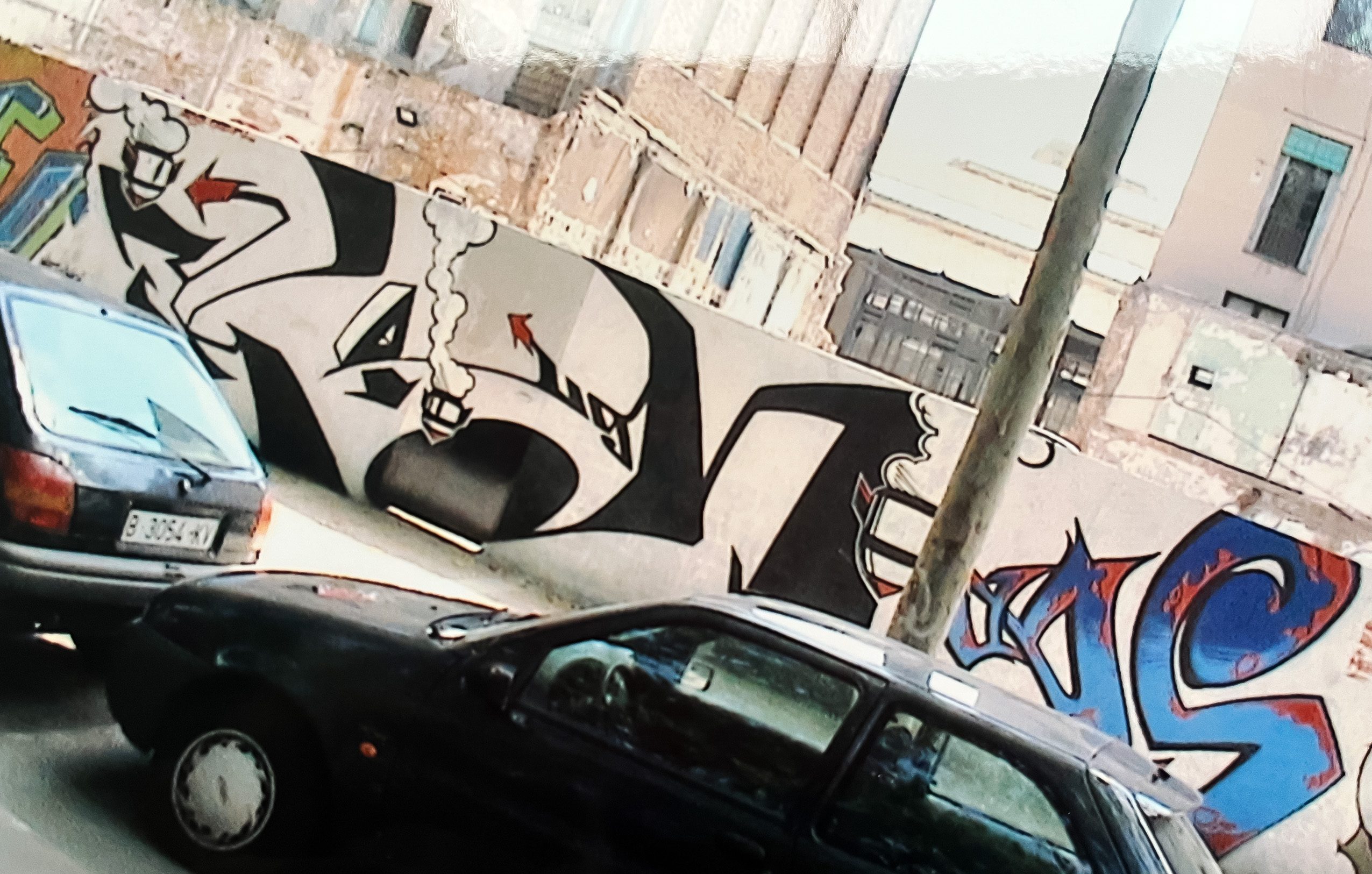
Remi ROUGH liked to travel as a young man and his first trip was Paris in 1990. There he met members of the Bad Boys Crew and LOKISS and many other style writers like DARCO from FBI crew. The scene out there was incredible at that time, according to the British artist. He went several times in the 90s and Paris became one of his second homes and still is to this day. Parisian style writing was probably the biggest influence on him at that stage. What BBC crew was creating there was on a similar level to what Iconoclast was doing in the UK. It seemed they were reading from the same book says ROUGH today. The early French graffiti magazine “1Tox“ gave him the information and inspiration he was looking for, being hungry about visual inputs from the French graffiti scene.
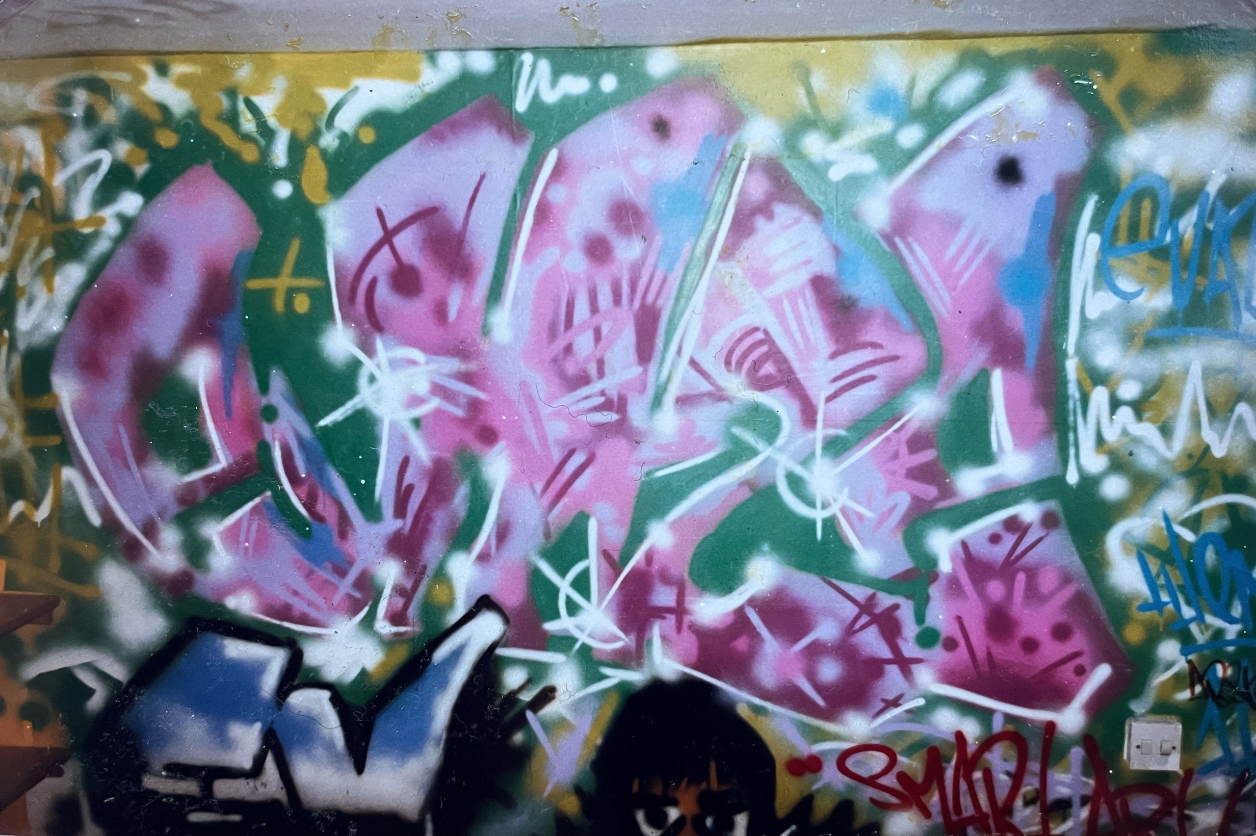
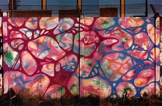
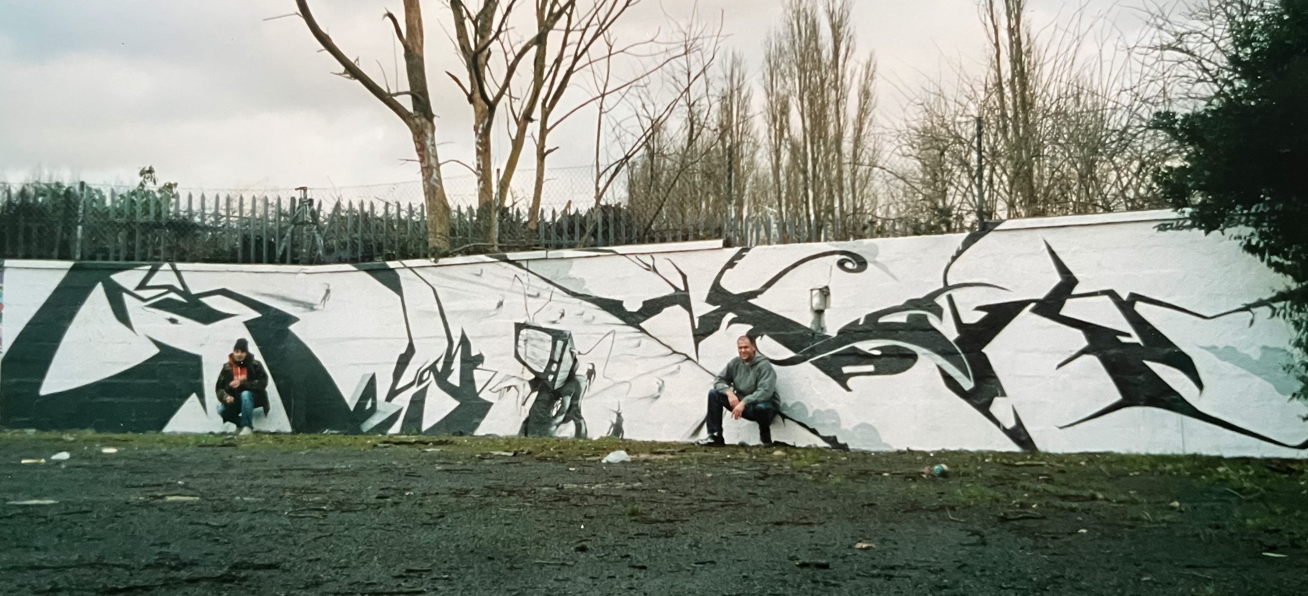
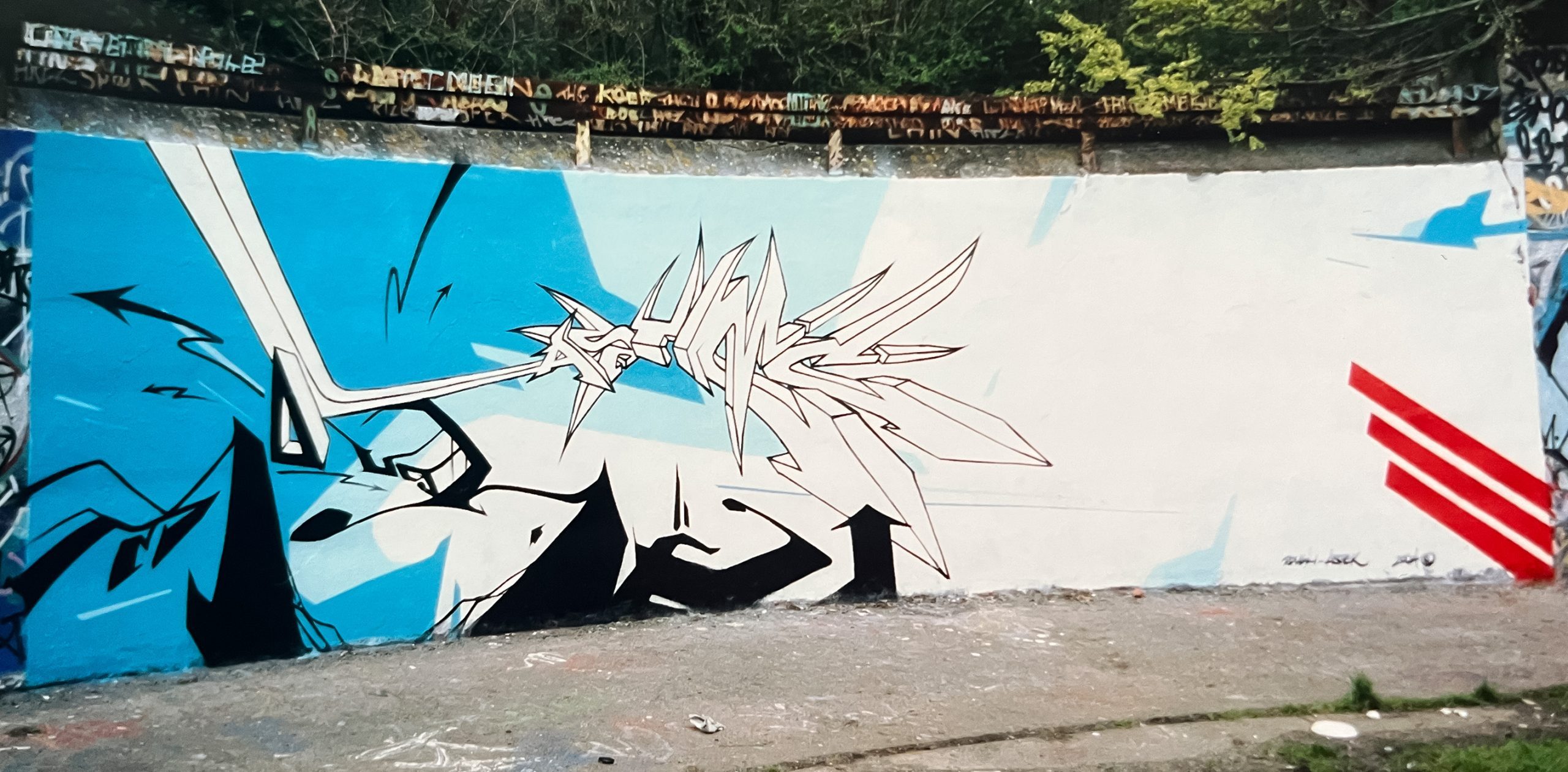
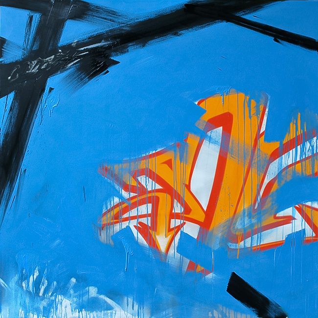
After experimenting a lot in the early beginnings, ROUGH stripped back to a simpler style mid-90s. ROUGH explains: „I started the same as everyone else but very quickly realised that my passion lay more left of field than most conventional style writing. I started experimenting at an early stage and during the late 90’s I started stripping back everything to a plainer style. By the early 00s, I was literally only going to paint with cans of black and I had stripped my style back to an abstract format of one colour letters. I felt you cannot hide behind colours or fills or peripheral additions. If you paint with solely one colour, you have to be able to have complete style or else you look foolish. My style of letters became increasingly minimal and abstract. I would often play around with the scale of letters with some very large letters and some very small. This was initially an influence I picked up from painting with the German artist LOOMIT.”
Developing in the studio and on walls
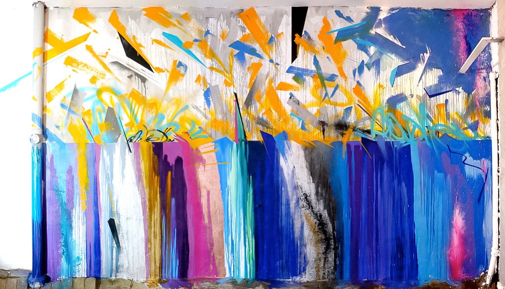
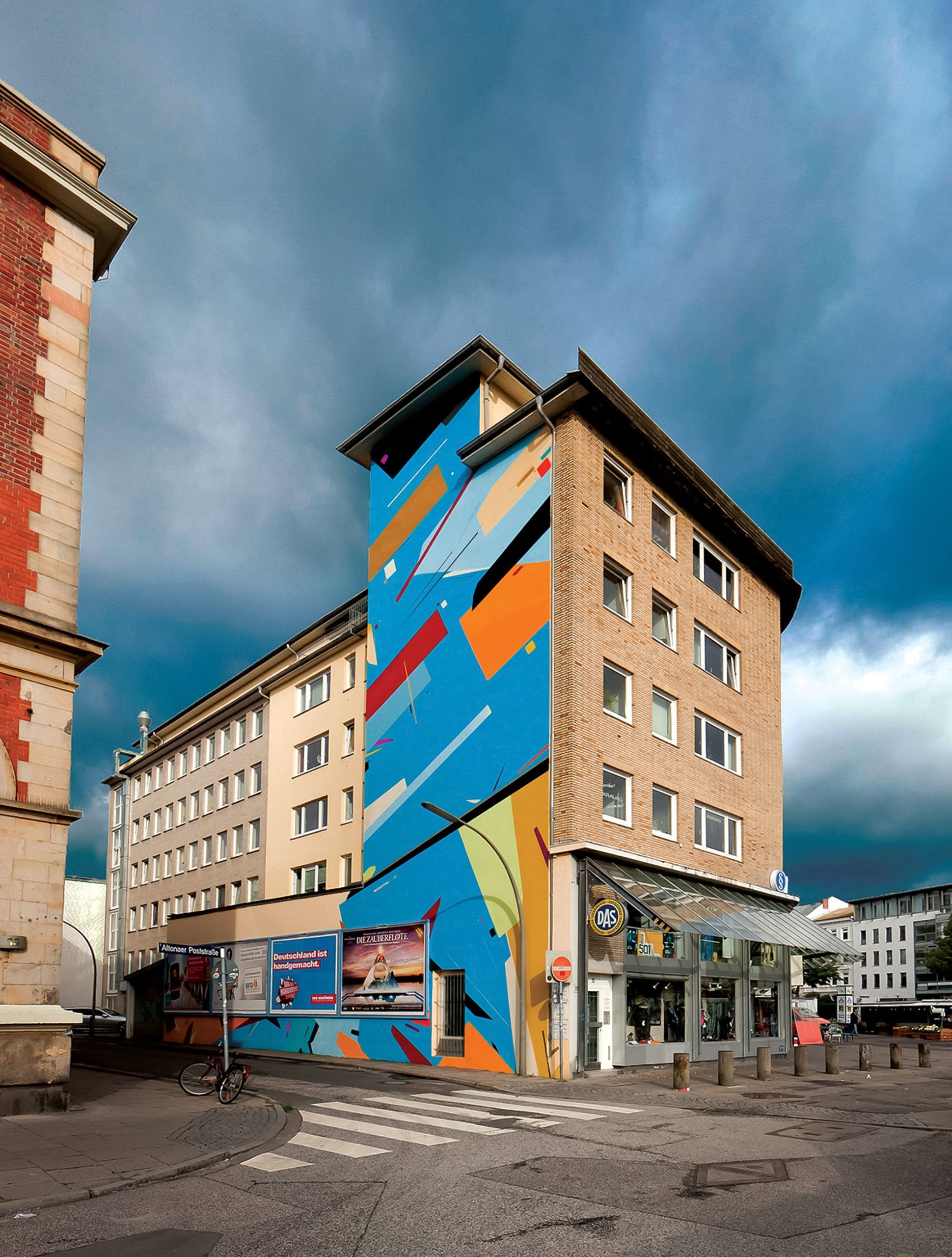
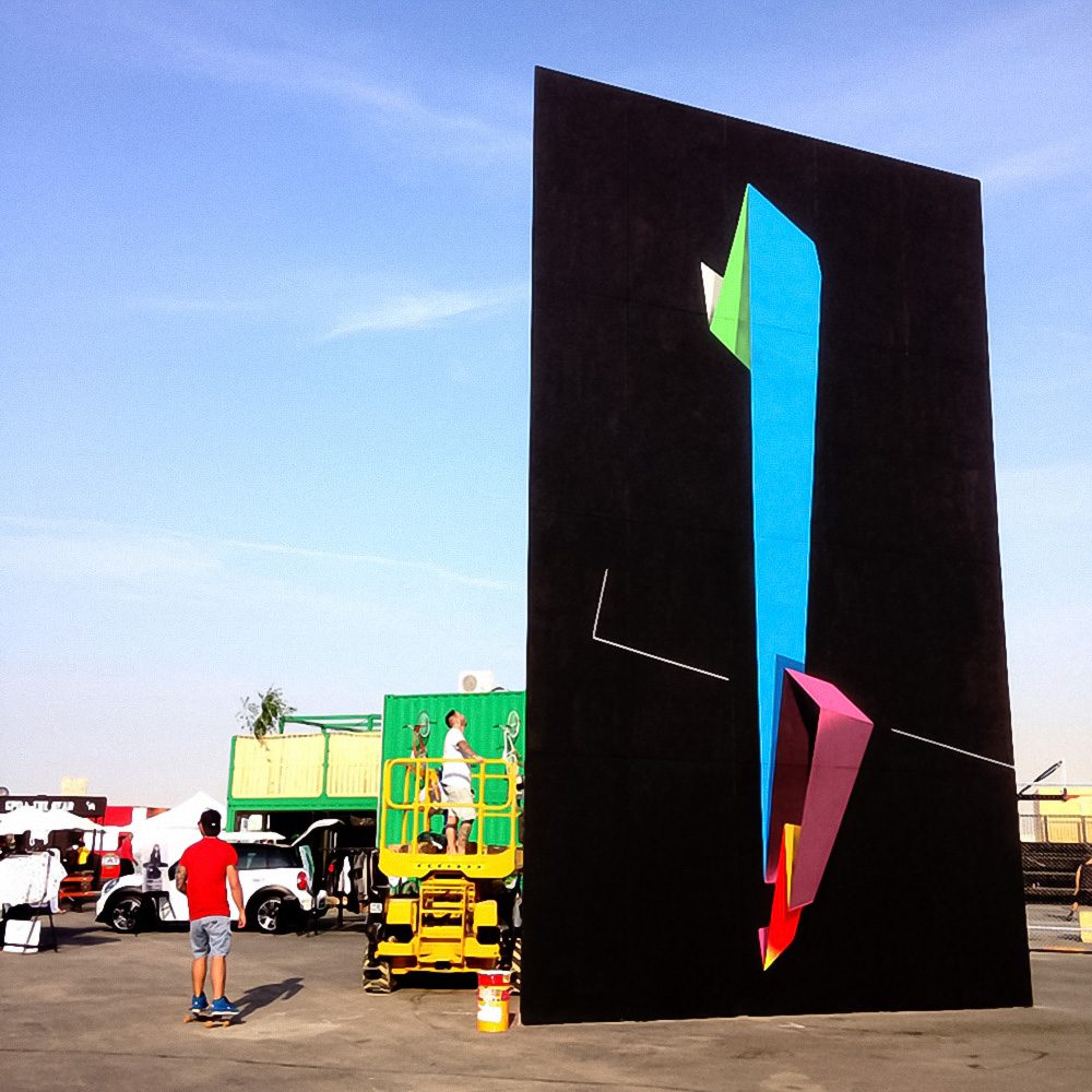
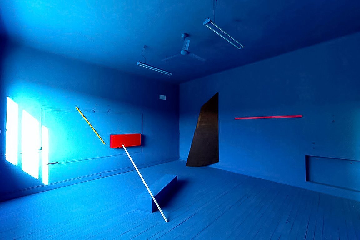
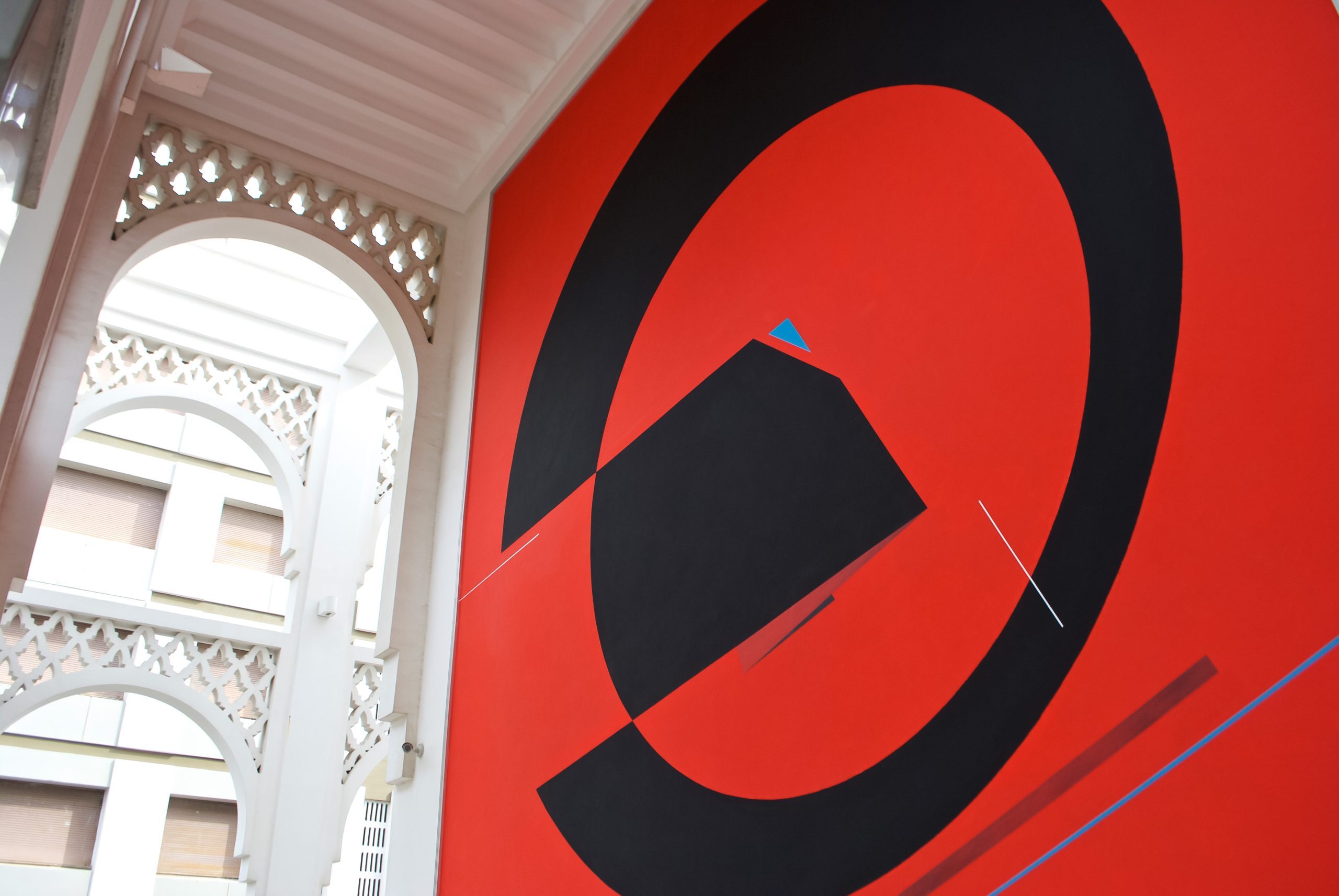
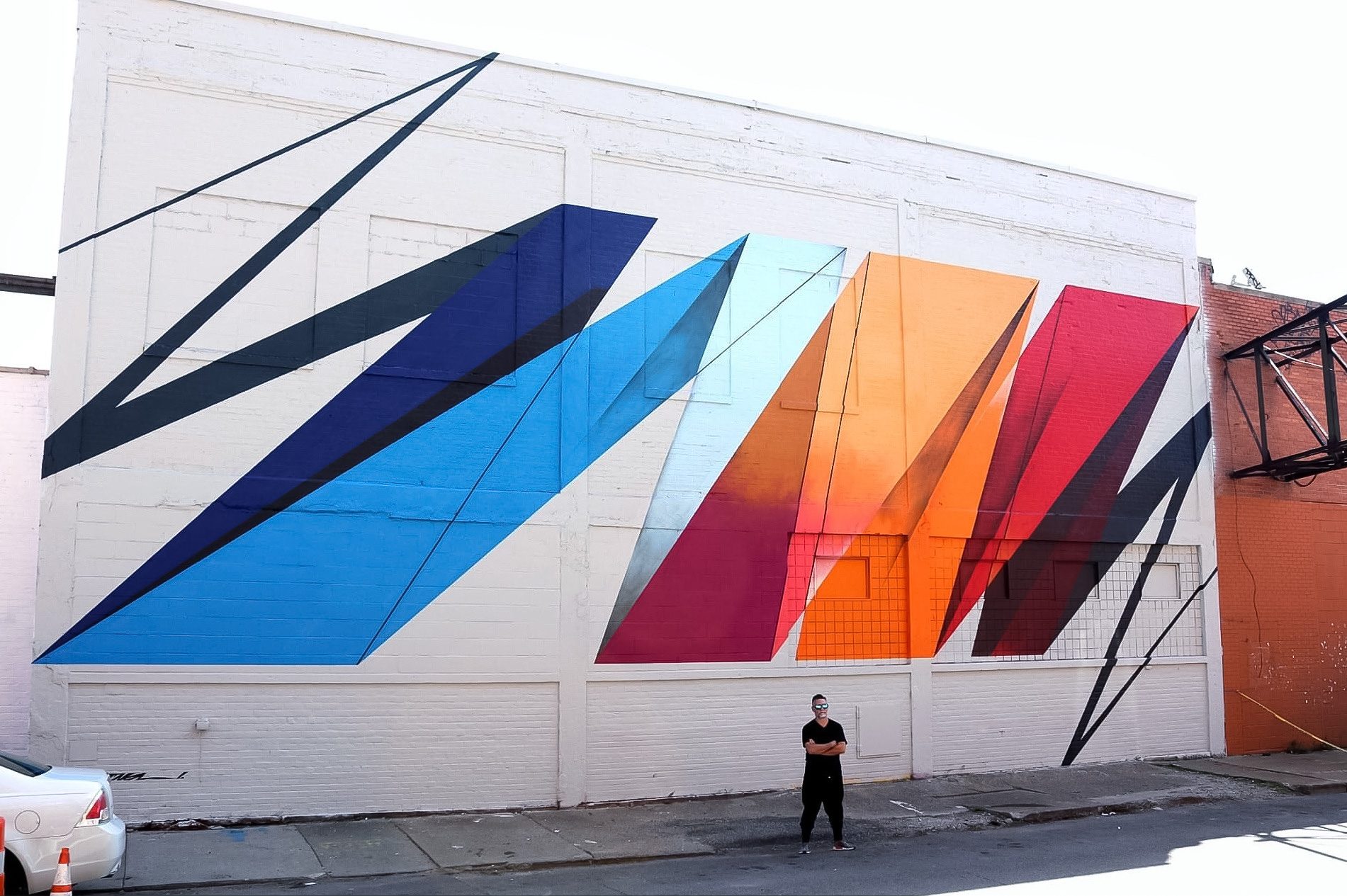
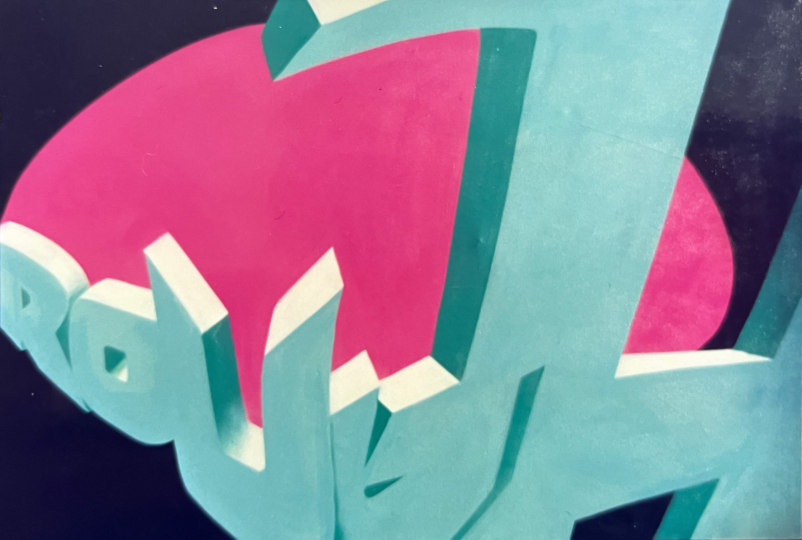
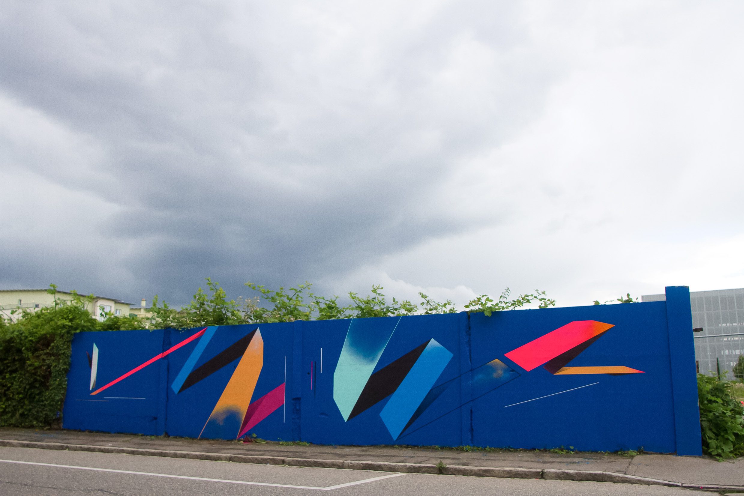
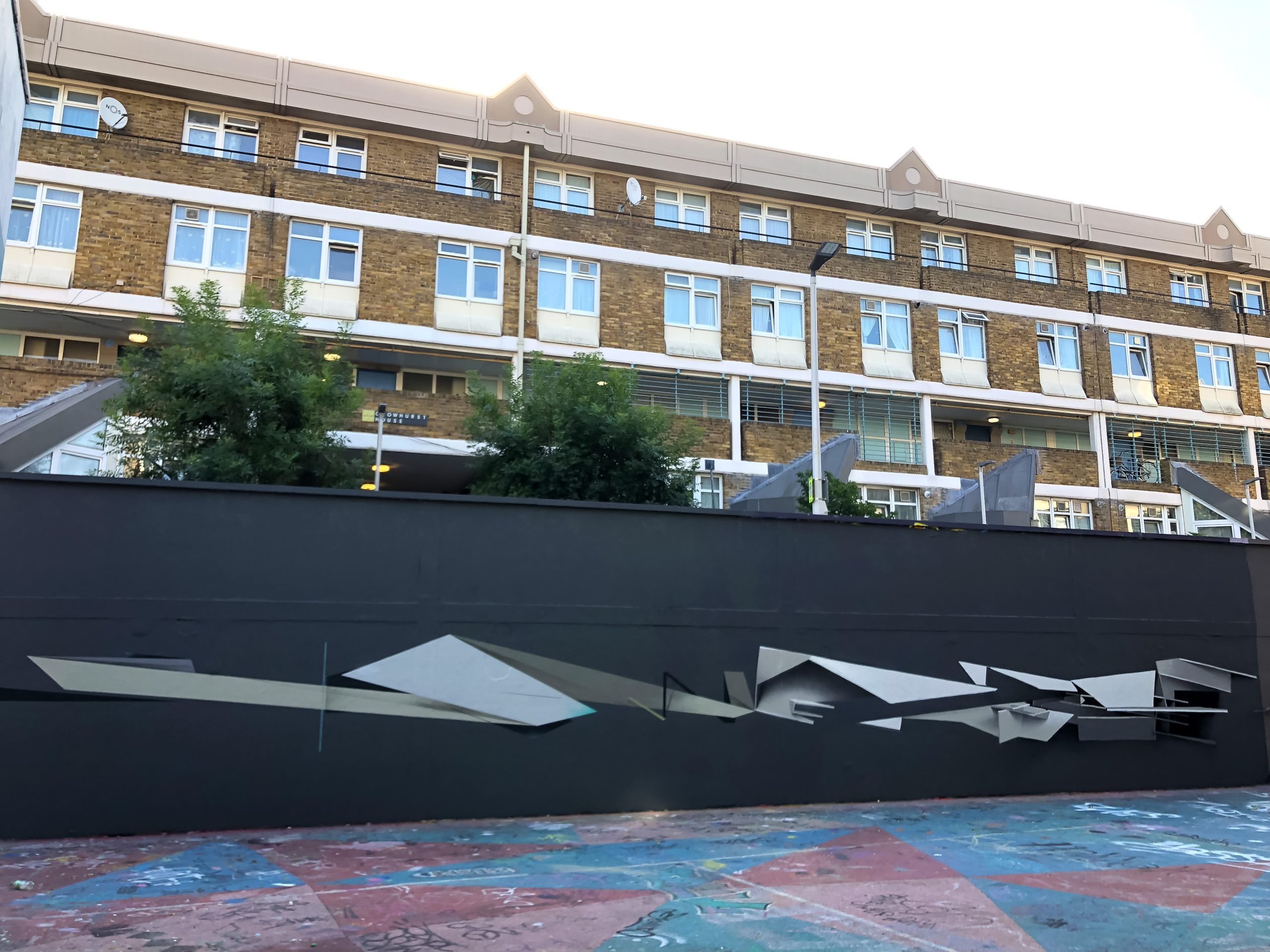
In the studio ROUGH had already developed an abstract colourful style on canvas mid/end of the 90s and was keeping studio and street work separate at this point. He felt he could be even more experimental in the studio and was really happy with the feedback he was getting, so it encouraged him to experiment further. In 2005, ROUGH started to be tired of lettering. He had just reached a point where he had more to say than simply writing his name and was seeking a new language. One of the key paintings he did to rethink his work was in 2011 in Altona, Hamburg, Germany. As part of a festival he produced a 6-storey wall, only in his geometric, block style, it really changed his perspective of how he wanted to make art according to the artist: “I look at graffiti as a perfect art school, it taught me scale, technique, patience, materials and surface but all of these things were useless without the direction I needed. I really had to find the language in which to speak with. “
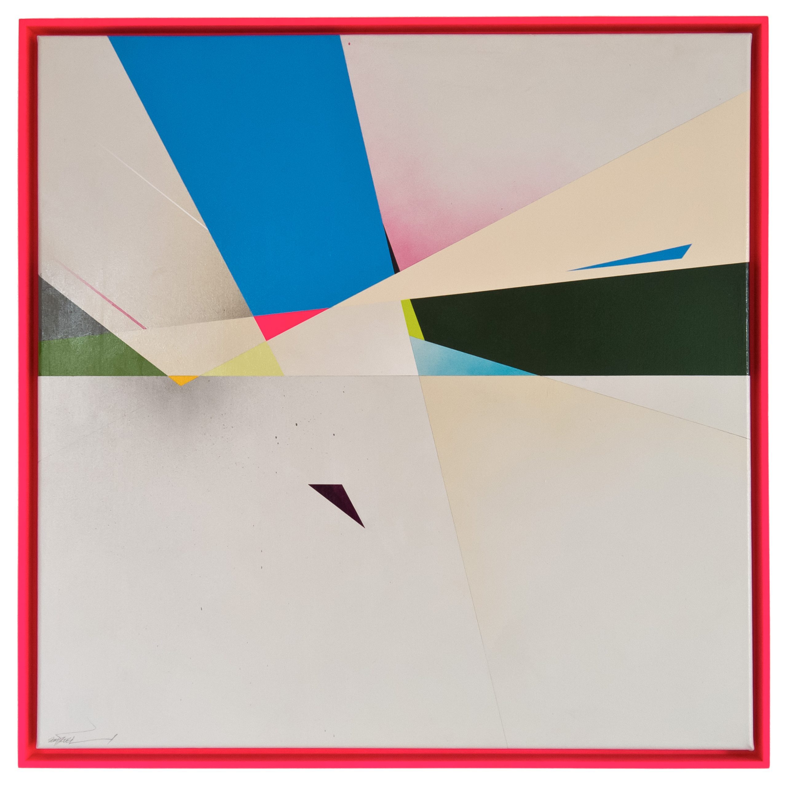
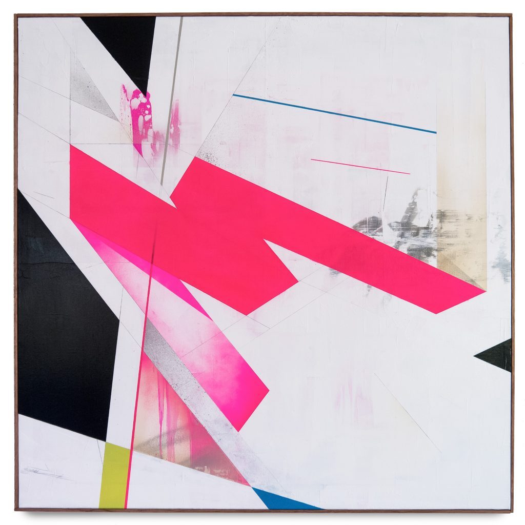
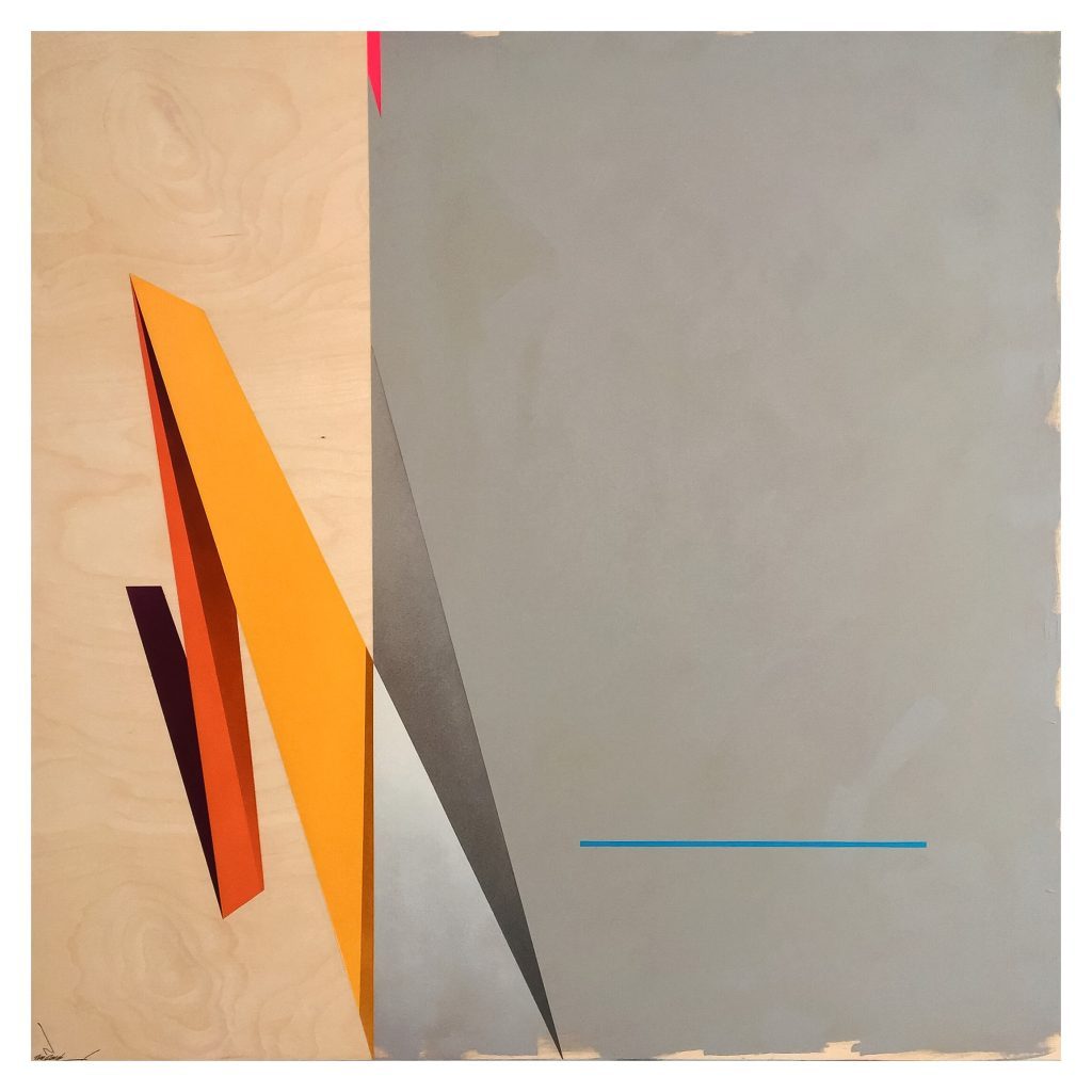
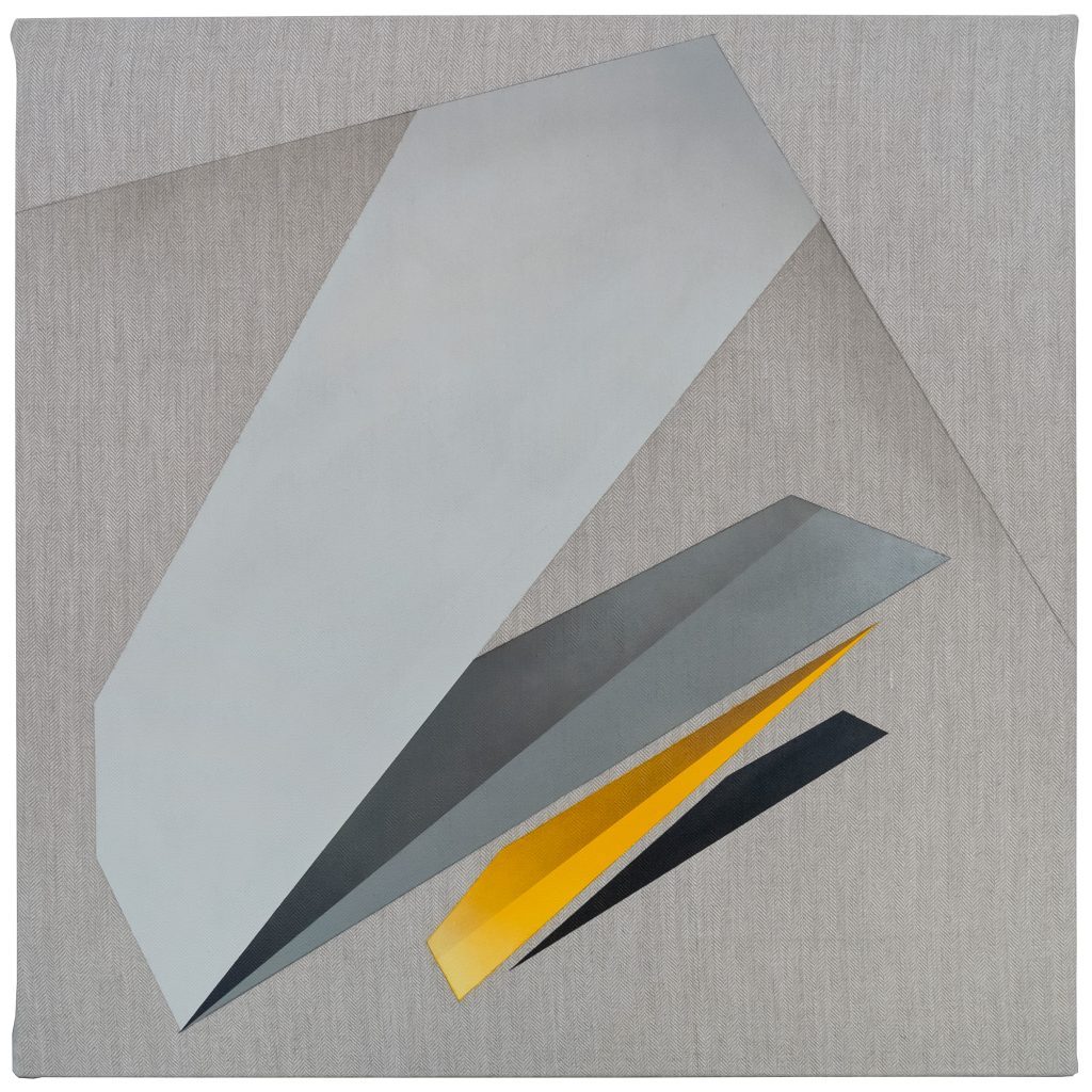
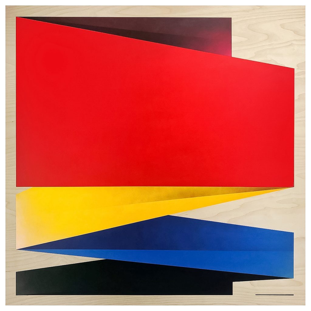
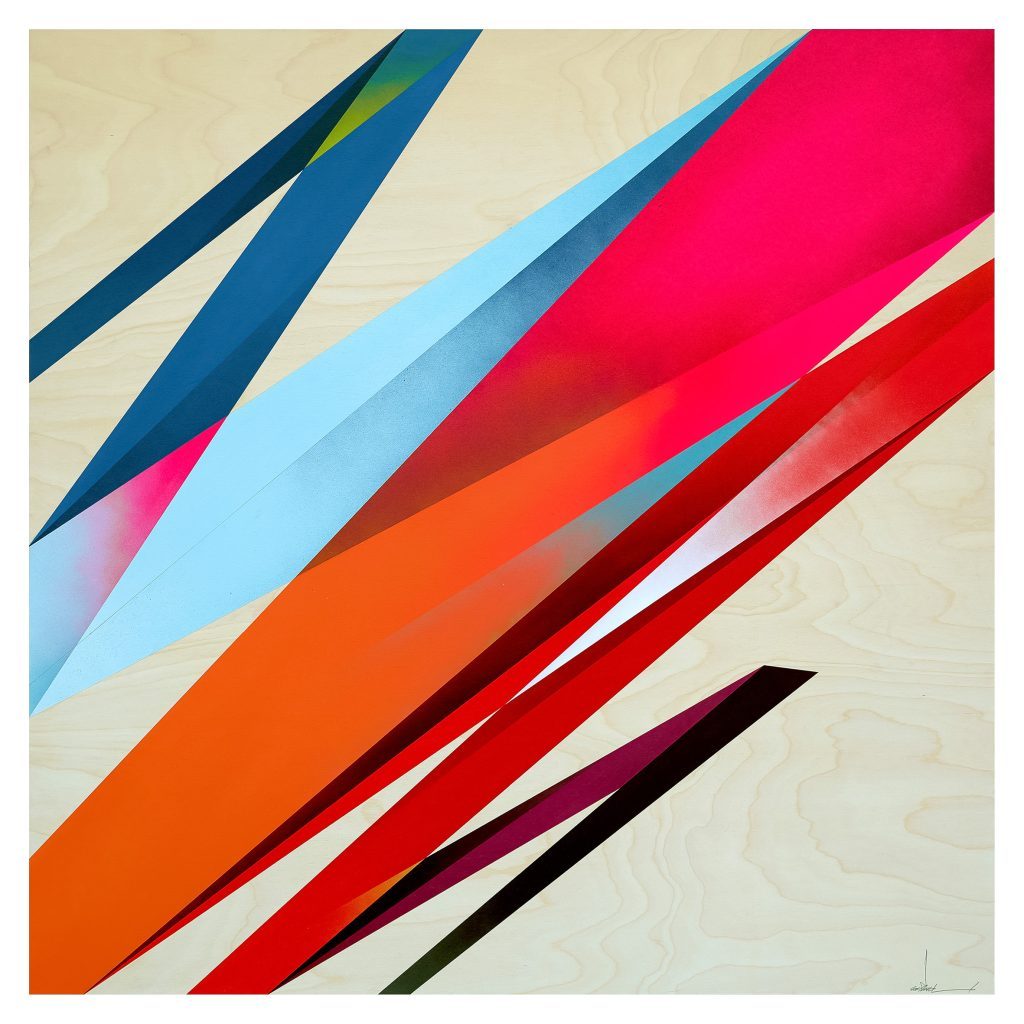
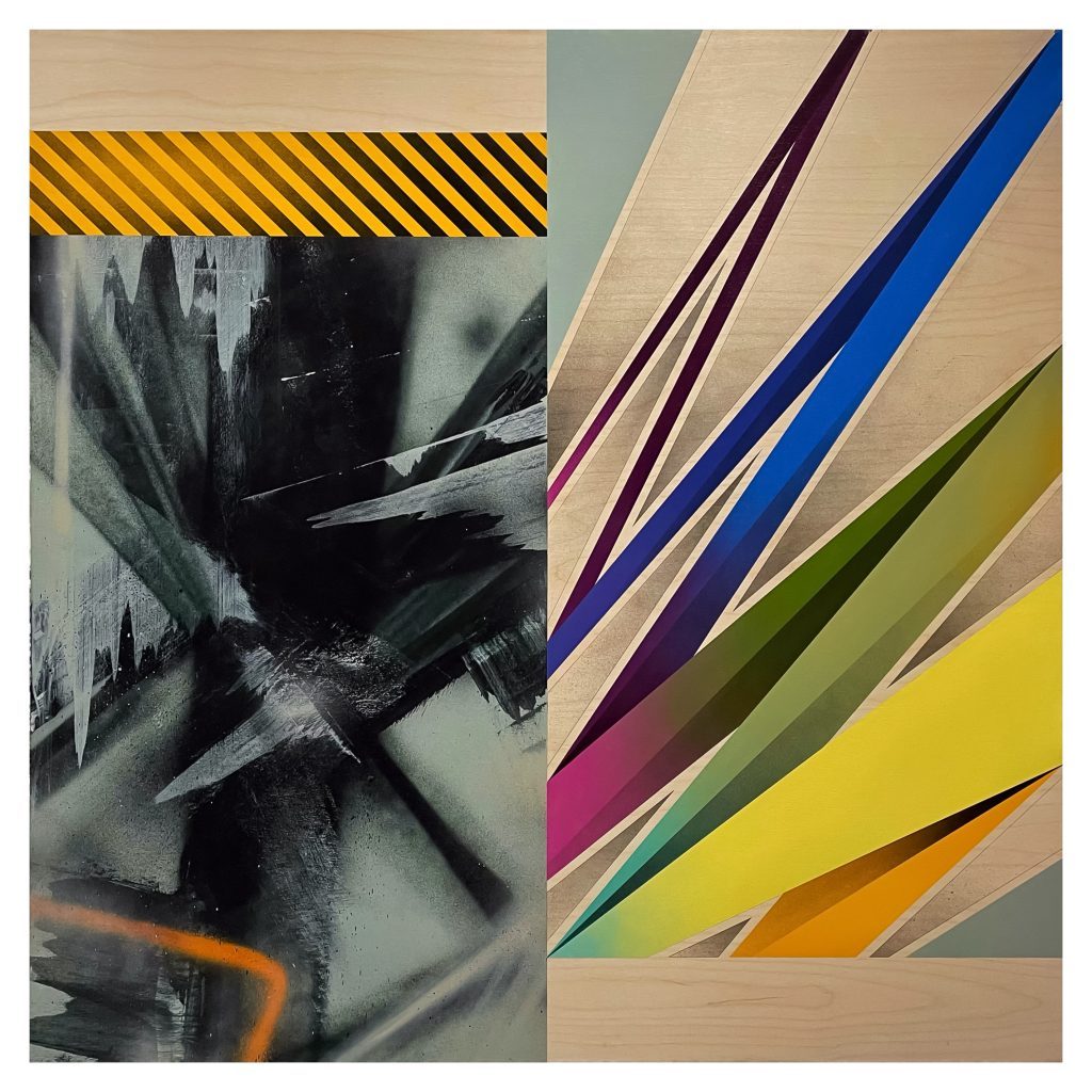
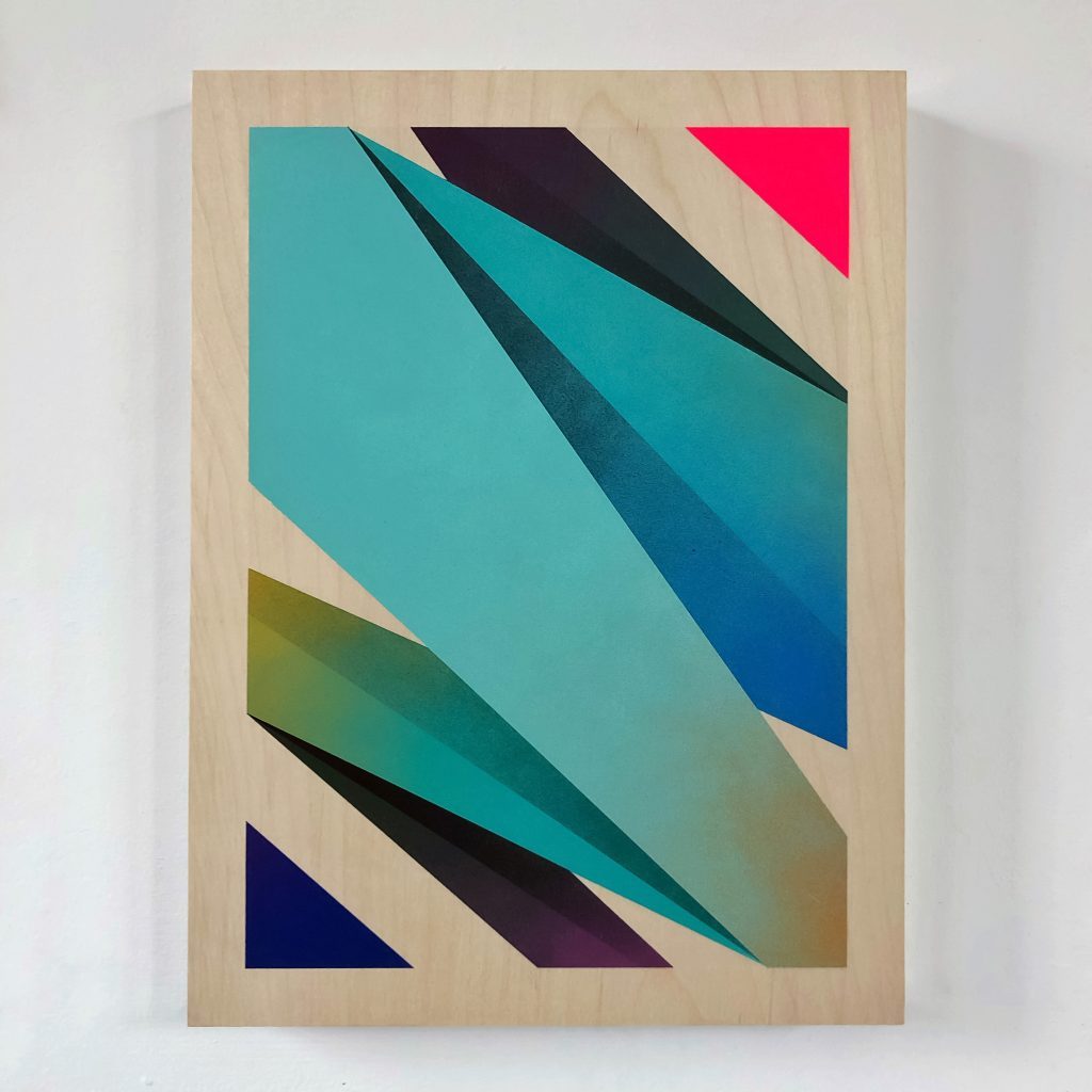
The first abstraction started with blocks and simple shapes and at first composition was everything. ROUGH describes it like this: “I was trying to use the same principals as my lettering pieces with regard to composition but that changed as it started to mature. At first there was a simplicity to the forms and then I started to include depth and a third dimension. I had already played with folding forms in 1997, but I returned to this, this time using tape as well, in order to have the cleanest edges I could achieve. There is a propensity to condone the use of tape with graffiti purists but I felt that I had more than proved myself with regard freehand technique in the years prior, and following on from CRASH and FUTURA both using tape in the 80s, I thought who cares. I need to achieve the look I want and that’s the most important thing at this stage. “
According to ROUGH his abstract works, described by himself as compositional abstraction have no real link to lettering anymore. Only the gestural motion and flow bares a distant similarity. Letters are of no importance to the paintings anymore. But he always considered graffiti to be an abstract movement because style writers take letters and remodel them into abstract icons: they add arrows, connections, flares, 3D and multiple colours. The entire concept behind it is completely abstract, as believed by ROUGH, so he never understood how so many artists within the movement can be so conformist and traditionalist. Even the fact that graffiti writing is the only art movement in history created by and taken forward by children is a completely abstract notion, as claimed by the British pioneer.
Other sources of inspiration
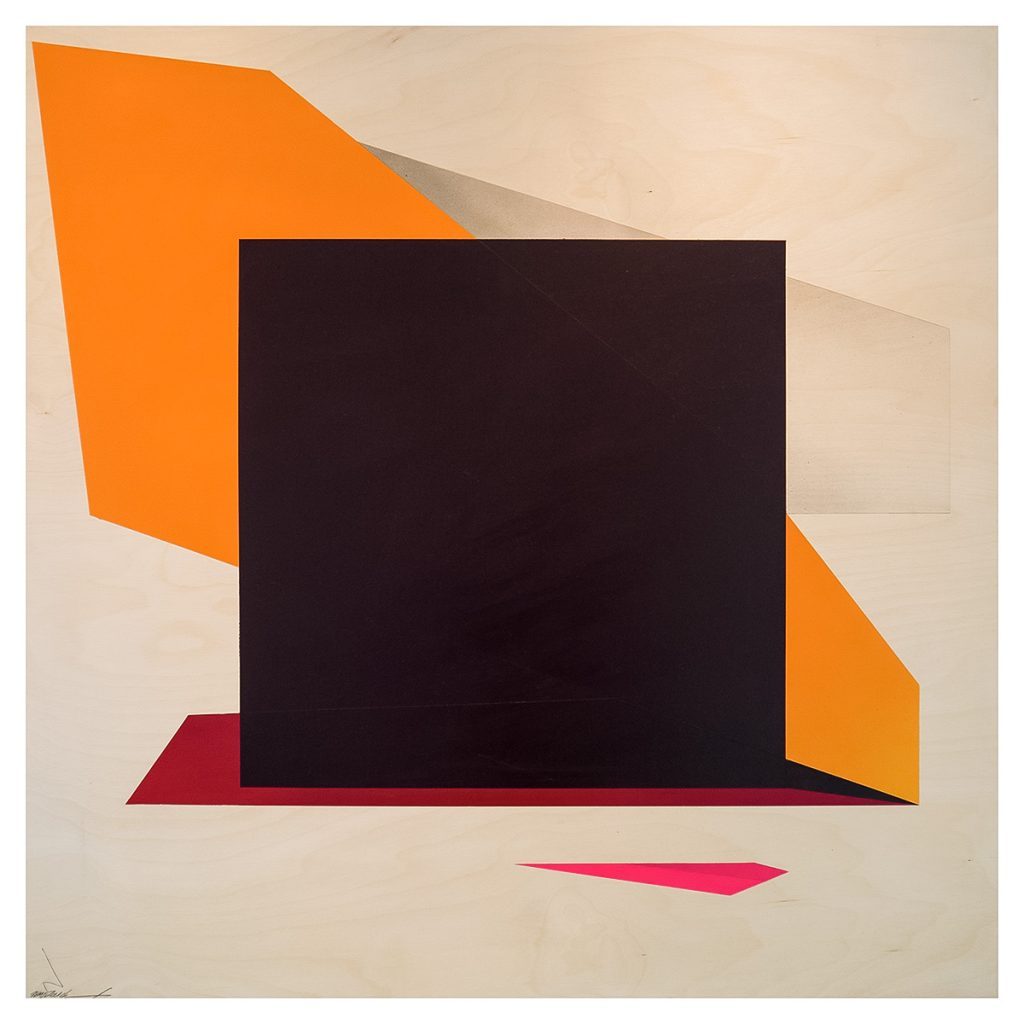
Besides style writing, modern art was another source of inspiration for the British artist. The first painting that truly inspired ROUGH to begin on a new path of painting was Jackson Pollock’s painting „Full Fathom Five “, which he saw at Tate Britain in 1999. He sat in front of it a long time and felt so at peace with the concept of letting go. Another pivotal show he visited with his artist friend Steve More was with works by Mondrian and Ben Nicholson in 2012. Through Nicholson, he discovered works by Barbara Hepworth, Bridget Riley and Carmen Herrera. Other modern artists he was very moved by is the constructivist artist Malevich and László Moholy-Nagy. ROUGH even dedicated a painting later to Malevich, the „black square remixed”. But it wasn’t just about the final works they have made, it was about the aesthetic, the narrative behind the works. ROUGH felt obligated in some way to continue those conversations for new audiences whilst still carrying his baggage of style writing with him as a strong part of that narrative. In 2007, ROUGH was commissioned by London’s Design Museum to edit the museum blog whilst the architect Zaha Hadid had a retrospective exhibition there. This was another major turning point for ROUGH, being subjected to so many incredible works and ideas that he took new shifts within his work.
Creating colour conversations in compositional abstraction
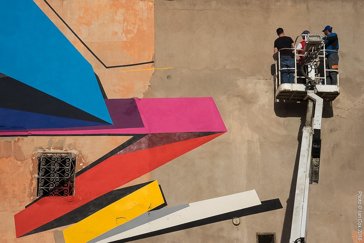
Sketching is still the base of ROUGH’s work. He just draws all the time. He carries a sketchbook with him wherever he goes, because it is important to him to capture notes and ideas especially when traveling. For his large format murals, some drafts are designed on computer as that makes it easier to imagine the work on the actual building. He always has a sketch in advance, but occasionally adapts it during the painting process, but the essence of the design always remains true to the sketch.
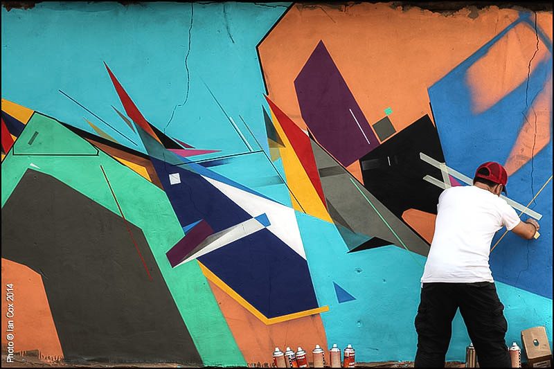
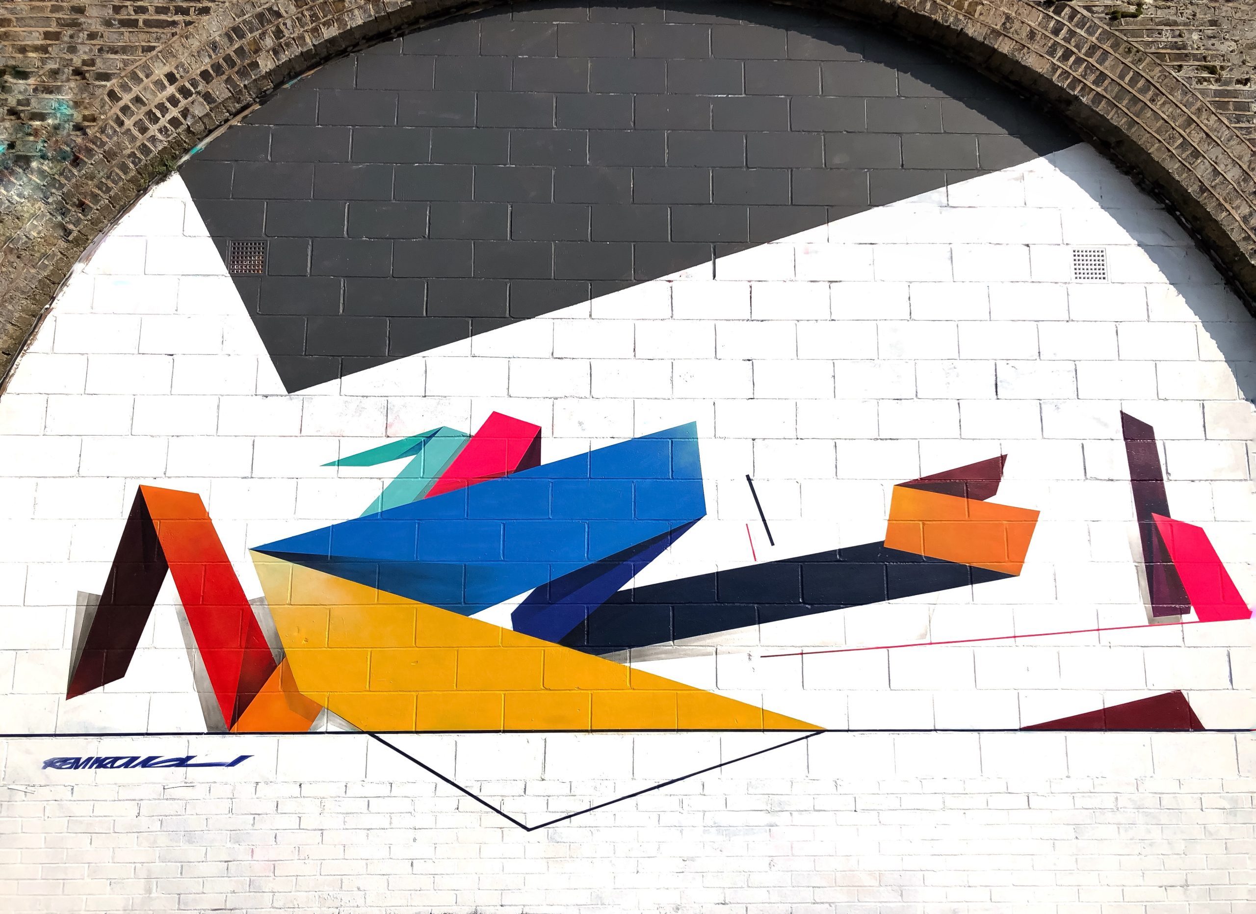
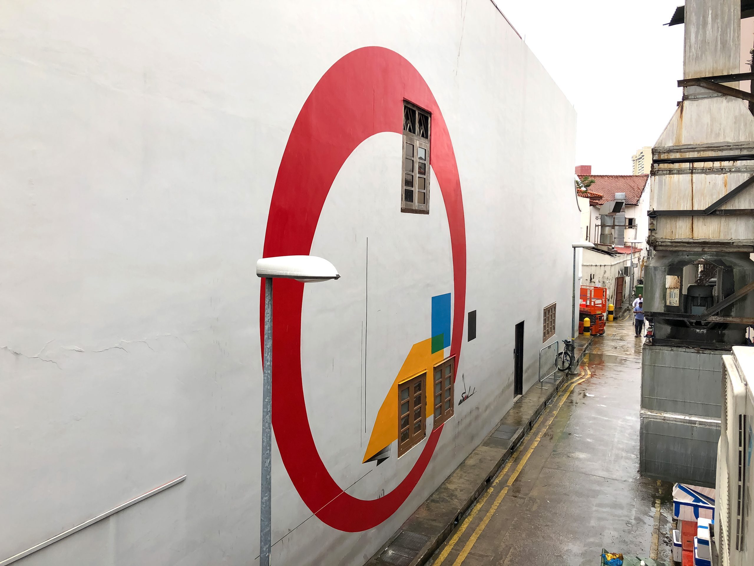
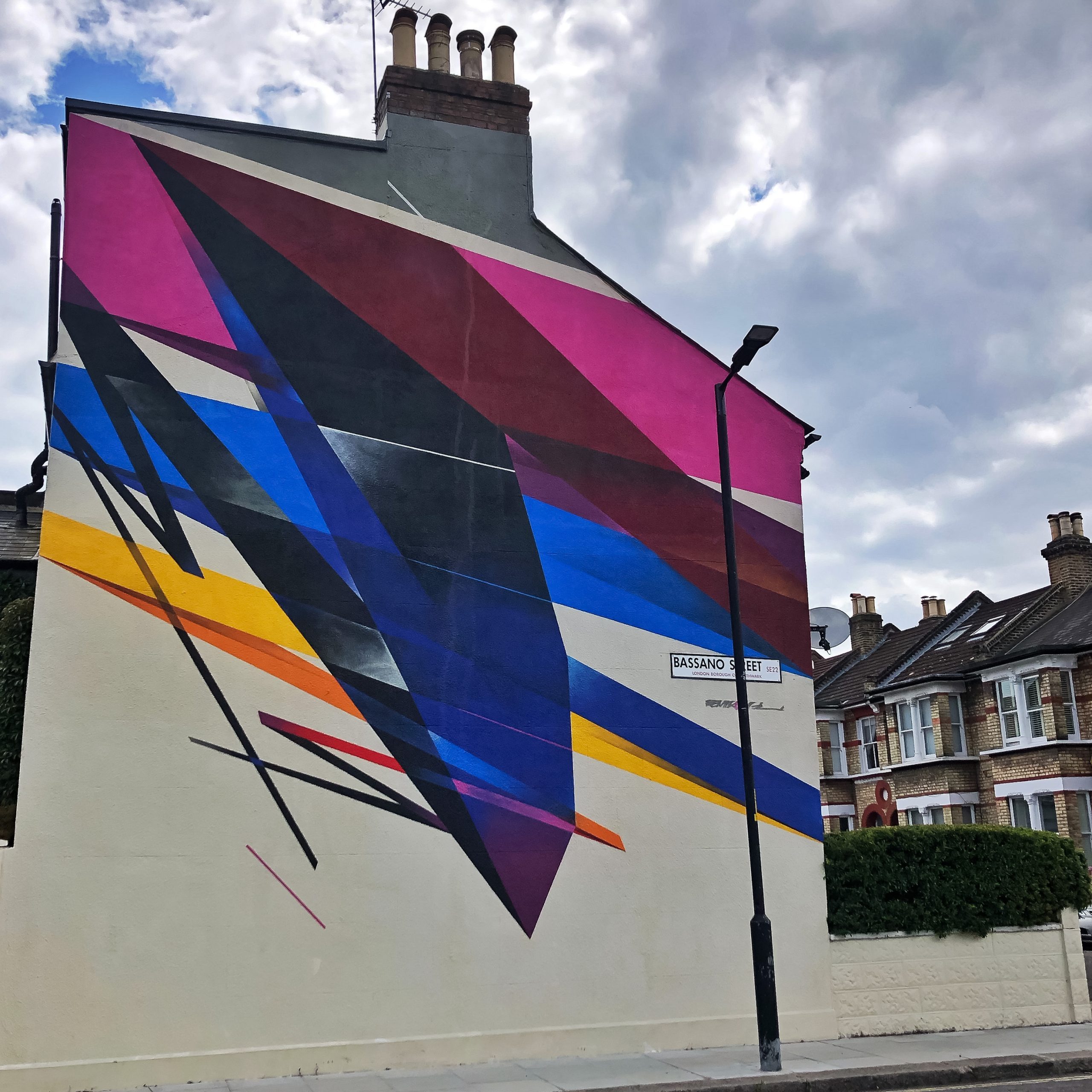
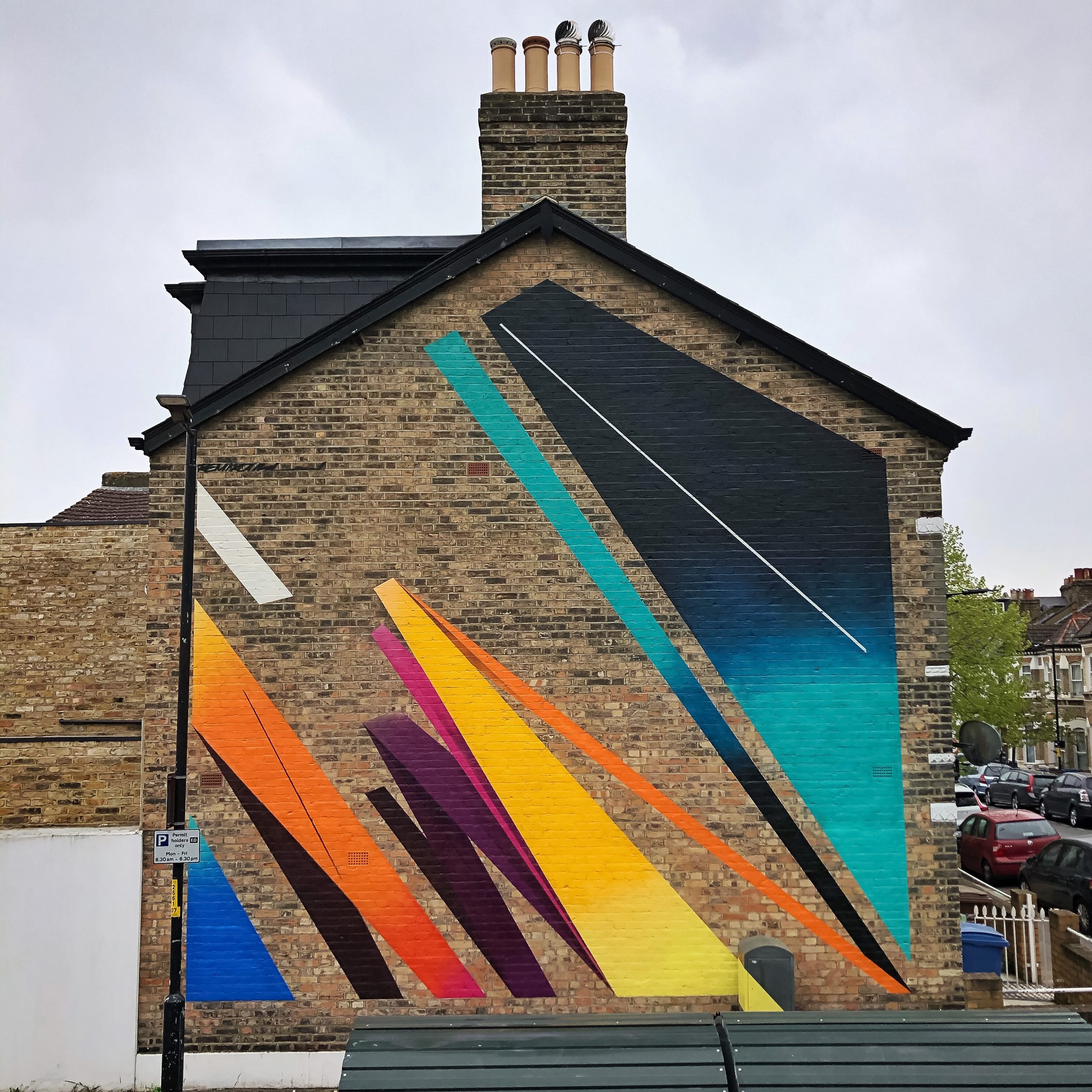
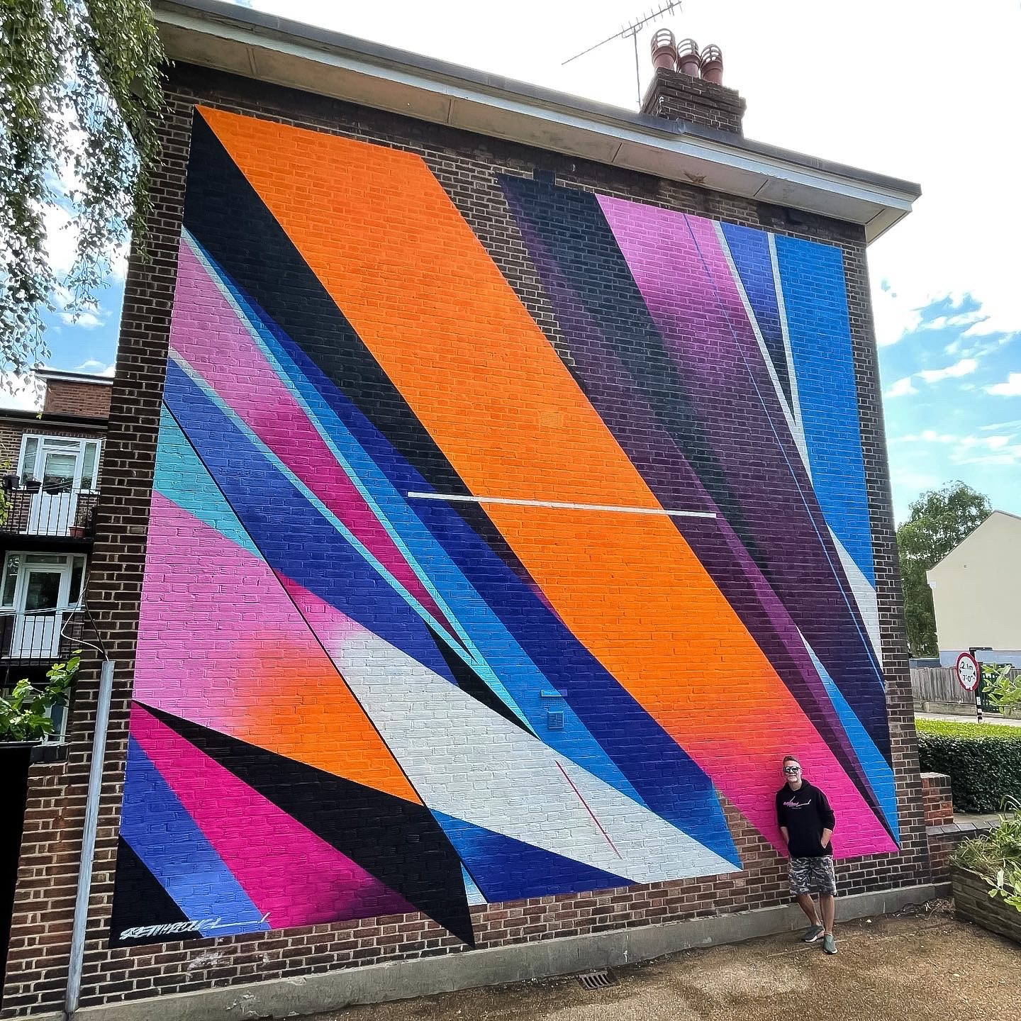
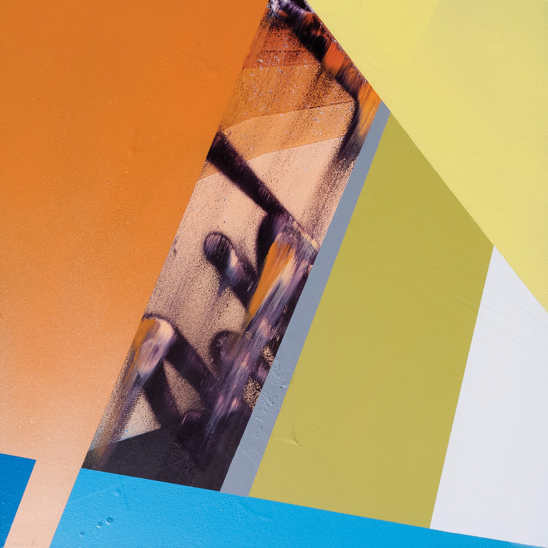
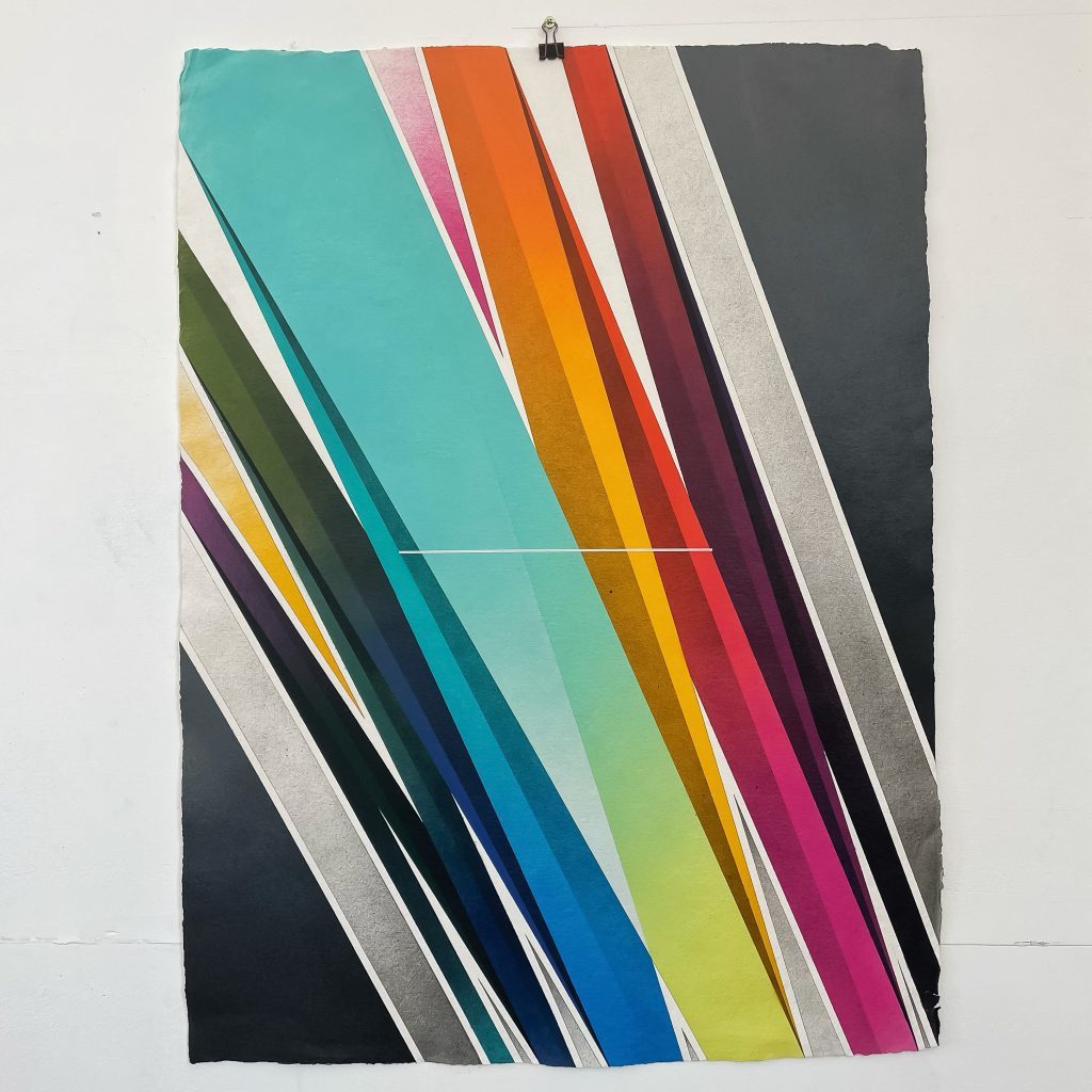
For his wall paintings, he uses a variety of materials to paint, a mixture of exterior house paint and spray paint. First, he draws the structural lines onto the wall with chalk line, graphite and a straight edge. For his abstract works, ROUGH uses maths as well, even though he painted free handed so many years before. For him, there is math within the freehand painting as well. It’s in everything he does at the end but it is just more obvious in the abstract compositions. He explains the need of using math for clarity and understanding where things sit exactly within a painting.
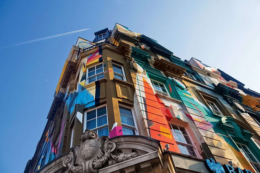
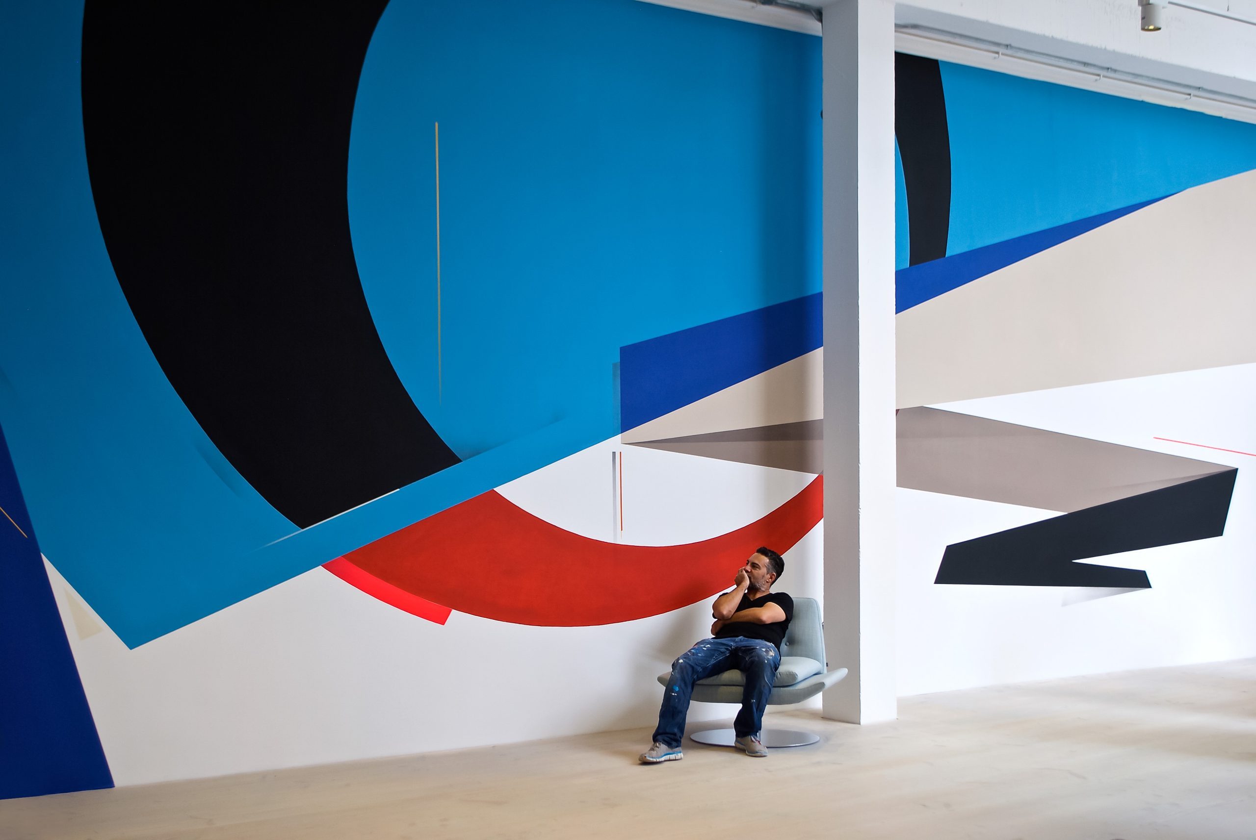
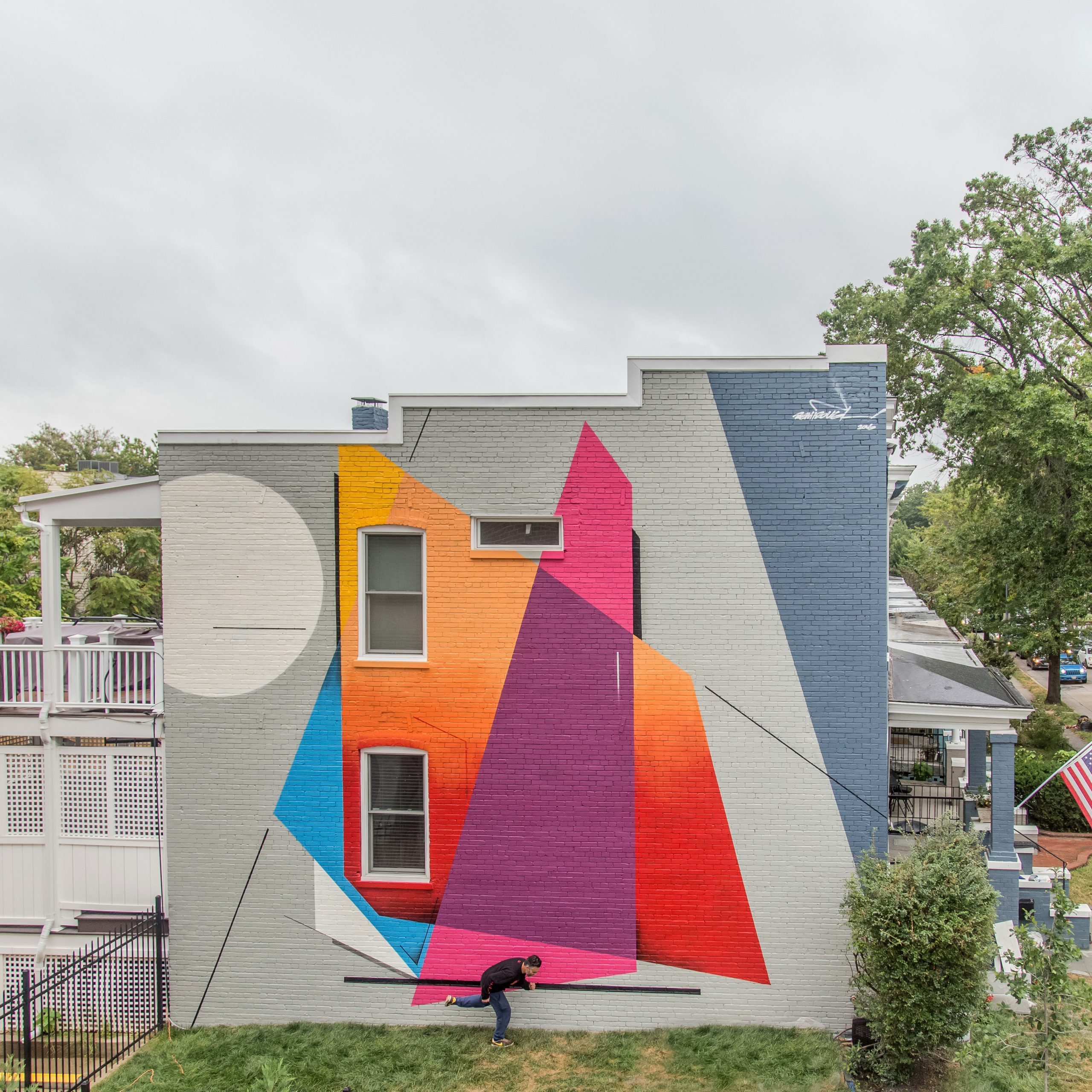
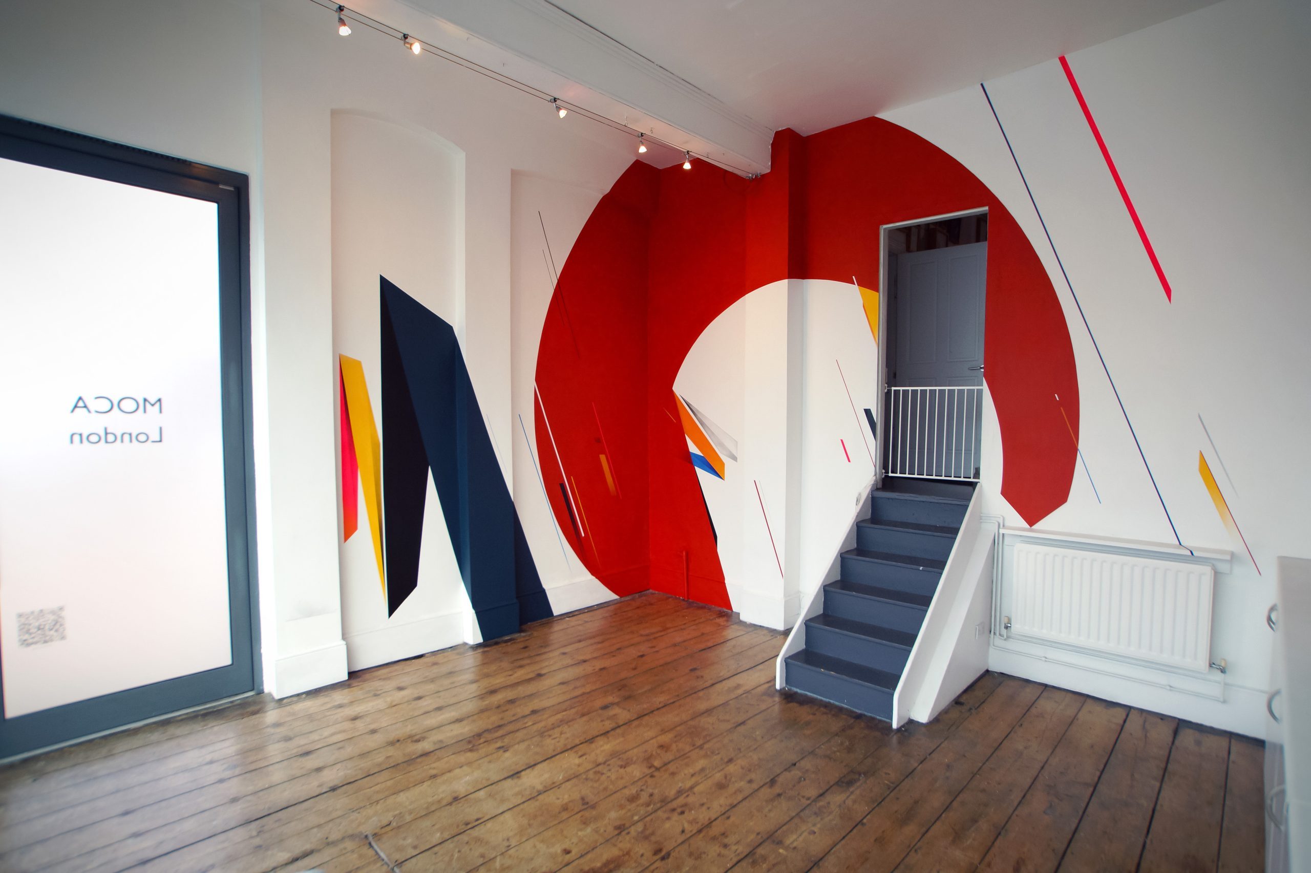
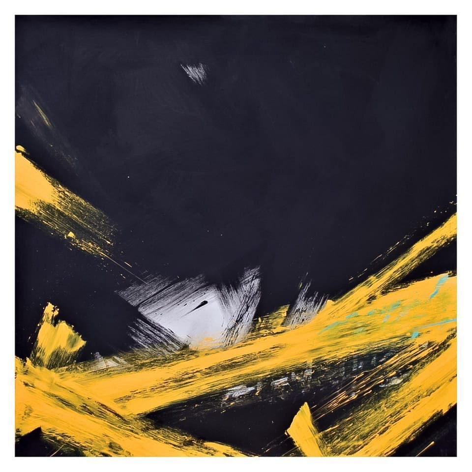
For finding new shapes and colours for his vibrant colourful abstract compositions on walls or canvas or paper, he works with different colour palettes that he returns to sometimes, like sampling with it. Even so the painter always likes to play with new colour combinations, does research, creates colour mood boards, uses an Adobe colour combining app, always looking for colours that have this particular energy, luminance and oscillation. His combinations intend to start a conversation between the colour fields, even if sometimes difficult ones. The negative space in his abstract compositions of colour fields is as important as what is actually there. They shape contrast, harmony and balance. Comfortable with what ROUGH paints for decades, new shapes and compositions just come naturally now and evolve at their own pace in a very calm way. Nevertheless, ROUGH is always trying to find compositions that are original, powerful and concurrently harmonious with balanced shapes and colour tones, paintings that speak to people, making his visual language accessible. Concerning his wall paintings or his studio works, the artist sees nearly no difference. The language is the same throughout, the scale is the only difference.
Studio practice
In his studio ROUGH works freely with works on linen or paper. His paper works are almost like his sketches, he says. Sometimes they inform larger paintings or mural ideas but more often they have their own entity. The smaller paper works are his training ground. With panels or canvas pieces ROUGH tends to have more of a plan as there is always negative space to contend with and that has to be considered within the composition. For him the studio is a hub to create compositional abstraction and to find solutions to the problems he faces within painting. He is a painter first and foremost but his practice takes him wherever it needs him to go. ROUGH likes to paint to music, sometimes jazz, sometimes electronic or avant-garde, sometimes hip hop, it all depends on his mood but it is also very important to the process. He usually works on larger formats over the course of a month and smaller works can be painted in a day or two. But every day, unless he is away on a mural commission or travelling, he is in the studio working.

ROUGH is one of the pioneers and major figures of abstract post graffiti in Europe. With the energy and dynamics of style writing and inspired by modern art, especially by constructivist painters, his abstract striking compositions with kinetic shapes, great dynamics and a bold colour palette are powerful, vibrant and a feast for the eyes. Moreover, the British artist never stopped doing styles and pieces outdoor because he thinks it is important to keep himself grounded within that movement, this practice of graffiti writing that conducted his artistic evolution and still does. There is a part of the younger him in everything ROUGH does, he says, still practicing graffiti writing is activating a muscle memory and gives him the feeling of freedom of painting, regardless of what it is. For that reason, it is part of him and will always be.


Leave a Reply