

23–30 May 2026
MOM art space, Valentinskamp 34a, Hamburg
Curated by Lara Bader, independent curator and art educator
Initiated by ZONENKINDER Collective
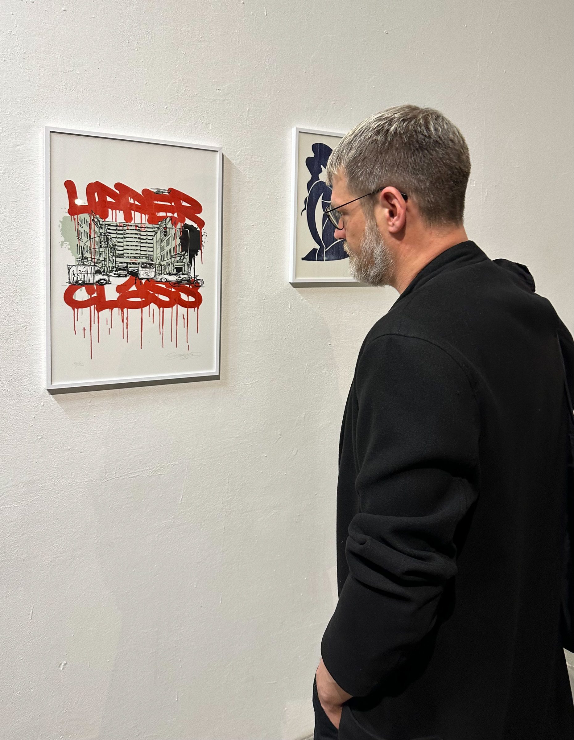
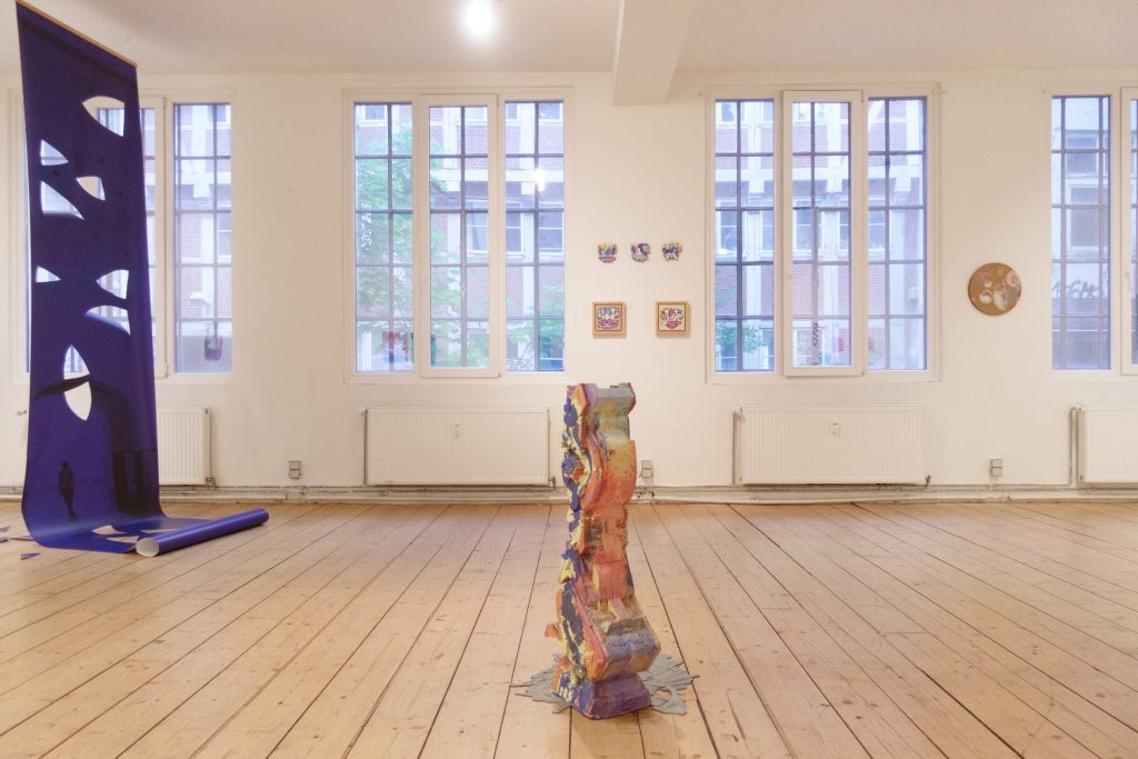
Street art meets post-graffiti, wall art meets the white cube, urban surfaces meet spatial arrangements: SAME DIFFERENCE explores the shift in aesthetic strategies between public space and the institutional context. The starting point is the question of how perception, materiality and legibility change when artistic practices leave their original setting – and which elements remain intact in the process.
The exhibition title articulates both convergence and difference. The common points of reference among the works on display lie in their engagement with the city, architecture, typography and surface. In the transition from the outdoor space to the gallery context, however, these parameters are reorganised: visibility shifts toward contemplation, intervention becomes deliberate artistic proposition, and ephemerality gives way to concentration.
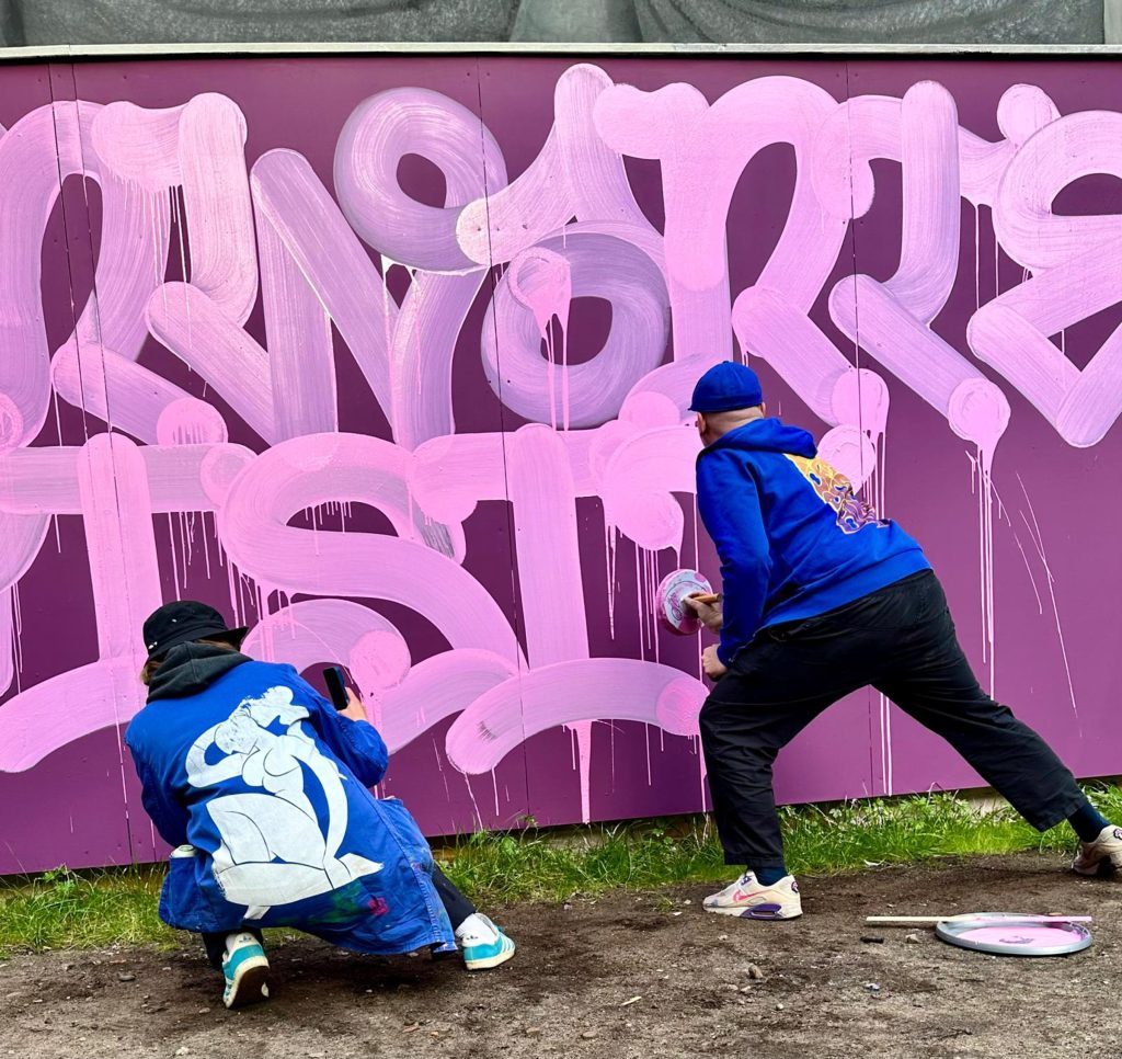
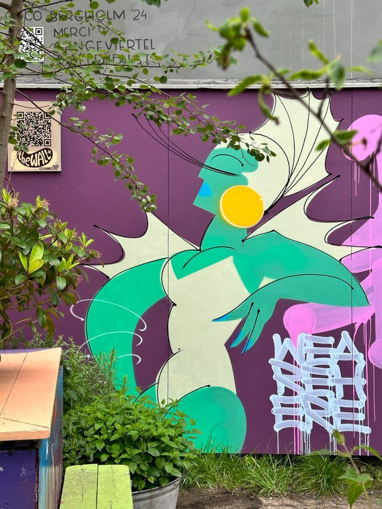
The exhibition takes its starting point from the mural project *the WALL+* in Hamburg’s Gängeviertel, which the ZONENKINDER Collective has been developing since 2024 as an open experimental space for contemporary mural art. Many of the participating artists were already involved in the project or have close ties to it.
What made the project special for me was that the selection of participating artists was, so to speak, already in place before I was invited by the ZONENKINDER Collective to curate the exhibition at MOM art space. So I saw my main task to develop a narrative thread throughout the exhibition through the choice of works and their positioning in the space, one that maintains the connection to the Wall+ whilst at the same time offering space for the individual artistic positions and their respective themes, says Lara Bader. The exhibition SAME DIFFERENCE is thus conceived less as a transposition of urban practices into the white cube, and more as a juxtaposition of different visual and public logics.
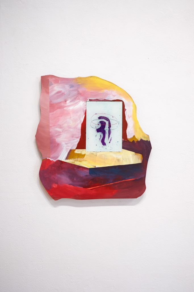
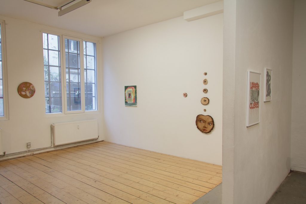
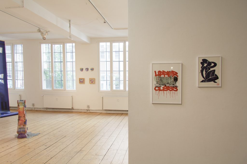
This is particularly evident in the work of Mina Mania and Stohead, who collaborated on an outdoor mural in the spring of 2026. In their figurative compositions and calligraphic abstractions, a tension emerges between legibility and signification. Questions of appropriation, visibility and presence in public space are not addressed in an illustrative manner, but are made visible through the use of lettering, form and placement. In their prints, exhibited indoors, urban art appears neither romanticised nor depoliticised, but rather as commentary, disruption and a demand for visibility. Mina Mania’s ‘Nana’ is a symbol of strength and female empowerment which, particularly within the context of an often male-dominated street art scene, can be interpreted as a feminist statement and draws connections to classical art history.
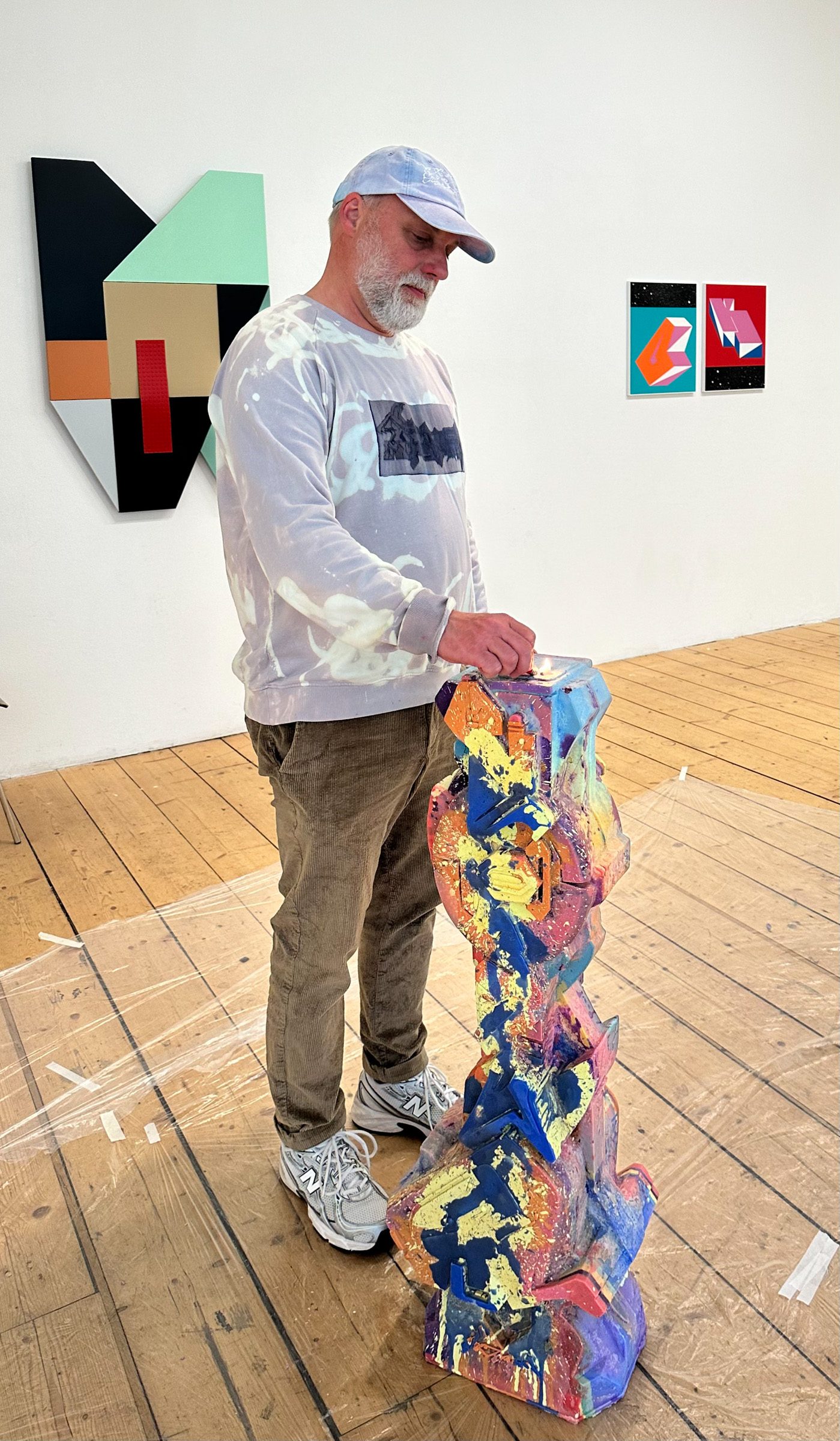
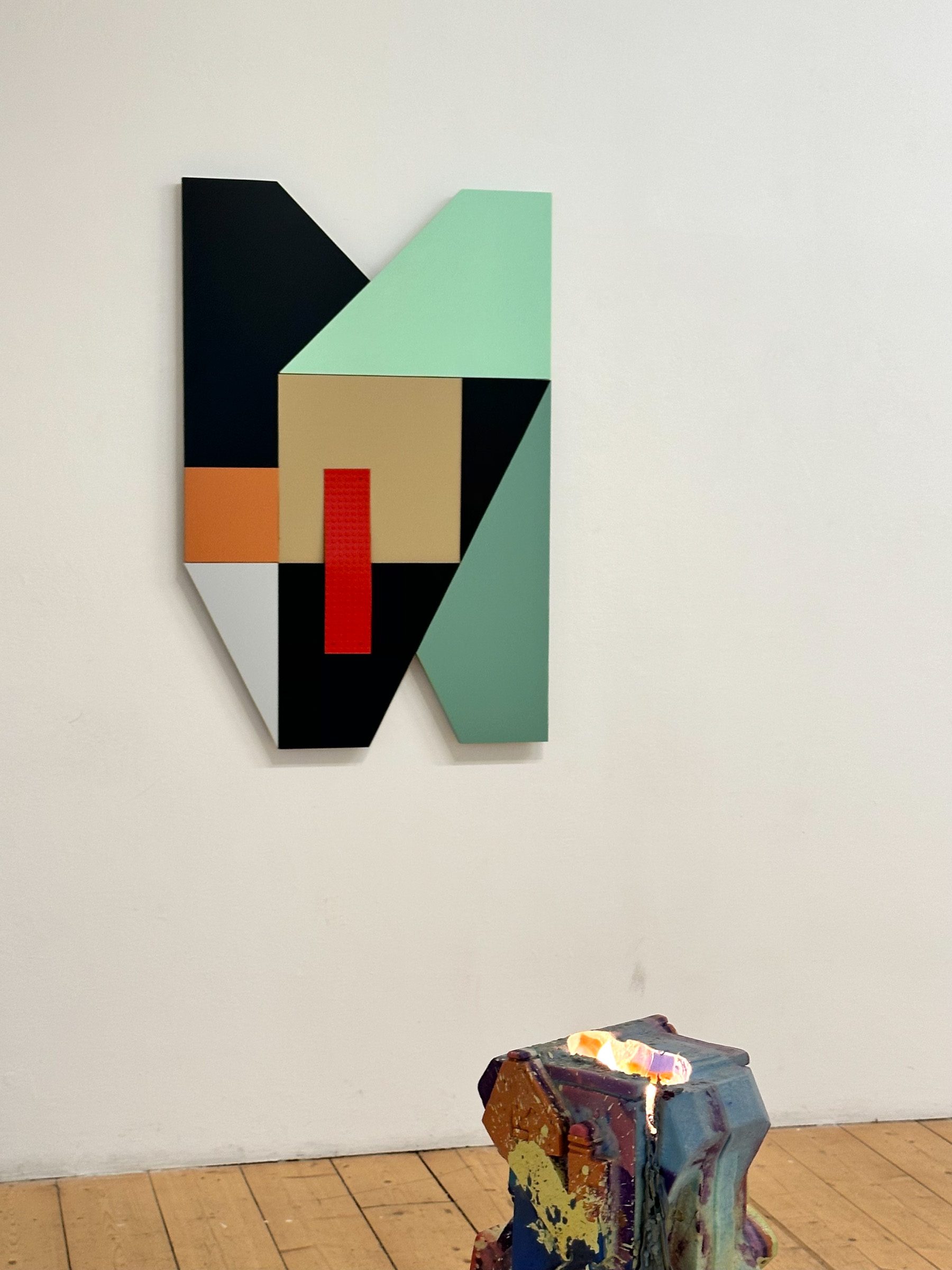
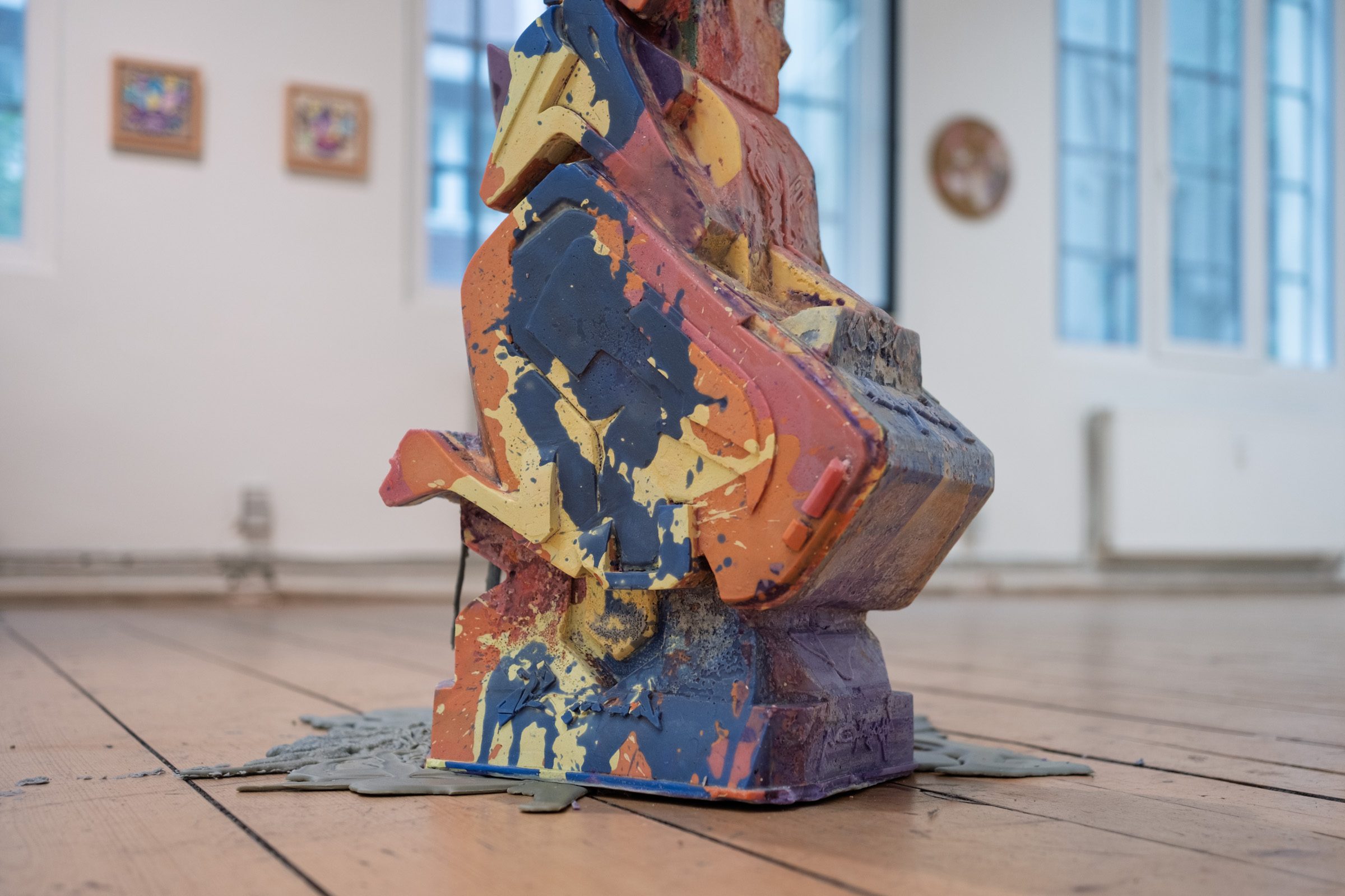
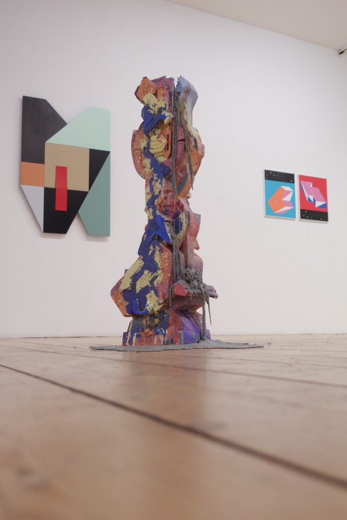
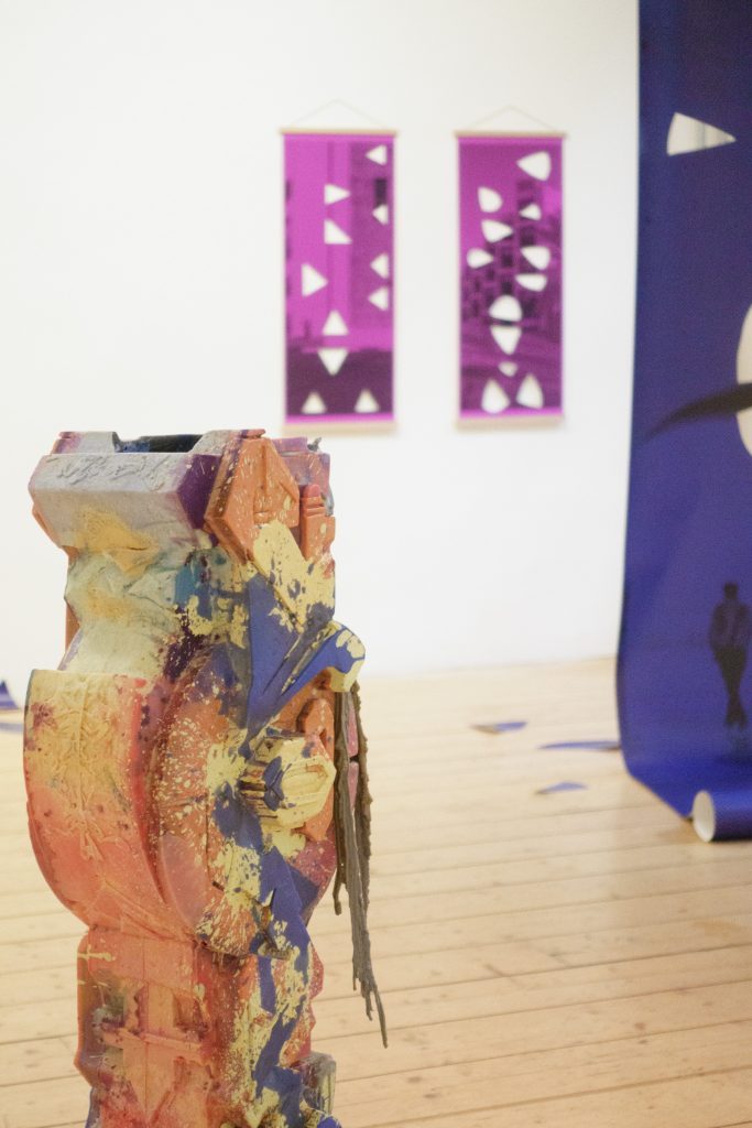
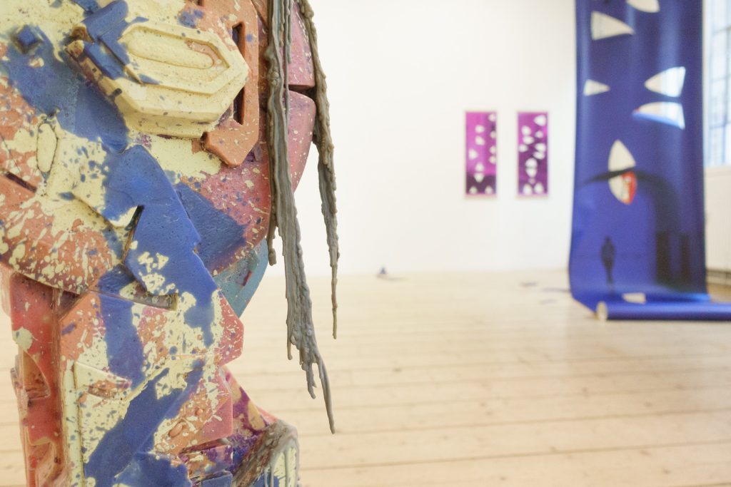
Glypholyth, N.O. Madski transforms elements of style writing into sculptural forms made of wax. Here, writing no longer appears as a fleeting mark, but as a three-dimensional object. The material simultaneously evokes transformation and transience – qualities that also characterise urban wall works, which are constantly changing through the passage of time, layers of paint and the elements.
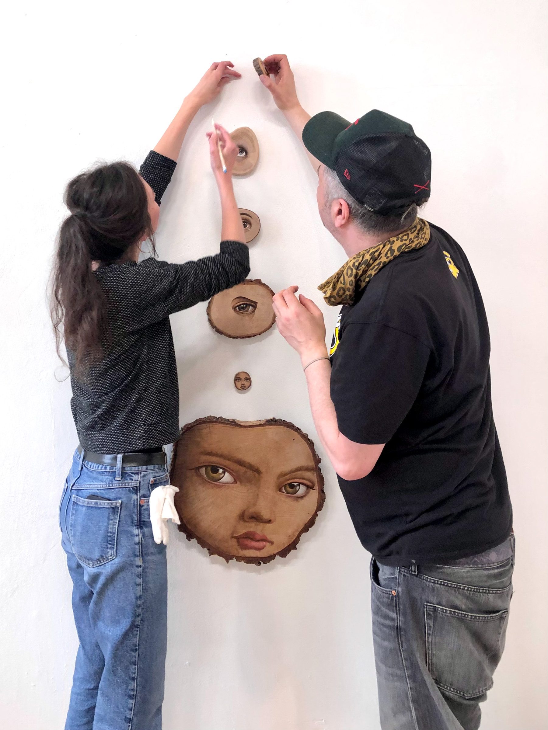
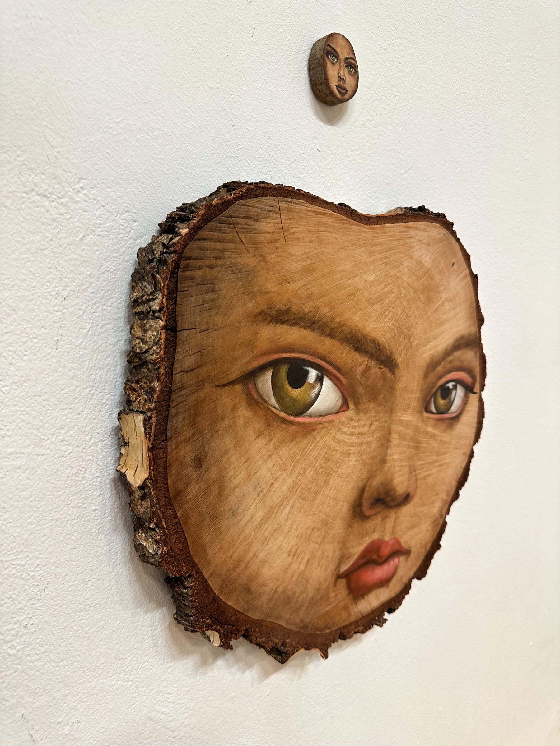
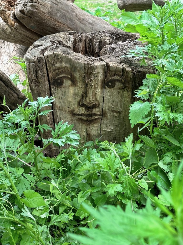
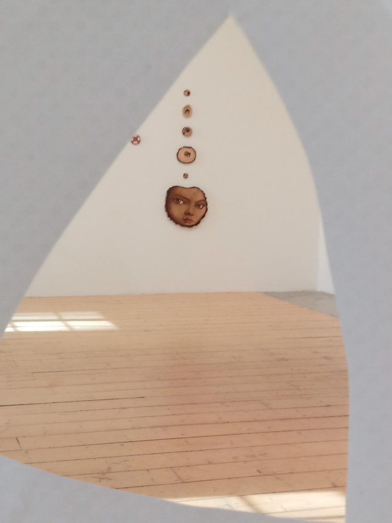
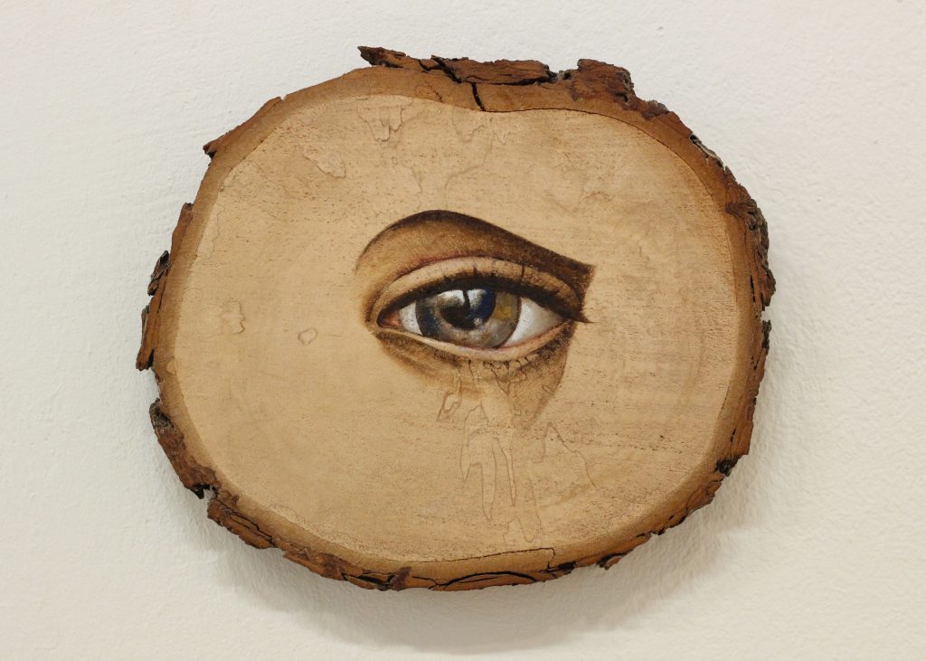
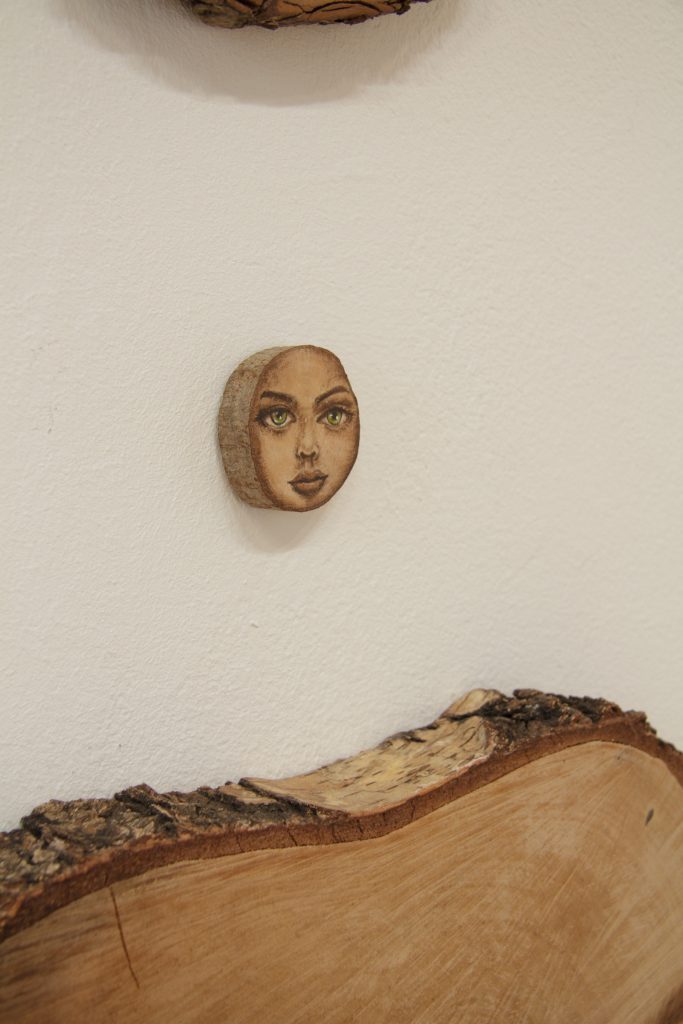
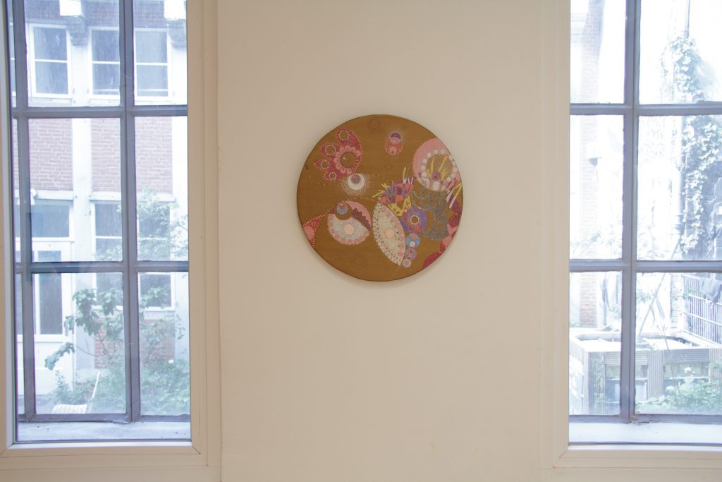
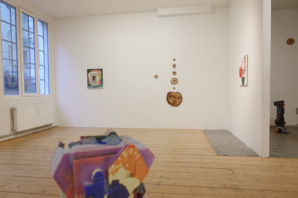
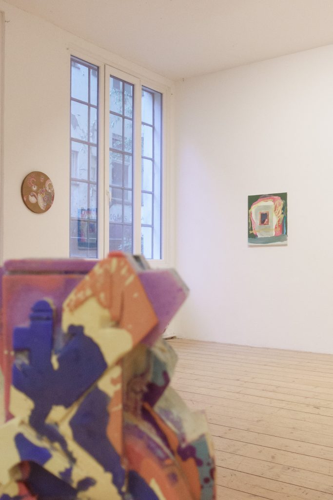
With the TREE PROJECT, the ZONENKINDER Collective shifts the focus to organic structures within the urban landscape. Wood becomes a canvas, and natural surfaces serve as the starting point for painterly interventions. Perception arises here through the discovery of forms and faces within the material itself. At the same time, subtle art-historical references establish connections between urban visual practice and traditional painting.
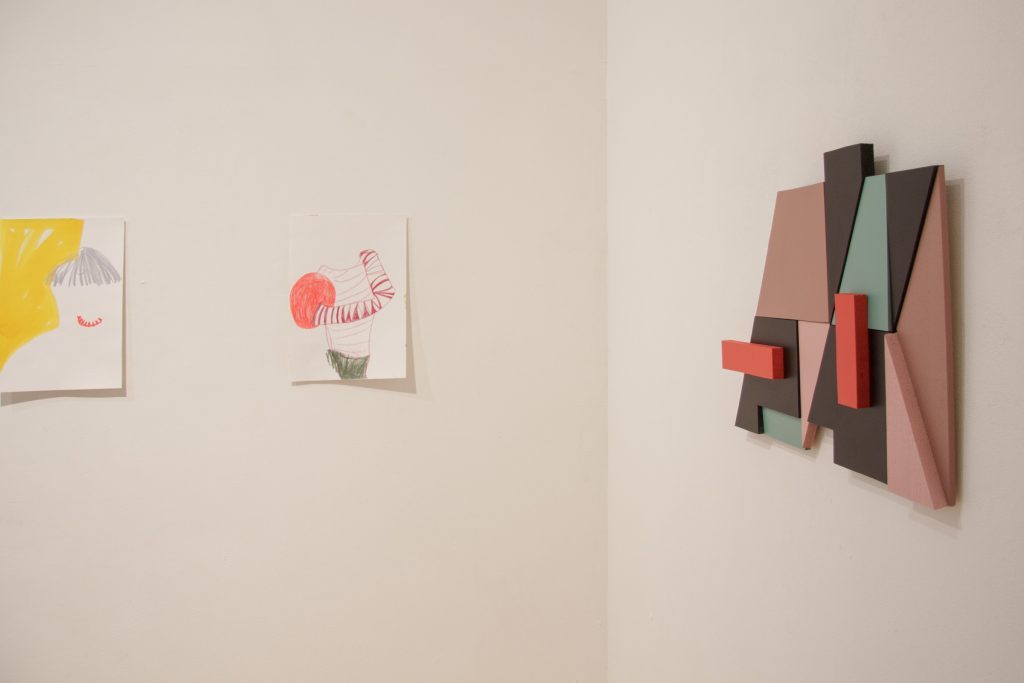
Solweig de Barry works with a minimalist visual language that lies between drawing and painting. Lines, empty spaces and fragmented forms create open pictorial spaces that function less through narrative than through rhythm and composition. Although her practice does not stem directly from street art, repeated work in outdoor spaces gives rise to overlaps in the treatment of surface, scale and spatial perception.

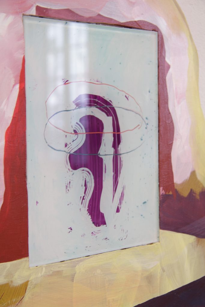
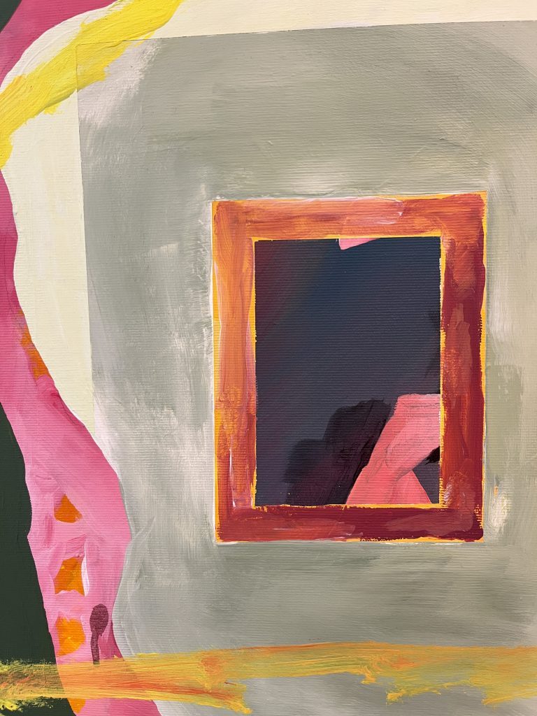
Johannes Mundinger, too, explores questions of space and perspective in his work. Architectural fragments, window structures and hints of landscape are deliberately left ambiguous. Interior and exterior appear less as fixed categories than as visual states. In this context, painting becomes both pictorial space and surface. When asked how his approach changes depending on the space and context, he replies:
Art in public spaces is visible to everyone, and I think that gives it a greater impact because it reaches people who would never go to a museum or a gallery. In conversations with passers-by or local drinkers, I notice time and again that my work really does trigger a process here, especially with images that appear quite abstract. In an exhibition space, on the other hand, people usually bring a whole host of preconceptions with them – and indeed, here painting is actually one of the less progressive forms of art. So I find it easier to attribute relevance to murals in public spaces.
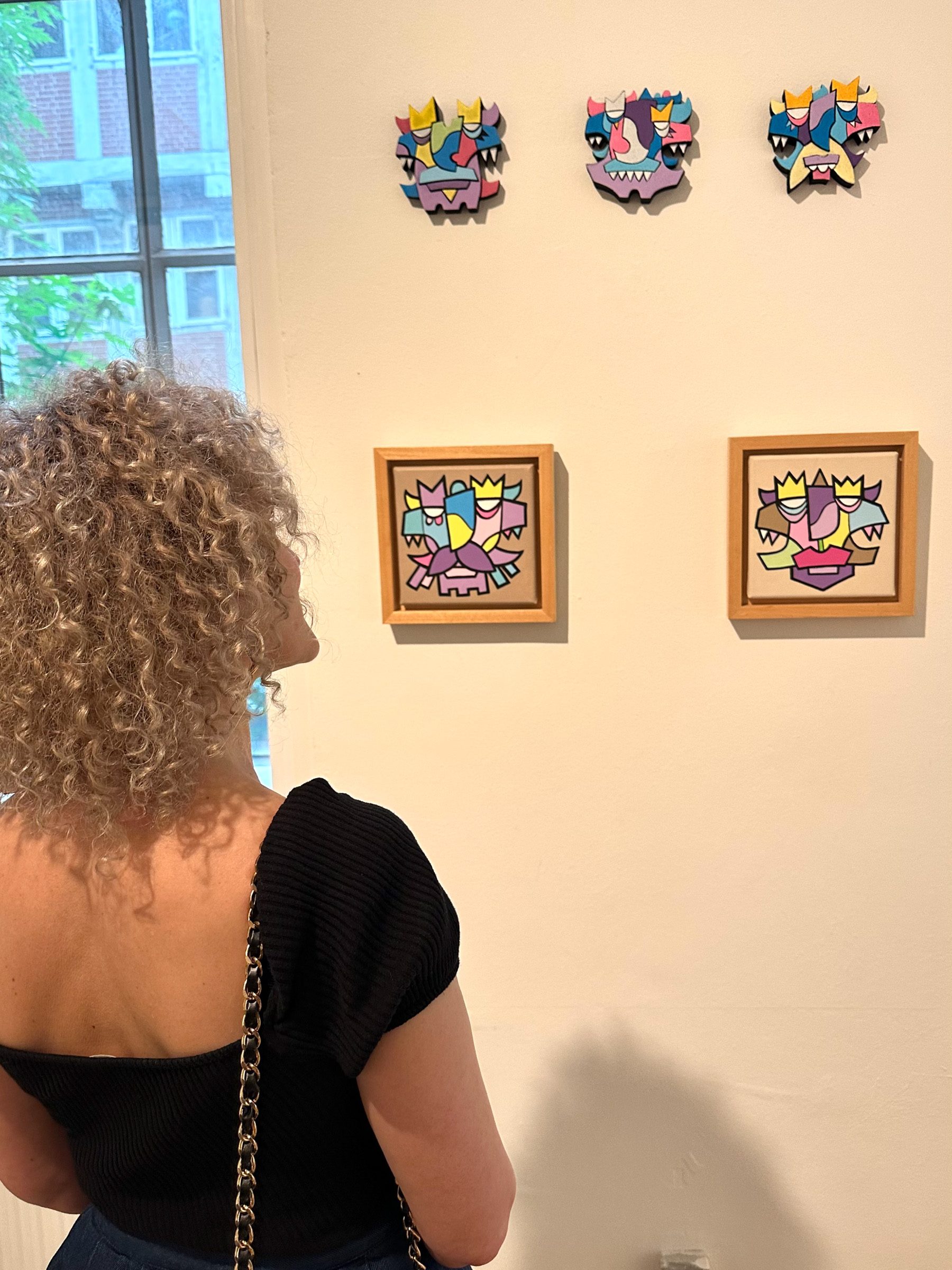
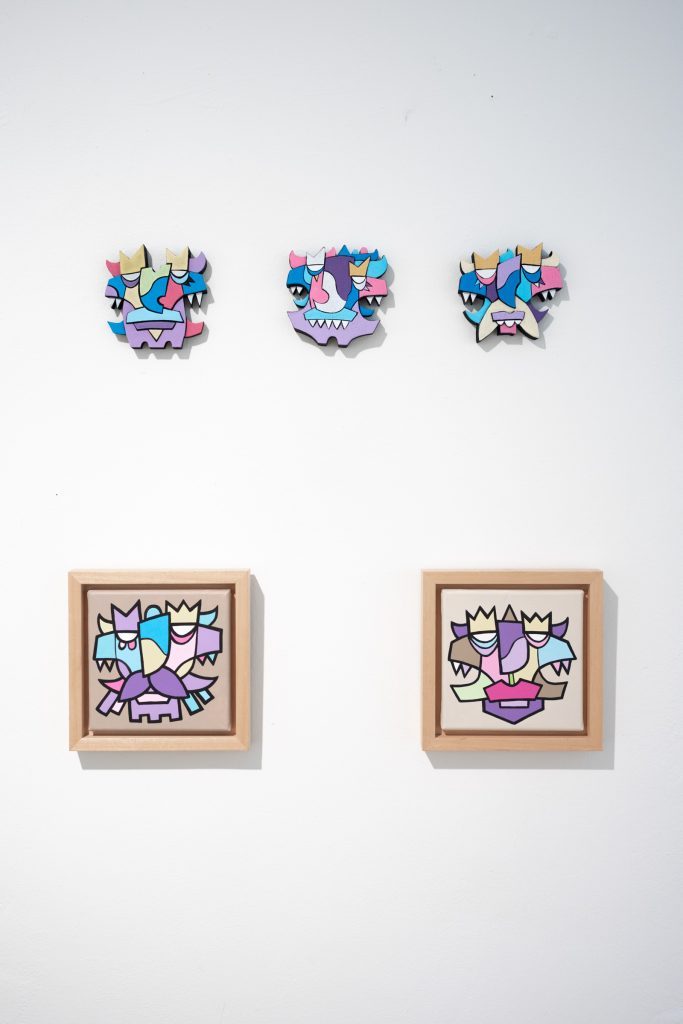
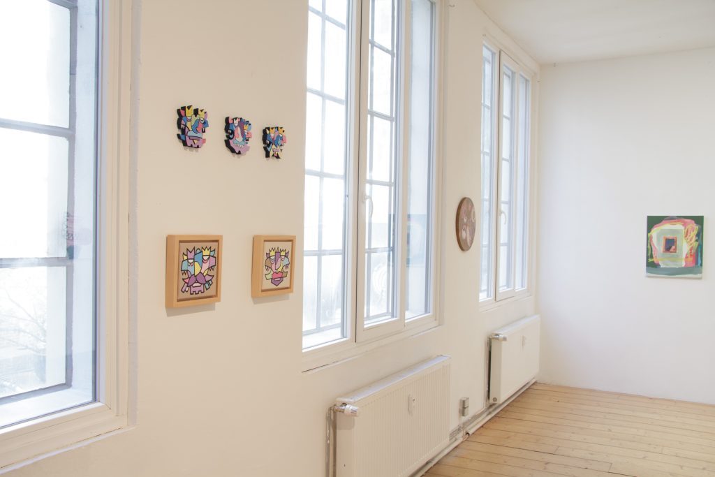
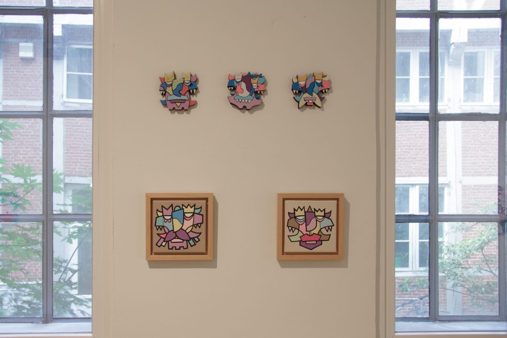
Alesh One develops his figures from geometric segments and comic-like condensations. The series *Kings of Nothing* was originally created against the backdrop of pandemic-related cultural closures and takes on new meaning in the context of current cultural and political developments. Between mask, sign and figure, pictorial spaces emerge that reflect social tensions as well as questions of visibility and cultural participation.
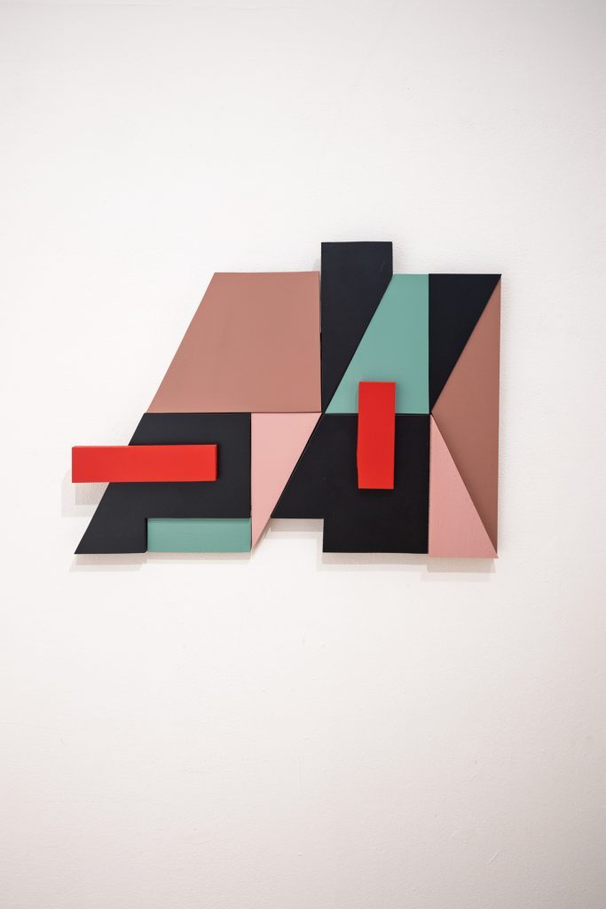
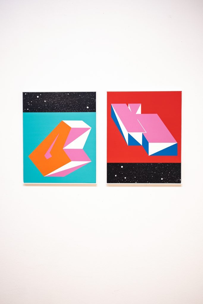
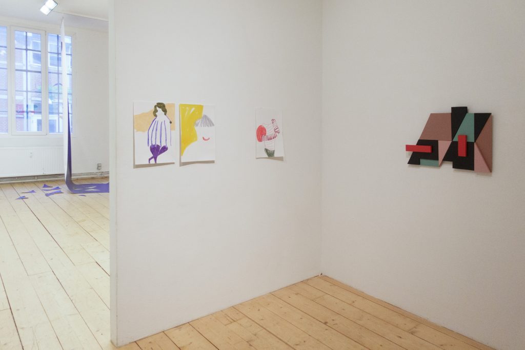
Moritz G. Green combines typography with spatial abstraction. Fragments of letters and architectural elements overlap to form open compositions in which legibility remains in a state of flux. Colour and form function both as autonomous elements and as references to larger spatial contexts.
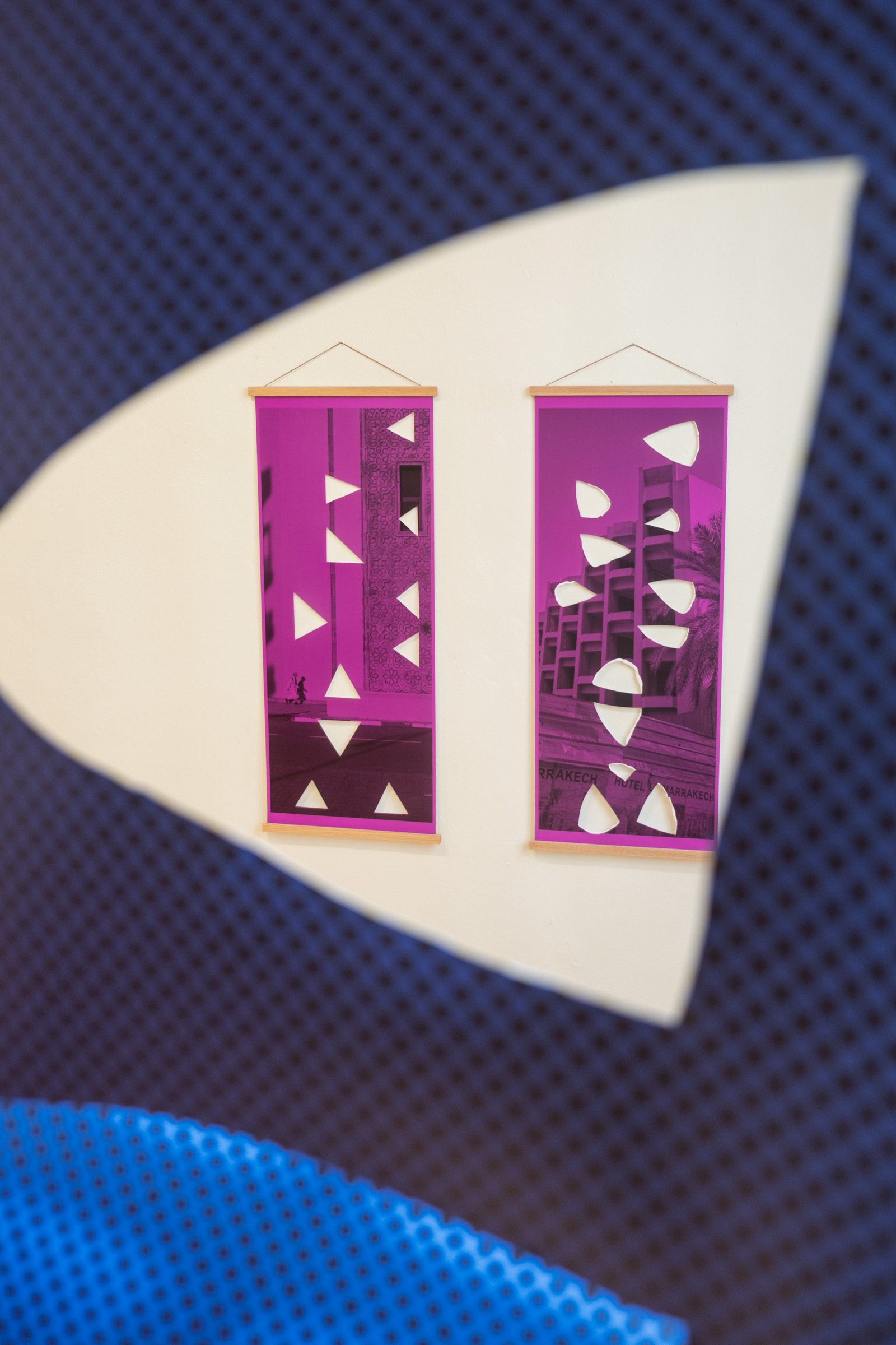
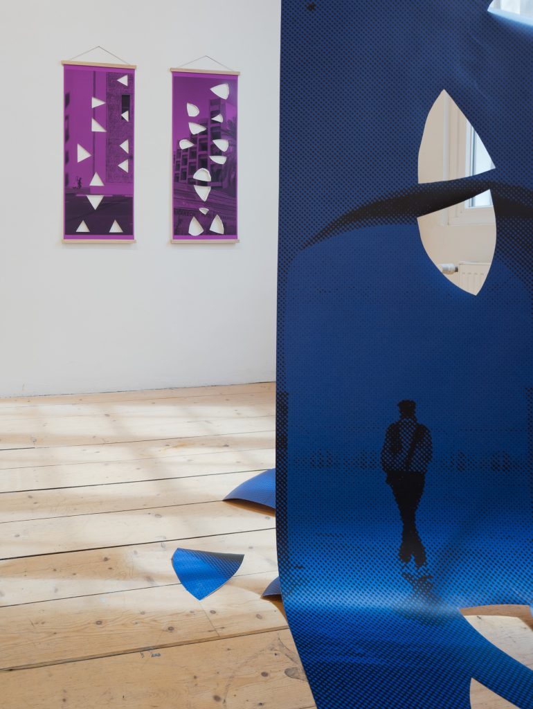
Bart Van Kersavond and CREAM present a different form of translation in their joint installation. The starting point is a series of photographs of urban structures in Marrakesh, which are further processed through enlargement, colour shifts and cut-out techniques. The interplay between the photographic surface and graphic intervention creates visual spaces that lie somewhere between documentation and abstraction.
OFFBEAT, on the other hand, combines urban design languages with material-oriented object work. His wall objects are made from reusable building materials and respond sensitively to light, surroundings and spatial configurations. The works explore repetition, cycles and architectural structure, as well as questions of sustainable material practice.
SAME DIFFERENCE thus presents street art and post-graffiti not as clearly defined stylistic concepts, but as multi-layered forms of spatial, social and aesthetic negotiation. The shift between public space and institutional context is not presented as a contradiction, but as a productive shift: writing becomes an object, a surface becomes pictorial space, an urban intervention becomes a curatorial statement. It is precisely in this movement between proximity and difference that the central tension of the exhibition lies.


Leave a Reply