

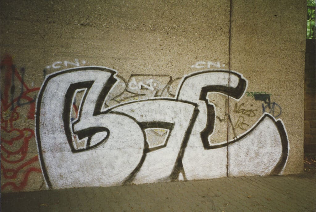
The Berlin-based writer BOE grew up in Heilbronn. In 1991, he started to get interested in style writing and became active himself. When he moved to Mainz in 1996 to study communication design, he met other graffiti writers and founded the artist collective Viagrafik in 1998 nearby Wiesbaden with crew members to realize commissions, exhibitions and free projects together. They exhibited together at one of the most important urban art exhibitions in Germany at that time, the Urban Discipline in Hamburg in 2002. The Via Grafik agency, which still exists today, was founded in Mainz in 2002 and received a lot of publicity in the mid-2000s. With their multi-layered works, the collective participated in several exhibitions and festivals in Europe. They have been widely published in the field of graphic design/illustration/graffiti/art. In 2005 Pyramid Editions published the Viagrafik monograph “choose your weapon!”. The creative minds of the collective dealt intensively with new forms of appearance and the interactions between graphic design and graffiti.
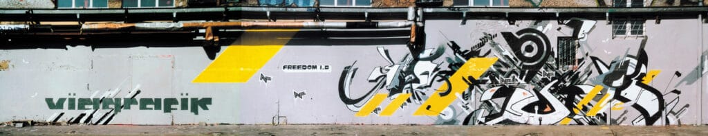
N6–SIGN–GEIST–BOE, 2003, Wiesbaden, ”Freedom 1.0“ ©BOE 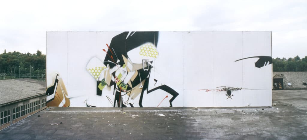
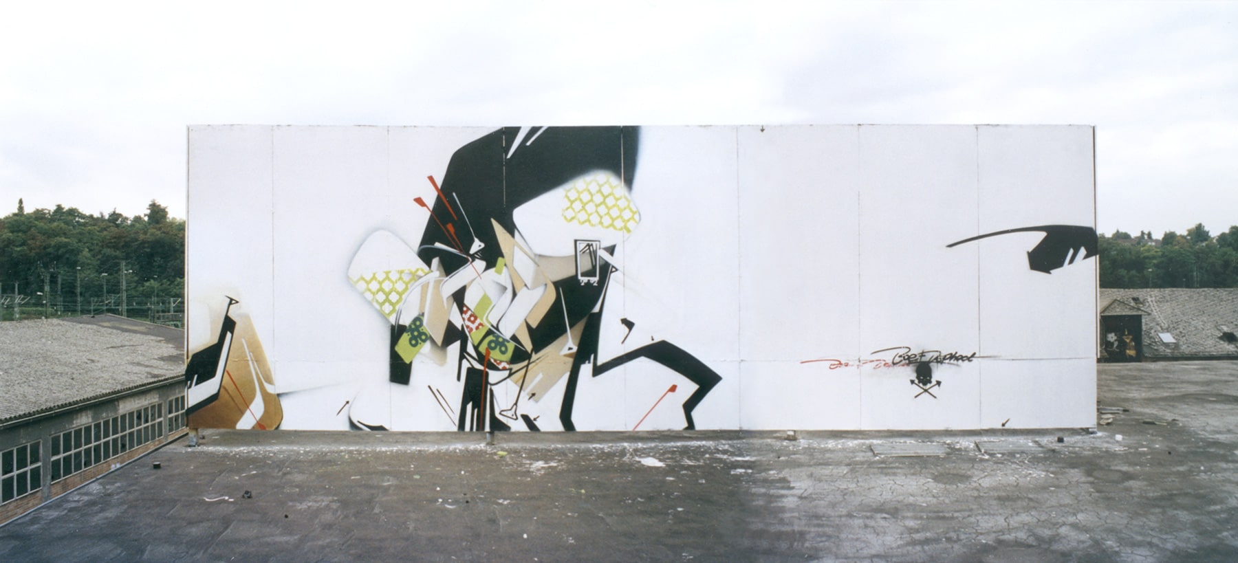
DEPHECT–BOE, 2003, Wiesbaden ©BOE

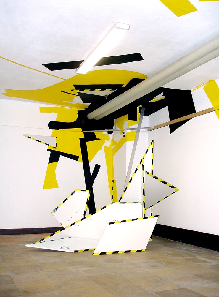
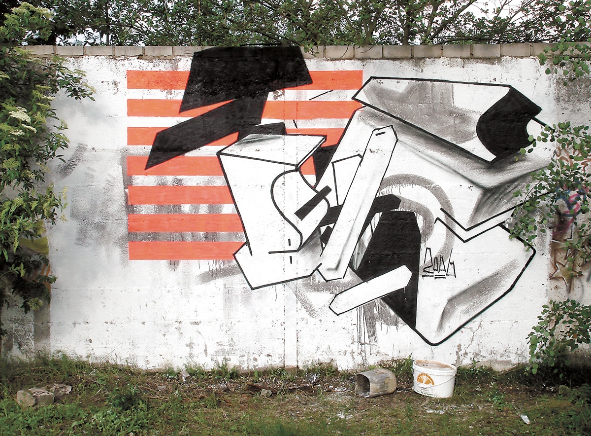
MNWRKS and BOE, 2005, Passage Gallery Wiesbaden, ”Wardrobe“ ©VGRFK 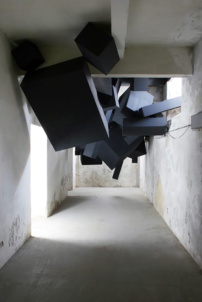
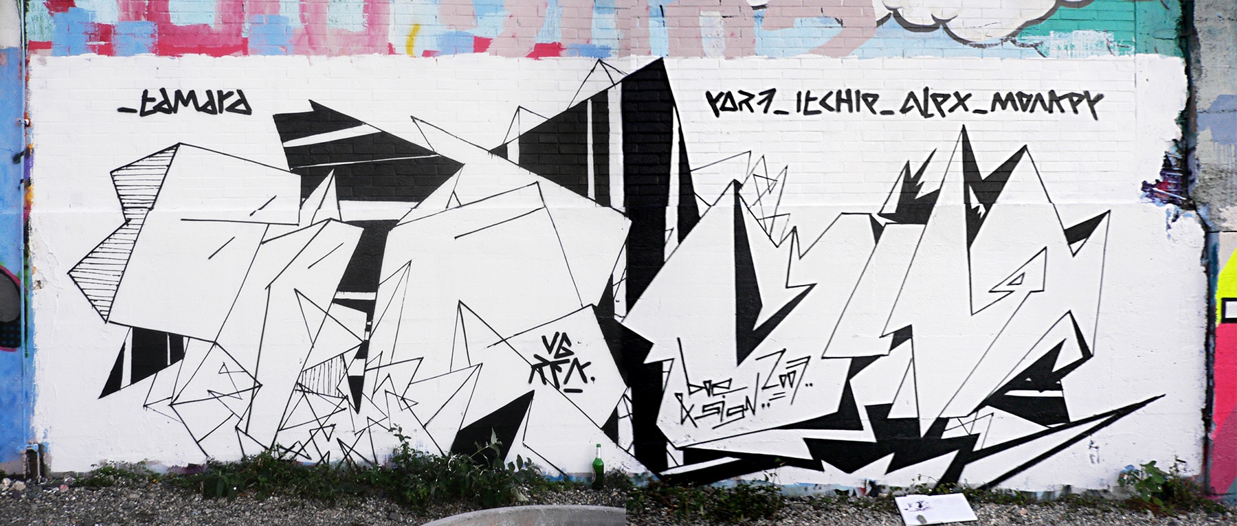
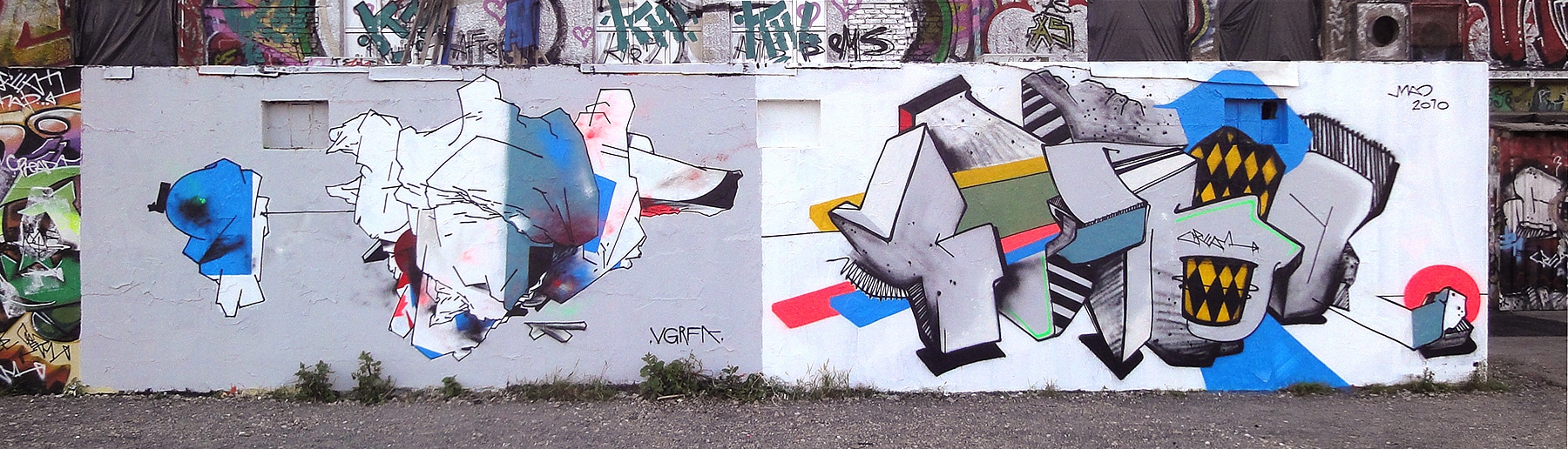
groupwork by VIAGRAFIK, 2008, NAMES festival in Prague ©VGFRK 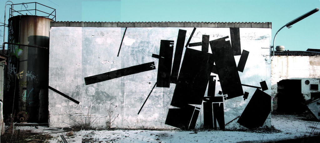
SIGN–GEIST–BOE, 2006, Wiesbaden ©VGRFK 
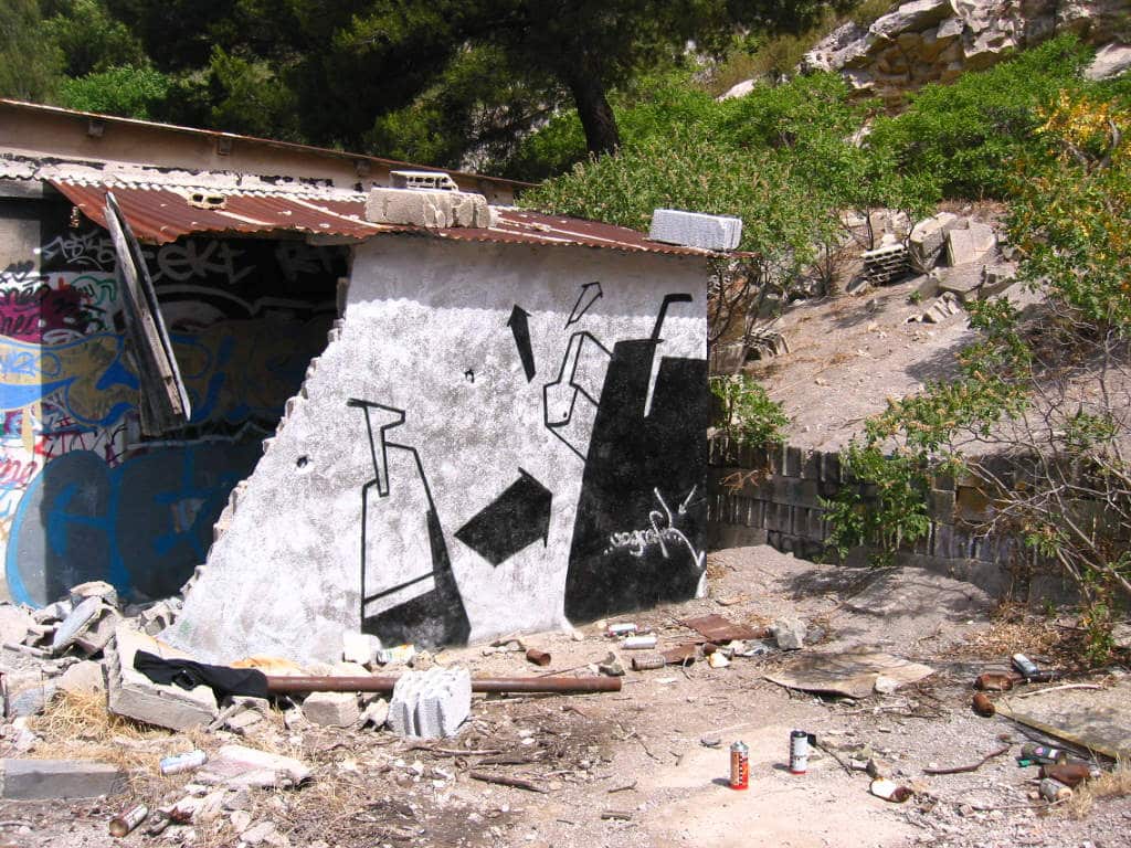
SIGN–BOE, 2009, San Sperate, “Il Fiume dei Writers“ Festival ©VGRFK 
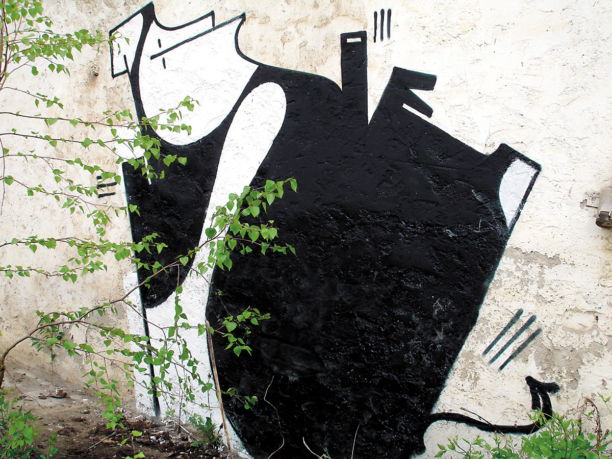
BOE, 2009, Wiesbaden, “Consume Yourself!“ ©BOE 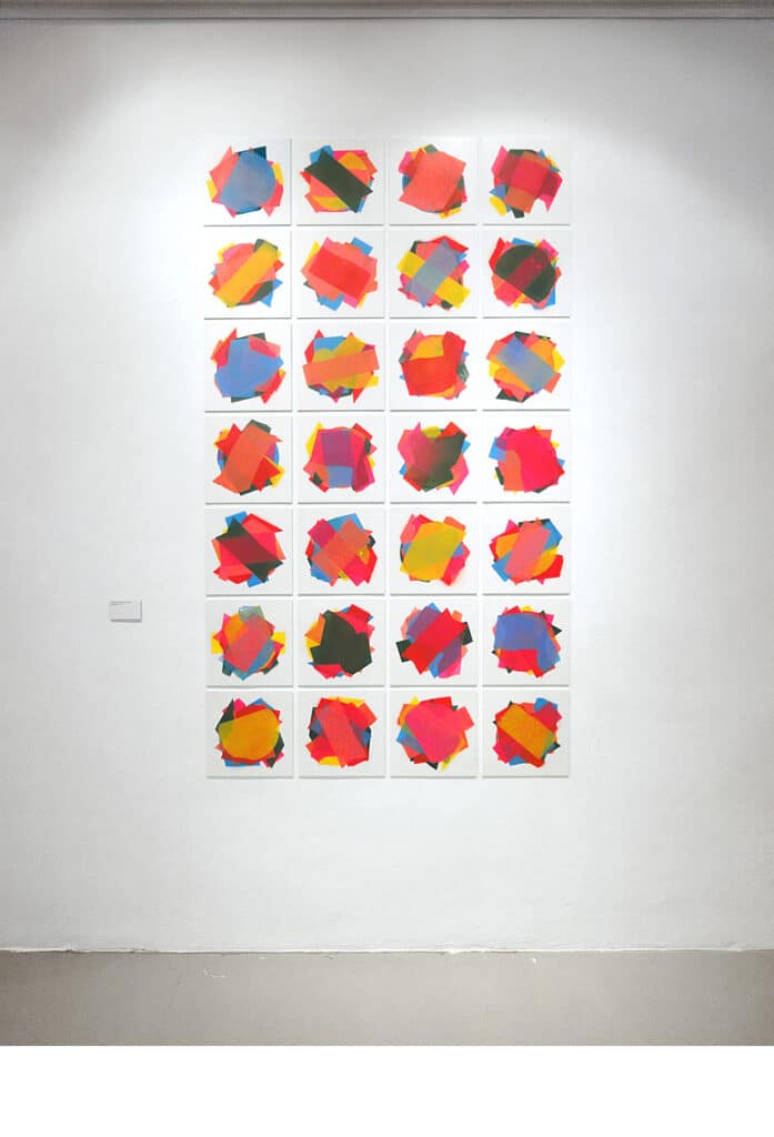
BOE, 2012, Neongolden Gallery Wiesbaden, ”DIdn’t know where else to put it“ ©BOE 
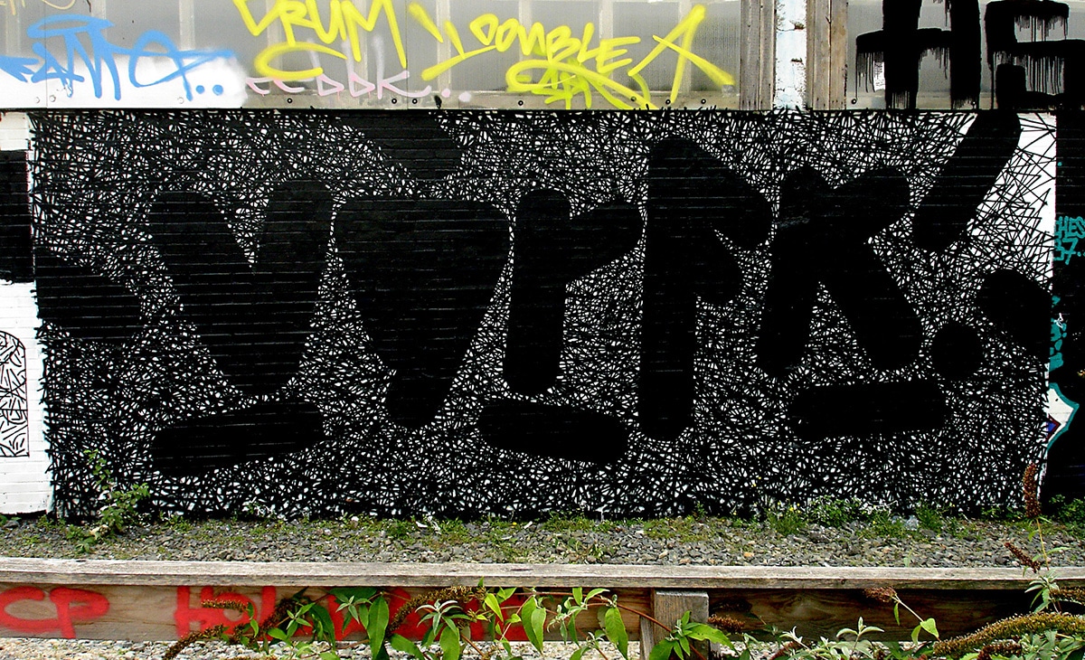
MNWRKS–BOE, 2016, DEADLINE Festival Munich ©BOE
BOE lived in Wiesbaden from 2005 to 2013, before finally moving to Berlin, the city he has visited regularly throughout his life through family connections. BOE was always enthusiastic about the many new styles in Berlin in the field of graffiti. In Heilbronn in the 90s, according to BOE, many writers were strongly influenced by graffiti from Munich and Basel, others were influenced by the Heidelberg School. In Berlin, BOE discovered different forms of graffiti, met many writers and became friends with the crew KHC.
BOE, 1996, Heilbronn ©BOE 
BOE, 1996, Heilbronn ©BOE 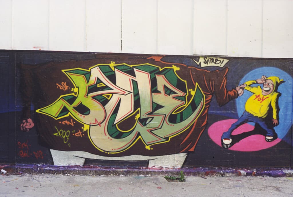
BOE, 1998, Heilbronn ©BOE 
BOE, 1999, WIesbaden ©BOE 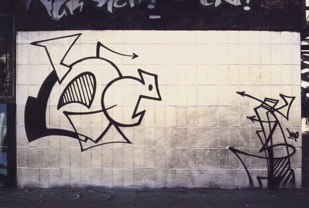
BOE, 1998, Wiesbaden ©BOE 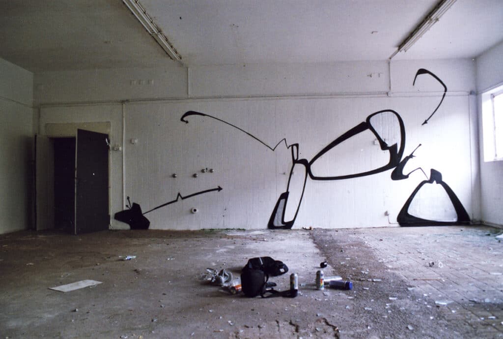
BOE, 1999, Wiesbaden ©BOE 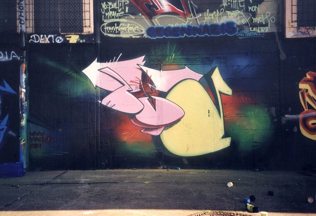
BOE, 2001, Wiesbaden ©BOE 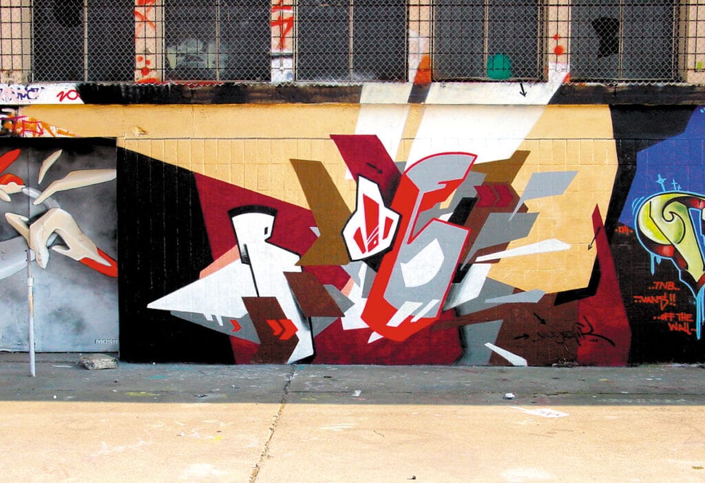
BOE, 2004, Wiesbaden ©BOE 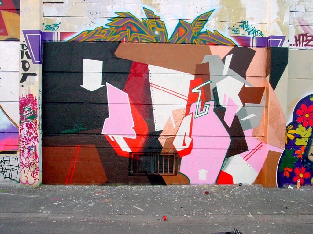
BOE, 2004, Wiesbaden ©BOE


The work on the silhouette
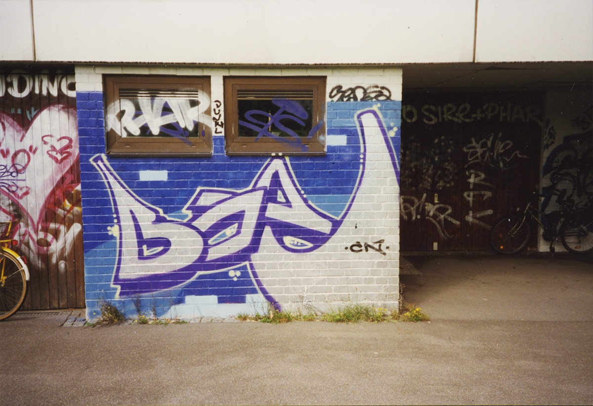
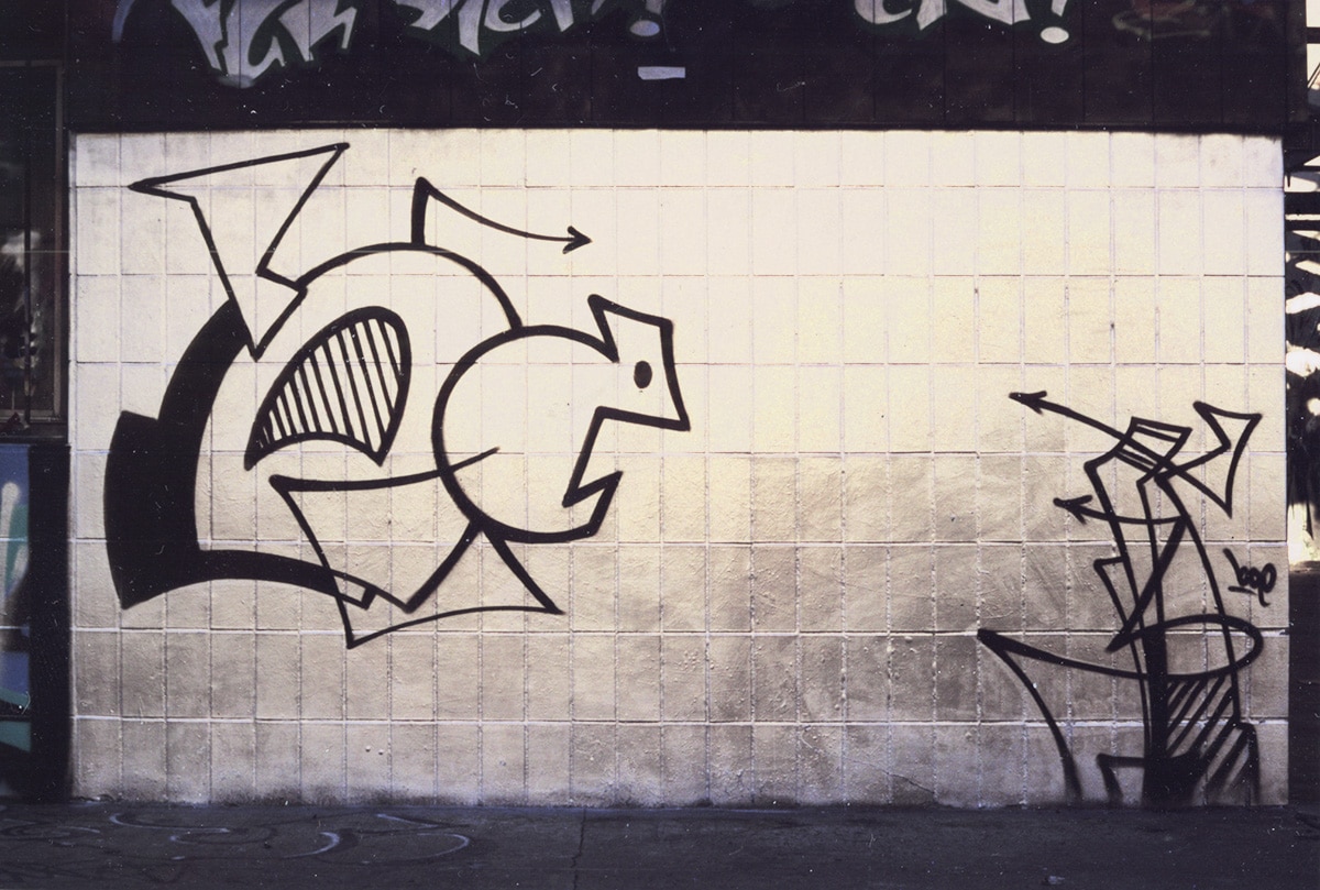
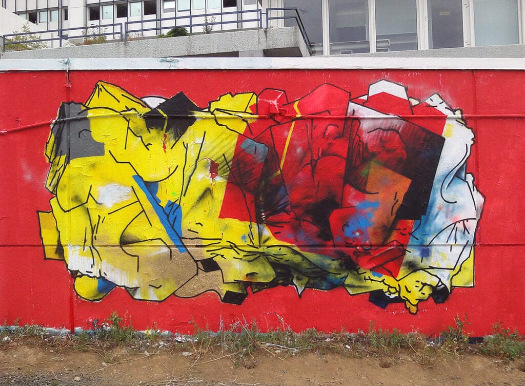
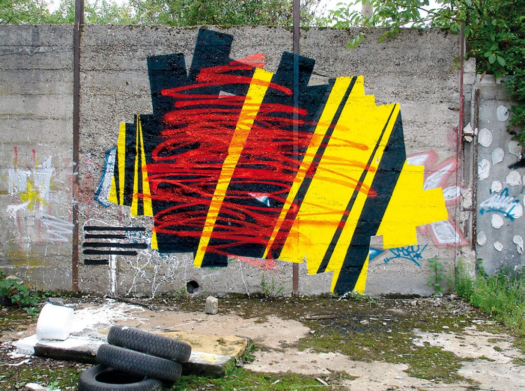
Initially most of the time kept in two colors, BOE paints his pieces with rounded letter forms, always searching for his own and new languages of form for each piece. Through his intentional color restriction with black or yet another additional color, the concentration is entirely on the form. His works at halls or lost places in the 2000s feature stylized letters surrounded by lines and arrows, sometimes comic-like, and are a testament to BOE’s playful way of always finding new ways to redefine the letters of his name and bring them into new relations, dynamics and tensions. For form-finding, he focuses less on the skeleton of the letters, instead he takes the outer form, the outline, the silhouette as his strong point of departure. The internal forms of the letters are usually kept minimal and inserted as a small graphic indication, such as small strokes. In order not to disturb the original forms of the letters, BOE refrains from connections between the letters. He explodes proportions among the three letters and creates tension in the composition among them. In some works he integrates fields of color that create space, in others he incorporates textures such as the crumple look, or through strokes, dots and other elements. BOE works mostly two-dimensionally, but in some works volume and perspective is also implied. At the beginning of the 2000s, BOE’s formal language becomes more geometric, lines are straightened and the color palette, even in color pieces, is increasingly reduced. As a result, the atmosphere created by his pieces becomes more serious. An initially precise realization of the forms is then replaced over time by a rougher stroke, which is also due to the change to a different cap. In this way, BOE wants to bring out more of the graphic origin of his works.

BOE, 2000, Wiesbaden ©BOE 
BOE, 2005, Mainz ©BOE 
BOE, 2004, Wiesbaden ©BOE 
BOE, 2006, Wiesbaden ©BOE 
BOE–SIGN, 2007, Wiesbaden ©BOE 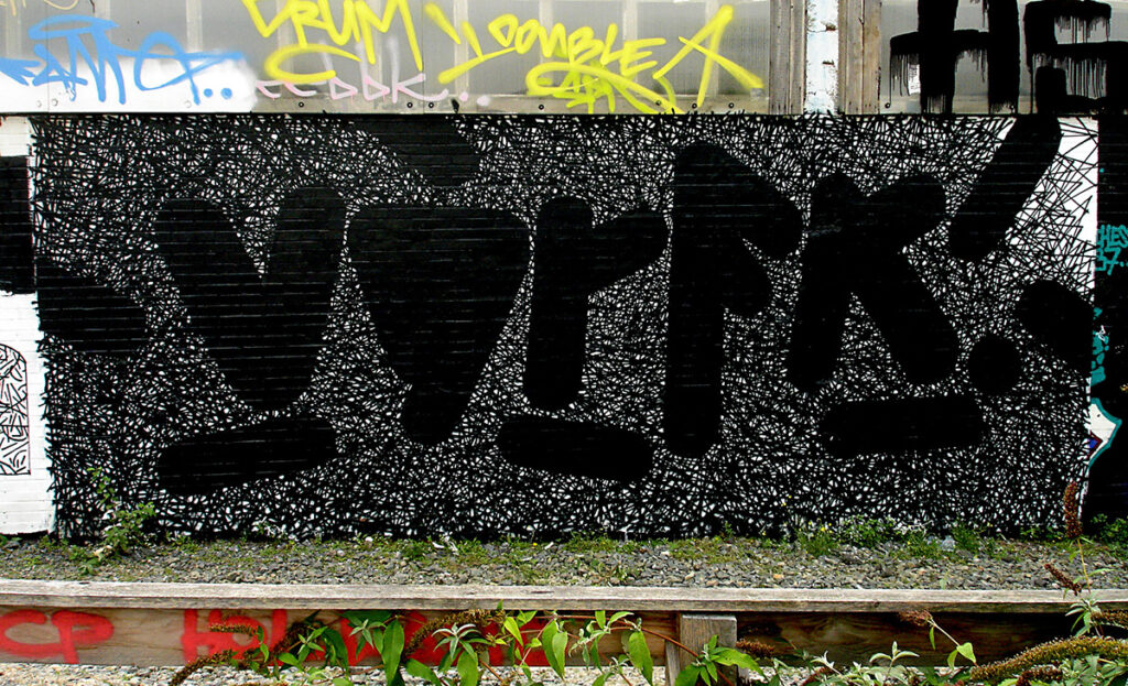
VGRFK, 2007, WIesbaden ©BOE 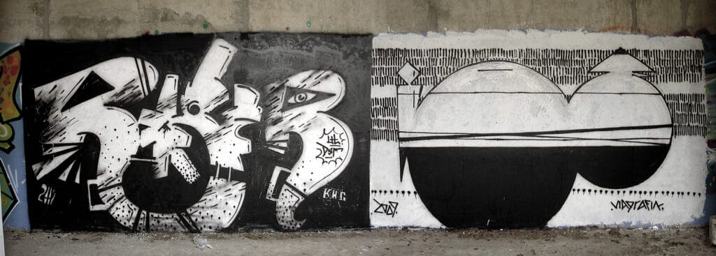
ROGER–BOE, 2009, Berlin ©BOE 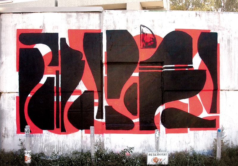
BOE, 2009, Wiesbaden ©BOE


BOE, 2010, Wiesbaden, ”Packshhot“ ©BOE 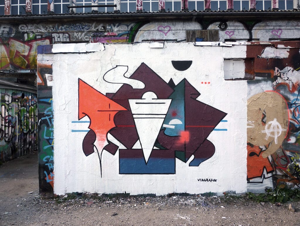
BOE, 2010, Wiesbaden ©BOE 
BOE–CREAM, 2010, WIesbaden ©BOE 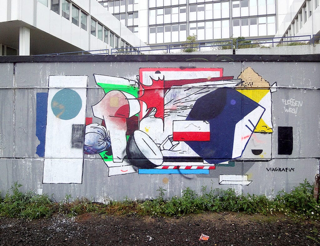
BOE, 2011, Wiesbaden ©BOE 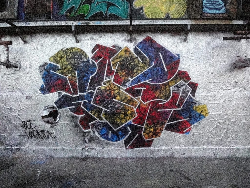
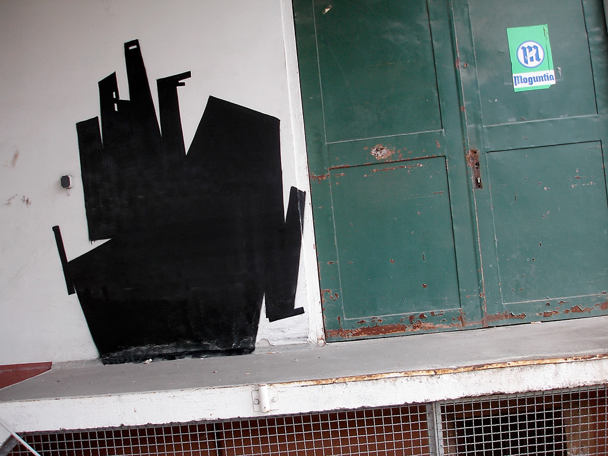
BOE, 2012, Wiesbaden, ”Bill in a Ball“ ©BOE


To experiment with impact in the environment
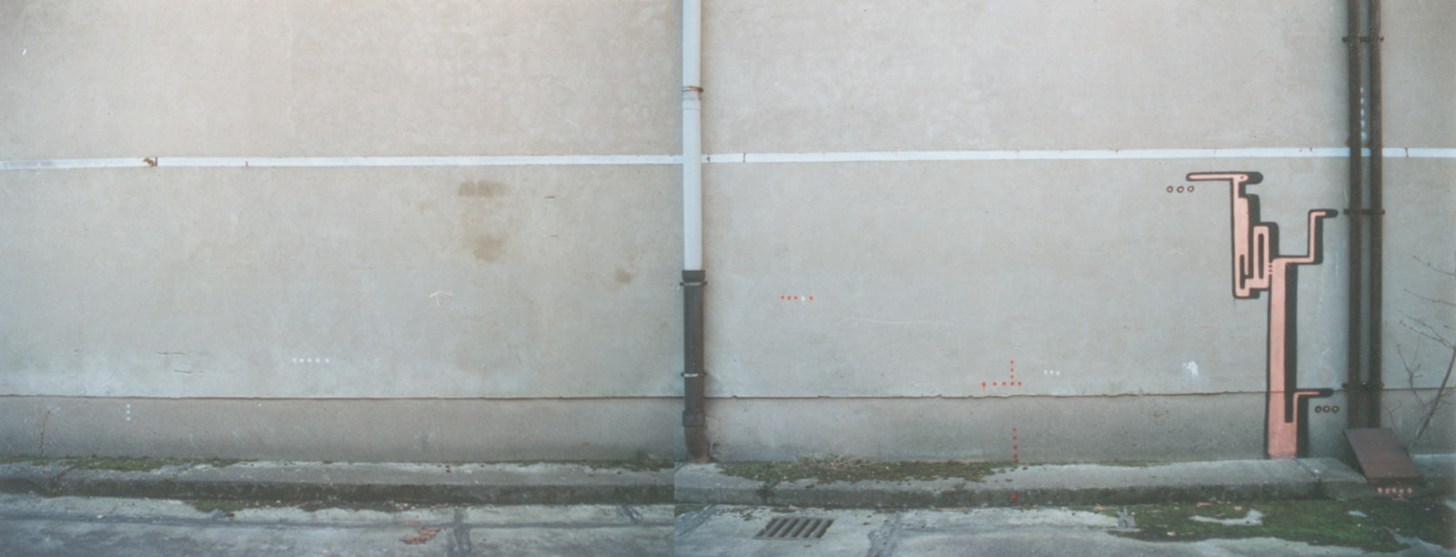
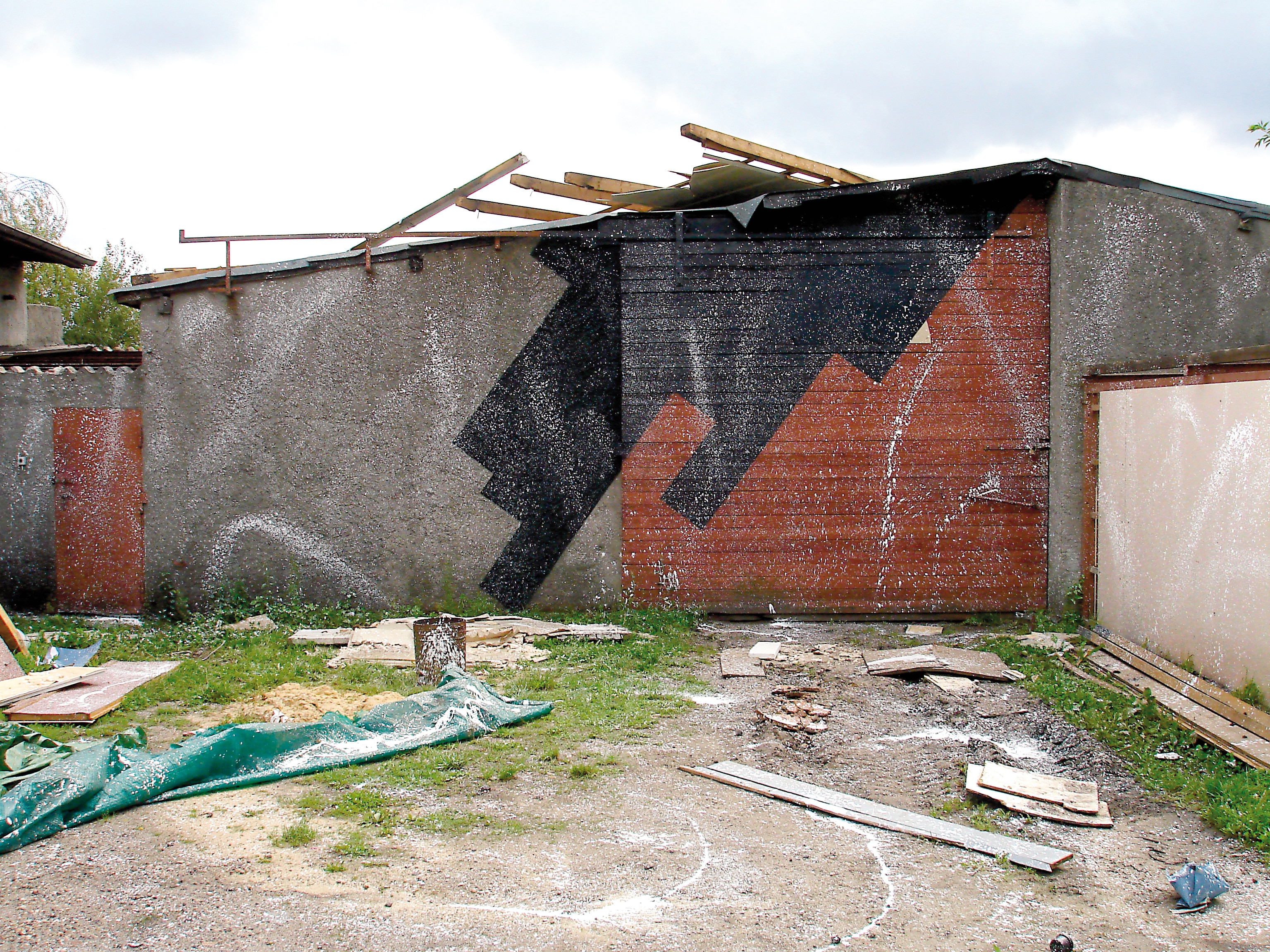
At the end of the 90s/beginning of the 2000s BOE often painted in lost places around Mainz and Wiesbaden. At that time it was new for graffiti to playfully experiment with the environment and also to include the surrounding architecture. Early on, the photos of his murals also show the immediate surroundings in which the piece was integrated, thus illustrating their effect in the environment.
BOE, 2004, Marseille ©BOE 
BOE, 2002, Berlin ©BOE 
BOE, 2002, Berlin ©BOE
In the 2006 series “Disinformation,” BOE’s concept was to paint a piece without being one: Letters, i.e. written information, are no longer present. He creates the dynamism that is usually in his pieces via the construction and arrangement of beam-like forms with graphic filling and additional painterly gestures, which for him represent design methods in the development and execution of graffiti pieces. The beam formations are reminiscent of the remains and remnants of letters. A formation of thin black lines suggest a typographic information block, familiar from exhibited artworks in galleries and museums. At the time, BOE wanted to break away from the name as the artistic content of his pieces. During this time, BOE wanted to create paintings images on walls that would be accessible to a more universal audience than stylized and intertwined letters would allow, to consider graffiti as an image/mural, and thus to break away from certain dogmas in style writing himself and be more open to artistic experimentation.
BOE, 2006, Wiesbaden, “Desinformation“ Serie ©BOE 
BOE, 2006, Wiesbaden, “Desinformation“ Serie ©BOE 
BOE, 2006, Wiesbaden, “Desinformation“ Serie ©BOE

Prototype development
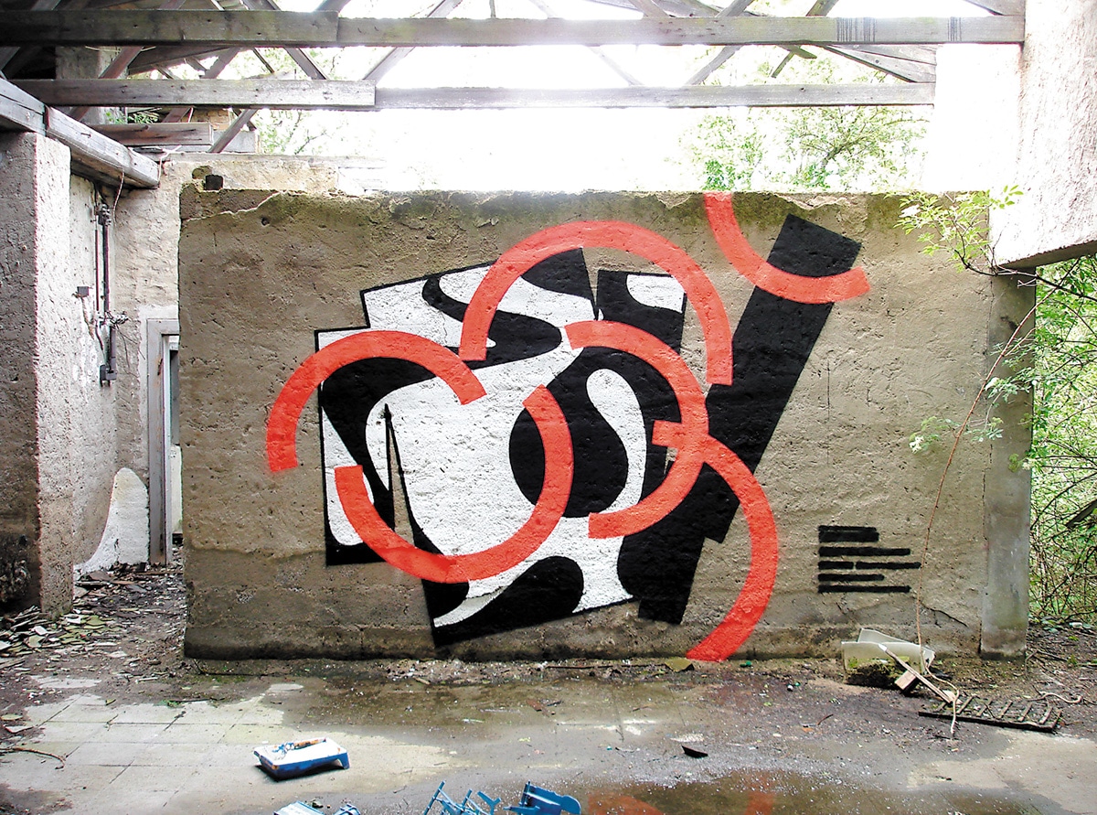
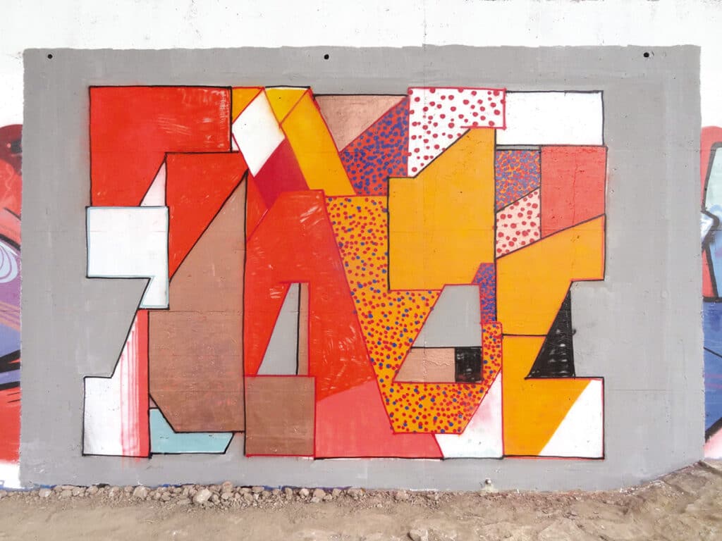
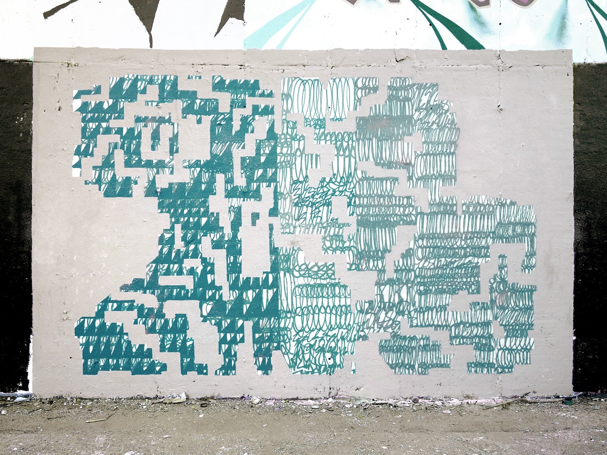
A series of pieces from the last ten years form a rectangular horizontal block consisting of his three letters, reduced to the minimum, merging inside and becoming legible through the minimal punctuation. Other works are entirely abstract. BOE’s works, however, maintain their mostly friendly playful uncomplicated character. They are minimalist, graphically well-defined and balanced, realized with a feeling for painting and have a special effect in their immediate environment.
Currently, BOE paints rather sporadically, when he finds the time to implement a precise idea and develop further in the formal language. With spray can and wall paint he then implements his planned images. BOE likes to work in the form of projects or project series, for which he sets some formal parameters at the beginning. Within these parameters he then develops new prototypes. The prototype can be understood here as a preliminary copy of a small series of similar pieces or as a working model of a new invention for a piece.
But BOE experiments in advance, before the act of painting. He develops drawings at home to determine his form and color ideas of new prototypes, before he goes with it to a wall. A functioning prototype is then painted once or only a few times in varied forms. Because the repetition of the same forms and styles interests the artist rather less, it is about the creative search for new possibilities for pieces. The forms and colors of a picture are thus already clearly defined in advance on paper, but always renegotiated. BOE’s work is graphic in nature and mostly concerned with maintaining the quality in the letter forms while working equally on aspects of the overall composition, the mise en scène of the pieces and the development of new elements, such as fragmentary surfaces and textures.
BOE, 2017, Berlin ©BOE 
BOE, 2018, Berlin ©BOE

No condition is permanent
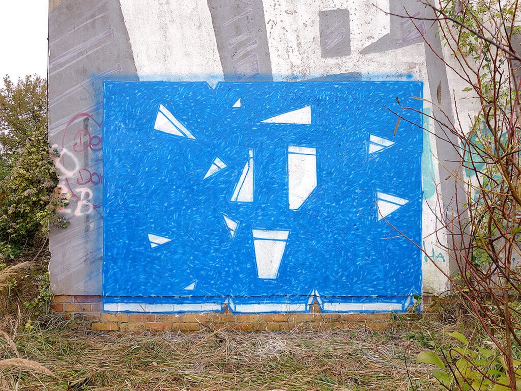
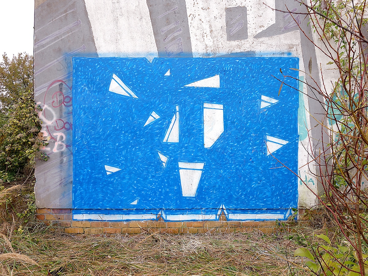
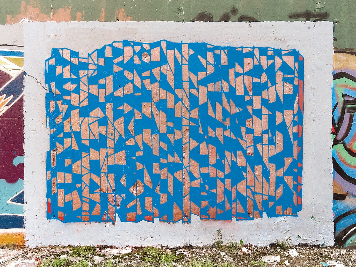
In the 2010s, BOE continues his research, repeatedly defining a rectangular landscape format on a wall surface for the background, which he paints at first in one color and grounds it as a kind of canvas for his compositions in urban or rural environments. In 2015, he starts a project with the aim of compiling the results of his work in a publication. At the beginning of the project, he sets some parameters to create a certain atmosphere with them. For example, he defines a canon of colors that he draws on in each piece in a different composition. And he establishes other stylistic devices, such as some shape parameters and the rectangular outer shape. In the abstract series, he is concerned with “creating a raw, warm atmosphere, letting approachable simplicity prevail and making the inner soul resound” through the choice of mediums and the joy of experimentation. He was also inspired by painterly aspects of his own photographs taken on forays through various cities and by the warm analog sounds of rock steady and high life music from the 60s/70s. In the publication “No condition is permanent”, published by Hitzerot 2019, he presents these works alongside a series of photographs in three booklets.
BOE, 2016, Heilbronn, ”Track005” ©BOE 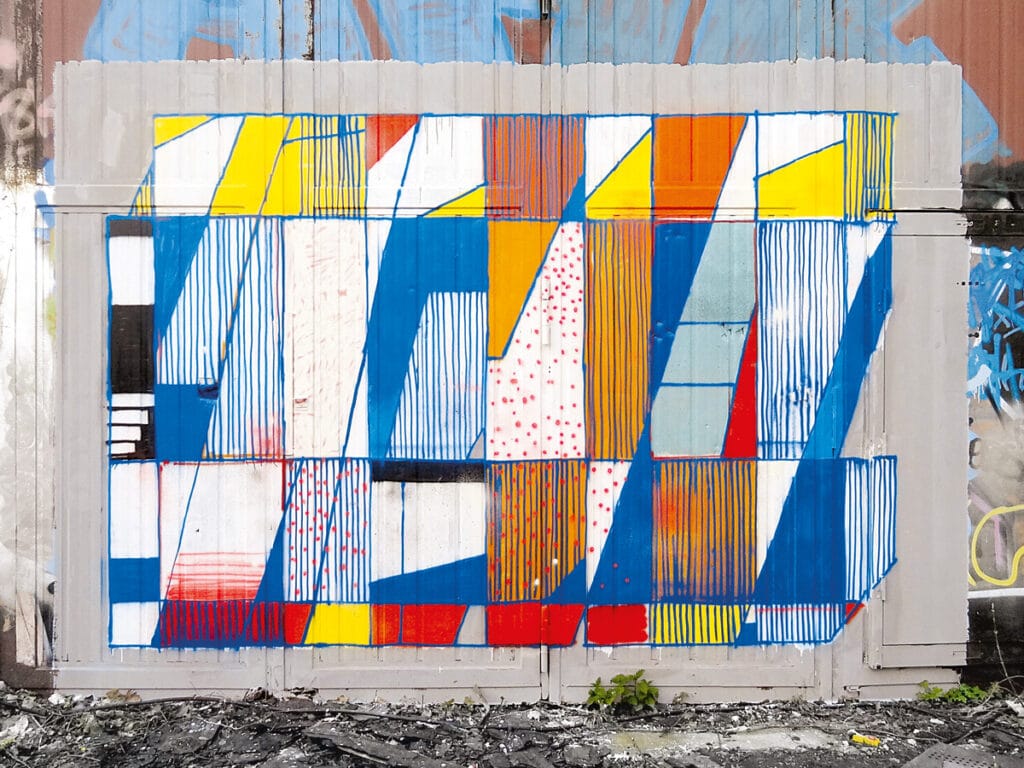
BOE, 2017, Berlin, ”Track002“ ©BOE 
BOE, 2017, Berlin, ”Track008“ ©BOE 
BOE, 2019, Berlin, ”Track022“ ©BOE 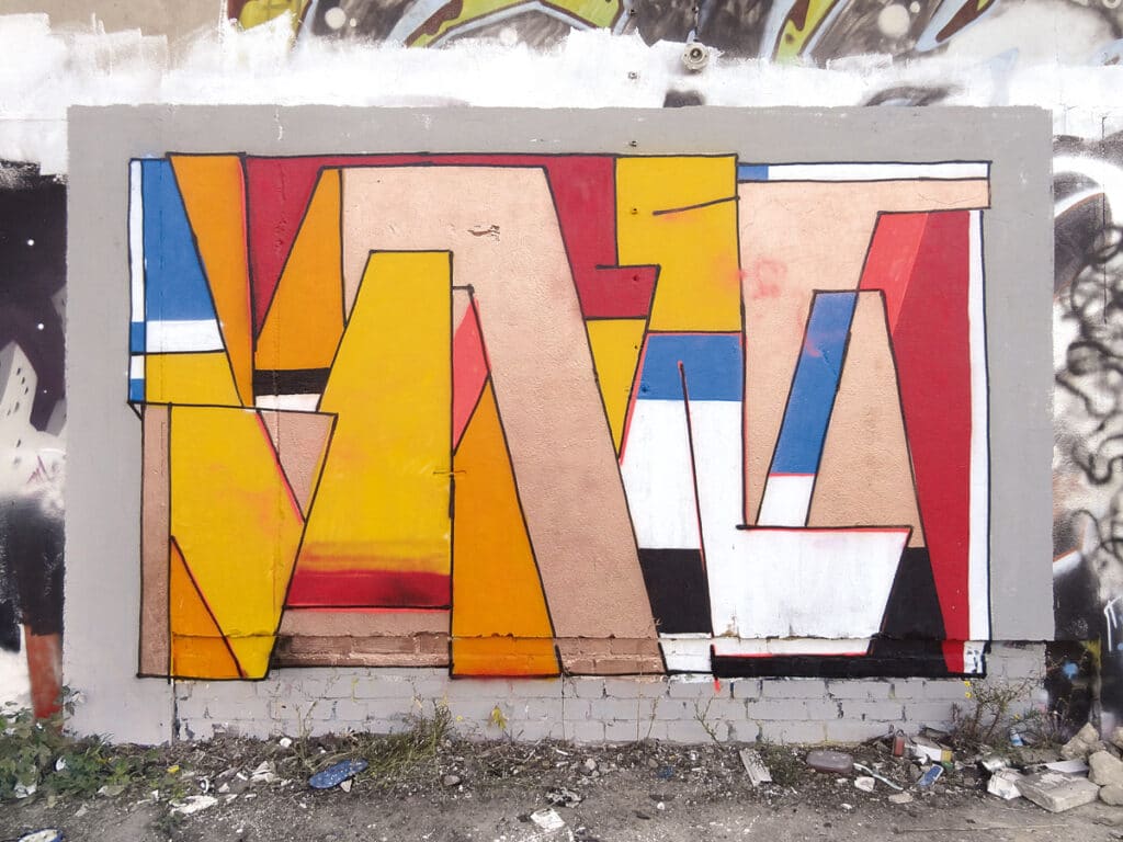
BOE, 2016, Berlin, ”Track001“ ©BOE


BOE writes the following lines for these three booklets, which contain quite a lot about his conception of connections between graffiti, graphic design and painting: “The spray can is an innocent tool for applying paint. Painting, according to a reflection by painter Daniel Richter, is the organization of color. Shapes serve as carriers of color. Letters, if present, are shapes. Photographs freeze moments. Vibe, unsound condition, things shifting among themselves. And carry color. (sure, they also tell and represent). Colors that represent and at the same time should be something completely different. From time to time setting parameters like an album does. Graphic is not design. What is the sound I’m missing – tomorrow they’ll be gone. Somehow heat should arise.“
BOE–CREAM, 2019, Berlin ©BOE 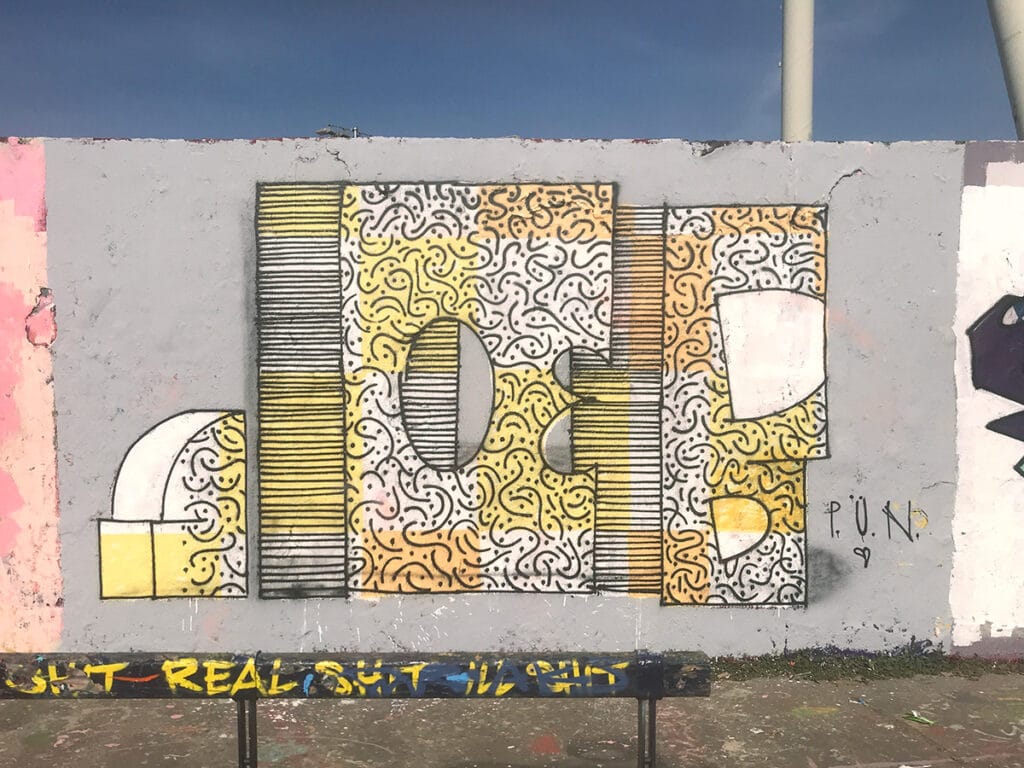
BOE, 2020, Berlin ©BOE


Leave a Reply